Thermodynamic cycles: Carnot, Brayton and Rankine Data?

Thermodynamic cycles

This data-file contains some simple PV plots and TS plots from different thermodynamic cycles, such as the Carnot Cycle, Brayton Cycle, Rankine Cycle and Otto Cycles.


The maximum theoretical efficiency of each different thermodynamic cycle can be derived from formulas: temperature deltas defined all of the cycles, especially the Carnot and Rankine cycles. Efficiency can also be expressed in terms of compression ratios for the Brayton and Otto Cycles.

Over time we will add more data to this file on the thermodynamics of different working fluids, including their Enthalpy, Entropy, Specific Heats, Cp/Cv, latent heat (where relevant) and densities.

Offshore wind: installation costs by vessel?

Offshore wind installation cost

An offshore wind project is likely to cost $2,500/kW, of which c$1,500/kW is turbines and $1,000/kW is offshore wind installation costs. This data-file aims to estimate the breakdown by vessel type, day-rates and costs per turbine.


Estimates range from 25 to 100 vessels being deployed in the installation of a typical offshore wind project, across different studies and technical papers.

Our base case estimate is that each turbine will require 10 days to install, consuming 100 “vessel days”, of which c10% are highly specialized vessels (data here).

The highest day-rates will be commanded by the most specialized vessels, and we think this includes wind turbine installation vessels, cable lay vessels (both intra-wind farm and for the export cable to shore), and foundation vessels that drive monopiles or jackets/piles into the seabed.

Offshore installation costs are sensitive and can realistically range from $800-2,500/kW, depending on project parameters.

These installation costs come on top of the underlying turbine costs, which we think are usually going to be around $1,500/kW per our cost breakdown of a wind turbine.

Economies of scale are achieved by using larger turbines in larger projects. Conversely, costs re-inflate when moving further from shore and into deeper water.

Please see our broader research into wind and solar and the ramp-up of renewables in our roadmap to net zero.

Please download the data-file to stress-test the numbers and see our estimates for the breakdown of offshore wind installation costs by vessel type.

Polyurethane: production costs?

Polyurethane production costs are estimated at $2.5-3.0/kg in our base case model, which looks line-by-line across the inputs and outputs, of a complex, twenty stage production process, which ultimately yields spandex-lycra fibers. Costs depend on oil, gas and hydrogen input prices.


Polyurethane production costs are complex to model, because there are over 20 intermediate stages when transforming oil, gas, air and mined minerals into this class of petrochemicals (chart below). And moreover, there are hundreds of different types of polyurethanes, in this 25MTpa market, which comprises c5% of all plastics.

This data-file builds up the mass balances for spandex-lycra polyurethanes, going line by line through this complex value chain, and drawing on our other models.

Our base case estimate is for polyurethane production costs of $2.5-3.0/kg, although costs are sensitive to oil, gas and hydrogen prices, as shown overleaf.

To reach these numbers, we have simply captured the mass balances of different products in the supply chains, and then drawn on our library of other economic models to add other costs associated with gas value chains, naphtha cracking, air separation, hydrogen production, chemical separations, CO2 separation, ammonia synthesis, nitric acid, methanol, formaldehyde, chlor-alkali, acetylene et al.

Can you use green hydrogen to decarbonize polyurethane? Substituting 0.12 kg of grey hydrogen per kg of polyurethane (at 9 tons of CO2 per ton of H2) with low carbon hydrogen saves a full 1 kg of CO2 per kg of polyurethane. However at $7-10/kg green hydrogen prices, this also inflates the polyurethane price by around $0.8-1.2/kg. Conversely, using US blue hydrogen can avoid similar CO2 emissions with minimal reinflation. This illustrates that there may be growing upside in blue chemicals, alongside other blue hydrogen themes.

It is a lot to capture. And hence we hope users of this model will find the big-picture sensitivity analysis of polyurethane production costs useful; including the ability to flex the inputs, which in turn can be interrogated by diving into our other economic models. For further details please see our outlook for polyurethane in the energy transition.

Decarbonized gas: ship LNG out, take CO2 back?

Transport CO2 in LNG carriers

This note explores an option to decarbonize global LNG: (i) capture the CO2 from combusting natural gas (ii) liquefy it, including heat exchange with the LNG regas stream, then (iii) send the liquid CO2 back for disposal in the return journey of the LNG tanker. There are some logistical headaches, but no technical show-stoppers. Abatement cost is c$100/ton.

Albedo of different landscapes: a challenge for reforestation?

Albedo of different landscapes

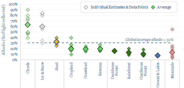
Forests are darker than their surroundings? So does their low albedo curb our enthusiasm for nature-based solutions? This data-file aggregates the average albedo of different landscapes, based on technical papers and internet sources. The albedo impact of reforestation seems numerically very small. There is even an intriguing link where forests can increase the formation of clouds, which have the highest average albedo of any reflective category.


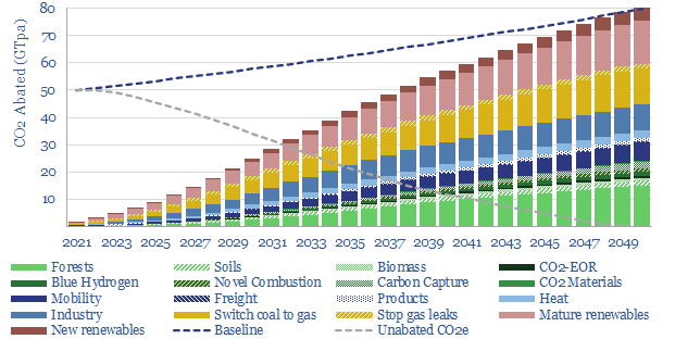
Our latest roadmap to net zero assumes that c20% of all decarbonization of the 2050 energy system will come from new forests and other nature-based solutions to climate change. These solutions need to prove they are real, incremental, measurable, long-lasting and have other social and ecological benefits, to score highly on our nature-based project screens.

However, some commentators have criticized that forests are a not a good climate solution, because they are darker than the surrounding landscape. Forests have an average albedo of 13% versus open landscapes at 20%. Thus they absorb more heat. Thus could planting more forests increase warming in addition to the impacts of CO2?

Four observations on this argument are summarized below, and supported by the data in this data-file.

(1) Starting with a definition: Albedo is the percentage of incoming radiation that a surface reflects. This includes both visible light (from violet at 380nm to red at 700nm), which is c43% of the incoming energy reaching the Earth’s surface; and infra-red radiation, which is 49%; and ultra-violet light, which is the remaining 8%. Physics’s theoretical ‘black body‘ has an albedo near 0%, and the brightest whites have an albedo near 100%. So it is true that land uses with a lower albedo will absorb more heat. But how much more heat?

(2) Albedo impacts are a rounding error? Overall, our roadmap to net zero sees 3bn acres of the planet going from ‘not forest’ to ‘forest’ (note here), which is 8% of the world’s total land (40 bn acres in total) and 2.4% of the planet’s total surface (126bn acres in total) (database here). Moreover, where land use is moving from ‘not forest’ to ‘forest’ in our models, it is mainly moving from pastureland or grassland (average albedo of 20%) to forest. We are not reforesting ice sheets (average albedo of 60%) or the Sahara desert (average albedo of 35%). And there may even be some areas where albedo increases, if reforestation occurs on dark and bare soils (albedo of 10%) or when planting mangroves that fill in open bodies of water (albedo of 8%). However, overall, a 7pp heat absorption delta on 2.4% of the world’s land is a rounding error. And it may itself be counteracted…

(3) Clouds and the cooling impacts of transpiration. One of the most interesting links in technical literature is that forests may increase cloud cover, and in turn, clouds have an average albedo of 63%, which is the highest of any surface condition that is averaged in our data-file. The best paper to cross our screen evaluated 10-years of satellite data over large oak and pine forests in Europe, finding 5-15pp higher absolute cloud cover during summer months over the forests (compared with surrounding cropland), and consistently higher cloud cover downwind of the forest. The downwind effect was most pronounced when wind speeds were higher, and absolute cloud cover decreased by 20pp after a large portion of one of these forests was damaged by a storm in 2009 (see Teuling, et al, 2017). Another recent study also found increased cloud cover over forests, and calculated that this would amplify the net carbon benefits of reforestation, especially at mid-latitudes (see Cerasoli, et al, 2020).

(4) Conflicting conclusions. It should also be highlighted that other technical papers have found more mixed links between forest cover and cloud cover. From the technical papers that crossed our screens, there seems to be much less certainty and much more debate than in other areas of climate science that we have reviewed. Even the science of measuring albedo is quite full of controversy, varying over time, with the seasons, with weather conditions. Some commentators argue that in winter, Arctic-latitude forests are much darker than snow, but to this I say, come visit me in Estonia in December-January, and see how little daylight there is to absorb/reflect!! Our summaries of different technical papers are in the data-file, along with average values for the albedo of different landscapes.

Overall, we still think that protecting and restoring nature is climate-positive, as well as being a philosophical virtue in the eyes of any true environmentalist (almost as a defining criterion!). We will continue to screen nature based CO2 removals in our research in 2023, and hope to see a new array of exponentially improved projects coming to the market.

Goldwind: frequency response from wind turbines?

Goldwind frequency response

Goldwind is one of the largest wind turbine manufacturers in the world, having delivered over 50,000 turbines by early-2023. The company was founded in 1998, headquartered in Beijing, it has 11,000 employees, and shares are publicly listed.

The wind industry is increasingly aiming to mimic the inertia and frequency response of synchronous power generators. Goldwind has published some interesting case studies, boosting power by 6-10%, within 1-2 seconds, for 5-6 seconds. Hence this data-file reviews Goldwind frequency response patents to look for an edge?


Synchronous power generators have ‘inertia’. If the grid suddenly becomes short of power, due to a large new load switching on, or a large power source disconnecting, then all of these synchronized machines will slow down very slightly, and in unison. Harvesting their rotational energy provides more power to the grid. But it also lowers the ‘frequency’ of the grid. At least for a few seconds, until firing rates can be ramped up. Generally, the larger the synchronous power generators, the higher their ‘inertia’, the more power that can be drawn out as they slow down, and the less grid frequency will drop per unit of incremental power. This is all crucial to the functioning of a modern power grid.

Wind turbines do not inherently provide any inertia or frequency response. Interestingly, they have about the same amount of angular momentum as conventional power generators, as they spin. But it is not synchronized with the grid. A wind turbine spins at 15-20 revolutions per minute, whereas a typical grid at 50 Hz (or 60 Hz in the US) is completing 50 full AC cycles per second.

An increasing goal for the wind industry is to ‘mimic’ some of the inertia and frequency responses of synchronous generators. Recently, Goldwind has published interesting case studies at wind farms, e.g., in Australia, boosting power by 6-10%, within 1-2 seconds, for 5-6 seconds (chart below).

The goal of this patent screen is to evaluate whether Goldwind’s frequency response algorithms give it an edge over other wind turbine manufacturers. We were unable to de-risk this idea from reviewing the patents, for the reasons explained in the data-file.

There are three key challenges for implementing frequency responses, as a form of ‘synthetic inertia’ and wind power plants, which are also borne out by the patent analysis. It takes time to implement the response (certainly longer than a battery, capacitor bank or conventional generator). Second, it is challenging to coordinate the responses of dozens of turbines, each with a different operating state. Third, there is always a danger that the wind drops at the precise moment you want to implement your frequency response, due to natural wind volatility.

Goldwind frequency response? Goldwind discusses possible solutions to each of these challenges in its patents. The bright spot is that we think many of the solutions are software-side, which will lower their implementation cost, and not pull too hard on already-bottlenecked power electronics. However, as usual, we find it harder to de-risk algorithm-heavy patents.

LNG shipping: company screen?

LNG shipping companies

This data-file is a screen of LNG shipping companies, quantifying who has the largest fleet of LNG carriers and the cleanest fleet of LNG carriers (i.e., low CO2 intensity). Many private companies are increasingly backed by private equity. Many public companies have dividend yields of 4-9%.


In total, there are 650 LNG carriers in operation in 2023. A dozen companies control half of the fleet and are captured in this data-file. They have an ‘average’ fleet size of 13 vessels (ranging from 6 to 70 vessels).

The CO2 intensity of the LNG carrier fleet is measured on an AER basis, at 9 grams of CO2 per deadweight ton mile travelled, which equates to 18 grams of CO2 per effective ton mile travelled (factoring in the return journey).

The lowest carbon and most efficient vessels currently being delivered are large (174,000m3+) and have two-stroke, low-speed propulsion such as MEGI (Man) and X-DF (WinGD), yielding AER CO2 intensities below 5 grams of CO2 per dwt-mile. Conversely, older vessels and steam vessels can have AER CO2 intensities above 12 grams per dwt-mile.

Another theme that stands out from the screen is the high 4-9% dividend yields of leading public LNG shipping specialists, with high-quality fleets and vessels locked-in on long-term contracts, with high-quality charterers.

A final theme that stands out is the growing involvement of private equity firms, including taking public LNG carrier companies private and investing to expand and modernize future fleets.

Please download the data-file for an overview of the LNG shipping companies and the fleets of gas carriers. Further details can be found in our broader LNG research, including the economics of LNG shipping.

Global energy: ten themes for 2023?

Predictions for global energy in 2023

This 14-page note lays out our top ten predictions for global energy in 2023. Brace yourself for volatility, a recession due to energy shortages, and deepening bottlenecks on accelerating new energies? However, the biggest change for 2023 is that an energy super-cycle is now gradually coming into view.

Exploration capex: long-term spending from Oil Majors?

This data-file tabulates the Oil Majors’ exploration capex from the mid-1990s, in headline terms (in billions of dollars) and in per-barrel terms (in $/boe of production). Exploration spending quadrupled from $1/boe in 1995-2005 to $4/boe in 2005-19, and has since collapsed like a warm Easter Egg. One cannot help wondering about another cycle?


The peer group comprises ExxonMobil, Chevron, BP, Shell and TOTAL, which comprise c10% of the world’s oil production and 12% of the world’s gas production. As a good rule of thumb, this group can be thought of as c10% of global production.

This peer group quadrupled its exploration expenditures, from $5bn pa spent on exploration in 1995-2005 to an average of $20bn pa on exploration at the peak of the 30-year oil and gas cycle in 2010-2015. Exploration spend ramped from $1/boe to $4/boe over this timeframe. It has since fallen back to $1/boe, or around $1bn per company pa in 2022.

The US has always been the most favored destination, attracting c25% of all exploration investment, both offshore (e.g., Gulf of Mexico) and increasingly for short-cycle shale. During the last oil and gas cycle, the largest increases in exploration investment occurred in Africa, other Americas, Australasia; and to a lesser extent Europe and the Middle East.

One possible scenario for the future is that this peer group continues to limit its exploration expenditures to the bare minimum, below $1bn per company per year, or below $1/boe of production; under the watchwords of “capital discipline”, “value over volume” and “energy transition”.

However, it is somewhat terrifying to consider that the industry needed to spend an average of $2.5/boe on exploration from 2005-2019 in order to hold its organic production “flattish”.

Under-investment across the entire industry may foreshadow a sustained shortage of energy, especially if 50% lower-carbon gas is intended to replace coal as part of the energy transition, per our roadmap to net zero, or more pressingly as Europe faces sustained gas shortages. Hence one cannot help wondering if industry-wide exploration capex in the 2020s and 2030s is going to resemble the 2000s and 2010s?

This data-files aggregates the Oil Majors’ exploration capex, across ExxonMobil, Chevron, BP, Shell and TOTAL disclosures, apples-to-apples, back to 1995.

Decarbonizing global energy: the route to net zero?

Roadmap to Net Zero

This 17-page report revisits our roadmap for the world to reach ‘net zero’ by 2050, after integrating over 1,000 pieces of research from 2019 through 2022. Our updated roadmap includes large upgrades for renewables and energy efficiency; less reliance on new energies breakthroughs; but most of all, simple, pragmatic progress is needed as bottlenecks and shortages loom.

Copyright: Thunder Said Energy, 2019-2024.