Room for reforestation: a database of global land use?

database of global land use

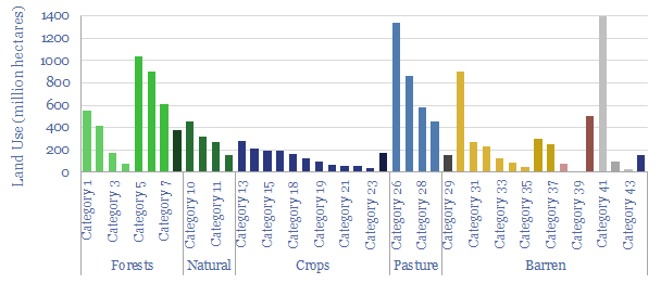
This database of global land uses shows how 40bn acres of land on planet Earth is used, in order to quantify how much land is available for nature based solutions such as reforestation. We think 3bn acres can be reforested, creating a 15-20GTpa carbon sink, abating 20% of all the CO2 in our roadmap to net zero.


The surface of Planet Earth covers 510 million square kilometers in size, of which two-thirds is ocean and one-third is land. This equates to almost 40bn acres of land, or around 15bn hectares.

The deforestation of 5bn acres of land has historically released almost 1 trillion tons of CO2, which is 25-30% of all anthropogenic CO2 emissions (model here), which even contributed to the dust bowl (note here). Reforestation still continues, at a pace of around 25M acres per year, releaseing 6.5GTpa of CO2-equivalents, a comparable number to all of the world’s passenger vehicles (model here).

Preventing deforestation and reforesting previously deforested areas therefore needs to be a clear part of any sensible roadmap to net zero. But is there enough land for reforestation?

The data-file includes a breakdown of land use, across 40 different categories, estimates of carbon stocks across these different land types, and more granular detail into agricultural lands, grasslands, degraded lands and reforestable lands.

Estimates in this data-file are derived from technical papers. Notes from select technical papers are also included in the data-file.

The best opportunity for reforestation is from the world’s stock of 2bn hectares of degraded/abandoned land, 8bn acres that is currently under pasture (sometimes grazed only very infrequently), while there is 3bn acres where tree cover be increased (although it is not always appropriate, per our note into savanna landscapes).

No cheating is allowed in the model either. 4bn acres of the world’s surface is icy or glacier, and another 7bn is barren as it is desertified, salty or rocky (although we have looked at reforestation in semi-arid climates, in a research note here).

Another 10bn acres of the world’s land remains forested, and while it is clearly not possible to re-forest an existing forest, there are data-points showing that actively managed forecasts can absorb more carbon than mature forests (summary here, wood carbon credentials here). We still think Finland’s forestry industry makes for a very interesting case study here.

Other complexities explored in our reforestation resarch are how changing forest cover changes global albedo, per the short article here.

A PDF research report, discussing how much land is available for reforestation is published here. All of our research into nature-based solutions to absorb CO2 is summarized here. Numbers into global land use are built up in the data-file, including other technical papers covering reforestation potential.

Proton exchange membrane fuel cells: what challenges?

Technical challenges for hydrogen fuel cells

This data-file reviews fifty patents into proton exchange membrane fuel cells (PEMFCs), filed by leading companies in the space in 2020, in order to understand the key challenges the industry is striving to overcome.

The key focus areas are controlling the temperature, humidity and longevity of hydrogen fuel cells. But unfortunately, we find over half of the proposed solutions are likely to increase end costs.

We remain cautious on the practicalities and the economics of hydrogen fuel cell vehicles (2x most costly than conventional vehicles per km, note here) and hydrogen fuel cells for power generation (10x more costly, note here).

Solid oxide fuel cells: what challenges?

Solid oxide fuel cells technical challenges from patents

This data-file reviews fifty patents into solid oxide fuel cells, filed by leading companies in the space in 2020, in order to understand the key challenges the industry is striving to overcome.

The key focus areas are improving the longevity and efficiency of SOFCs. But unfortunately, we find many of the proposed solutions are likely to increase end costs.

Economics of SOFCs could eventually become very exciting for low-carbon heat and power (model here). But our conclusion from the latest patents is that the technology is not yet on the path to deflate and achieve cost competitiveness in the near-term.

Prevailing wind: new opportunities in grid volatility?

UK wind power

UK wind power has almost trebled since 2016. But its output is volatile, now varying between 0-50% of the total grid. Hence this 14-page note assesses the volatility, using granular, hour-by-hour data from 2020. EV charging and smart energy systems screen as the best new opportunities. Gas-fired backups also remain crucial to ensure grid stability. The outlook for grid-scale batteries has actually worsened. Finally, downside risks are quantified for future realized wind power prices.

UK grid volatility as renewables gain share?

UK grid volatility

This data-file contains the output from some enormous data-pulls, evaluating UK grid power generation by source, its volatility, and the relationship to hourly traded power prices. We conclude the grid is growing more expensive and volatile, with the increasing share of wind.


This data-file tracks the mix of power generation sources in the UK grid, month by month, going back to 2016. In the trailing twelve months, the UK power grid was 38% natural gas, 28% wind, 18% nuclear, 8% imports, 7% biomass and ‘other’, and finally, 1% coal. The chart below shows the changes over time.

Wind. The biggest change is the ramp up of wind, which has grown from 8% of the grid in 2016 to 28% in the trailing twelve months (chart below). However, the output of wind is volatile (second chart below). 10% of the time, wind is supplying over 50% of the total UK grid, and 15% of the time it is generating less than 10% of the UK grid.

UK grid volatility
Wind percent of the UK grid over time

Different durations of wind volatility can be seen in the data-file, from half-hour-by-half-hour, to day-to-day, to season-to-season. The latter is particularly challenging for energy storage economics, as wind power in the UK tends to generate 2x more electricity in the peak month of February versus the trough month of July.

UK grid volatility
Volatility of wind in the UK power grid

Natural gas power backs up wind today, as shown in the fascinating chart below. Gas has always been a flexible supply source. And the total share of gas has remained relatively constant at about 40%. But look how the volatility profile has changed! In 2016, gas was supplying 30-50% of the grid 65% of the time, and was outside this range just 35% of the time. Conversely, by 2023, gas, is supplying >50% of the grid or <20% of the grid 65% of the time, and only providing 30-50% of the grid 35% of the time.

Gas percent of the UK grid over time

Nuclear power is less flexible but has also been scaled back as more volatile generation has scaled up. For the first time in many years, in 2023, there were times when nuclear was generating less than 20% of the total UK power grid.

UK grid volatility
Nuclear percent of the UK grid over time

Power prices are therefore becoming more volatile, reflecting the increasing volatility of the generation mix. For example, the chart below shows the average daily ‘range’ between the highest and lowest intra-day power prices, from 2013-2023. The numbers are shown in the data-file in £/MWH and c/kWh terms. This determines the spreads that are theoretically available to providers of energy storage or to companies that can flex demand.

Volatility of power prices in the UK grid

Underlying data in the file is sourced from Elexon, however this data-file includes the output from running description statistics on literally hundreds of MB of half-hourly input data, and simply summarizes the output in a way that we hope is a useful reference.

Electric vehicle charging: what challenges?

EV Charging Challenges

This data-file tabulates the greatest challenges for charging electric vehicles, based on the recent patent literature, looking across fifty patents filed by leading companies.

Our top three conclusions are that EV charging will require complex algorithms to ensure grid stability, creating an opportunity for big data companies; vehicle-manufacturers are concerned about balancing the convenience of EV charging with the investment costs of charging networks; while interestingly, increasing speed of charging is not a primary focus.

Our conclusions are typed up in the data-file, plus the full back-up of patents from large OEMs, EV-charging specialists, capital goods companies that make components and tech giants, working on optimization algorithms.

Geothermal energy: what future in the transition?

Levelized costs of different geothermal energy projects are highest for deep geothermal and lowest for the best hotspots.

Drilling wells and lifting fluids to the surface are core skills in the oil and gas industry. Hence could geothermal be a natural fit in the energy transition? This 17-page note finds next-generation geothermal economics can be very competitive, both for power and heat. Pilot projects are accelerating and new companies are forming. But the greatest challenge is execution, which may give a natural advantage to incumbent oil and gas companies.

Ground source heat pumps: the economics?

The breakdown of heat pumps economics. The largest costs are in piping and duct work.

This data-file models heat pump economics, costs, energy savings and potential CO2 savings of a ground source heat pump (GHP), compared to traditional home heating and cooling options.

A GHP approximately doubles the efficiency of conventional heating and cooling, through heat-exchange with the shallow earth, 30ft below the surface, which tends to remain at 10-15°C temperatures year-round.

The model can be stress-tested, flexing annual heating/cooling demands, coefficients of performance, as well as oil, gas, power and CO2 prices, to see how heat pump economics vary. Also included are a granular cost build-up for CHPs and our notes.

The capex costs of electric pumps in general, pump opex, pump energy consumption and the efficiency of pumps are reviewed from first principles in this data-file. Total pump costs can be ballparked at $600/kW/year of power, of which 70% is electricity, 20% operations and maintenance, 10% capex/capital costs. But the numbers vary.

Enhanced geothermal has accelerated by 3x in the past half-decade and this research note evaluates the energy economics of enhanced geothermal from first principles. Geothermal power is produced from 200 geothermal fields globally, feeding 16GW of power capacity, generating around 110 TWH of useful electricity, which equates to 0.4% of the world’s electricity and 0.15% of its total useful energy.

Geothermal energy: costs and economics?

Geothermal energy costs are estimated at 10c/kWh for a leading enhanced geothermal project at large scale, reflecting capex, opex and capital costs for a 10% IRR

Geothermal energy costs are modelled from first principles in this data-file. LCOEs of 6c/kWh are available in geothermal hotspots. Outside of the hotspots, enhanced geothermal heat can cost 2-14c/kWh-th for a 10% IRR on $500-5,000/kW-th capex, while a rule of thumb is that geothermal electricity costs 5x geothermal heat.


Geothermal energy is produced from 200 geothermal fields globally, feeding 16GW of power capacity, generating around 110 TWH of useful electricity, which equates to 0.4% of the world’s electricity and 0.15% of its total useful energy.

However this is almost all from geothermal hotspots (e.g., California, Indonesia, Philippines, Iceland), where hot fluids naturally well up to the surface. The levelized costs of geothermal electricity, in these hotspots, is 6c/kWh, as can be stress-tested in our model (chart below).

However, the average geothermal gradient globally is 25ºC per kilometer. Hence 100-300ºC temperatures are accessible by drilling deep wells, down to 3-10km total depth (chart below).

The pace of progress in enhanced geothermal has trebled in the past half-decade. This data-file contains a screen of over 20 enhanced geothermal pilots, tabulating their timings, total depth, bottom-hole temperatures, thermal capacity (in MW-th), electrical capacity (in MW-e), capex costs and other relevant details (chart below).

One factor that is hurting the economics of the geothermal power projects we have tabulated is that they are all small-scale pilots, with an average size of just 4MWe. We plot a line of best fit over the past data-points in the model. While it is always dangerous to extrapolate lines of best fit, we cannot resist doing this, as a simple ballparking exercise, to estimate where costs could end up at larger scale.

The levelized costs of enhanced geothermal are built up from first principles in the data-file, covering the costs of enhanced geothermal electricity, and enhanced geothermal heat. The capex costs for geothermal draw on our models, which capture the costs of drilling wells, heat exchangers and Organic Rankine Cycles.

Please download the data-file, to stress test geothermal energy costs, in hotspots (first tab), across geothermal electricity (second tab), geothermal heat (third tab), in other enhanced geothermal systems, and for other useful background data-points.

Shale productivity: snakes and ladders?

Shale Productivity Snakes and Ladders

Unprecedented high-grading is now occurring in the US shale industry, amidst challenging industry conditions. This means 2020-21 production surprising to the upside, and we raise our forecasts +0.7 and +0.9Mbpd respectively. Conversely, when shale activity recovers, productivity could disappoint, and we lower our 2022+ forecasts by 0.2-0.9 Mbpd. This 7-page note explores the causes and consequences of this whipsaw effect.

Copyright: Thunder Said Energy, 2019-2024.