How much wind, solar and/or batteries are required to supply a stable power output, 24-hours per day, 7-days per week, or at even longer durations? This data-file stress-tests grid-scale battery sizing, with each 1MW of average load requiring at least 3.5MW of solar and 3.5MW of lithium ion batteries, for a total system cost of at least 18c/kWh.
Start by modelling a power demand curve. Then model how much wind or solar would need to be installed to provide this electricity demand across a comparable timeframe. Then model how big a battery is required to move the renewables to align with the timing of the power demand curve. This data-file works through the maths, for different batteries, including their round trip efficiencies, and their costs.
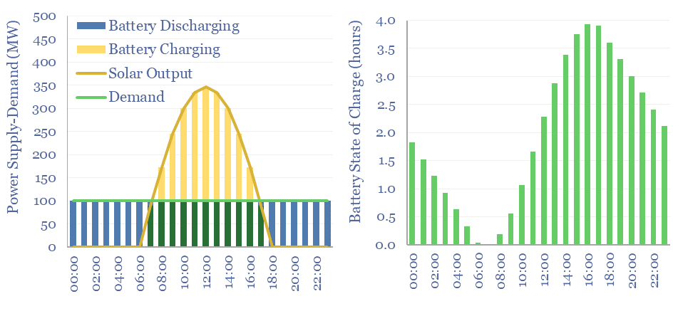
The minimum possible requirement for a fully solar-powered electricity grid is that each 1MW of load requires 3.5MW of solar modules and 3.5MW of lithium ion batteries with daily charging-discharging, in a location where every day is perfectly sunny, with no clouds, and no seasonality, for a total levelized cost (LCOTE) of 18c/kWh.
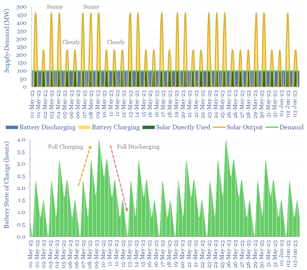
Introduce volatility into the weather pattern, and the requirement for a fully solar-powered grid is that each 1MW of average load requires 5MW of solar modules and 9MW of lithium ion batteries with full charging-discharging every 1.5 days on average, and a total levelized cost (LCOTE) of 35 c/kWh. For more detail, please see our data-file into the volatility of solar generation.
Sizing of a solar array and battery module to supply a 100MW load for 30-days including cloudy days
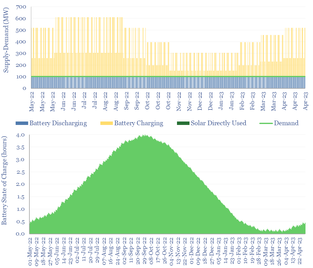
Introduce seasonality in the weather pattern, with 50% lower solar output in winter versus the summer, and the requirement for a fully solar-powered grid is that each 1MW of average load requires 6MW of solar modules and a somewhat insane 235MW of lithium ion batteries with full charging-discharging every 70-days on average, for a total levelized cost (LCOTE) of 800c/kWh. Which is also somewhat insane.
Sizing of a solar array and battery module to supply a 100MW load for 365-days including seasonality
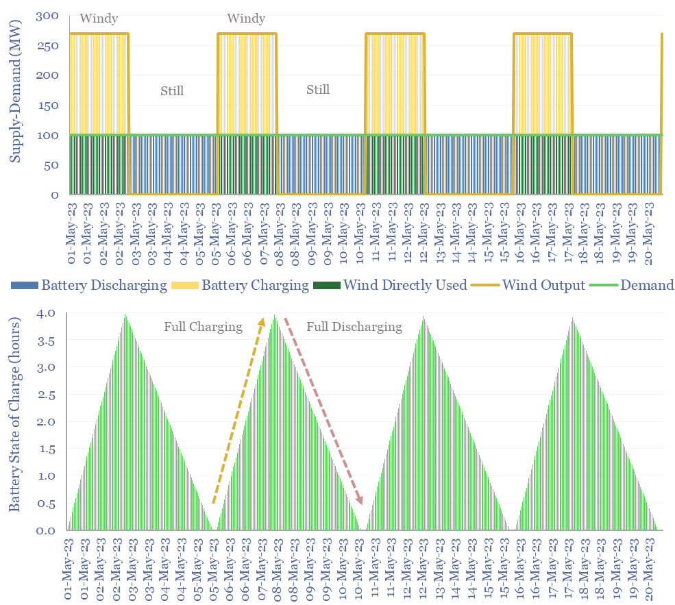
Wind numbers are more demanding than solar numbers, all else equal, because the sun rises and sets daily (helping the utilization rate of the batteries), while wind can incur 2-3 windy days followed by 2-3 non-windy days (hurting the utilization rate of batteries). For more detail, please see our data into the volatility profile of wind generation.
Sizing of a wind farm and battery module to supply a 100MW load for 2-3 weeks including still days
Redox flow batteries are particularly helpful for integrating larger shares of renewables, and are modelled to result in total system costs that are c50% lower than using lithium ion batteries at grid scale. Please see our deep-dive research note into redox flow batteries.
This data-file provides underlying workings into renewable asset sizing, grid-scale battery sizing and total system costs for our recent research into renewables’ true levelized cost of electricity (LCOTE).
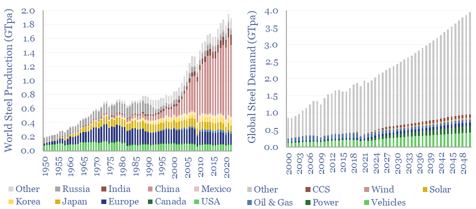
Global steel supply-demand runs at 2GTpa in 2023, having doubled since 2003. Our best estimate is that steel demand rises another 80%, to 3.6GTpa by 2050, including due to the energy transition. Global steel production by country is now dominated by China, whose output exceeds 1GTpa, which is 8x the #2 producer, India, at 125MTpa.
Global steel demand is running at 2GTpa in 2023, having doubled since 2003. Our best estimate is that steel demand will rise by another 80%, to 3.6GTpa by 2050, including due to the energy transition.
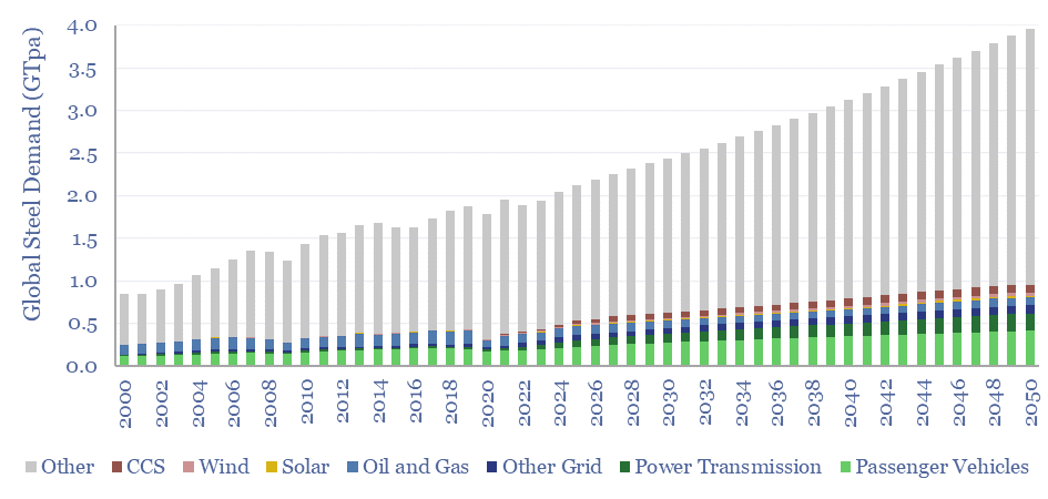
Global steel demand by end use in GTpa from 2000 to 2050
Specifically, passenger vehicles currently use 200MTpa of steel, which doubles to over 400MTpa, as energy transition requires a rapid build-out of electric vehicles alongside increasing turnover of the vehicle fleet. These numbers are based on breaking down the mass of vehicles and our forecasts for passenger vehicle volumes.
Some humility is warranted when analyzing global steel markets in aggregate, overlooking the differences between 500 different products/grades, made via three different pathways (blast furnace, DRI, EAF), and for which there are c80 different decarbonization options currently swirling. We use a regression to GDP to estimate ‘other demand’ in our model, which can be flexed in the model.
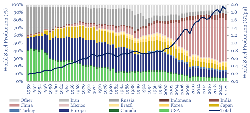
On the other hand, global steel supply reads like something out of a George Orwell novel. Back in 1950, when Nineteen Eighty-Four was first published, there really were three world super-powers — the US, the Soviet Union and Europe — producing over 90% of the world’s steel. Really the chart below shows the history of the world post World War II.
Global steel production by country in GTpa from 1950
Since 1950, the US has declined from 40% of the world’s steel to 4%. Europe has declined from 35% to 7%. Meanwhile China now produces over 1GTpa of steel, more than half of the global total, an order of magnitude more than the world’s #2 producer (India, 125MTpa) and #3 producer (Japan, 90MTpa).
Geopolitics matters in the energy transition, and we cannot help feeling that the world is careening towards a strange dichotomy between carbon-abolitionist nations and carbon-emitting industrial titans, somehow strangely reminiscent of the United States in the 1840s and 1850s.
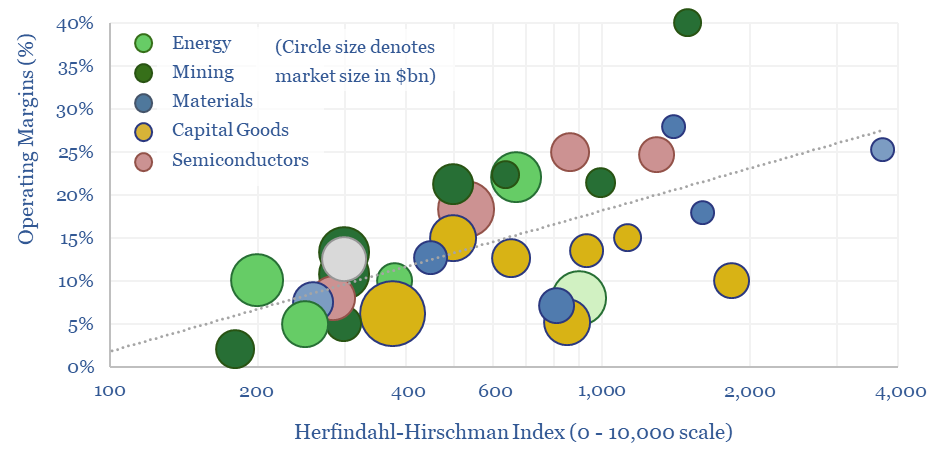
We have assessed over 100 markets in energy, materials, manufacturing and decarbonization across our research. More concentrated industries achieve higher margins across the cycle. But not always. This 10-page report draws out seven rules of thumb to help decision-makers.
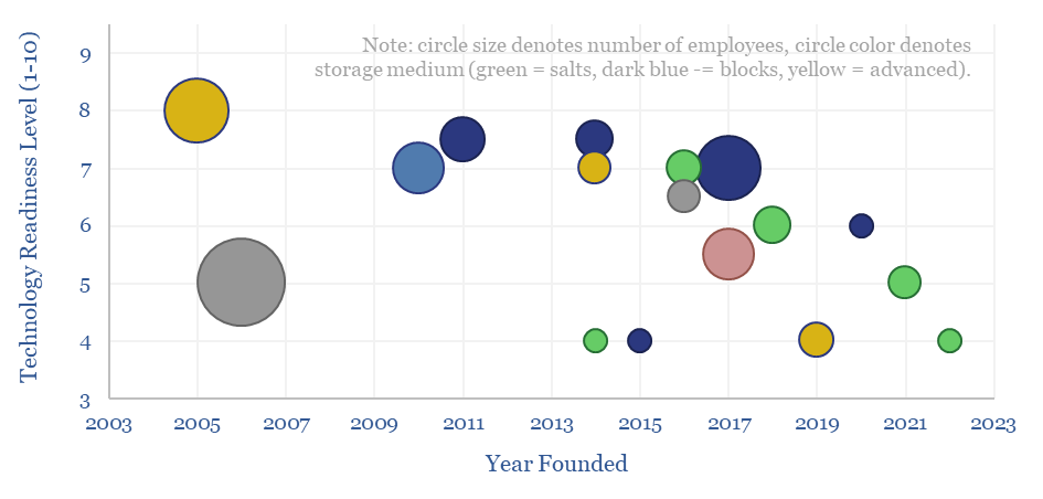
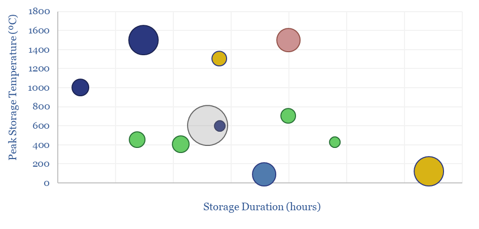
This data-file is a screen of thermal energy storage companies, developing systems that can absorb excess renewable electricity, heat up a storage medium, and then re-release the heat later, for example as high-grade steam or electricity. The space is fast-evolving and competitive, with 17 leading companies progressing different solutions.
Thermal energy storage solutions aim to help integrate solar and wind into power grids, by absorbing excess generation that would otherwise be curtailed, and then re-releasing the heat later when renewables are not generating.
Across the 17 leading thermal energy storage companies, the average one was founded in 2015, has c50 employees, is at TRL 6 and aims to convert excess renewable electricity into 750ºC heat.
Thermal losses are usually limited to 1-2% per day, and these systems have the ability to re-release the heat at MW-scale over an average period of c15 hours, in a system that will last c30-years. The data-file tabulates disclosures into these different dimensions.
Different solutions. Around one-third of the companies are using molten salt as a heat storage medium, one third are using blocks or bricks, and one-third are using other advanced materials.
Details are tabulated for each company, showing the variability across all of these parameters, plus 3-10 lines of notes, from company materials, which stood out as interesting to us.
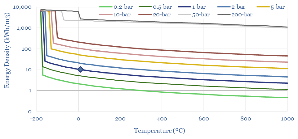
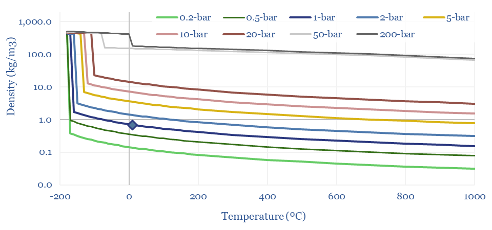
The density of gases matters in turbines, compressors, for energy transport and energy storage. Hence this data-file models the density of gases from first principles, using the Ideal Gas Equations and the Clausius-Clapeyron Equation. High energy density is shown for methane, less so for hydrogen and ammonia. CO2, nitrogen, argon and water are also captured.
The Ideal Gas Law states that PV = nRT, where P is pressure in Pascals, V is volume in m3, n is the number of mols, R is the Universal Gas Constant (in J/mol-K) and T is absolute temperature in Kelvin.
The Density of a Gas can be calculated as a function of pressure and temperature, simply by re-arranging the Ideal Gas Law, where Density ρ = P x Molecular Weight / RT. Our favored units are in kg/m3.
Density of methane in kg/m3 and kWh/m3
The Density of Methane (natural gas) can thus be derived from first principles in the chart below, using a molar mass of 16 g/mol, and then flexing the temperature and pressure. This shows how methane at 1 bar of pressure and 20ºC has a density of 0.67 kg/m3. LNG at -163ºC is 625x denser at 422 kg/m3. And CNG at 200-bar has a density of 180kg/m3.
Density of methane, LNG and CNG according to pressure and temperature
The Energy Density of Methane can thus be calculated by multiplying the density (in kg/m3) by the enthalpy of combustion in kJ/kg, and then juggling the energy units. A nice round number: the primary energy density of methane is 10 kWh/m3 at 1-bar and 20ºC, increasing with compression and liquefaction. CNG at 200-300 bar has around 30-60% of the energy density of gasoline, in kWh/m3 terms.
The energy density of methane is 10kWh/m3 as a nice rounded rule-of-thumb.
Clausius-Clapeyron: gas liquefaction?
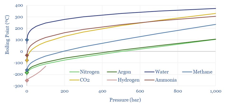
Methane liquefies into LNG at -162ºC under 1-bar of pressure. The boiling points of other gases range from water at 100ºC, ammonia at -33ºC, CO2 at -78ºC, argon at -186ºC, nitrogen at -196ºC to hydrogen at -259ºC. This is all at 1-bar of pressure.
However, liquefaction temperatures rise with pressure, as can be derived from the Clausius-Clapeyron equation, and shown in the chart below. At 10-20 bar of pressure, you can liquefy methane into ‘pressurized LNG’ at just -105 – 123ºC, which can sometimes improve the efficiency of LNG transport. This can also help cryogenic air separation.
Boiling Points of Different Gases According to the Clausius Clapeyron Relationship
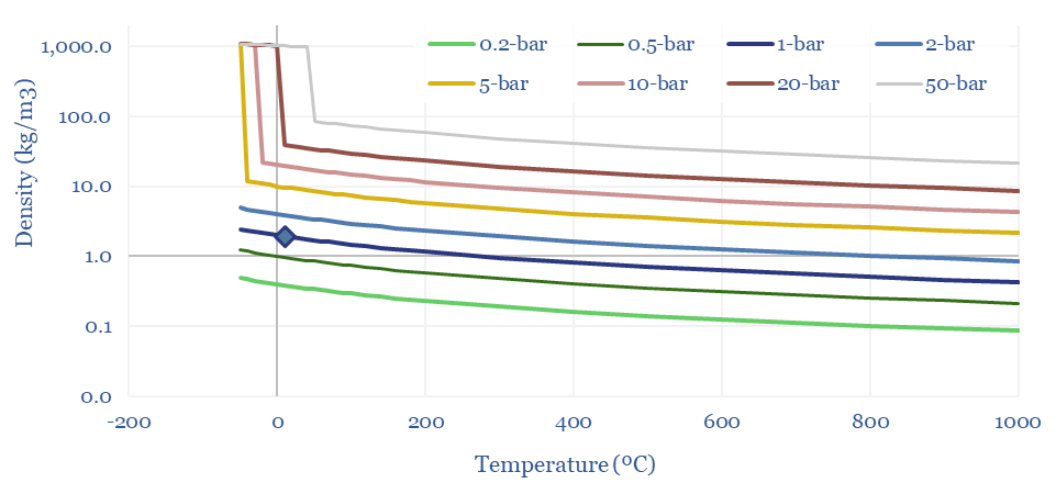
Density of CO2: strange properties?
The Density of CO2 is 1.87 kg/m3 at 20ºC and 1-bar of pressure, which is 45% denser than air (chart below). But CO2 is a strange gas. It cannot exist as a liquid below 5.2 bar of pressure, sublimating directly to a solid. CO2 can also be liquefied purely by compression, with a boiling point of 20-80ºC at 30-100 bar of pressure.
Density of CO2 according to pressure and temperature in kg per m3
Hence often the disposal pipeline in a CCS or blue hydrogen value chain may often be pumping a liquid, rather than flowing a gas. And finally, these properties of CO2 open the door to surprisingly low cost CO2 transport by truck or in ships. This is all just physics.
Super-critical fluids: fourth state of matter?
There is also a fourth density state for all of the gases in the data-file. Above their critical temperature and critical pressure, fluids ‘become super-critical’. Sometimes this is described as ‘having properties like both a gas and liquid’. Mathematically, it means density starts rising more rapidly than would be predicted by the Ideal Gas Equations.
Super-critical gases behave unpredictably. Their thermodynamic parameters cannot be derived from simple formulae, but rather need to be read from data-tables and/or tested experimentally. This is why the engineering of supercritical systems tends to involve supercomputers.
Examples of super-critical gases? Steam becomes supercritical above 218-bar and 374ºC. CO2 becomes supercritical about 73-bar and 32ºC. Thus CO2 power cycles inevitably endure supercriticality.
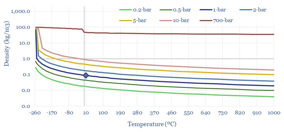
The Density of Hydrogen is 0.08 kg/m3 at 20ºC and 1-bar of pressure, which is very low, mainly because of H2’s low molar mass of just 2g/mol. Methane, for example, is 8x denser. CO2 is 20x denser. In energy terms, gasoline is 3,000x denser per m3.
Hence hydrogen transportation and storage requires demanding compression or liquefaction. Tanks of a hydrogen vehicle might have a very high pressure of 700-bar, to reach a 40kg/m3 (the same density can be achieved by compressing methane to just 50-bar!). Liquefied hydrogen has a density around 70kg/m3 (LNG is 6x denser).
The density of hydrogen is just 0.08 kg/m3 at 20ºC of temperature and 1-bar of pressure
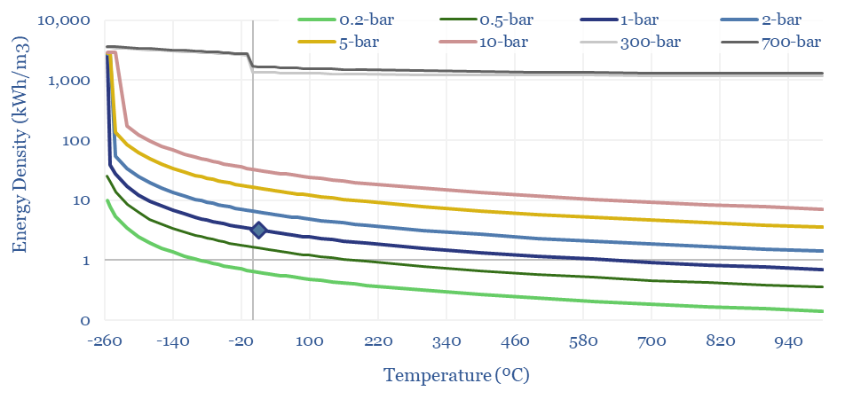
The energy density of hydrogen, in kWh/m3 also follows from these equations. At 1-bar and 20ºC, methane contains 3x more energy per m3 than hydrogen. Under cryogenic conditions, it contains 2x more energy. Under super-critical and ultra-compressed conditions, it contains 4x more.
The energy density of hydrogen is 50-75% lower than natural gas, even after compression/liquefaction
This data-file allows density charts — in kg/m3 and in kWh/m3 — to be calculated for any gas, using the Ideal Gas Laws and the Clausius-Clapeyron equations. The data-file currently includes methane, CO2, nitrogen, ammonia, argon, water and hydrogen.
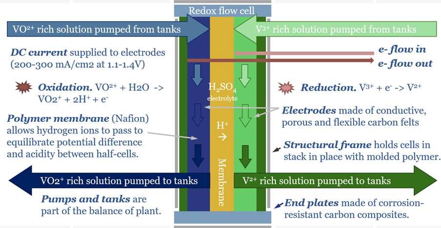
Redox flow batteries have 6-24 hour durations and require 15-20c/kWh storage spreads. They will increasingly compete with lithium ion batteries in grid-scale storage. Does this unlock a step-change for peak renewables penetration? Or create 3-30x upside for total global Vanadium demand? This 15-page note is our outlook for redox flow batteries.
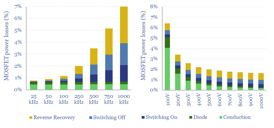
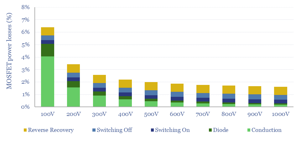
MOSFETs are fast-acting digital switches, used to transform electricity, across new energies and digital devices. MOSFET power losses are built up from first principles in this data-file, averaging 2% per MOSFET, with a range of 1-10% depending on voltage, switching, on resistance, operating temperature and reverse recovery charges.
Transistors are digital switches made of semiconductor materials, which allow one circuit to control another. Our overview of semiconductors explains how a transistor works, from first principles, by depicting a bipolar junction transistor (BJT), which is driven by current.
However, it is better to control a transistor using voltage than current. Ambient electrical fields induce currents that can cause current-driven transistors to misfire. Hence MOSFETs and IGBTs are driven by voltage.
MOSFETs were invented at Bell Labs in 1959 and are now the most used power semiconductor device in the world. Something like 2 x 10^22 transistors have been produced across human history by 2023.
We are sorry to say it, but it is simply not possible to understand how a MOSFET works, without a basic understanding of voltage, current, conduction band electrons, valence band holes, N-type semiconductor, P-type semiconductor and Fermi Levels. Do not despair! To help decision-makers understand these concepts, we have written an overview of semiconductors and an overview of electricity.
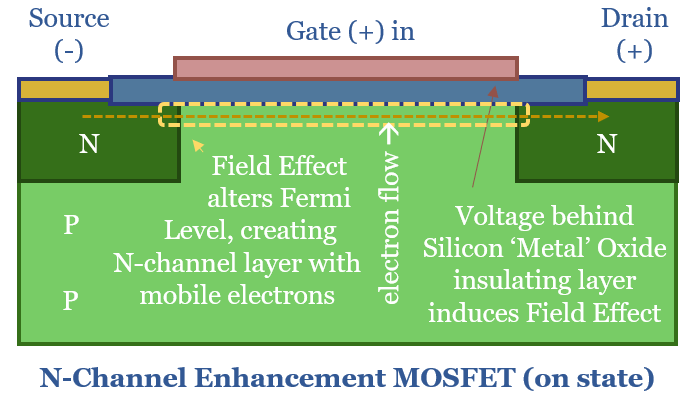
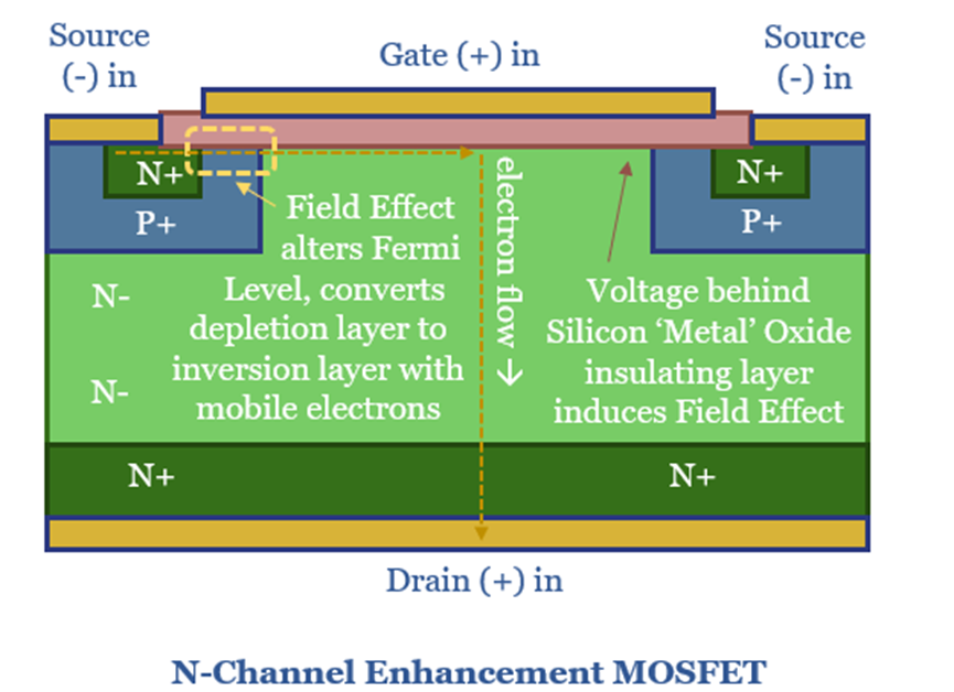
MOSFET stands for Metal Oxide Semiconductor Field Effect Transistor. Actually this is something of a misnomer. The eponymous ‘metal oxide’ is referring to an oxide of silicon metal, or in other words, a highly pure layer of silicon dioxide. It is oxidized to create an insulating layer. In turn, the reason for creating this insulating layer is so that a Field Effect can be induced by a potential difference (voltage) across the gate.
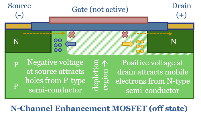
Why can’t current flow through a MOSFET in the off-state? A simplified diagram of an N-channel enhancement MOSFET is shown below. Ordinarily, electrons cannot flow from the source to the drain, due to the PN junction between the body and the drain, which is effectively a reverse-biased diode. A negative voltage at source draws in the mobile holes from the P-type semiconductor. A positive voltage at the drain attracts the mobile electrons in the N-type layer. And this creates a depletion zone where no current can flow, just like in any other diode.
How can current flow through a MOSFET in the on-state? The ‘Field Effect’ occurs when a positive voltage is applied to the gate, raising the Fermi level of the P-type semiconductor. Remember the Fermi Level is the energy level likely to be exceeded by 50% of electrons. A large enough voltage raises the Fermi Level above the lower bound of the conduction band. Suddenly there is a sea of mobile electrons, forming an N-channel, so that electrons can flow from source to drain.
What power losses in a MOSFET?
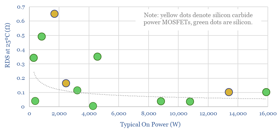
Resistive losses occur when a current flows through a semiconductor, proportional to the on-resistance of the semiconductor, and a square function of the current. The on resistance of different MOSFETs is typically in the range of 0.1-0.6 Ohms, at power ratings of 1-20kW, based on data-sheets from leading manufacturer, Infineon (as profiled in our screen of SiC and MOSFET companies).
Hence a better depiction of an N-channel enhancement MOFSET follows below. In the chart above, the N-channel through the P-layer is very long and thin, which is going to result in high resistance. Hence in the chart below, the NPN junction is slim-lined, and the on resistance from source to drain is going to be lower, which helps efficiency.
Raising voltage is also going to reduce I2R conduction losses, because less current is flowing. However, voltage is limited by a MOSFET’s breakdown voltage. Above this level, the PN junction will fail to block the flow from source to drain, and the MOSFET will be destroyed (avalanche breakdown). The voltage ratings of different MOSFETs are tabulated in our data-file. A clear advantage for silicon carbide power MOSFETs is their higher breakdown voltage, which allows them to be operated at higher voltages across the board, reducing conductive losses.
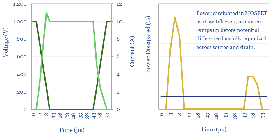
Switching losses are also incurred whenever a MOSFET turns on or off. When the MOSFET is off, there is a large potential difference (voltage) between the source and the drain. When the MOSFET turns on, current flows in while the voltage is still high, which dissipates power. And then the voltage falls when current flow is high, which dissipates power. The same effect happens in reverse when the MOSFET is switched off. These losses add up, as the pulse width modulation in an inverter will often exceed 20kHz frequency. And the latest computer chips run with a clock speed in the GHz. Minimizing switching losses is the rationale for soft switching, being progressed by companies such as Hillcrest.
A reverse recovery loss is also incurred by a MOSFET, because every time the MOSFET switches on, the body diode needs to be inverted from reverse bias to forward bias. This physically requires moving charge carriers, or in other words, requires flowing a current. The reverse recovery loss can often be the largest single loss on a MOSFET.
Transistors: IGBTs vs MOSFETs?
IGBTs stand for Integrated Gate Bipolar Transistors, which is another transistor design that has been heavily used in solar, wind, electric vehicles and other new energies applications.
An IGBT is effectively a MOSFET coupled with a Bipolar Junction Transistor, to improve the current controlling ability.
IGBTs are generally more expensive than MOSFETs, and can handle higher currents at lower losses. However when switching speeds are high (above 20kHz), MOSFETs have lower losses than IGBTs, because IGBTs have slow turn off speeds with higher tail currents.
Finally, in the past, it was suggested that IGBTs performed better than MOFSETs above breakdown voltages of 400V, although this is now more nuanced, as there are many high-performance MOSFETs with voltages in the range of 600-2,000 V.
The very highest voltage IGBTs and MOSFET modules we have seen are in the range of 6-12 kV. This explains why so much of new energies requires generating at low-medium voltage then using transformers to step up the power for transmission; or conversely using transformers to step down the voltage for manipulation via power electronics modules.
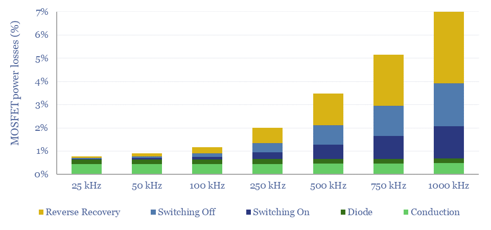
This data-file aims to calculate the power losses of a power MOSFET from first principles, covering I2R conduction losses, voltage drops across the diode, switching losses and reverse recovery losses, so that important numbers can be stress tested.
Generally, the losses through a MOSFET will range from 1-10%, with a base case of 2% per MOSFET. These numbers consist of conduction losses, voltage drops across the diode layer, switching losses and reverse recovery charges.
Losses add. Many circuit designs contain multiple MOSFETs, or layers of MOSFETs and IGBTs (example below). Roughly, flowing power through 6 MOSFETs, each at c2% losses, explains why the EV fast-charging topology depicted below might have losses in the range of 10-20%.
Power losses in a MOSFET rise as a function of higher switching speeds, as calculated in the data-file, shown in the chart below, and for the reasons stated above. High switching speeds produce a higher quality power signal, but are also more energetically demanding.
Power losses in a MOSFET fall as a function of Voltage, as calculated in the data-file, shown in the chart below, and for the reasons stated above. Although lower voltage MOSFETs face less electrically demanding conditions and are less expensive.
Overall, our model is intended as a simple, 30-line calculator to compute the likely power flow, electricity use and losses in a MOSFET. This should enable decision makers to ballpark the loss rates of MOSFETs, and power electronic devices containing them.
However, interaction effects are severe. Drain current, breakdown voltage, gate voltage, temperature, on resistance, reverse recovery charges and all of the switching times depend on one-another. Hence for specific engineering of MOSFETs it is better to consult data-sheets.
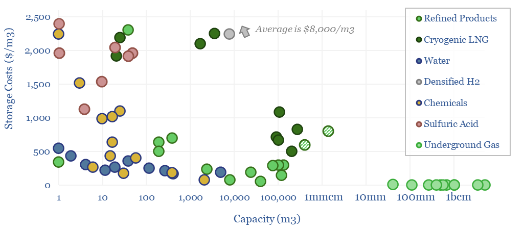
Storage tank costs are tabulated in this data-file, averaging $100-300/m3 for storage systems of 10-10,000 m3 capacity. Costs are 2-10x higher for corrosive chemicals, cryogenic storage, or very large/small storage facilities. Some rules of thumb are outlined below with underlying data available in the Excel.
This data-file tabulates 80 data-points into the costs of storage tanks for water, oil products, chemicals, LNG, natural gas and hydrogen. In both $/m3 terms and $/ton terms.
We also think that some industrial facilities may be able to benefit from increasingly volatile power prices, amidst the build out of renewables, by demand shifting, which means timing their electrical loads to the times when renewables are generating. In some cases, this requires increasing the sizes of storage tanks to increase flexibility.
Volatility is also growing in the global energy system, which may allow owners of midstream infrastructure to generate excess returns in years of deep shortages, per our overview of energy market volatility.
A good rule of thumb is that the storage tank costs for storing fluid commodities will average around $100-300/m3 of capacity, at capacities of 10m3 to 10,000 m3, for relatively simple and non-hazardous commodities such as water and fuel.
Generally tank costs fall (in $/m3 terms) as tank capacities rise. Bigger tanks benefit from economies of scale, and this is visible in the chart above for all categories. Although some mega-sized terminals re-inflate.
Costs are typically 3-5x higher for corrosive chemicals that can require double tanks, stainless steel or specialized tank linings. Maybe $1,000/ton is fair here.
Costs are also typically 3-5x higher for storing cryogenic liquids, which can require specialized nickel steel and insulation.
Costs are also 2-3x higher for very small tanks (below 10m3, lacking economies of scale) or very large tanks (on the magnitude of 100,000m3, so large that they need to be stick-built rather than simply purchased as finished modular units).
LNG storage tanks thus come in as some of the most expensive storage facilities in the data-file, because they are very large and cryogenic. Higher capex may be worthwhile to install higher grade tanks that minimize boil-off and improve energy efficiency.
Large-scale hydrogen storage would likely be higher cost than LNG storage, in our view, and the median small-scale facility for cryogenic or ultra-compressed hydrogen storage is estimated to cost $8,000/m3. Please see our hydrogen storage model and broader hydrogen research.
Storage costs are lowest for underground gas storage, with a median $0.4/m3 of storage capacity. The key reason is scale. The average facility in our database can store over 1bcm of gas.
Methodology. Mainly we have aimed to capture tank costs in the data-file, while excluding the costs of their foundations, pumps, valves and installation; but the lines get a little bit blurry, especially for some of the very large tanks.
Context matters. Some of the data-points are supplier quotes, some are estimates for technical papers, and some are disclosed data-points from specific projects. Please download the data-file for the additional context.
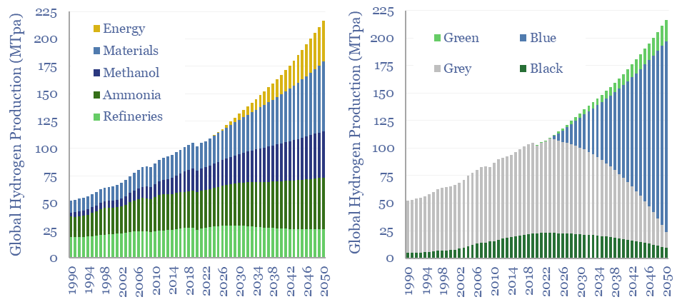
110MTpa of hydrogen is produced each year, emitting 1.3GTpa of CO2. We think the market doubles to 220MTpa by 2050. This is c60% ‘below consensus’. Decarbonization also disrupts 80% of today’s asset base. Our outlook varies by region. This 17-page note explores the evolution of hydrogen markets and implications for industrial gas incumbents?
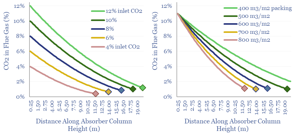
Post-combustion CCS plants flow CO2 into an absorber unit, where it will react with a solvent, usually a cocktail of amines. This data-file quantifies operating parameters for CCS absorbers, such as their sizes, residency times, inlet temperatures, structural packings and the implications for retro-fitting CCS at pre-existing power plants.
Post-combustion CCS aims to capture the CO2 from pre-existing industrial facilities and power plants, by flowing exhaust gases upwards through an absorber unit, while a solvent simultaneously flows downwards and reacts with the CO2. Costs, energy penalties and leading solvent candidates are covered in our CCS research.
But how hard is it to find space for these absorber units at pre-existing industrial facilities? This data-file has compiled key parameters from various technical papers, most aiming for 90% capture rates.
Across a dozen CCS examples in the data-file, each m/s of inlet gas requires 7 m3 of absorber capacity. Hence the absorber units for a world-scale 500MW power plant can reach 3,000 – 10,000 m3 of volume, usually across 2-4 absorbers with 10-15m diameters and 15-25m heights.
For the ultimate space requirements of the CCS plant, multiply by 2-5x, for the desorbers, utilities, piping and balance of plant.
This model calculates the size of the absorber unit required, as a function of height, diameter, residency time, CO2 inlet concentration, CO2 capture rate, solvent properties and structural packing.
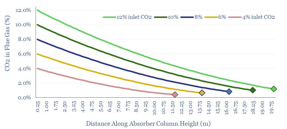
Generally larger absorber units are required at industrial facilities with higher CO2 inlet concentrations and lower target CO2 levels.
Larger absorber units are required for CCS plants that start with more CO2 and absorb more CO2
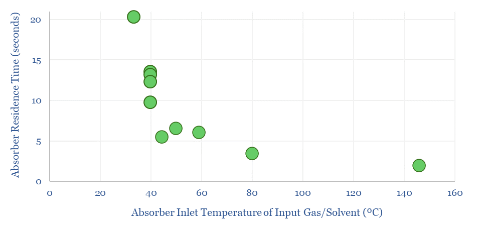
The average residency time within a CCS absorber is below 10-seconds. Although the number depends on the unit size, flow velocity, amine quality and temperature. These can all be flexed in the data-file.
Residence time for a CCS absorber is usually below 10 seconds. Hotter inlet gas and solvent allows for shorter residence times.
Smaller and less expensive absorbers are possible with faster-acting amines, shorter residency times and greater structural packing.
A listed mid-cap company based in Switzerland was often mentioned in technical papers, with a product range of packing materials that can achieve 200-1,200 m2/m3 of internal surface area to promote gas-liquid exchange and slim-line CCS absorbers.
Cookies?
This website uses necessary cookies. Our cookies are simply to improve your experience. We do not undertake any advertising or targeting via our cookies. By clicking 'accept' or continuing to use the website, you consent to our use of cookies.AcceptRead More
Privacy & Cookies Policy
Privacy Overview
This website uses cookies to improve your experience while you navigate through the website. Out of these, the cookies that are categorized as necessary are stored on your browser as they are essential for the working of basic functionalities of the website. We also use third-party cookies that help us analyze and understand how you use this website. These cookies will be stored in your browser only with your consent. You also have the option to opt-out of these cookies. But opting out of some of these cookies may affect your browsing experience.
Necessary cookies are absolutely essential for the website to function properly. This category only includes cookies that ensures basic functionalities and security features of the website. These cookies do not store any personal information.
Any cookies that may not be particularly necessary for the website to function and is used specifically to collect user personal data via analytics, ads, other embedded contents are termed as non-necessary cookies. It is mandatory to procure user consent prior to running these cookies on your website.