Industry Data
-
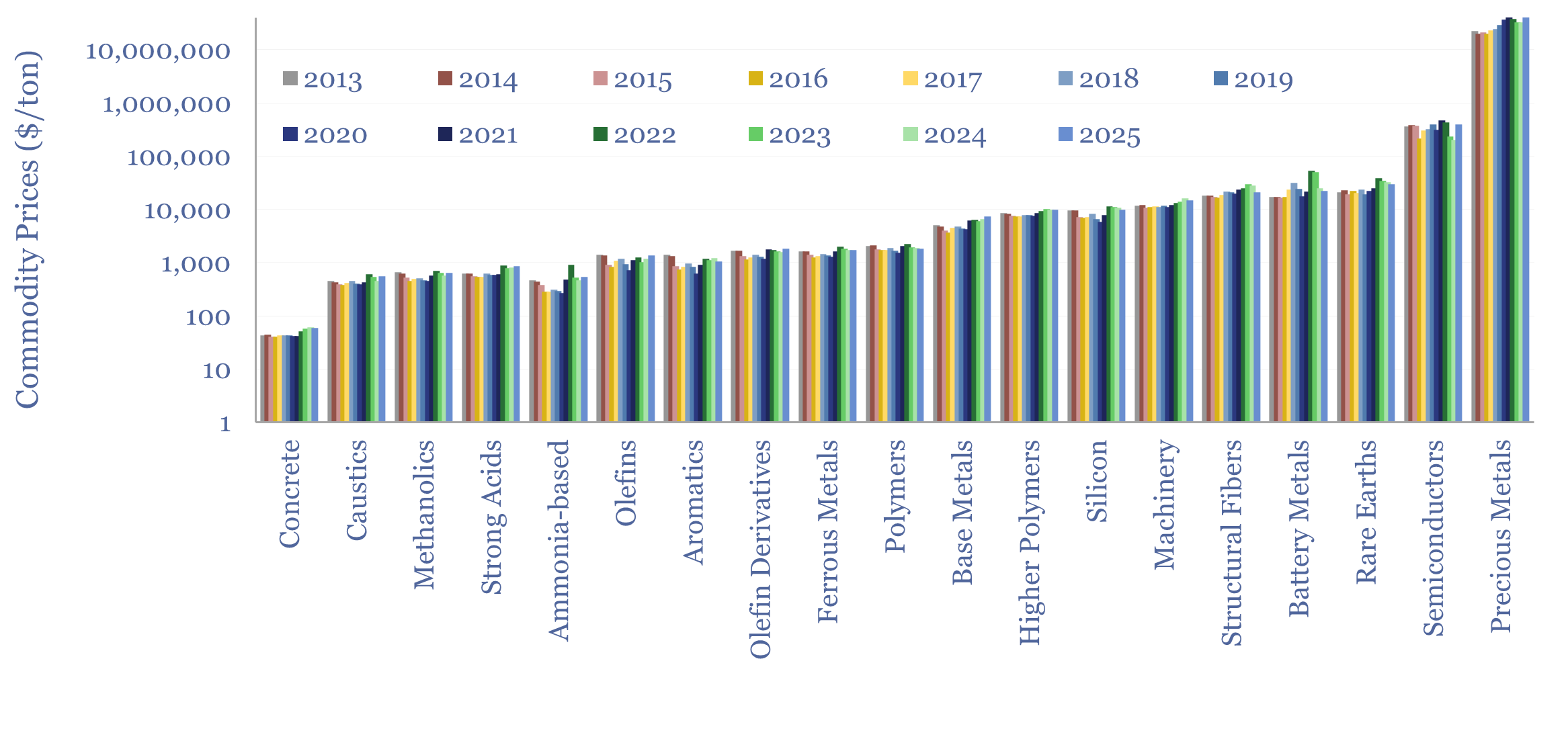
Commodity prices: metals, materials and chemicals?

Annual commodity prices are tabulated in this database for 70 material commodities, as a useful reference file; covering steel prices, other metal prices, chemicals prices, polymer prices, with data going back to 2012, all compared in $/ton. We have updated the data-file for 2025 data in April-2026.
-
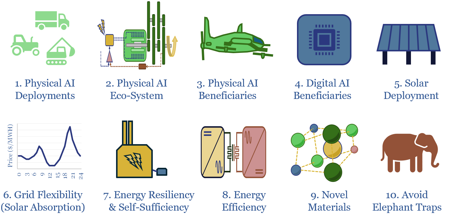
Ten investment themes for 2026-30?

The global energy and industrial landscape is undergoing an AI energy transition. We have also recently published our top ten themes for 2H26. Hence what would be the top ten investment themes for 2026-30, amidst these new technologies, policies and opportunities? This article sets out the ideas that excite us most, with links to supporting…
-
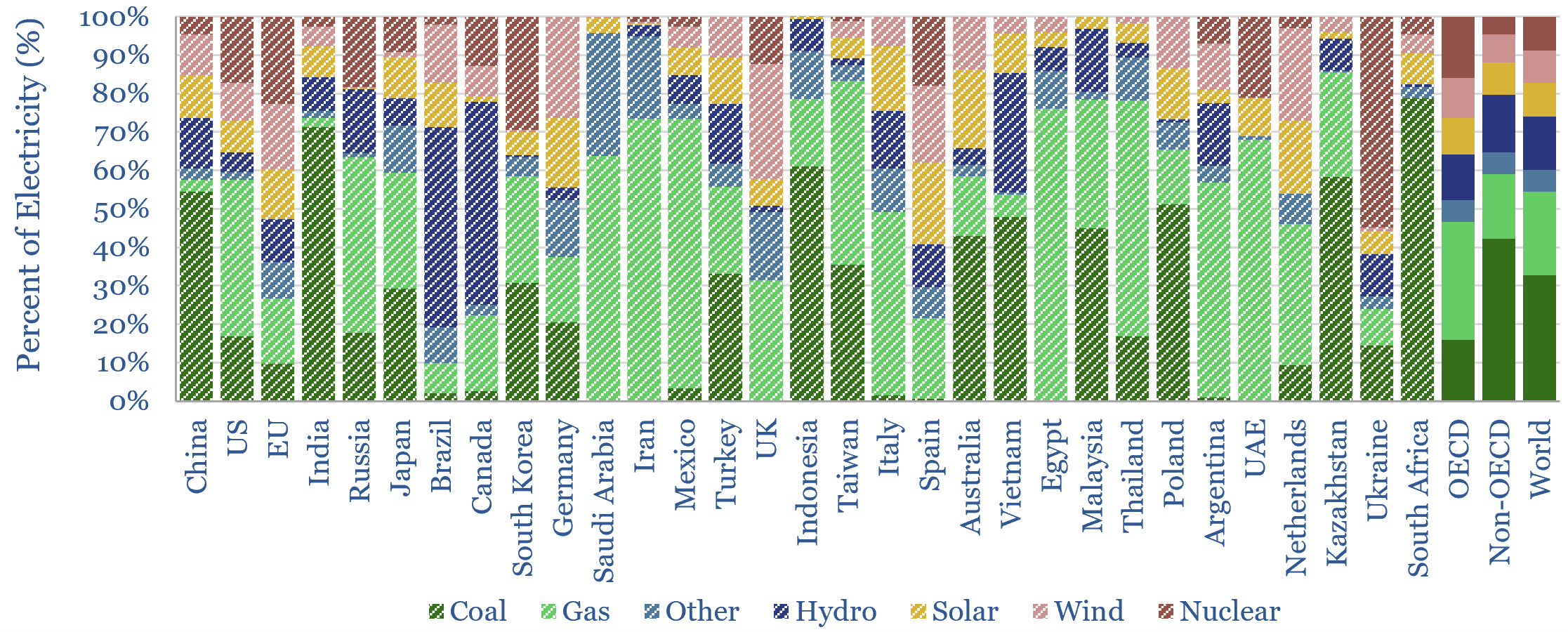
Renewables: share of global energy and electricity by country?

This data-file is an Excel visualizer for some of the key headline metrics around renewables’ share of global energy: such as total global energy use, electricity generation by source, wind penetration and solar penetration; broken down country-by-country, and showing how these metrics have changed over time, in an easy-to-compare visual format.
-
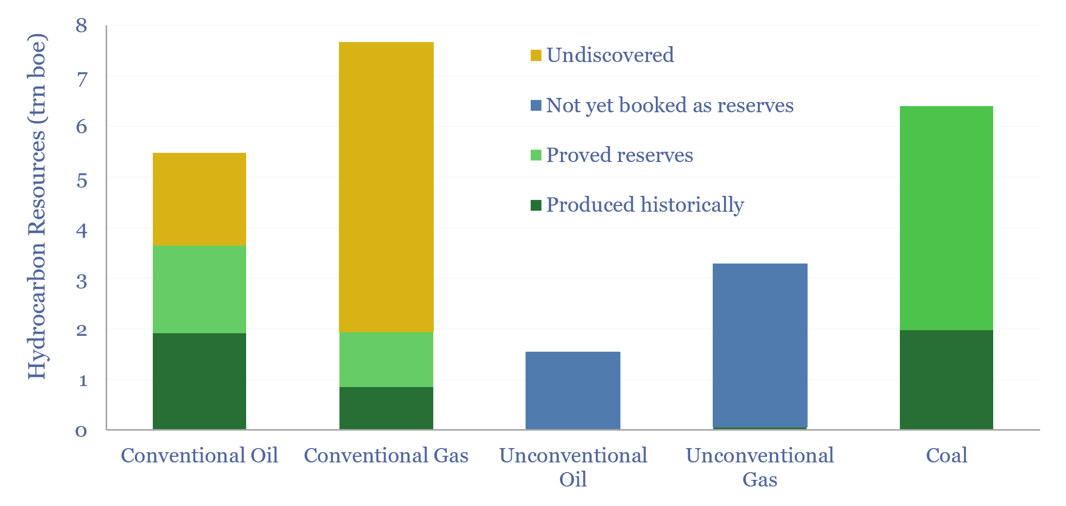
Global hydrocarbon resources and coal resources?

Global hydrocarbon resources and global coal resources — in-place resources and economically recoverable resources — are estimated from first principles in this data-file. We see the world’s remaining economically recoverable reserves of oil and gas being 4x larger than remaining economically recoverable reserves of coal.
-
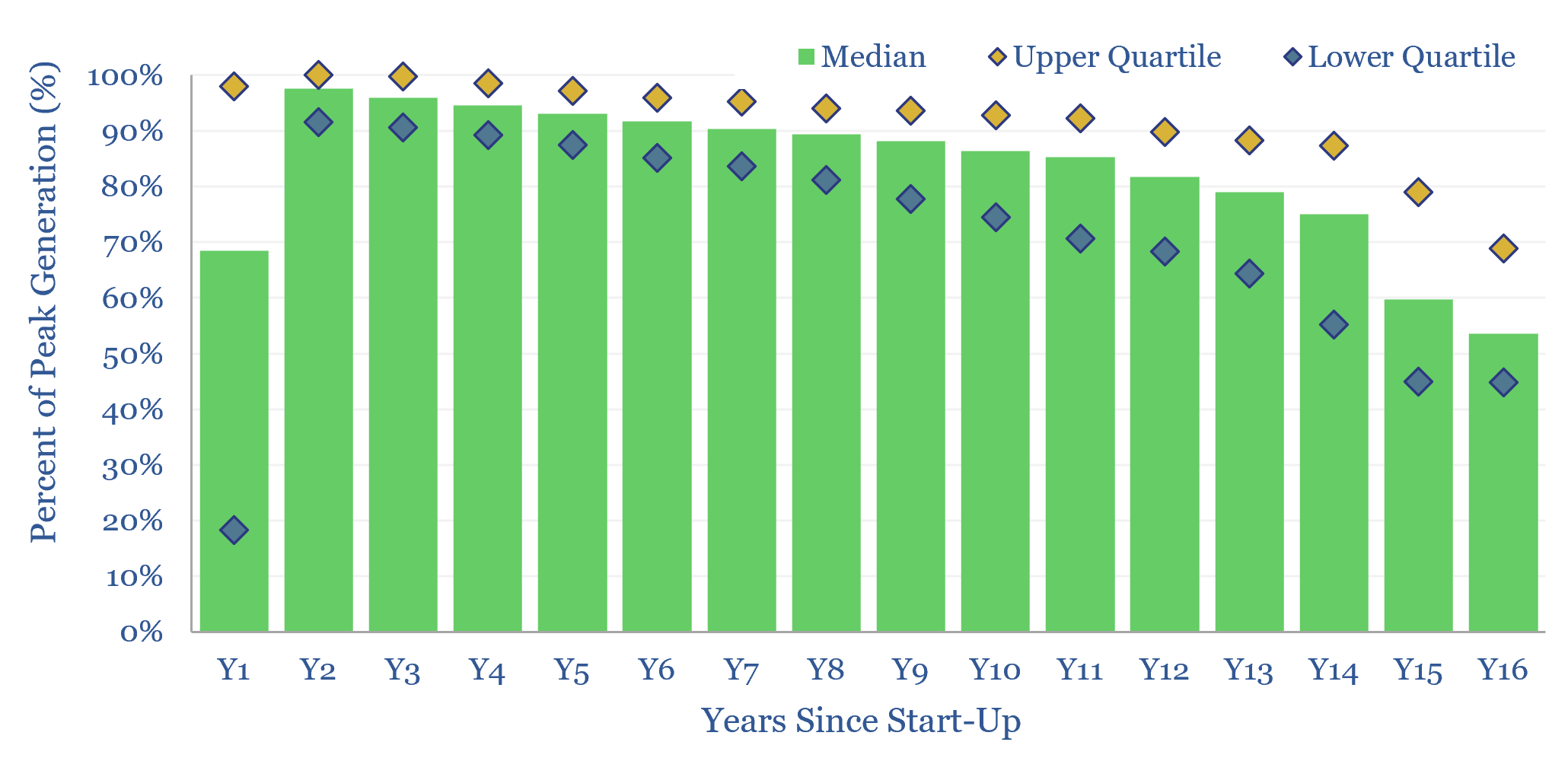
Solar power: decline rates?

This data-file tabulates the ‘decline rates’ of 6,600 US solar power plants, going back to 2001. Solar power decline rates average -1.5% up to year 12, after which decline rates increase. This matters for the economics of solar projects.
-
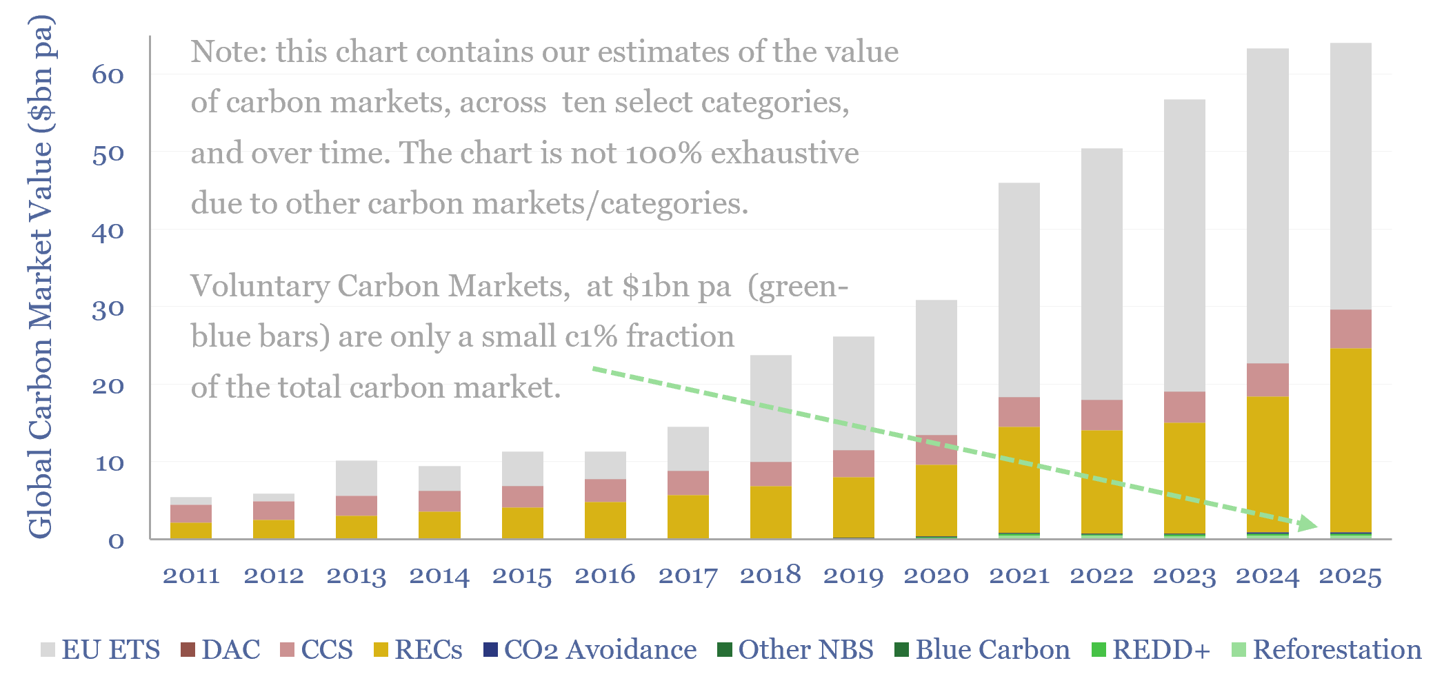
Carbon markets: by category over time?

This data-file quantifies global carbon markets by category over time, including the EU ETS as an example of a compliance market, RECs, CCS and VERRA-certified “carbon credits”, across categories such as REDD, reforestation and other “carbon offsets”. We also draw analogies with charitable giving and forecast carbon markets out to 2050.
-
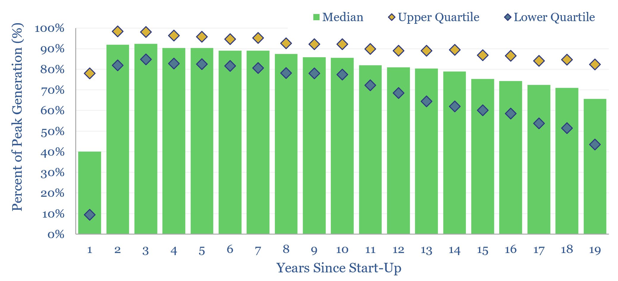
Wind power: decline rates?

This data-file aggregates wind generation by facility, across the US, at 1,500 wind farms, going back 25-years. Wind power decline rates average 1.1% per year, then accelerate to 2% per year in years 10-20. However wind generation is also noisy, typically varying +/- 7% YoY. This matters for the economics and ultimate share of wind.
-
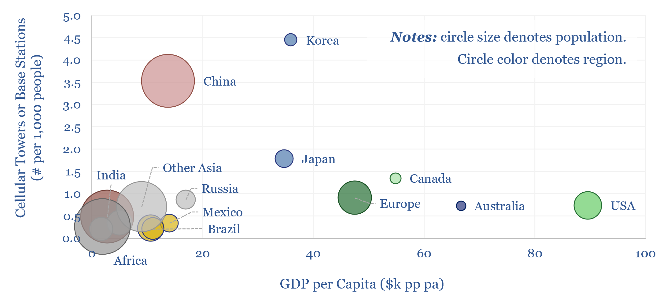
Cellular networks: how much energy consumption?

The energy consumption of global cellular networks is estimated at 250TWH pa in this data-file, by tabulating the deployment of 5G base stations, and other cellular towers, region-by-region. This matters as physical AI may require more cellular connections, across autonomous vehicles, drones and robotics.
-
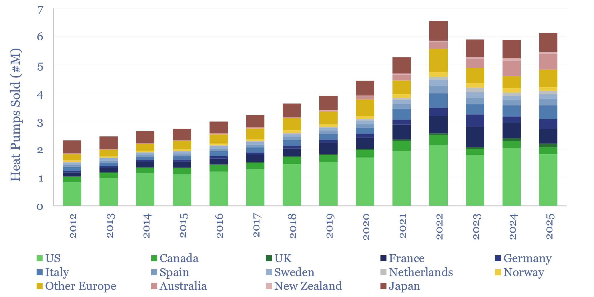
Global heat pump sales by country?

Global heat pump sales by country are tabulated in this data-file, for 14 countries/regions. Developed world heat pump sales rose at an 11% CAGR over the decade since 2012, reaching 6.5M units sold in 2022, but then unexpectedly fell by -10% to 2024. 2025 has seen the start of a recovery, with sales rising 4%…
-
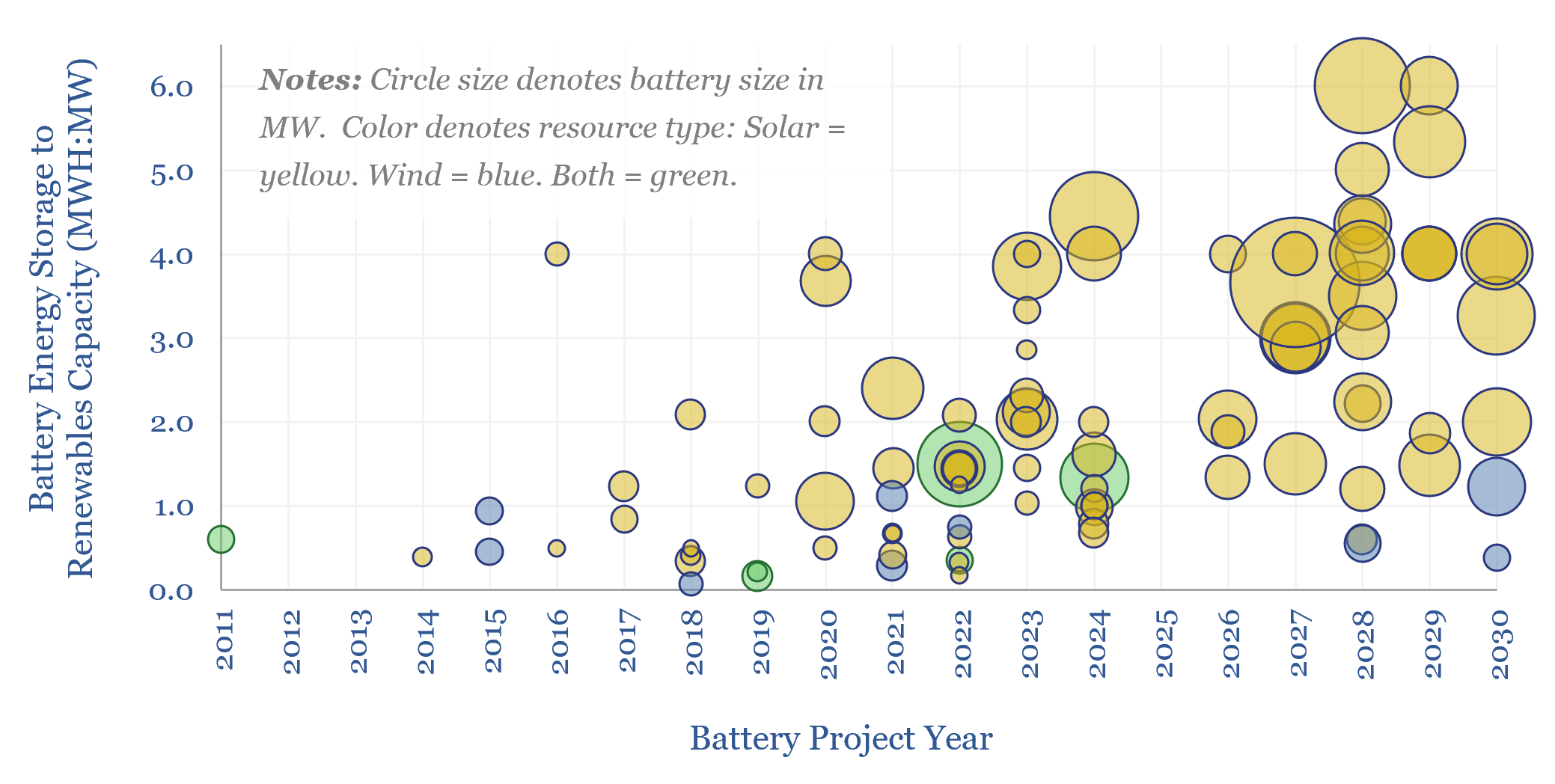
Renewables plus batteries: co-deployments over time?

More and more renewables projects are being co-developed with battery storage. On average, projects in 2026-30 that codeploy batteries will supplement each MW of renewables capacity with 0.8MW of battery capacity, which in turn offered 4-hours of energy storage per MW of battery capacity, for 3.3 MWH of energy storage per MW of renewables.
Content by Category
- Batteries (96)
- Biofuels (44)
- Carbon Intensity (48)
- CCS (64)
- CO2 Removals (9)
- Coal (44)
- Commentary (65)
- Company Diligence (105)
- Data Models (928)
- Decarbonization (163)
- Demand (131)
- Digital (92)
- Downstream (47)
- Economic Model (222)
- Energy Efficiency (76)
- Hydrogen (63)
- Industry Data (311)
- LNG (56)
- Materials (86)
- Metals (89)
- Midstream (45)
- Natural Gas (163)
- Nature (76)
- Nuclear (28)
- Oil (178)
- Patents (39)
- Plastics (44)
- Power Grids (156)
- Renewables (153)
- Screen (139)
- Semiconductors (36)
- Shale (58)
- Solar (72)
- Supply-Demand (53)
- Vehicles (94)
- Video (24)
- Wind (46)
- Written Research (410)