Data Models
-
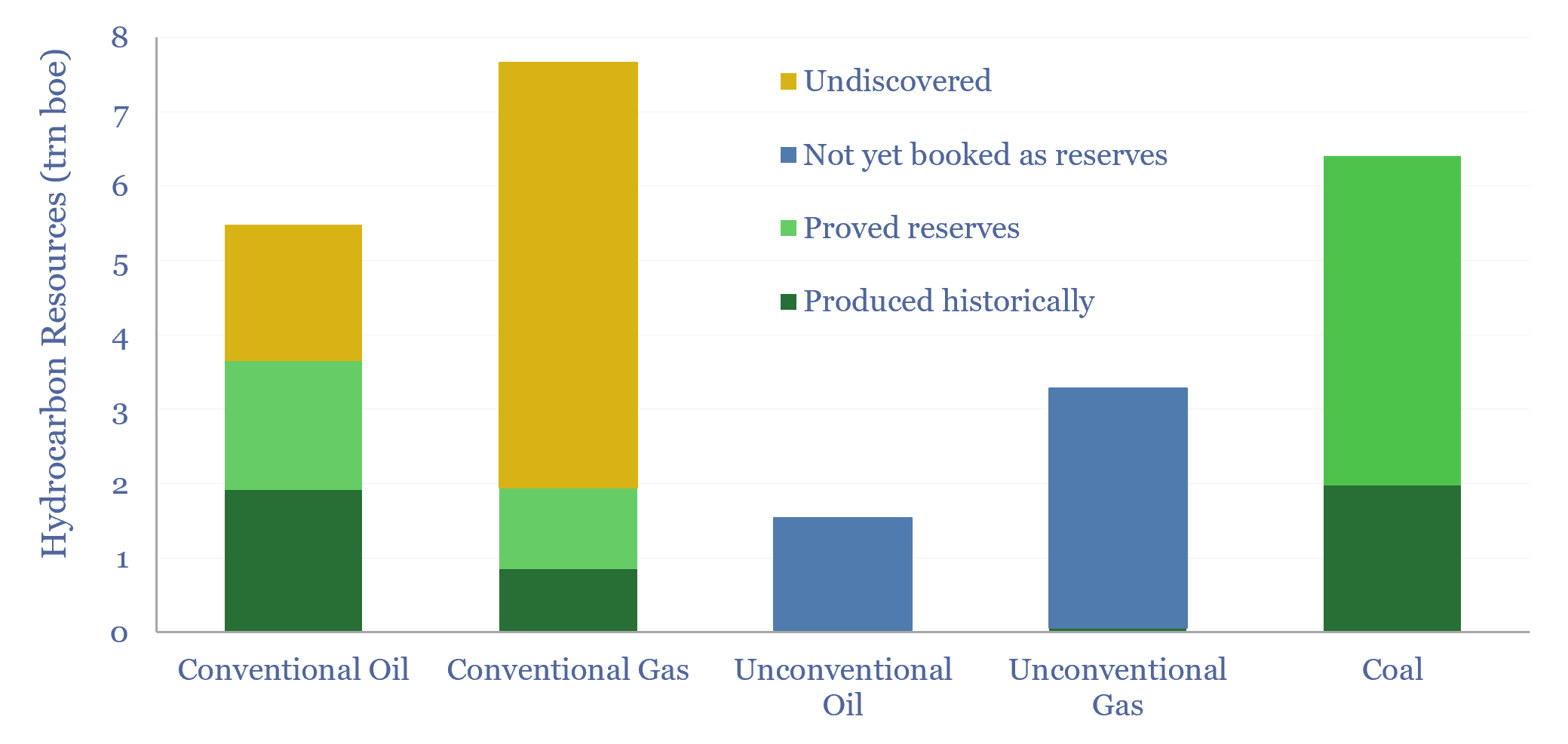
Global hydrocarbon resources and coal resources?

Global hydrocarbon resources and global coal resources — in-place resources and economically recoverable resources — are estimated from first principles in this data-file. We see the world’s remaining economically recoverable reserves of oil and gas being 4x larger than remaining economically recoverable reserves of coal.
-
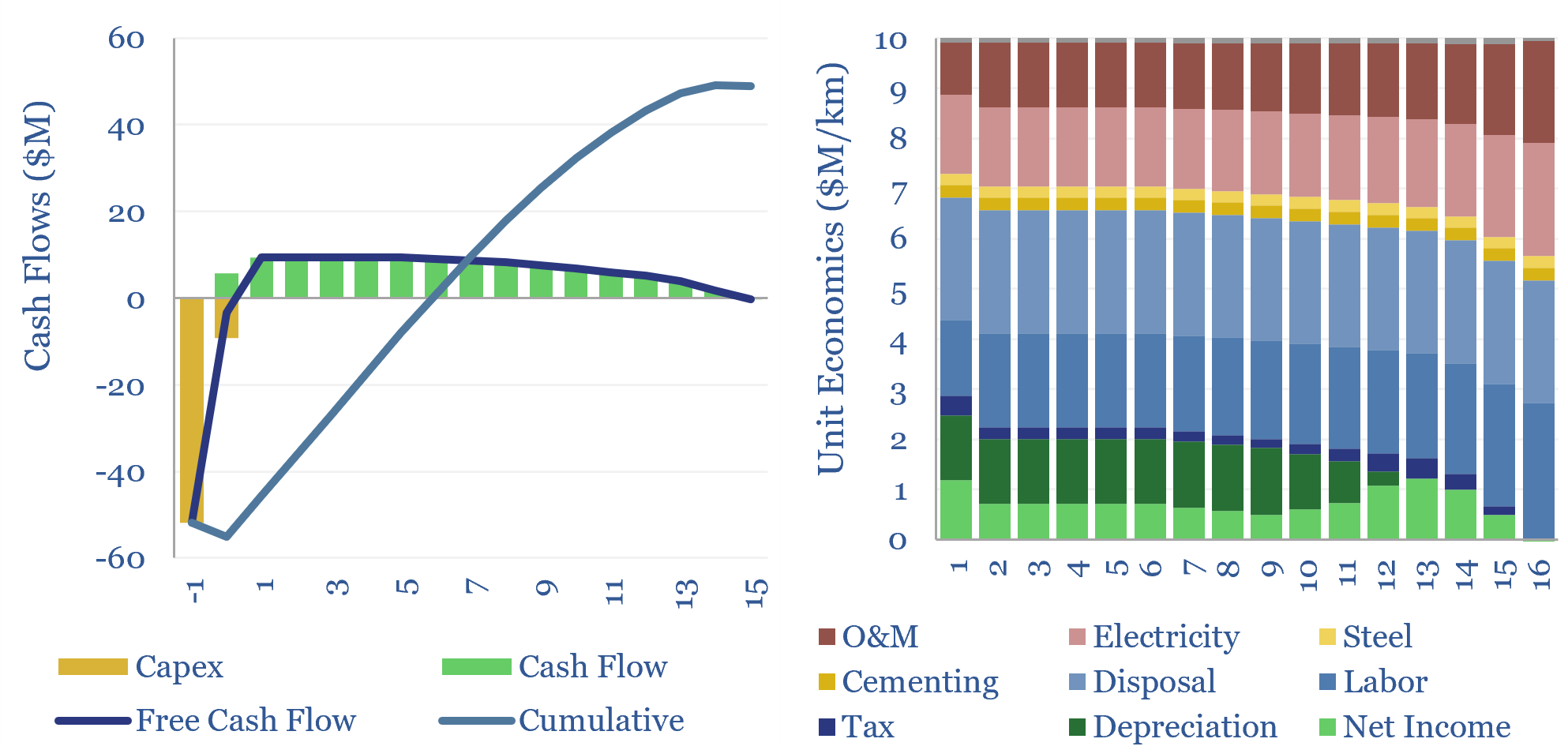
Tunnel boring: the economics?

The global market for tunnel boring machines has been estimated at $7.5bn pa. But what are the costs of tunnel boring? This data-file models tunnel boring economics, estimated at $10M/km for civil infrastructure projects today, $30M/km for deep mine shafts, but will cheap solar and autonomous robots deflate costs?
-
Energy economics: an overview?
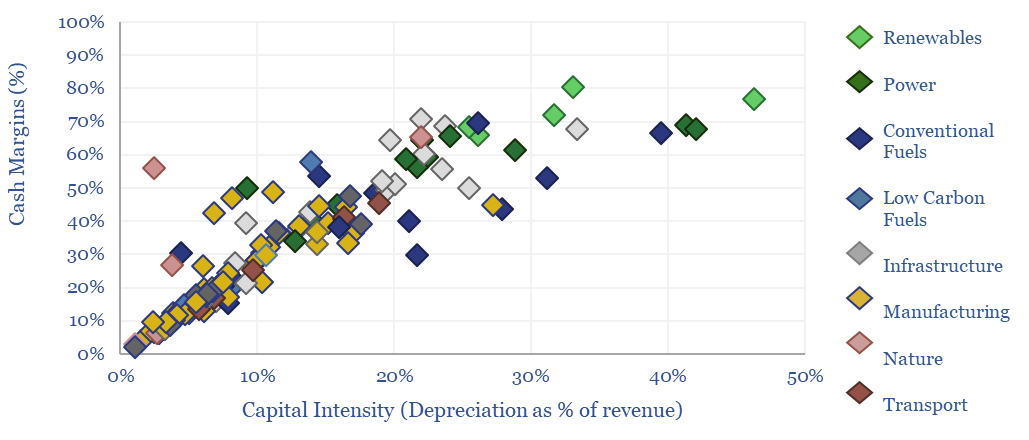
This data-file provides an overview of energy economics, across 175 different economic models constructed by Thunder Said Energy, in order to put numbers in context. This helps to compare marginal costs, capex costs, energy intensity, interest rate sensitivity, and other key parameters that matter in the energy transition.
-
LNG: top conclusions in the energy transition?
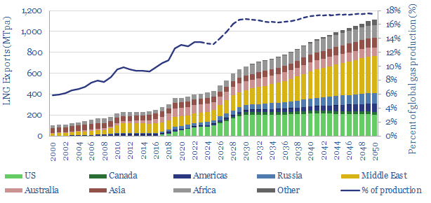
Thunder Said Energy is a research firm focused on economic opportunities that drive the energy transition. Our top ten conclusions into LNG are summarized below, looking across all of our research.
-
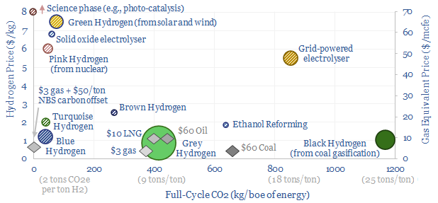
Hydrogen: overview and conclusions?

We think the best opportunities in hydrogen will be to decarbonize gas at source via blue and turquoise hydrogen, displacing ‘black hydrogen’ that currently comes from coal, and to produce small-scale feedstock on site via electrolysis for select industries. Others see green hydrogen as a cornerstone of the future energy system. We think there may…
-
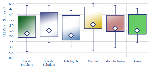
TSE Patent Assessments: a summary?

This data-file aggregates all of our patent assessments into a single reference file, so different companies’ scores can be compared and contrasted. Our average score is 3.5 out of 5.0. Skew is to the downside. Intelligibility is the biggest challenge. Scores correlate with TRL and revenues.
-
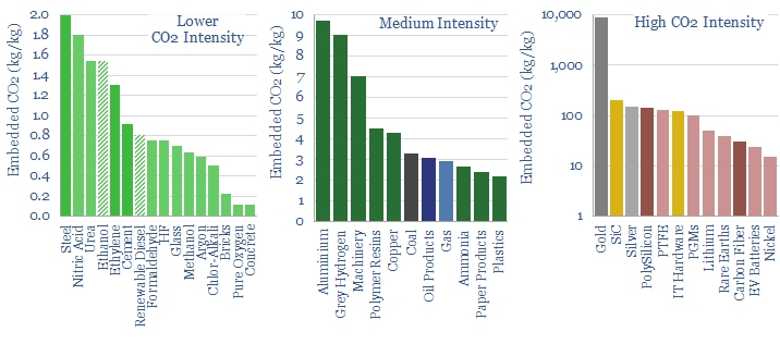
CO2 intensity of materials: an overview?

This data-file tabulates the energy intensity and CO2 intensity of materials, in tons/ton of CO2, kWh/ton of electricity and kWh/ton of total energy use per ton of material. The build-ups are based on 160 economic models that we have constructed to date, and simply intended as a helpful summary reference. Our key conclusions on CO2…
-
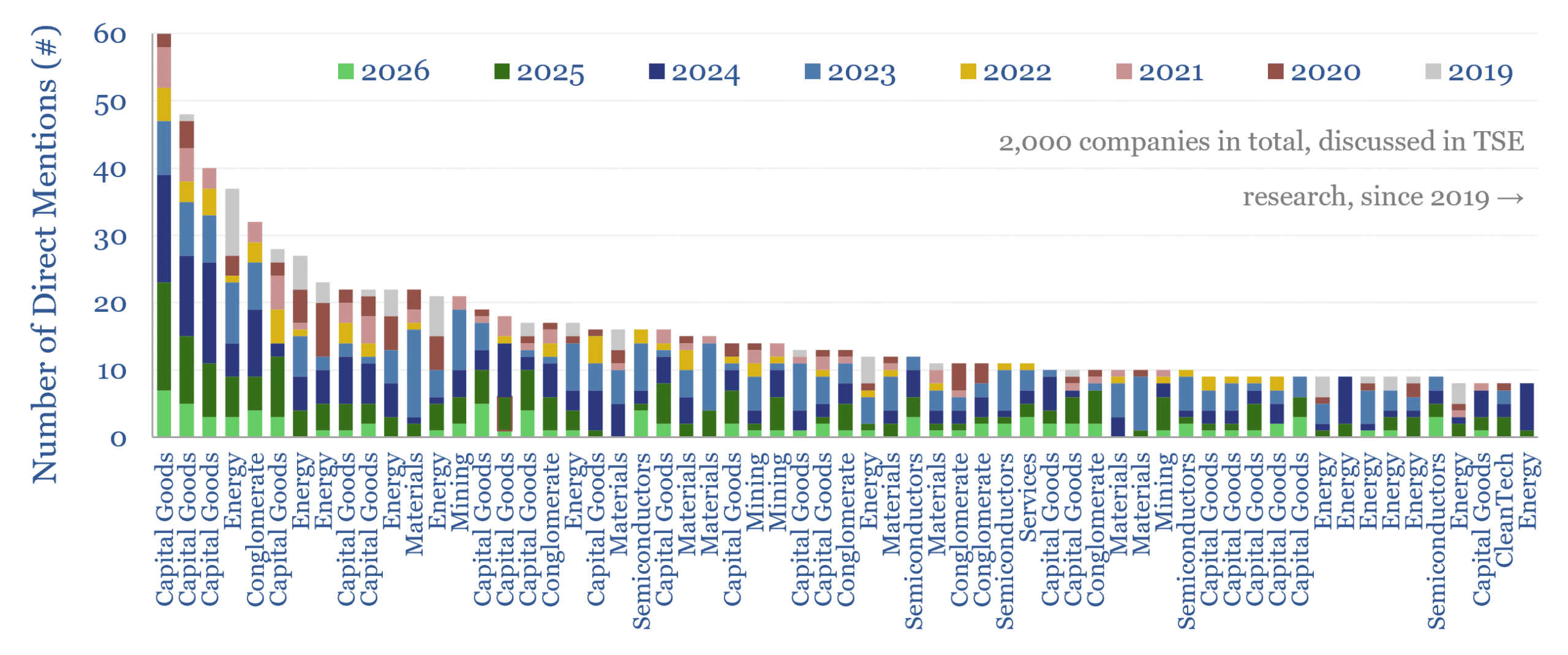
Energy technology and energy transition companies?

This database contains a record of every company that has ever been mentioned across Thunder Said Energy’s energy technology research, as a useful reference for TSE’s clients. As of July-2026, the database summarizes 4,000 mentions of 2,000 energy transition companies, broader energy producing and consuming companies; their size, focus and a summary of our key…
-
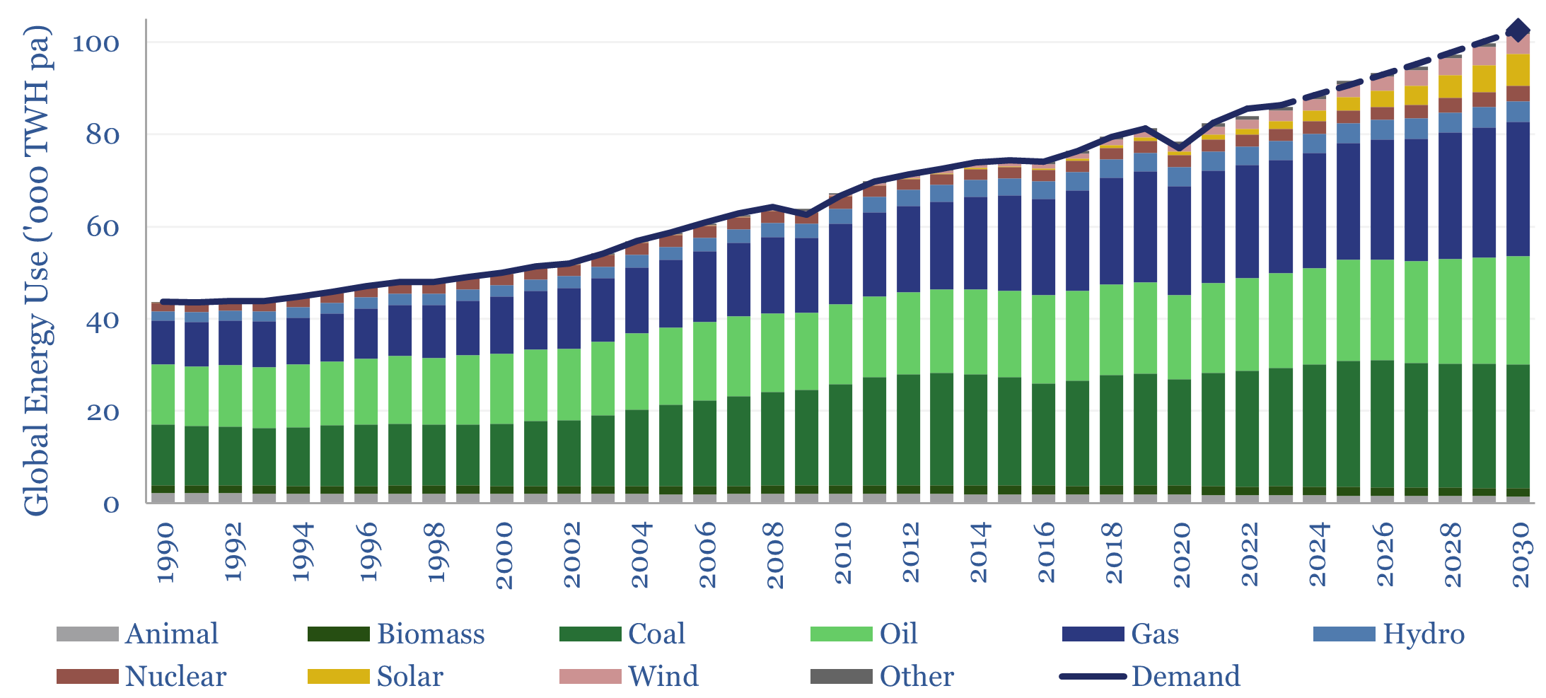
Global energy: supply-demand model?

This global energy supply-demand model combines our supply outlooks for coal, oil, gas, LNG, wind and solar, nuclear and hydro, into a build-up of useful global energy balances in 2023-30. 2026 will be a year of recalibration, as global energy markets shift from c1% over-supply in 2025 to -0.5% under-supply in 2027?
-
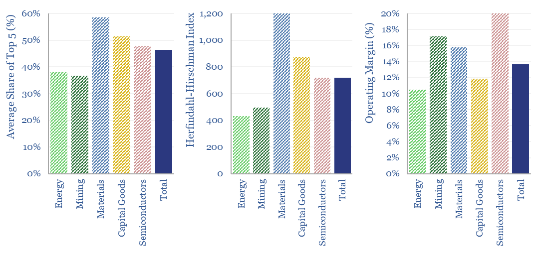
Market concentration by industry in the energy transition?

What is the market concentration by industry in energy, mining, materials, semiconductors, capital goods and other sectors that matter in the energy transition? The top five firms tend to control 45% of their respective markets, yielding a ‘Herfindahl Hirschman Index’ (HHI) of 700.
Content by Category
- Batteries (96)
- Biofuels (44)
- Carbon Intensity (48)
- CCS (64)
- CO2 Removals (9)
- Coal (43)
- Commentary (65)
- Company Diligence (105)
- Data Models (927)
- Decarbonization (162)
- Demand (131)
- Digital (89)
- Downstream (47)
- Economic Model (222)
- Energy Efficiency (76)
- Hydrogen (63)
- Industry Data (310)
- LNG (56)
- Materials (86)
- Metals (89)
- Midstream (45)
- Natural Gas (162)
- Nature (76)
- Nuclear (28)
- Oil (177)
- Patents (39)
- Plastics (44)
- Power Grids (156)
- Renewables (153)
- Screen (138)
- Semiconductors (35)
- Shale (58)
- Solar (72)
- Supply-Demand (53)
- Vehicles (94)
- Video (24)
- Wind (46)
- Written Research (408)