Renewables
-
Renewables: share of global energy and electricity by country?
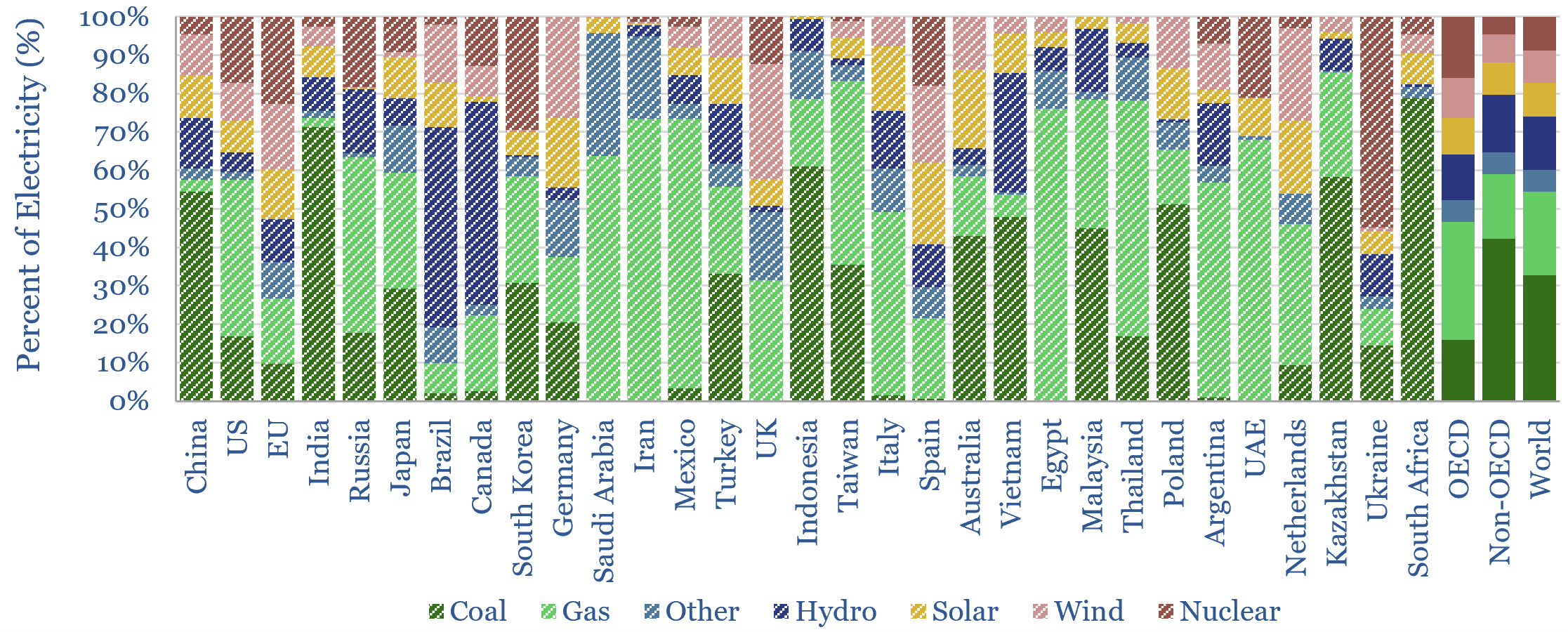
This data-file is an Excel visualizer for some of the key headline metrics around renewables’ share of global energy: such as total global energy use, electricity generation by source, wind penetration and solar penetration; broken down country-by-country, and showing how these metrics have changed over time, in an easy-to-compare visual format.
-
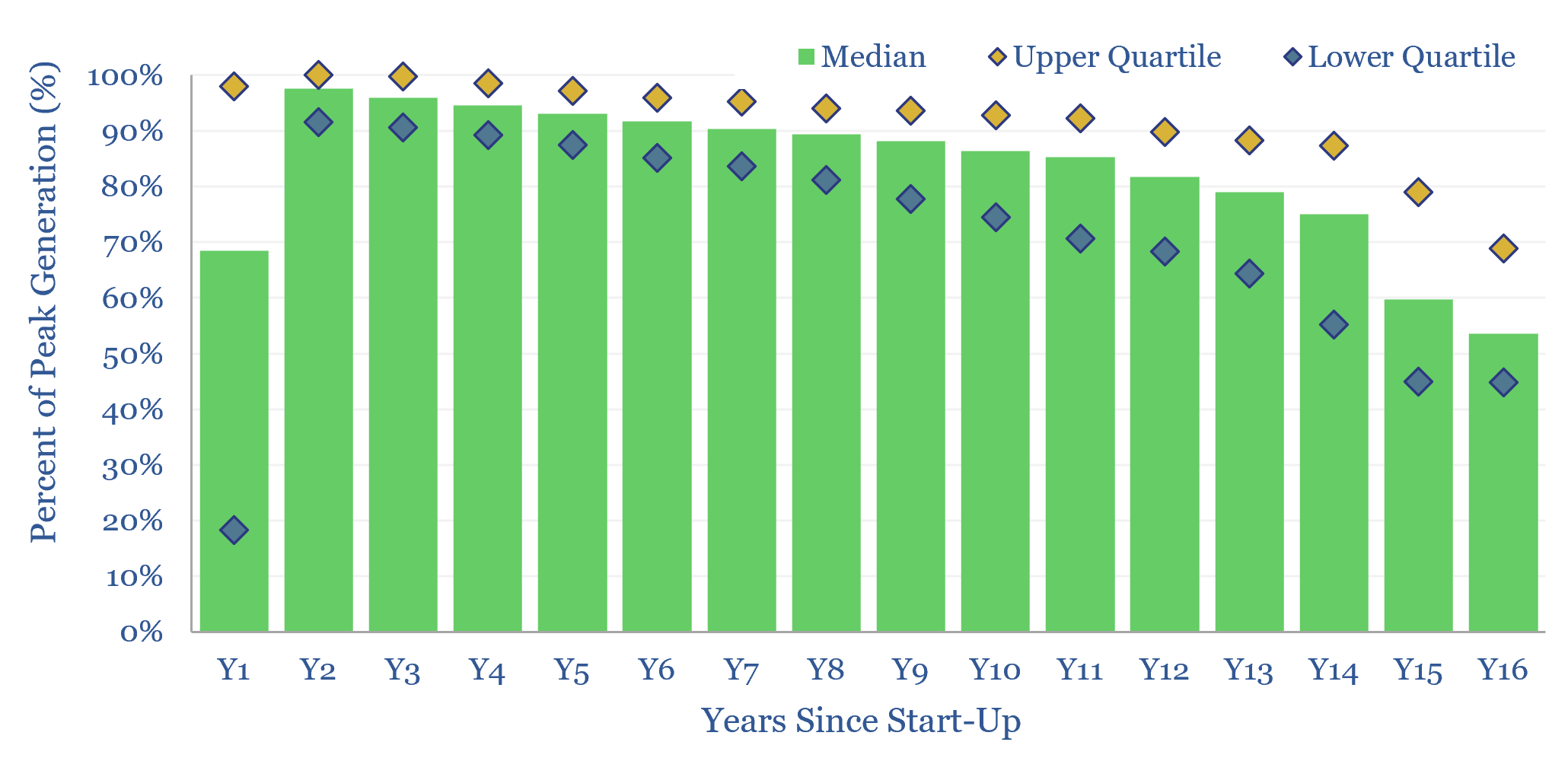
Solar power: decline rates?

This data-file tabulates the ‘decline rates’ of 6,600 US solar power plants, going back to 2001. Solar power decline rates average -1.5% up to year 12, after which decline rates increase. This matters for the economics of solar projects.
-
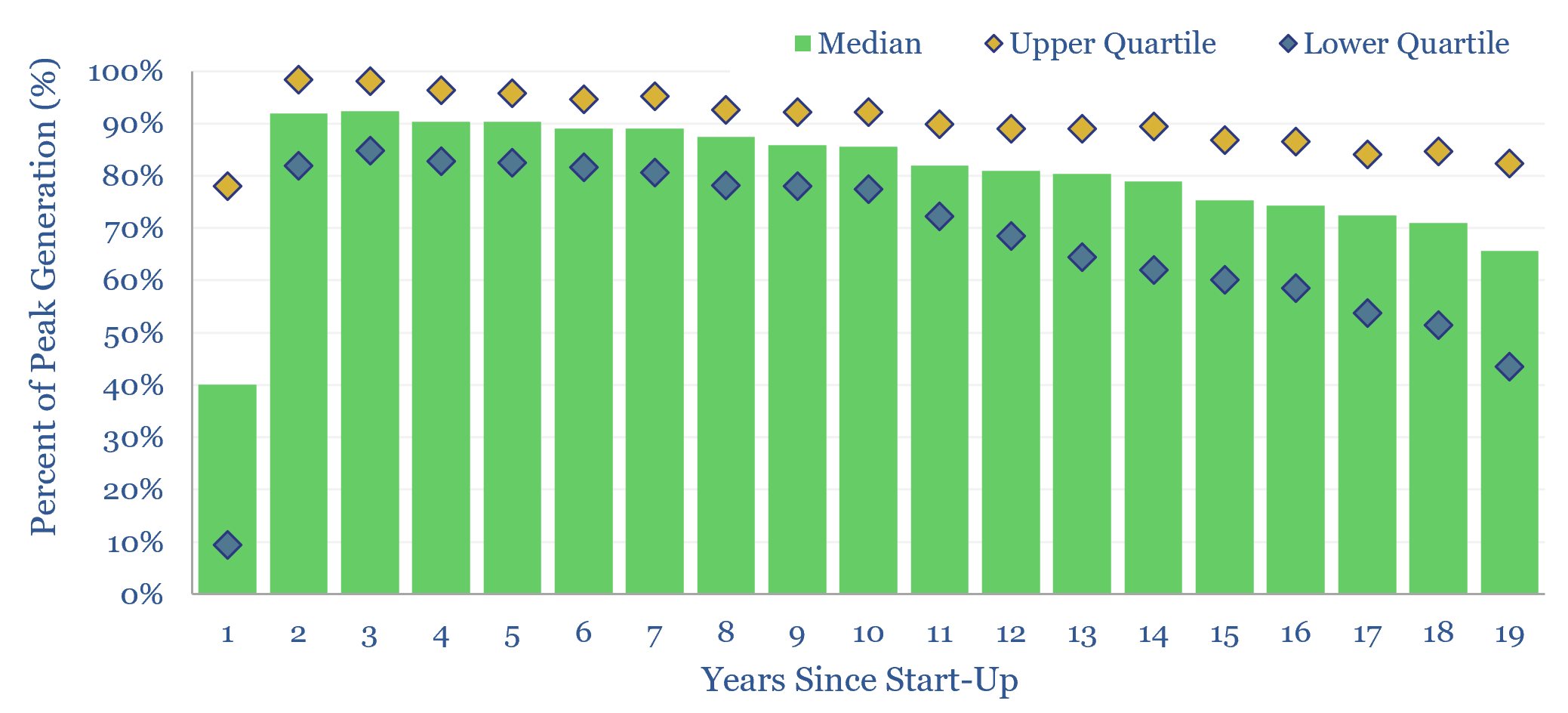
Wind power: decline rates?

This data-file aggregates wind generation by facility, across the US, at 1,500 wind farms, going back 25-years. Wind power decline rates average 1.1% per year, then accelerate to 2% per year in years 10-20. However wind generation is also noisy, typically varying +/- 7% YoY. This matters for the economics and ultimate share of wind.
-
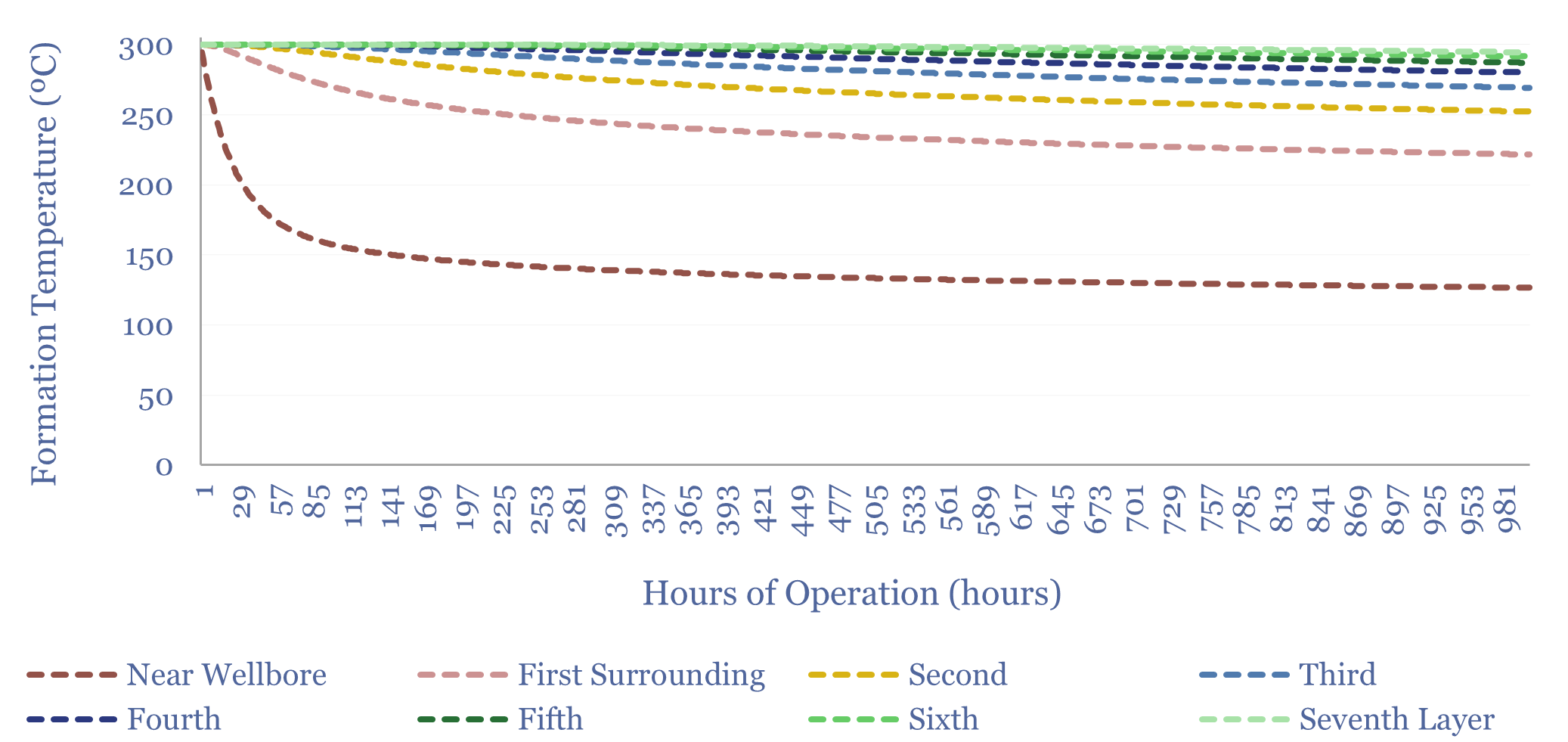
Advanced geothermal: modeling the reservoir?

How long does a geothermal well have to be to avoid thermal depletion? To answer this question, we built our own reservoir model, which is outlined in this 12-page report. Advanced Geothermal would require 10-100km laterals, which is cost prohibitive. Enhanced Geothermal or geothermal for ‘winter heating’ may fare better.
-
Advanced geothermal: reservoir model?

This data-file is a geothermal reservoir model, showing how a lateral well could harvest heat from the sub-surface, cool the rock surrounding the well, and ultimately settle at a “steady state” (in MW-th), where the flow of heat into the well from surrounding rock layers matches the rate of heat extraction. Inputs can be stress-tested.
-
Global electricity: by source, by use, by region?

Global electricity supply-demand is disaggregated in this data-file, by source, by use, by region, from 1990 to 2050, triangulating across all of our other models in the energy transition, and culminating in over 50 fascinating charts, which can be viewed in this data-file. Global electricity demand rises 3x by 2050 in our outlook.
-
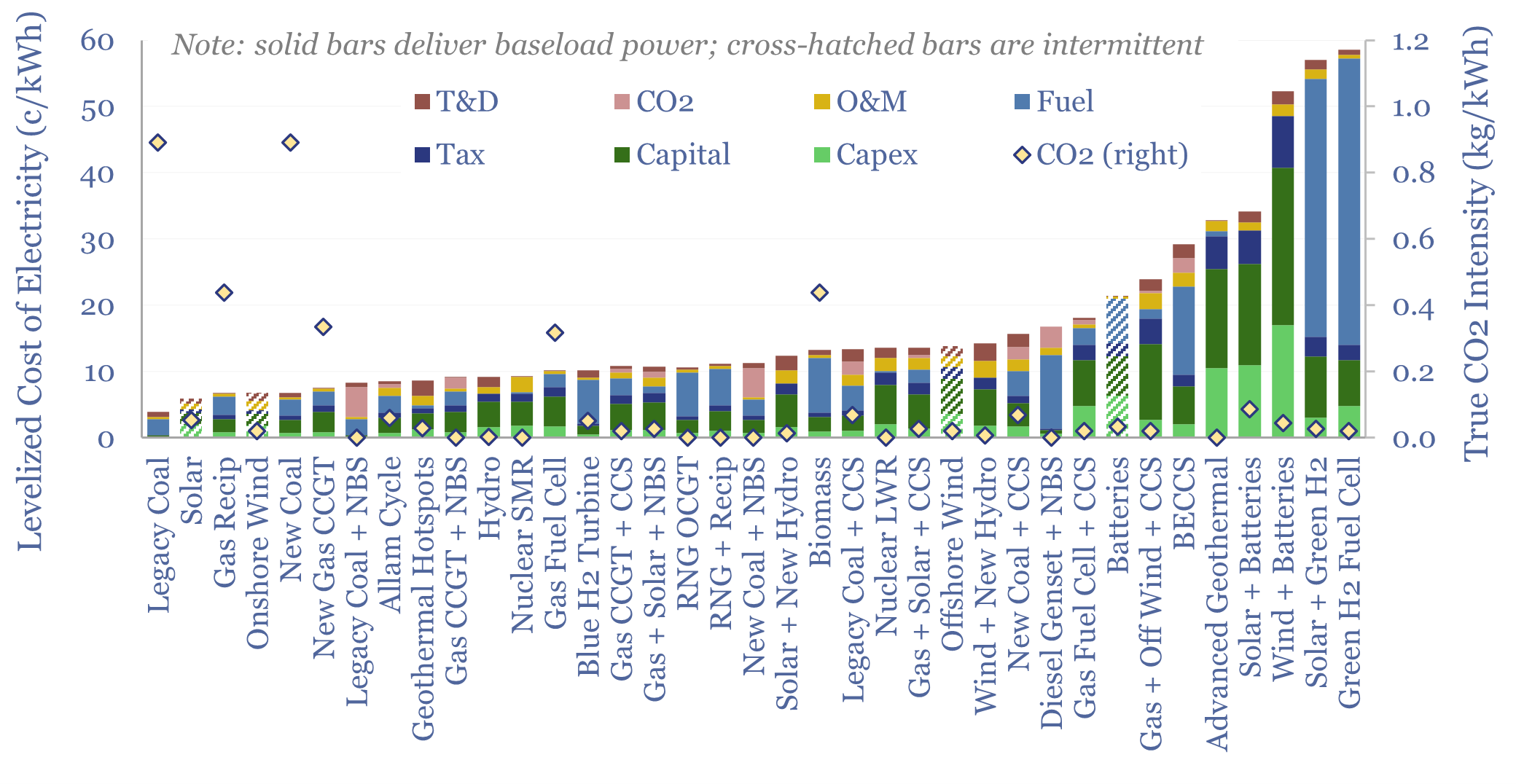
Levelized cost of electricity: stress-testing LCOE?

This data-file summarizes the levelized cost of electricity, across 35 different generation sources, covering 20 different data-fields for each source. Costs of generating electricity can vary from 2-200 c/kWh. The is more variability within categories than between them. Numbers can readily be stress-tested in the data-file.
-
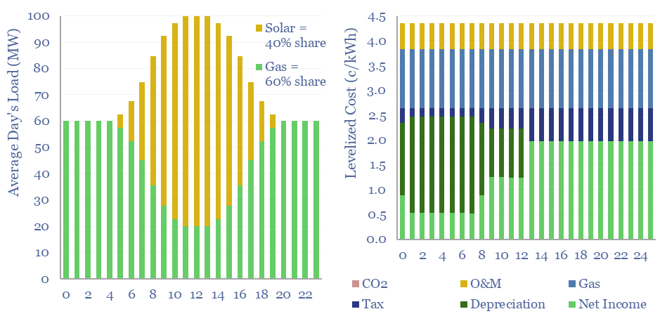
Renewables+gas LCOEs versus standalone gas turbines?

Levelized costs of electricity depend as much on the system being electrified as the energy sources used to electrify it. This data-file captures solar+gas LCOEs (in c/kWh), when meeting different load profiles, as a function of solar capex (in $/kW), gas prices (in $/mcf), and the relative utilization of solar vs gas.
-
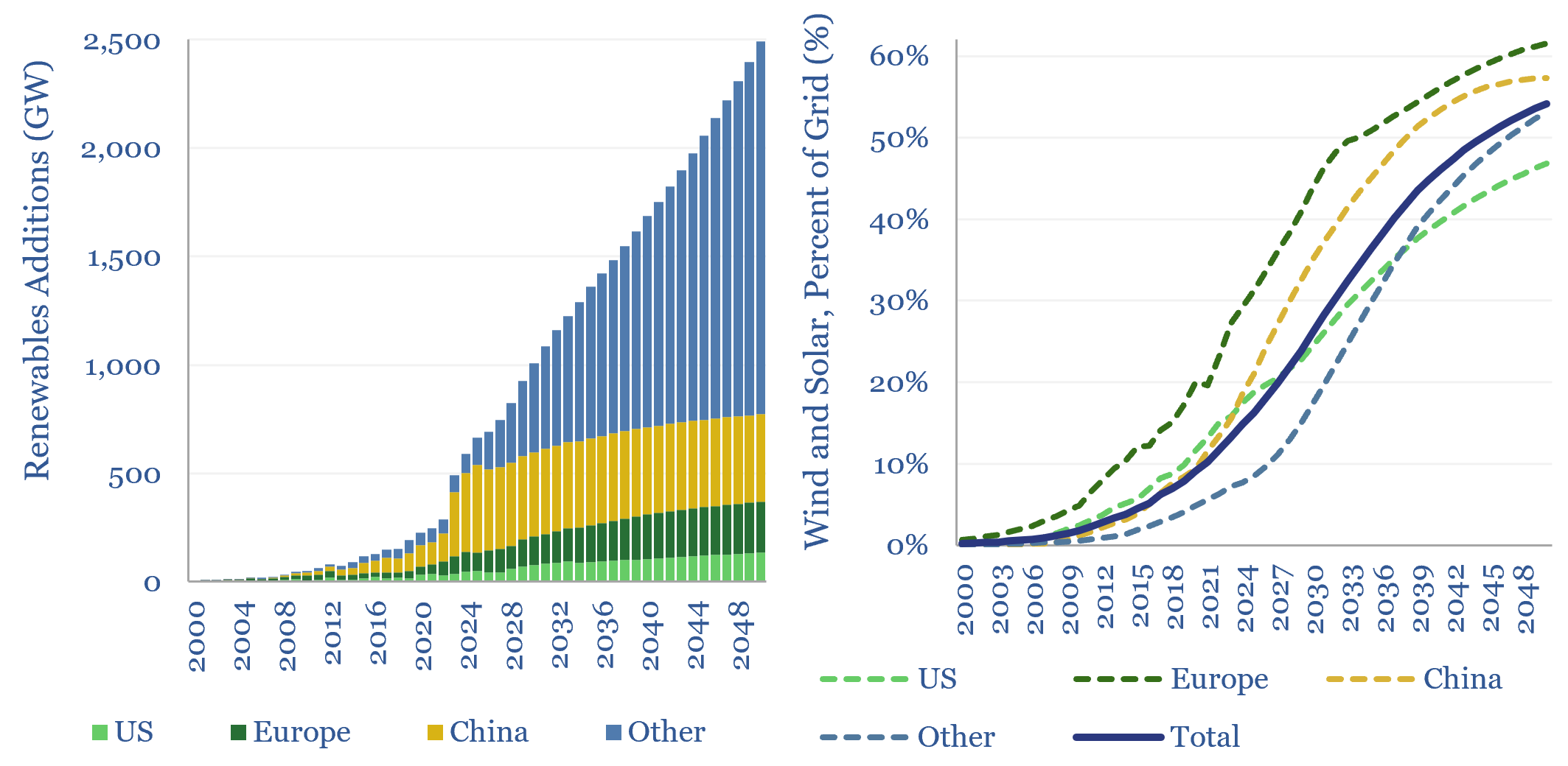
Wind and solar capacity additions?

Global wind and solar capacity additions reached 630GW pa (AC-basis) in 2025, which is 3x 2020 levels and 10x 2011 levels. The pace of gross wind and solar capacity additions can rise by a further 3x by 2050, bringing wind and solar to 55% of a greatly expanded global power grid by 2050. Most of…
-
Wind and solar: curtailments over time?

Wind and solar curtailments now average 8% across different grids that we have evaluated in this data-file, and have generally been rising over time, especially in 2024-25. The key reason is grid bottlenecks. Grid expansions are crucial for wind and solar to continue expanding.


Content by Category
- Batteries (96)
- Biofuels (44)
- Carbon Intensity (48)
- CCS (64)
- CO2 Removals (9)
- Coal (44)
- Commentary (65)
- Company Diligence (105)
- Data Models (928)
- Decarbonization (163)
- Demand (131)
- Digital (92)
- Downstream (47)
- Economic Model (222)
- Energy Efficiency (76)
- Hydrogen (63)
- Industry Data (311)
- LNG (56)
- Materials (86)
- Metals (89)
- Midstream (45)
- Natural Gas (163)
- Nature (76)
- Nuclear (28)
- Oil (178)
- Patents (39)
- Plastics (44)
- Power Grids (156)
- Renewables (153)
- Screen (139)
- Semiconductors (36)
- Shale (58)
- Solar (72)
- Supply-Demand (53)
- Vehicles (94)
- Video (24)
- Wind (46)
- Written Research (410)