Power Grids
-
Power grids: opportunities in the energy transition?

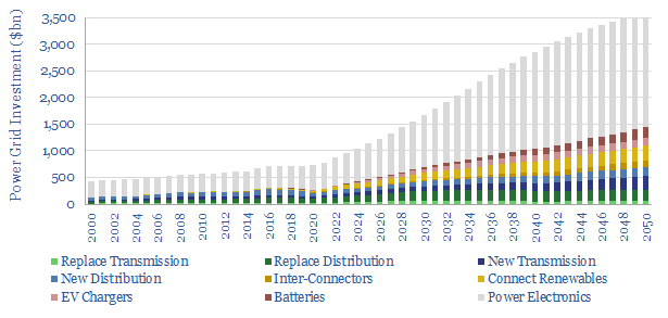
Power grids move electricity from the point of generation to the point of use, while aiming to maximize the power quality, minimize costs and minimize losses. Broadly defined, global power grids and power electronics investment must step up 5x in the energy transition, from a $750bn pa market to over $3.5trn pa. But this theme…
-
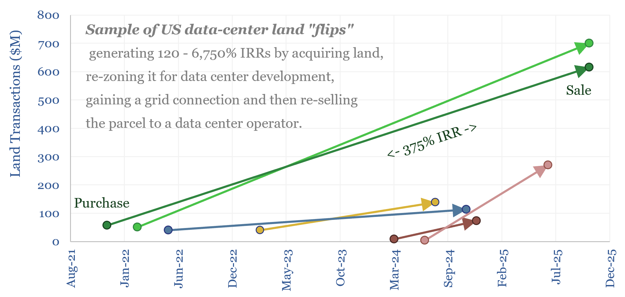
Electrical service agreements: how real are those data centers?

Are speculative data center projects, 80% of which will never get built, inflating future load growth forecasts? This 18-page report reviews evidence from land developer returns, recent PUC deliberations and evolving terms in Electrical Service Agreements (ESAs).
-
Heat potential: what if AI can load-shift hot water tanks?

Residential heat is 13% of global energy. So what if AI could optimize residential electric heating? This 16-page report finds that load-shifting hot water tanks can unlock 1.5-8.5% additional flexibility in grids and make air source heat pumps the lowest cost option for heat in Europe, eclipsing gas-combi boilers, saving $300 per household per year?
-
Residential heating energy from first principles?
This data-file models residential heating energy from first principles, taking an example in Northern Europe, for a house with 150m2 floor space, requiring 15MWth of heat (space heating and hot water), which is met by consuming 5MWH-e pa in a heat pump, costing $1,500/year. But this can also be optimized.
-
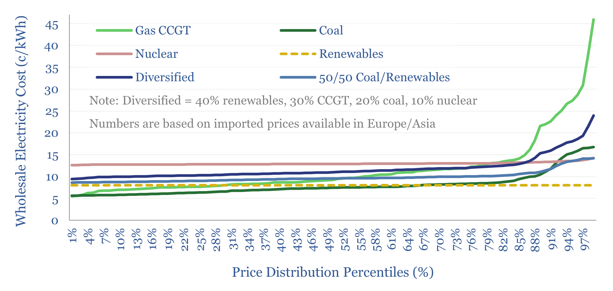
Global power: what grid mix is most stable?

Energy importing countries value stable electricity prices. Hence this 18-page report evaluates the optimal grid mix, after taking stability into account? Recent gas price volatility will encourage further diversification for developed world importers, while coal+solar could dominate emerging world growth. Our forecasts are revised.
-
Global electricity: by source, by use, by region?

Global electricity supply-demand is disaggregated in this data-file, by source, by use, by region, from 1990 to 2050, triangulating across all of our other models in the energy transition, and culminating in over 50 fascinating charts, which can be viewed in this data-file. Global electricity demand rises 3x by 2050 in our outlook.
-
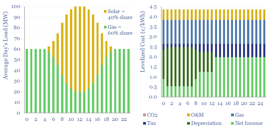
Renewables+gas LCOEs versus standalone gas turbines?

Levelized costs of electricity depend as much on the system being electrified as the energy sources used to electrify it. This data-file captures solar+gas LCOEs (in c/kWh), when meeting different load profiles, as a function of solar capex (in $/kW), gas prices (in $/mcf), and the relative utilization of solar vs gas.
-
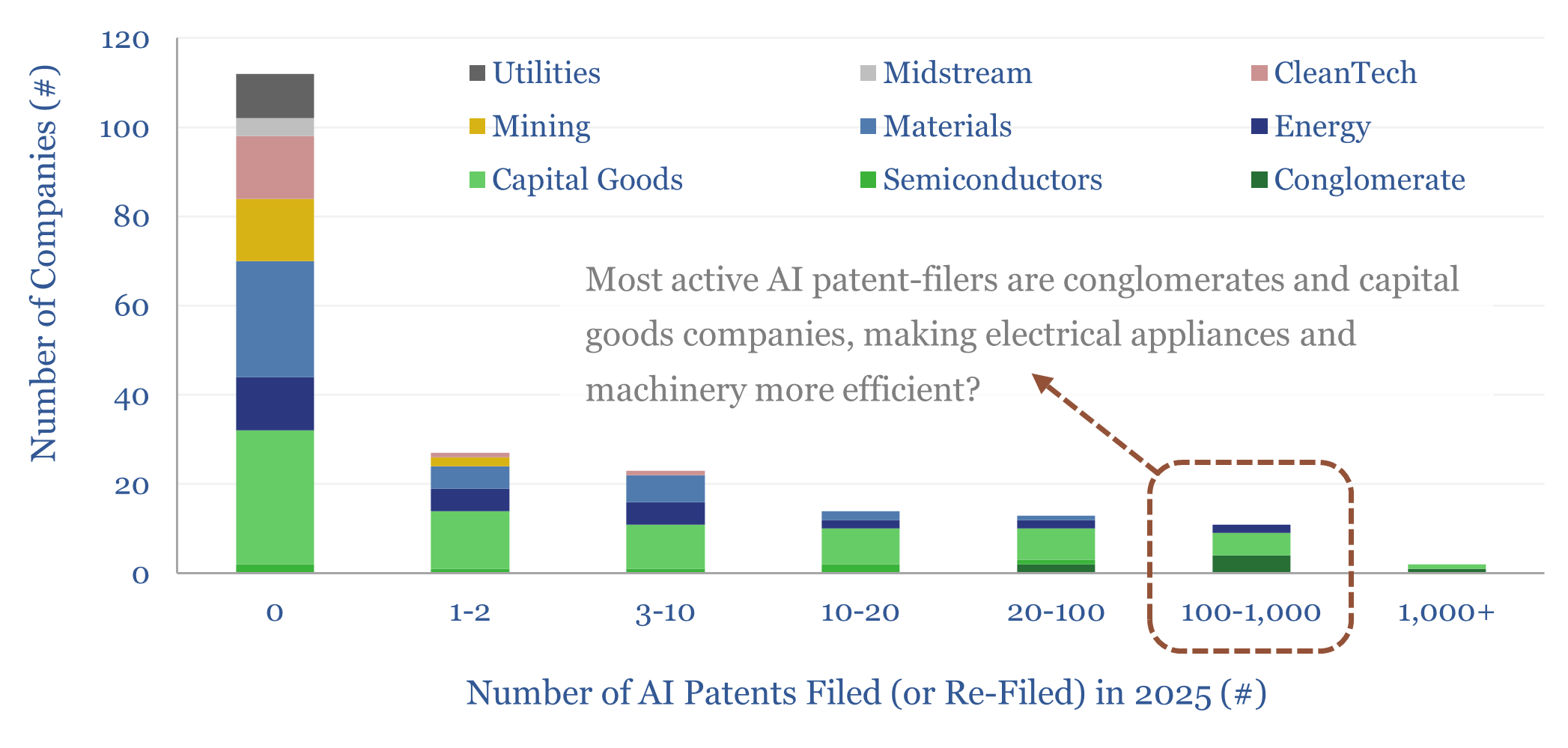
Electrical appliances: will AI accelerate efficiency gains?

500,000 AI-related patents were filed in 2025. But electrical appliance manufacturers were particularly active. Hence we used AI ourselves, in this 14-page report, to home in on 50 key patents, which will improve efficiency and flexibility of electrical appliances using AI – in HVAC, lighting, refrigerators, TVs, etc. – which make up 50% of the…
-
Wind and solar: curtailments over time?

Wind and solar curtailments now average 8% across different grids that we have evaluated in this data-file, and have generally been rising over time, especially in 2024-25. The key reason is grid bottlenecks. Grid expansions are crucial for wind and solar to continue expanding.
-
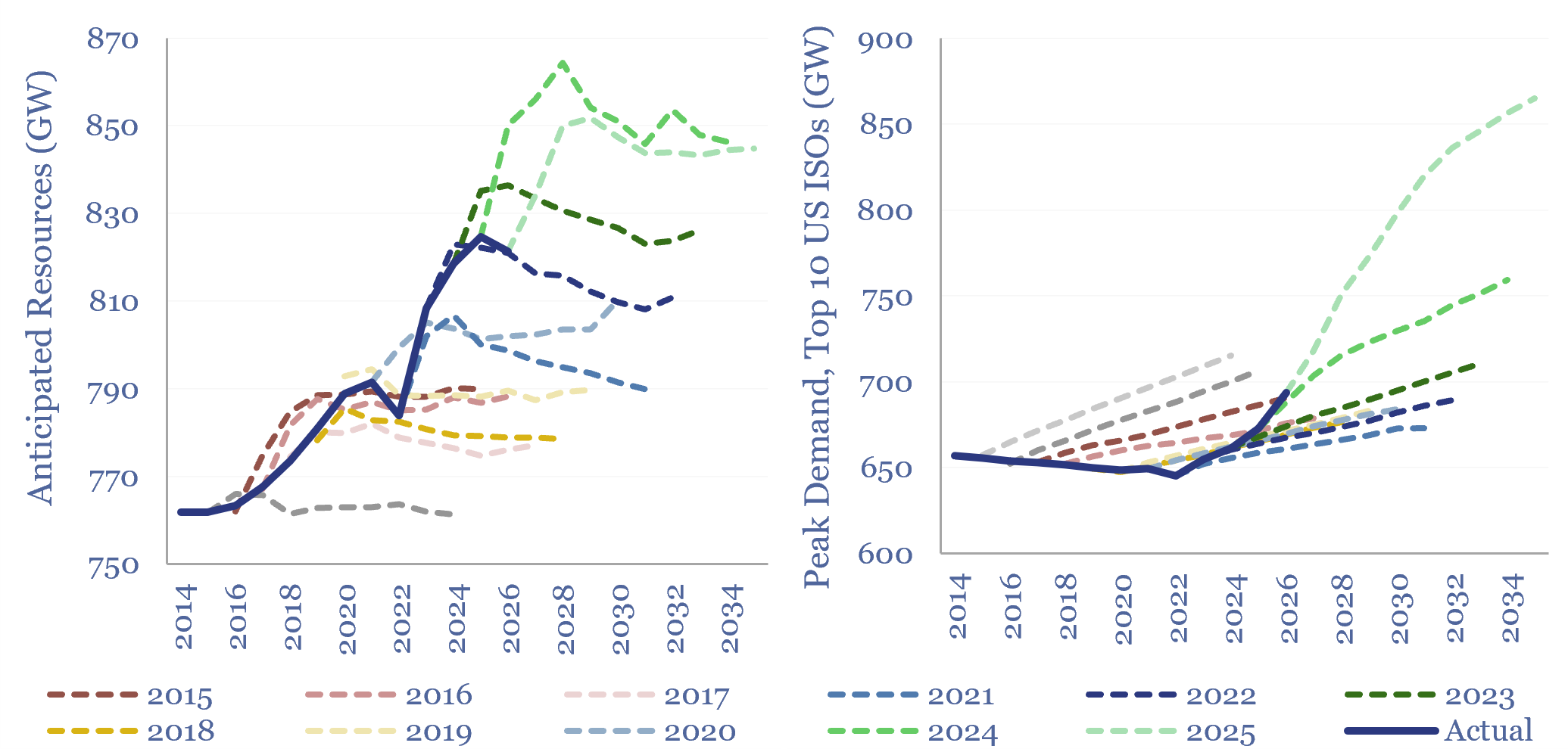
Reserve margins: by ISO and over time?

Reserve margins across major ISOs in the US power grid average 26% in 2026, are seen declining to 10% in the next decade by NERC, and turning negative in regions such as PJM and MISO. Surging power demand and resource retirements are the culprits, although may not unfold as feared. This data-file tabulates reserve margin…


Content by Category
- Batteries (96)
- Biofuels (44)
- Carbon Intensity (48)
- CCS (64)
- CO2 Removals (9)
- Coal (44)
- Commentary (65)
- Company Diligence (105)
- Data Models (927)
- Decarbonization (162)
- Demand (131)
- Digital (89)
- Downstream (47)
- Economic Model (222)
- Energy Efficiency (76)
- Hydrogen (63)
- Industry Data (310)
- LNG (56)
- Materials (86)
- Metals (89)
- Midstream (45)
- Natural Gas (163)
- Nature (76)
- Nuclear (28)
- Oil (178)
- Patents (39)
- Plastics (44)
- Power Grids (156)
- Renewables (153)
- Screen (138)
- Semiconductors (35)
- Shale (58)
- Solar (72)
- Supply-Demand (53)
- Vehicles (94)
- Video (24)
- Wind (46)
- Written Research (409)