Oil
-
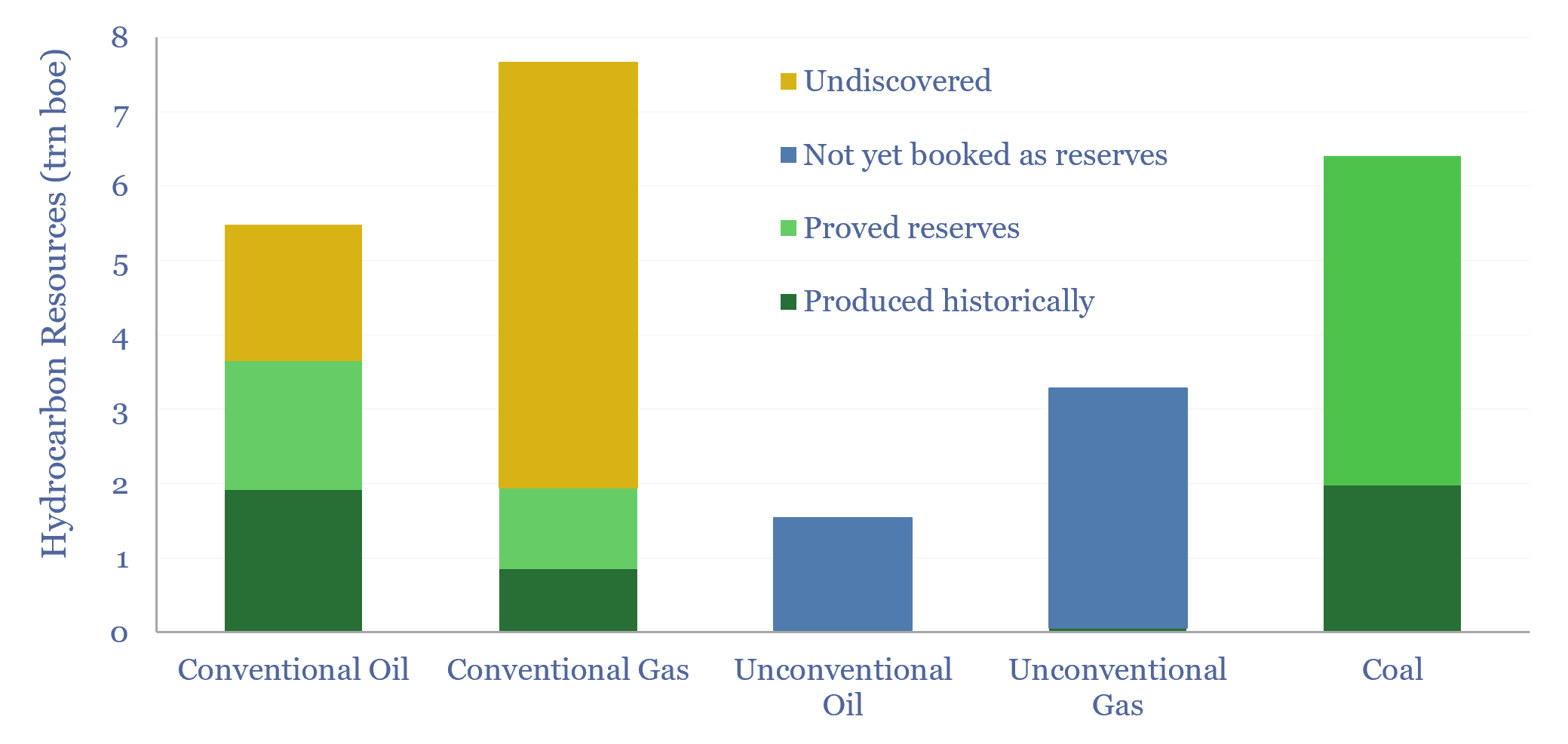
Global hydrocarbon resources: across the history of the world?

We have quantified global hydrocarbon resources, from first principles, in this 15-page report. We estimate how much oil, gas and coal ever formed across the total history of the world. And more importantly, we estimate how much is left. Our numbers support an energy transition from coal to gas.
-
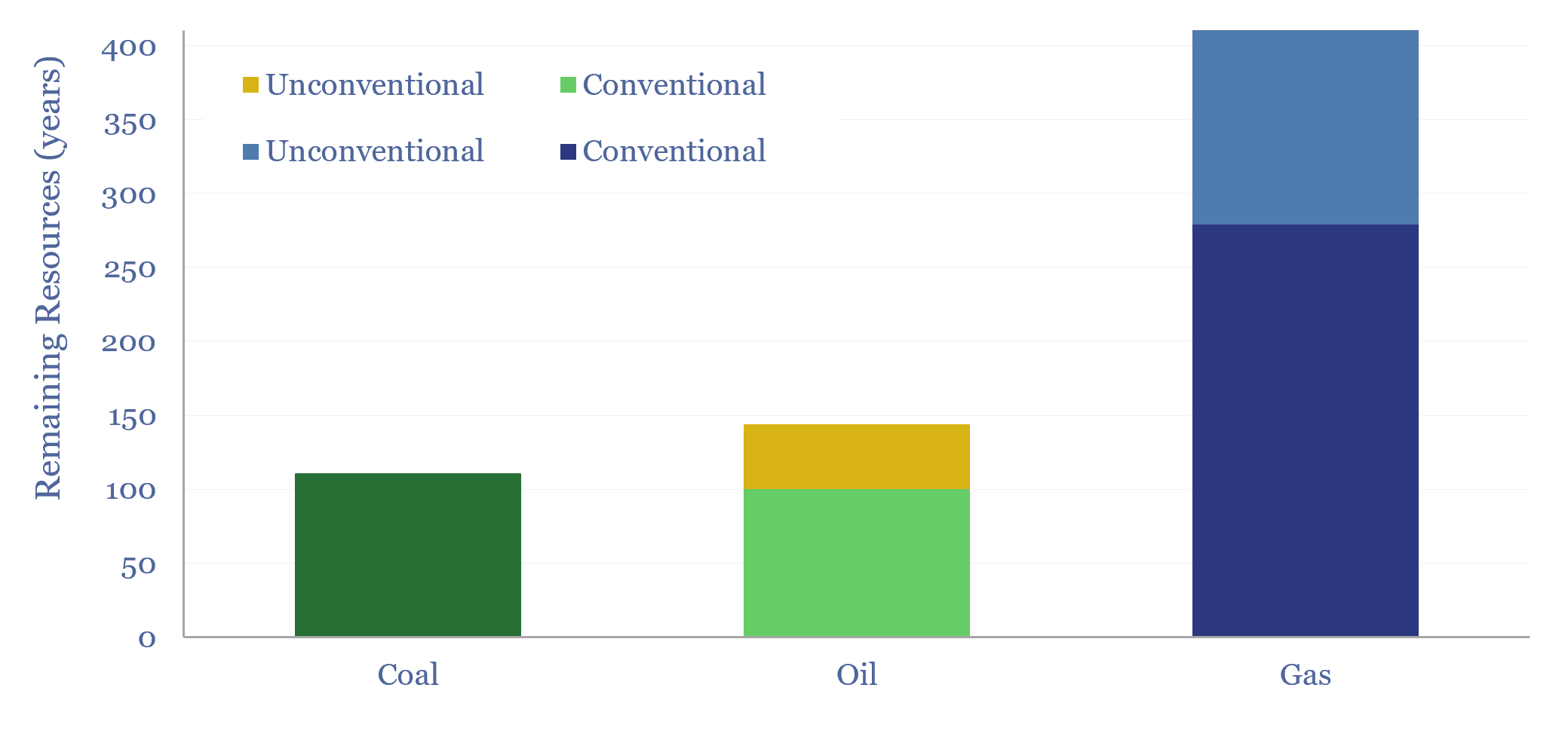
Global hydrocarbon resources and coal resources?

Global hydrocarbon resources and global coal resources — in-place resources and economically recoverable resources — are estimated from first principles in this data-file. We see the world’s remaining economically recoverable reserves of oil and gas being 4x larger than remaining economically recoverable reserves of coal.
-
US shale: outlook and forecasts?

This model sets out our US shale production forecasts by basin. It covers the Permian, Bakken, Eagle Ford, Marcellus/Utica and Haynesville, as a function of the rig count, drilling productivity, completion rates, well productivity and type curves. The data-file was last updated in May-2025, revising liquids growth negative in 2025-26, which in turn tightens US…
-
SAGD oil sands economics?
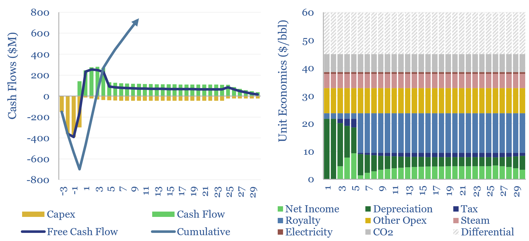
SAGD oil sands economics are modeled in this data-file, generating a 10% IRR, at $60/bbl WTI oil prices in our base case. This hinges on a 2.7 m3/m3 steam oil ratio, for a 4x EROEI. Breakevens can vary from $45-90/bbl depending on capex costs and steam oil ratios.
-
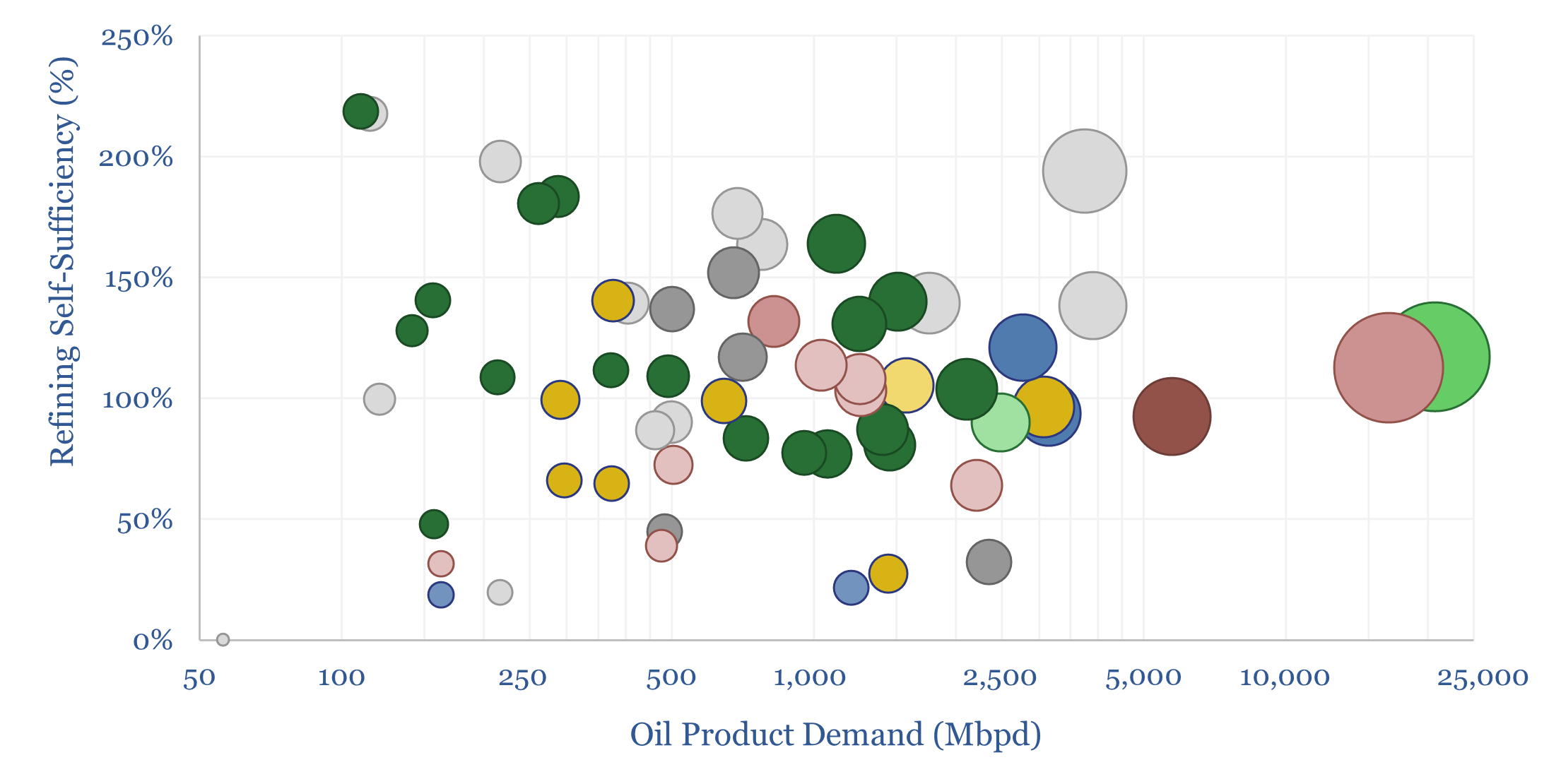
Refining self-sufficiency by country?

Which countries are self-sufficient in refining capacity? Which countries export oil products? And which are least self-reliant, thus needing to import oil products, and potentially facing shortfalls in disrupted markets? This data-file estimates global oil refining self-sufficiency by country.
-
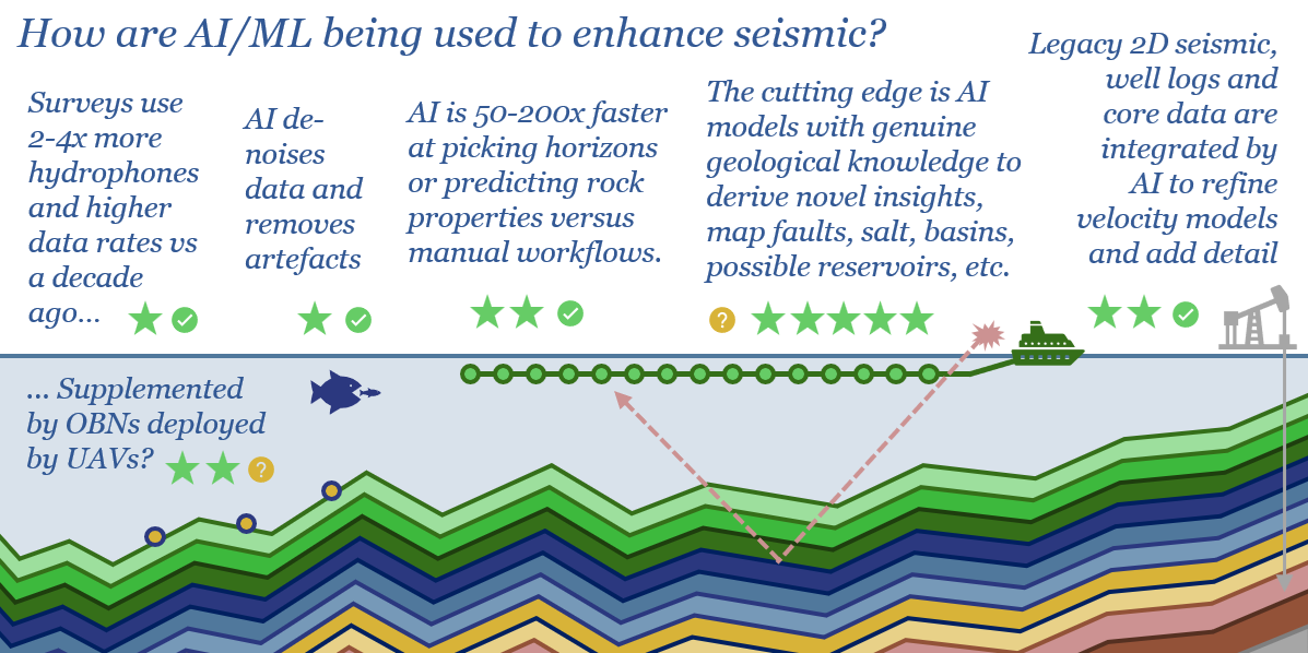
Seismic shift: how is AI reshaping oil exploration?

The global seismic industry is worth $10bn pa. But an additional $10bn pa of value could be unlocked by AI. This 19-page report finds promising progress with AI in seismic, uplifting the value of seismic hardware and multi-client libraries. But the theme is still in early innings. Who benefits?
-
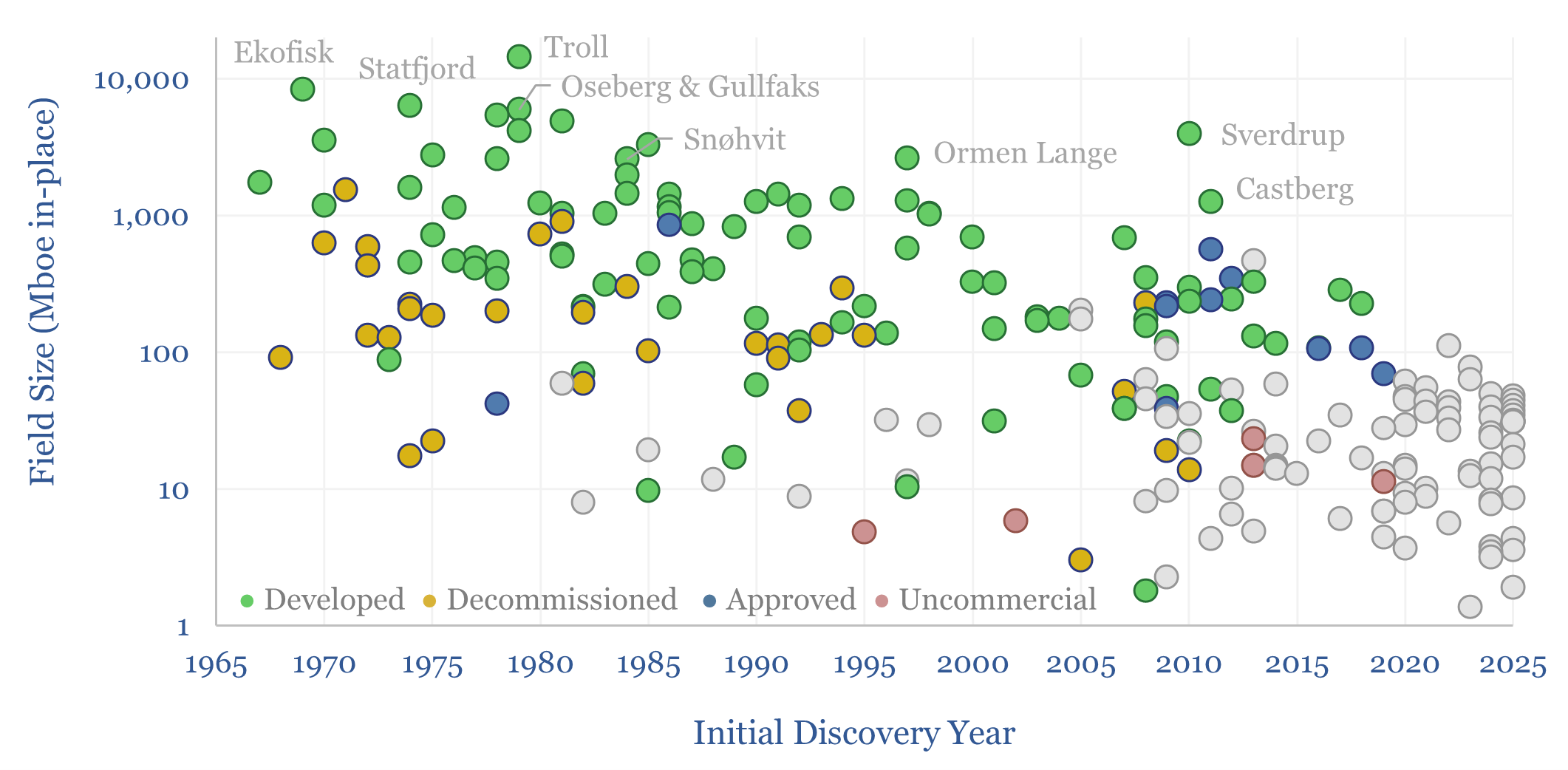
Mature oil basins: an ocean of oil still to find?

There is an ocean of oil (and gas) still to find, even in some of the most mature hydrocarbon basins in the world, but finding it will almost certainly require improved seismic, possibly enhanced by AI, as shown by this case study, tracking the sizes of oil resources, discovered off Norway, from 1969 to present.
-
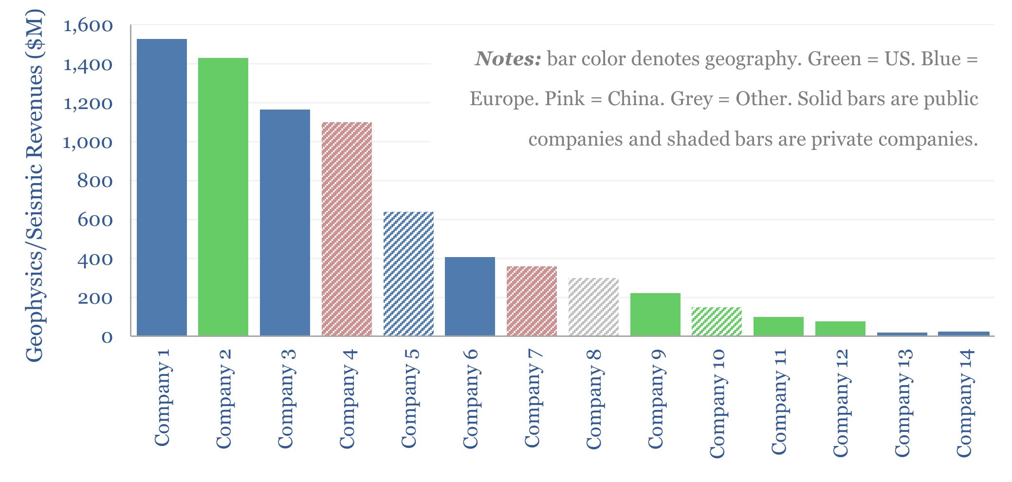
Leading seismic and geophysics companies?
This data-file screens 14 leading seismic and geophysics companies, based on company disclosures and reviewing c500 patents over the past 20-years. This restructured and increasingly consolidated industry is now worth $10bn pa. Companies have recently generated c10% EBIT margins. But capabilities are growing and costs are deflating through deploying AI?
-
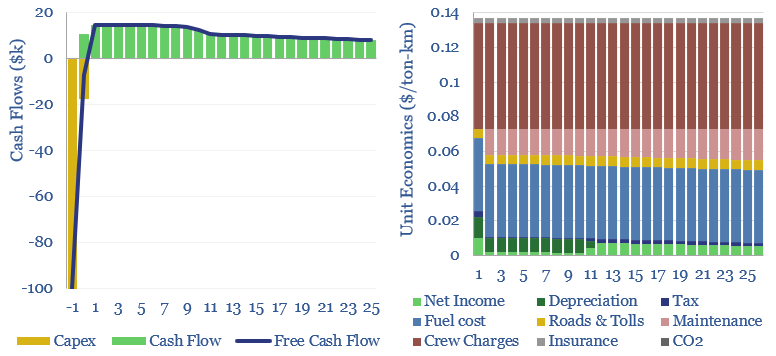
Heavy truck costs: diesel, gas, electric or hydrogen?

Heavy truck costs are estimated at $0.14 per ton-kilometer, for a truck typically carrying 15 tons of load and traversing over 150,000 miles per annum. Today these trucks consume 10Mbpd of diesel and their costs absorb 4% of post-tax incomes. Hydrogen trucks would be 45-75% more costly, but from 2026, we are starting to see…
-
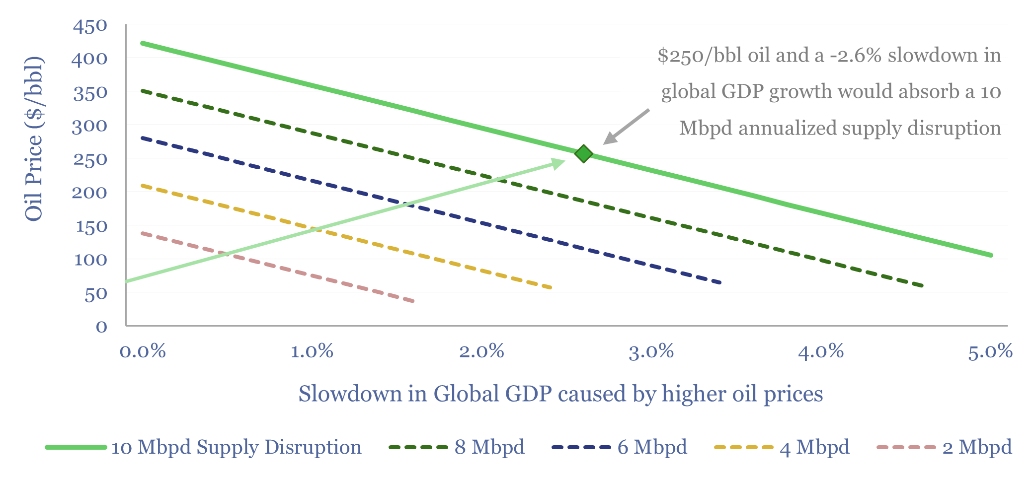
Oil price elasticity of demand: how high can oil prices go?

What is the price elasticity of oil demand — globally, by region, and by product? This 11-page report argues that a supply disruption of 10-20Mbpd magnitude, lasting for 6-12 months, pushes oil above $250/bbl, and also zeroes global GDP growth. Rationing and solar/EV substitution may cushion the impact.
Content by Category
- Batteries (96)
- Biofuels (44)
- Carbon Intensity (48)
- CCS (64)
- CO2 Removals (9)
- Coal (44)
- Commentary (65)
- Company Diligence (105)
- Data Models (928)
- Decarbonization (163)
- Demand (131)
- Digital (92)
- Downstream (47)
- Economic Model (222)
- Energy Efficiency (76)
- Hydrogen (63)
- Industry Data (311)
- LNG (56)
- Materials (86)
- Metals (89)
- Midstream (45)
- Natural Gas (163)
- Nature (76)
- Nuclear (28)
- Oil (178)
- Patents (39)
- Plastics (44)
- Power Grids (156)
- Renewables (153)
- Screen (139)
- Semiconductors (36)
- Shale (58)
- Solar (72)
- Supply-Demand (53)
- Vehicles (94)
- Video (24)
- Wind (46)
- Written Research (410)