Solar
-
Can residential solar cover residential AC demand?
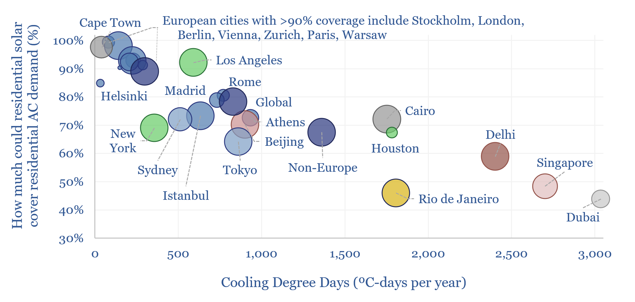
Can residential solar cover residential AC demand? To answer this question, we have downloaded hourly data across 2025, from NASA Earth Observatory, across 25 major cities. The average home, with 20m2 of solar modules (a 5kW array), can cover 80% of the energy costs of keeping indoor temperatures below 20C, rising above 90% in many…
-
Solar power: decline rates?
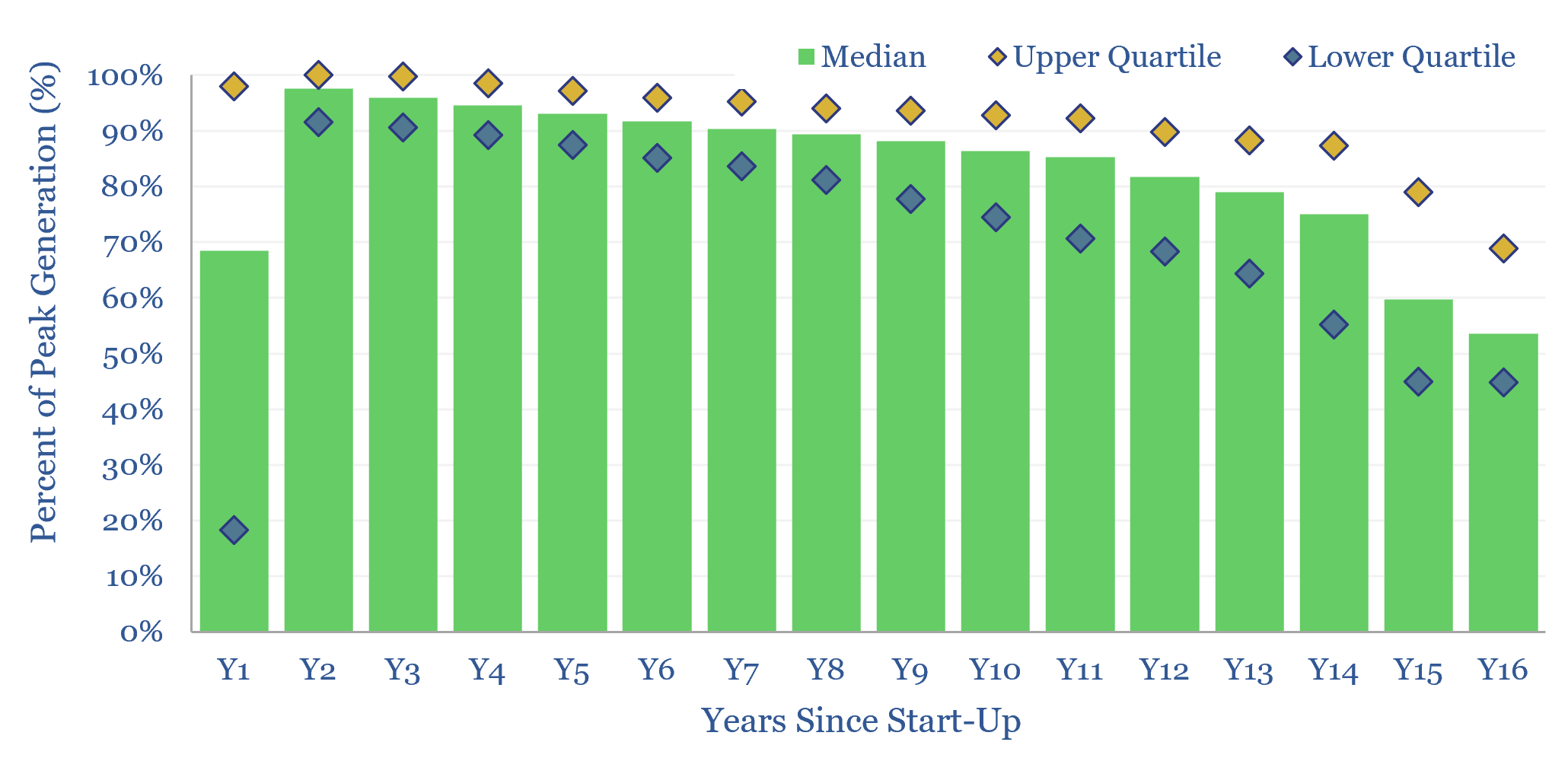
This data-file tabulates the ‘decline rates’ of 6,600 US solar power plants, going back to 2001. Solar power decline rates average -1.5% up to year 12, after which decline rates increase. This matters for the economics of solar projects.
-
Solar trackers: leading companies?
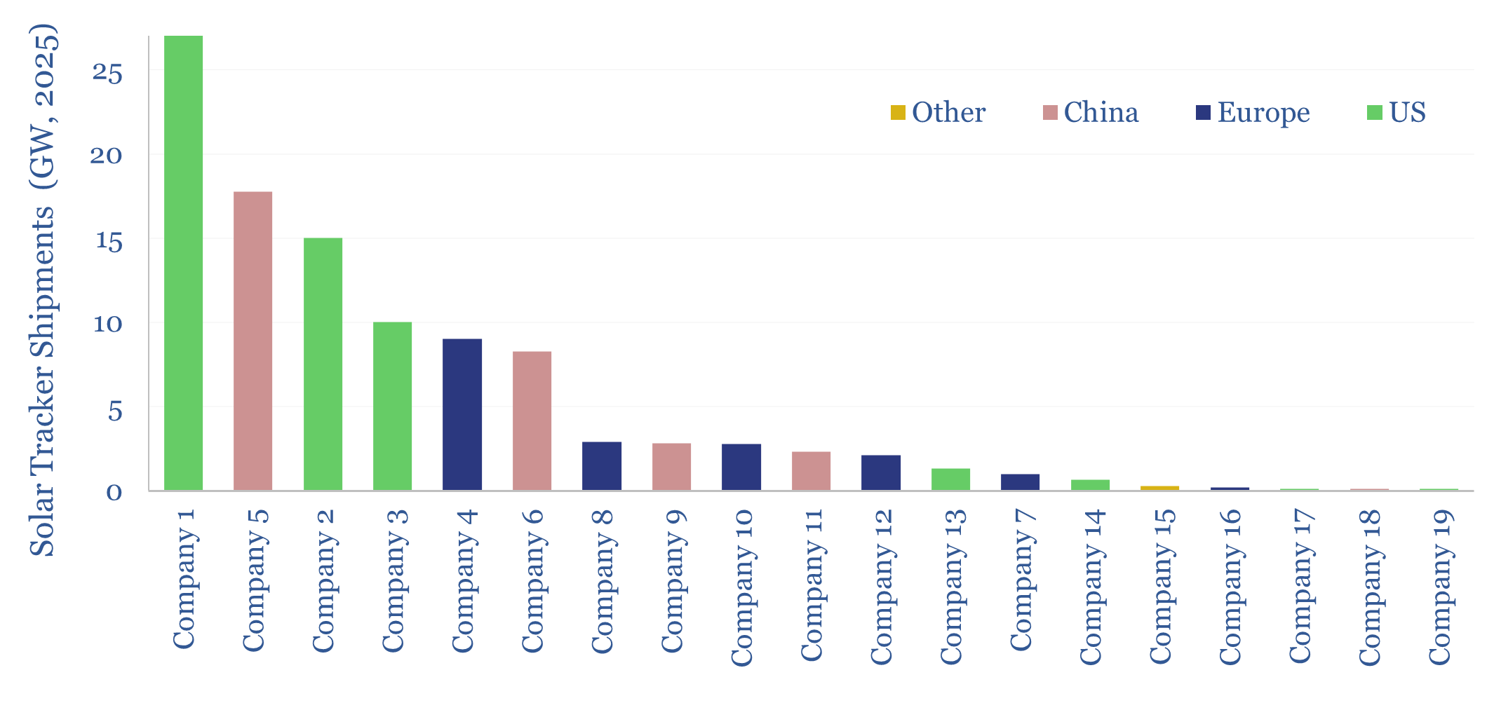
This data-file summarizes the leading companies in solar trackers, their market share, pricing (in $/kW), operating margins (in %), company sizes, sales mixes and recent news flow. Five companies supply 70% of the market, which is worth $10bn pa. But competition is intensifying from East-West dual-tile arrays and within the tracker industry.
-
Wind and solar capacity additions?
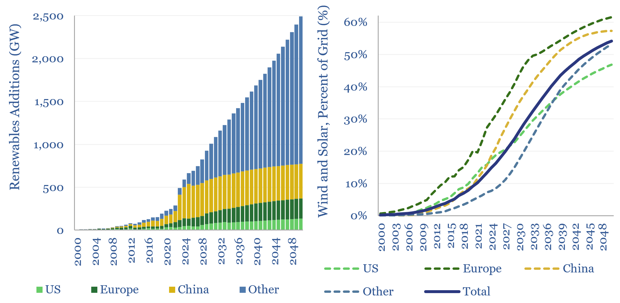
Global wind and solar capacity additions reached 630GW pa (AC-basis) in 2025, which is 3x 2020 levels and 10x 2011 levels. The pace of gross wind and solar capacity additions can rise by a further 3x by 2050, bringing wind and solar to 55% of a greatly expanded global power grid by 2050. Most of…
-
Enphase: GaN microinverter technology?
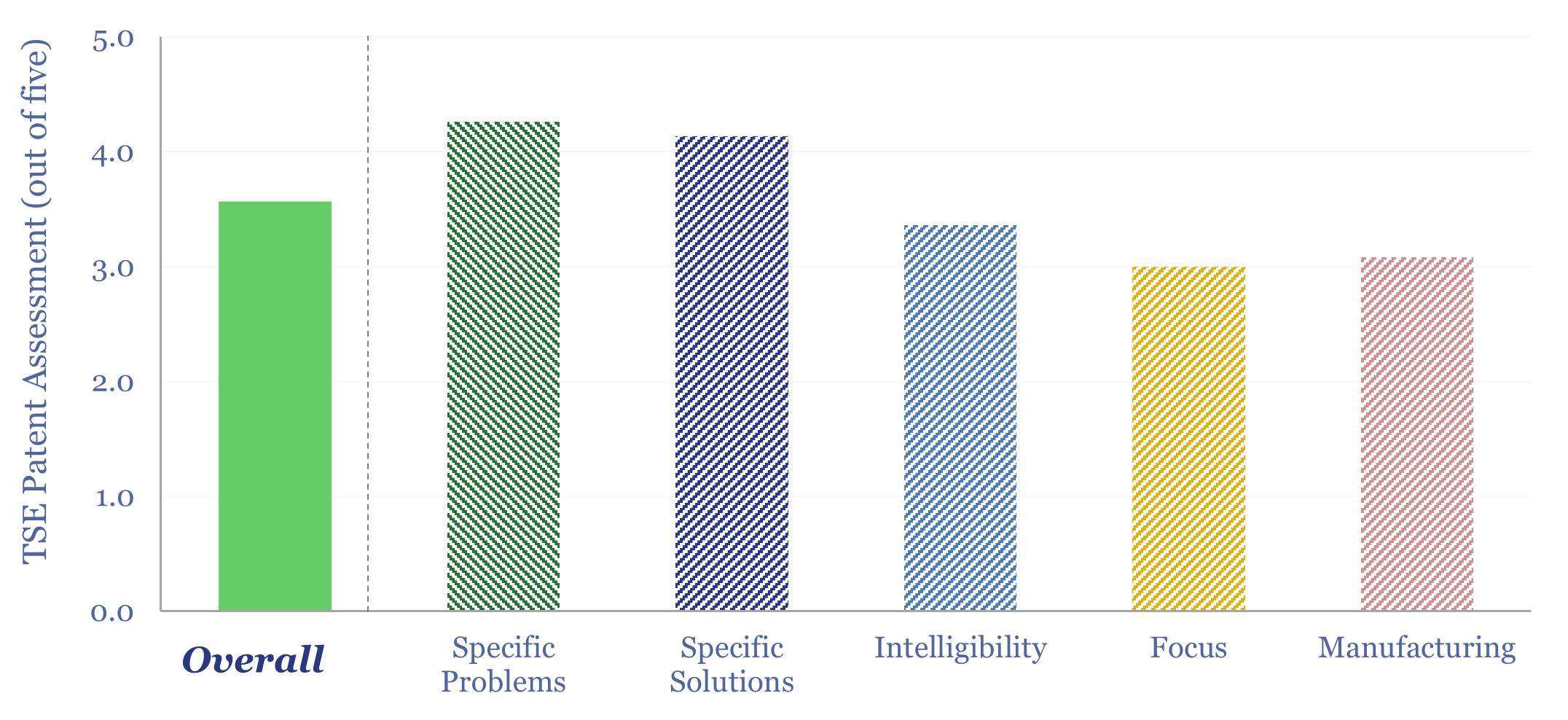
Enphase is a global leader in microinverters. In 2026, it released its first GaN-based microinverter, reducing weight by 25% and volume by 35%. Specific innovations come out in the patents and suggest more radical changes lie ahead, for even more power dense microinverters based on cycloconverter topologies. But does this confer any kind of edge…
-
Solar costs: a breakdown over time?
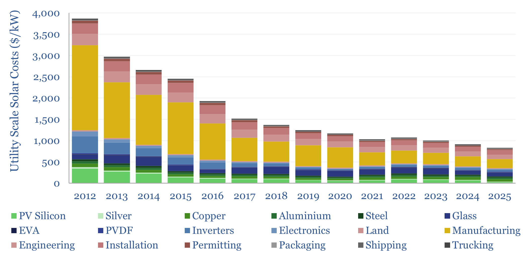
Solar costs have deflated by 70% in the past decade to $800/kW in 2025. 60% has been the scale-up to mass manufacturing, and 40% has been rising efficiency of solar modules. Doubling the efficiency, and thereby the output of solar modules, can halve costs again.
-
Piling works: anchoring construction costs?
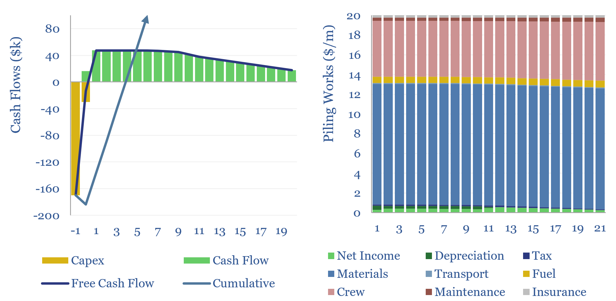
Piling works involve driving long vertical shafts into the ground, which will anchor and support a structure. The costs of piling works can run to $20-200/m, as captured in this data-file, to generate a return and cover the costs of piling operations.
-
Can solar provide round-the-clock power for data-centers?

This 15-page report models the costs of powering AI data centers, and other round-the-clock loads, using only solar and batteries, plus a “penalty” of 100-600 c/kWh for unmet demand. In some locations, solar+batteries will out-compete gas in the future? But an ocean of excess power gets thrown out?
-
Solar+battery co-deployments: cost profiles?
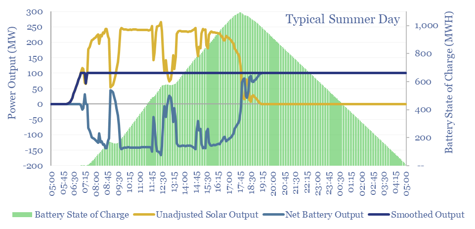
Solar+battery co-deployments allow a large and volatile solar asset to produce a moderate-sized and non-volatile power output, during 40-50% of all the hours throughout a calendar year. The smooth output is easier to integrate with power grids, including with a smaller grid connection. The battery will realistically cycle 100-300 times per year.
-
Wind and solar: total resource estimates?

This 16-page report estimates the total global resource potential from solar and wind. Solar resources are 20-100x larger than for wind. And more economical. Wind turbine wake losses are a growing controversy. Hence, will future renewables growth shift more towards solar?
Content by Category
- Batteries (96)
- Biofuels (44)
- Carbon Intensity (48)
- CCS (64)
- CO2 Removals (9)
- Coal (44)
- Commentary (65)
- Company Diligence (105)
- Data Models (930)
- Decarbonization (163)
- Demand (132)
- Digital (92)
- Downstream (47)
- Economic Model (223)
- Energy Efficiency (76)
- Hydrogen (63)
- Industry Data (311)
- LNG (56)
- Materials (86)
- Metals (90)
- Midstream (45)
- Natural Gas (163)
- Nature (76)
- Nuclear (28)
- Oil (179)
- Patents (39)
- Plastics (44)
- Power Grids (157)
- Renewables (153)
- Screen (139)
- Semiconductors (36)
- Shale (58)
- Solar (73)
- Supply-Demand (53)
- Vehicles (94)
- Video (24)
- Wind (46)
- Written Research (411)