Total useful energy consumption in the US runs at 12,500 TWH pa, or 37 MWH pp pa. But this data-file disaggregates useful US energy consumption by State and by energy source, from 2000 to 2024. The US energy system is not a monolith, but full of amazing regional variation.
This data-file is a breakdown of useful US energy consumption by State and by energy source, from 2000 to 2024. Underlying data are available from the EIA for individual commodities, but requires painstaking scrubbing and aggregation, in order to create an accurate picture, State by State.
59% of the US’s total useful energy now comes from natural gas, up from 52% a decade ago in 2014. The gassiest states are Louisiana (83% of its useful energy is from gas), Alaska (83%), Mississippi (79%), Pennsylvania (77%) and Connecticut (71%). Our US gas outlook is the stuff of dreams.
The States with the lowest gas consumption do not have more renewables, but more oil use for heating. The average state gets 59% of its useful energy from gas, 20% from oil. Hawaii’s mix is 3% and 87%. Vermont’s is 23% and 41%. Maine’s is 37% and 41%. California’s is 55% and 24%. Florida’s is 58% and 26%.
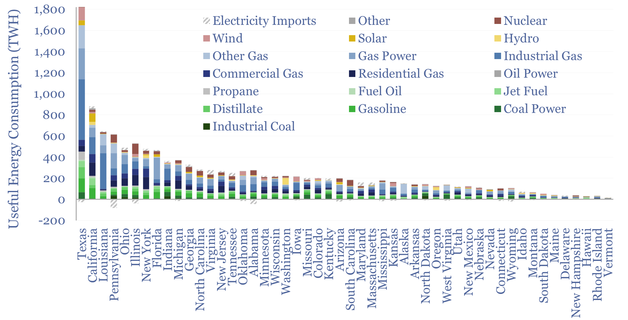
Texas is truly huge, with 8% of the US’s people, yet 15% of its energy consumption, which is 2x the next largest state, California. Overall, the ten largest states by energy consumption explain over 50% of total US energy consumption.
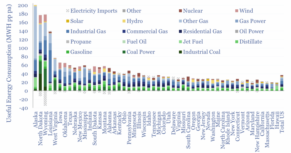
Useful energy consumption per capita is 37 MWH pp pa, ranging from 19 MWH pp pa in Hawaii to 200 MWH pp pa in Alaska, although these are both outliers. The inter-quartile range is from 26 MWH pp pa to 51 MWH pp pa. So what explains these differences?
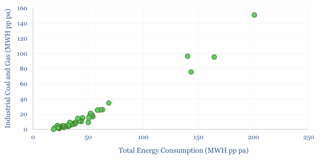
Energy consumption per capita in different US States is 98% correlated with these States’ industrial consumption of coal and gas. So this is the biggest determinant of State-by-State energy consumption differences (chart below).
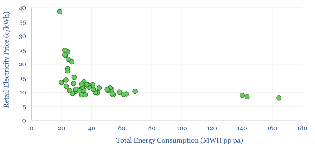
Total energy consumption is also -43% correlated with retail electricity prices, which mostly range from 8c/kWh in North Dakota and Wyoming to 25c/kWh in California and Connecticut, and 40c/kWh in Hawaii (chart below). Interestingly, net migration into or out of these States, over the past decade, is also 27% correlated with their retail electricity prices.
Hydro resources are unequally distributed, explaining 2% of US useful energy, but as much as 28% of the useful energy consumed in Washington State, and 21% in Oregon. The challenge with resources like this is transmission bottlenecks moving the power out of State.
Wind resources are also unequally distributed, explaining 3.6% of the US’s useful energy. But five States – Texas, Iowa, Oklahoma, Kansas, South Dakota – explain half of total US wind generation. South Dakota, Iowa and Kansas get 20-25% of their useful energy from wind.
California is 26% of the US’s total solar generation, sourcing 9% of its useful energy from solar, compared to a national average of 2.4%. But the State with the highest energy share of solar is Nevada at 16%. Lowest are North Dakota, Alaska, Louisiana, West Virginia, Nebraska, Kansas and Oklahoma at 0-0.2%.
Coal explains just 7% of the US’s total useful energy consumption, down from 21% in 2004. But coal still comprises 42% of useful energy in North Dakota, 37% in West Virginia and 36% in Wyoming. Conversely ten States, mostly in New England, get 0% of their energy from coal.
Imports and exports of electricity are also shown in the data-file. The largest electricity exporter is Pennsylvania, due to a large gas and nuclear fleet. The largest electricity importer is Virginia, for data-centers.
Overall, we hope this data-file, which took a couple of days to build out from EIA disclosures, is a useful resource. The charts in the Output tab are shown for 2024. However, you can change the year in cell G6, to produce similar snapshots for any year, from 2000-2024.