Energy transition: classic blunders?!

Classic blunders famously include “never start a land war in Asia” and “never go up against a Sicilian when death is on the line”. But this video sets out what we believe are the three classic blunders that should be avoided by energy analysts, and in the energy transition, based on our own experiences over the past 15-years.


2024 has been a particularly forceful year for busting through blunders, so the video contains important reflections, and early resolutions for 2025, as we are trying to learn from the scars we have accumulated over the past six years of TSE research.

Our first classic blunder for energy analysts is never to assume that what you want to happen in the energy transition will defy the laws of economics. Costs matter. This is why we have ended up building over 200 economic models.

Our second classic blunder for energy analysts is never to write that a new physical or chemical process technology is “right on the cusp of commercialization”. We enjoy exploring new technologies, and deep-diving into patent libraries, but usually new technologies take longer than expected to reach commerciality.

Our third classic blunder is never to bet against semiconductor technologies. This seems important as the biggest theme in 2024 energy markets has been the rise of AI, but another semiconductor technology is solar, and there are other potentially world-changing semiconductor energy technologies waiting in the wings.

In case you are wondering, the video was recorded in Kadriorg Park, in Tallinn, because a sunny winter day in Estonia demands going outside!! Although it was somewhat windy in the park, and hence please accept our apologies that the audio went a little bit funny in places, and makes Rob sound like a robot.

Some recent research that seeks to avoid these energy transition blunders, and draw out opportunities discussed in the video, is linked below…

Grid-forming inverters: islands in the sun?

The grid-forming inverter market may soon inflect from $1bn to $15-20bn pa, to underpin most grid-scale batteries, and 20-40% of incremental solar and wind. This 11-page report finds that grid-forming inverters cost c$100/kW more than grid-following inverters, which is inflationary, but integrate more renewables, raise resiliency and efficiency?


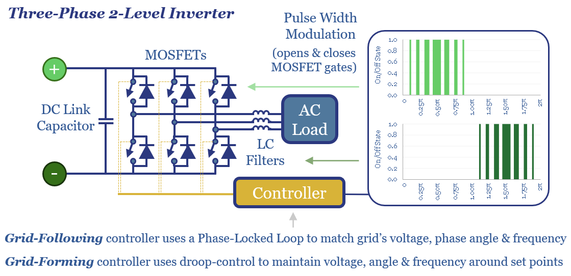
The output of a solar module, a lithium ion battery, or a rectified wind turbine generator comes in the form of Direct Current, i.e., a steady flow of charge.

However, power is transmitted and mostly consumed as Alternating Current, a smooth sine wave of rising and falling voltage and current. This makes it easier to alter voltages in transformers and drive motors that are 40% of global electricity.

Inverters are used to convert DC to AC. In fact, there are two ways of synthesizing an AC waveform from a DC generation source: using pulse-width modulation or by stacking transistors, as outlined on pages 2-3.

But how do the inverters know what waveform to synthesize, i.e., at what frequency, phase angle and in synchrony with the rest of the grid? Historically the answer has almost entirely been via grid-following inverters, as described on page 4.

The issue that arises for energy systems with high penetrations of inverter-based resources – wind, solar and batteries – is that grids become unstable once grid-following inverters start providing around 60-70% of the instantaneous power, as described on pages 5-6.

Grid-forming inverters are the solution to enable stable grids with higher instantaneous shares of inverter-based generation. We outline how they work, and what they cost, on pages 6-7.

Other advantages of grid-forming inverters appear in small grids, in island grids, or when preventing the inefficient operation of rotating generators at low loads, which in turn can amplify fueling costs and CO2 intensity factors by 2-4x, per pages 8-9.

Our estimates of market sizing for grid-forming inverters are outlined on page 10 and a short screen of leading grid-forming inverter companies is on page 11, alongside some conclusions.


Commodity intensity of global GDP in 30 key charts?

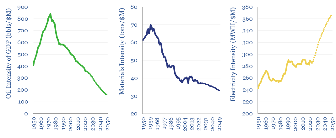
Intensities of oil and other materials for the global GDP have fallen over time, but electricity intensity has increased.

The commodity intensity of global GDP has fallen at -1.2% over the past half-century, as incremental GDP is more services-oriented. So is this effect adequately reflected in our commodity outlooks? This 4-page report plots past, present and forecasted GDP intensity factors, for 30 commodities, from 1973->2050. The -1.5% pa decline in the oil intensity of global GDP is anomalous and could even slow from here. While surprisingly many other commodities show demand increasing in line with, or above GDP growth.


Each $M of global GDP is associated with 80 tons of coal use, 350 bbls of oil, 1,360 mcf of gas, 285 MWH of electricity, 19 tons of steel, 19 tons of wood, 5 tons of plastics, 1.8 tons of ammonia, 1 ton of hydrogen, 0.7 tons of aluminium, 0.3 tons of copper. These inputs are crucial to the global economy, which in turn drives demand for these inputs.

However, a well-known economic effect is that the commodity intensity of GDP declines as GDP rises, or in other words, incremental units of global GDP tend to be more service-oriented and less energy/materials/manufacturing-oriented. This effect is quantified for different commodities on page 2, showing the commodity intensity of GDP from 1950 to 2023, plus our forecasts through 2050.

Oil intensity of global GDP is particularly interesting, showing one of the larger historical declines among different commodity categories in our database. And for good reason. Oil is expensive relative to other energy commodities. And three categories of global oil demand, have been particularly easy to substitute. Hence fifteen different oil product sensitivities to GDP are plotted on page 3.

Each incremental $1k increase in GDP per capita has tended to unlock 0.75 MWH pp pa of primary global energy demand based on regressions back to 1965. This can be explained by incremental global GDP shifting towards services over time. This is charted on page 4.

Overall, the report sense-checks our long-term commodity forecasts, draws out key conclusion into the commodity intensity of GDP, and finds that the historical trend differs sharply by commodity. For surprisingly many commodities, the relationship with GDP is a 1:1 beta, or evan a >1:1 beta, as highlighted on the conclusions page.


Solar plus batteries: the case for co-deployment?

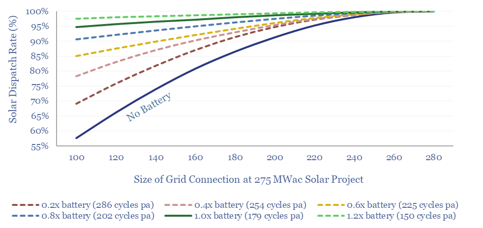
The percentage of solar output dispatched to the grid depending on the capacity of the interconnection and the capacity of co-deployed batteries.

This 9-page study finds unexpectedly strong support for co-deploying grid-scale batteries together with solar. The resultant output is stable, has synthetic inertia, is easier to interconnect in bottlenecked grids, and can be economically justified. What upside for grid-scale batteries?


There are many different reasons that might motivate the deployment of a grid-scale battery, as tabulated on page 2. The most common is at a grid node, for load shifting and power price arbitrage, in ever-steeper duck curves.

But interestingly, we have seen a different model gaining traction in 2022-24, which is co-deploying renewables plus batteries, as explained on page 3.

The key rationale motivating co-deploying grid-scale batteries with renewables is to circumvent power grid bottlenecks and interconnection queues, which are biting for the reasons on page 4.

We can simplify the complexity for how the co-deployment of a battery alongside a utility-scale solar project might work, by returning to a data-file from earlier in 2024, which plotted the output every 5-minutes from a 275MW solar project in Australia. Our ‘battery rules’ and modeling framework are explained on page 5.

The results are fascinating. We find that battery co-deployments can allow a solar installation to dispatch about 95% of its power through a 65% smaller grid connection, while the asset can generate a highly stable, high-inertia power output across c50% of all hours across the year, which makes 2-3x better use of bottlenecked transmission capacity than a raw solar output. These numbers and sensitivities are explained on pages 6-8.

Co-deploying batteries is more expensive than standalone solar, but it can be economically justified, for the reasons on page 9.

Overall, our analysis may help the deployment of solar, LFP batteries and their supply chains.


Long-duration storage: dirtier than gas peakers?

The CO2 credentials of long-duration batteries may be as bad as 0.35-2.0 kg/kWh, which is worse than gas peakers, or even than coal power. Grid-scale batteries are best deployed in high-frequency applications, to maximize power quality, downstream of renewables. But we were surprised to find that there is almost no net climate benefit from turning off gas peakers in favor of long-duration, low-utilization batteries.


The Energy and CO2 paybacks of new energies are often called into question. Mostly wrongly, in our view. A solar installation repays its up-front energy and CO2 costs after 1.5-2 years and goes on to have a 10x energy and CO2 payback. A wind installation repays its up-front energy and CO2 costs after 1-year and goes on to have a 20x energy and CO2 payback. It does not help that there are some outdated studies from the mid-2000s still swirling around on the internet.

The Energy and CO2 paybacks of batteries, however, are more nuanced, and depend on how the batteries are used. Our build-up estimates that producing a lithium ion battery requires 175 kWh/kWh of energy and emits 100 kg/kWh of CO2. When this battery is installed in an electric vehicle, achieving 2,250 charge-discharge cycles over the useful life of the battery, then the breakeven comes after 1-year and the total payback is 10x.

For grid-scale batteries, there are many different potential business models. Our favorite is to install grid-scale batteries downstream of renewables projects, to cushion the high short-term volatility of wind, high short-term volatility of solar, provide synthetic inertia, and thus ensure high power quality in increasingly renewable-heavy grids. We see this model playing around already as renewables+batteries co-deployments accelerate. A battery like this can realistically achieve 1-3 charge-discharge cycles per day.

But some renewables advocates have grander ambitions, to use batteries for long-duration storage, in order to push renewables past their natural limits. Renewables will naturally peak at 50-55% of power grids in the best geographies, which can maybe be increased to 60% with demand shifting and some sensible deployments of batteries, which mainly do intra-day load shifting. But pushing renewables beyond this level will incur astronomical costs.

The idea of long-duration storage is to bridge longer periods of low-wind and/or low-solar generation, via batteries that store power for several days, weeks or months, until this energy is needed. This role is currently served by gas peakers, which make up c40% of the gas generation fleet but have utilization rates ranging from 2-20%. Across our research, we see gas plants increasingly being run as peakers, and rising value of peakers, due to increasing grid volatility. This is all due to the economics of gas peakers. Whereas the costs of long-duration, low-utilization batteries are crazy-high, at several hundred cents per kWh.

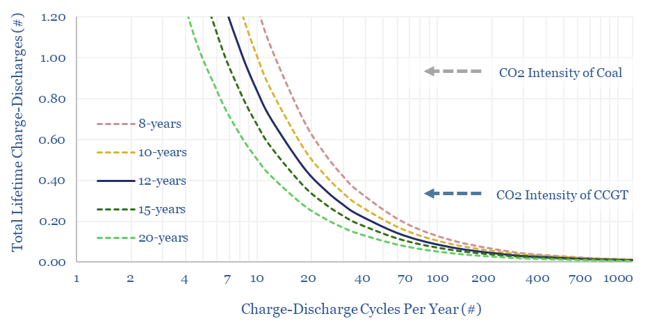
But the really crazy feature of long-duration energy storage, if it is done via lithium ion batteries, is that the full-cycle CO2 intensity may actually be higher than sticking with gas or even coal. To see this, consider the chart below. A battery that fully charges just 10-times per year, for 10-years, will amortize 100 kg/kWh of battery manufacturing CO2 across 100 total charge-discharge cycles, thus coming out at 1kg/kWh of CO2 intensity. That is dirtier than coal power.

The CO2 intensity of long-duration battery storage depends on the number of charge-discharge cycles per year and asset lifetime. Low utilization batteries may be more CO2 intensive than fossil generation.

Similarly, a long-duration battery that fully charges and discharges 2x per month, for 12-years, will amortize 100 kg/kWh of up-front battery manufacturing CO2 across 288 charge-discharge cycles over its lifetime, coming out at 0.35 kg/kWh, which is about the same as a typical CCGT power plant today. In other words, there is almost no net climate benefit from turning off the gas peakers in favor of such long-duration, low-utilization batteries.

The chart also confirms that the CO2 credentials are exceptionally good for batteries that get flexed multiple times per day, for a decade or more. Here, the batteries may amortize 100 kg/kWh of up-front manufacturing CO2 across 4,000 – 14,000 charge-discharge cycles, or maybe slightly less if limited by battery degradation, thereby achieving an exceptionally low 0.01-0.03 kg/kWh of total embedded CO2 intensity.

Rapidly cycled batteries are the way to go, for economic costs and CO2 costs, especially where they are co-deployed with renewables in order to ensure high power quality. We cannot see much rationale for replacing gas peakers with long-duration and low-utilizisation batteries. Our own outlook is that gas peakers will retain a long-lasting role in evolving power grids. There are growing opportunities to lower the CO2 footprint of gas power.

Energy research in the age of AI?

How will AI change the research and investment worlds? Our view is that large language models (LLMs) will soon surpass human analysts in assimilating and summarizing information. Hence this video explores three areas where human analysts can continue to earn their keep, and possibly even help decision-makers beat the ‘consensus engines’.


We have spent much of 2024 writing about the rise of AI, and how it will change the energy industry: unlocking new step-changes in industrial efficiency, next-gen DAC or autonomous vehicles; while re-exciting gas generation, compounding grid bottlenecks, wolfing up grids’ spare capacity, boosting fiber-optics, industrial cooling, transformers and harmonic filters.

But how will these AI models change the research and investment worlds? This video sees decreasing value in research that assimilates and summarizes information already floating in the public domain. Machines can increasingly do that. But where will the machines struggle?

By definition, Large Language Models are ‘consensus engines’. These AIs are trained by throwing billions of tokens at an algorithm, which must learn to guess the most likely tokens to follow on from previous tokens. Or in other words, they will average out all of the wonky views on the internet, thereby arriving at a stale consensus!!

AIs are also not human. Humans may retain an edge in understanding what is on the minds of decision-makers, undertaking novel analysis to address these debates, pitching the conclusions in ways that will engage human readers, and relating conclusions back to their actual human experiences. Being a good analyst is ultimately about empathy.

Man versus machine? We are considering a new series of videos, where we will identify a topic that is particularly on the minds of our clients, then pit Rob against ChatGPT. Rob will present his best answer to the question, based on the TSE research library then ask ChatGPT to critique his answer. Then Rob will critique ChatGPT’s answer.

Since AIs are consensus machines, this exercise may help to draw out counter-consensus ideas. So please do write in if you would like to suggest any topics for Rob to debate with ChatGPT in the first instalment of ‘Man versus Machine’.

LNG trucks: Asian equation?

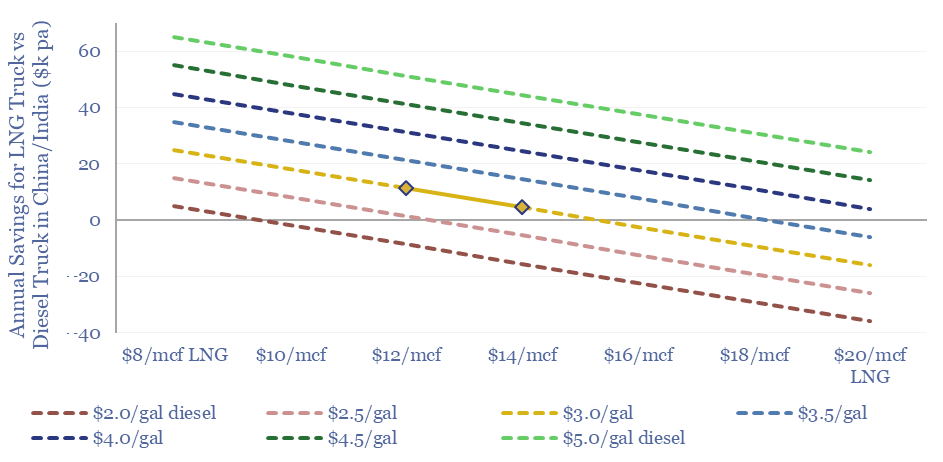
LNG trucking is more expensive than diesel trucking in the developed world. But Asian trucking markets are different, especially China, where exponentially accelerating LNG trucks will displace 150kbpd of oil demand in 2024. This 8-page note explores the costs of LNG trucking and sees 45MTpa of LNG displacing 1Mbpd of diesel?


When we have evaluated LNG trucks in Western markets, such as the US or Europe, they are 20% more expensive than diesel trucks, per our models of truck costs.

What has surprised us is how different Asian trucking is from Western trucking, after tabulating the prices for 100 new trucks, with different fuels, and on sale in different geographies (see page 3).

Hence the costs of trucking are compared in Western markets and Asian markets, especially for China and India, on page 4.

Another key difference is that while the costs of LNG trucking are higher in the US or Europe, they are lower in China or India. A sensitivity analysis is given on page 5.

Other advantages for gas-powered trucks are spurring adoption in China in 2024. Some observations on the advantages are on page 6.

What impacts on global oil markets and global LNG markets, if gas-powered trucking continues accelerating in China and India? We can see 1Mbpd of oil being displaced, and substituted for 45MTpa of LNG, impacting our oil demand models and LNG models.

The other angle that excites us in energy commodities is rising volatility, linked to geopolitics, and the ramp of volatile wind and solar, whose regional output varies +/- 10% per year, and whose global output varies +/- 5% per year. This creates volatility in demand for backups โ€“ e.g., LNG โ€“ and greater regional arbitrage potential. LNG trucks play into this theme. Companies and opportunities are noted on page 8.


Underlying calculations behind this report, and data into truck costs by geography, can be found in our overview of trucking costs.

Can solar reach 45% of a power grid?

Can solar reach 45% of a power grid? This has been the biggest pushback on our recent report, scoring solar potential by country, where we argued the best regions globally – California, Australia – could reach 45% solar by 2050. Hence today’s model explores what a 45% solar grid might look like. Generation is 53% solar. 8% is curtailed, 35% is used directly, 7% is used via demand-shifting and 3% is time-shifted via batteries.


Solar can easily reach 30% of a 100MW power grid, as shown in the chart below. Specifically, to calculate this curve, we took the actual distribution of power demand in California, and the actual distribution of solar insolation as calculated from first principles. As both of these variables vary seasonally, we calculated balances for each month separately, then averaged together all twelve months of the year.

Example power grid where solar makes up 30% of a 100MW grid. Yearly average load-profile.

Can solar reach higher shares of the grid? We are going to set a limit that 25% of baseload generation (i.e., non-solar generation) can never be curtailed, as it is needed for grid stability, both instantaneously (e.g., due to inertia) and intra-day, to ramp up if/when solar stops generating. Hence ramping up solar beyond 30% of a grid requires some adaptations.

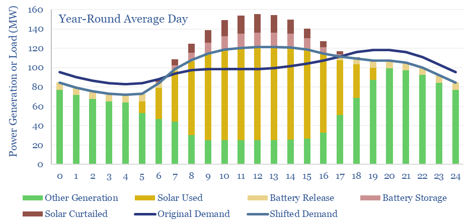
Can solar reach 45% shares of a grid? We think the answer to this question is yes, and the chart below shows our best attempt to model what such a grid would look like. It uses three adaptations.

Example power grid where solar makes up 45% of a 100MW grid. Yearly average load-profile.

Curtailments are not the end of the world. If 15% of the solar that is generated fails to dispatch, then this requires the ‘other 85%’ to charge about 15% more, in order to achieve the same IRRs. In other words, the LCOPE of all solar in our grid re-inflates from 6-7c/kWh to 7-8c/kWh. This is mildly inflationary, but basically fine. But a challenge for deploying further solar from here, is that a c15% average curtailment rate is associated with a c50% marginal curtailment rate, so building incremental solar from here will likely cost 12-15c/kWh (see below).

Demand shifting is the second adaptation that allows solar to reach higher shares. It is generally cheaper to move parts of the original demand curve (dark blue line) to when the solar is generating (yielding the light blue line), than to store solar energy in a battery and re-release it when solar is not generating. Our model has the total demand curve shifted by +/- 8% on average throughout the year. The need for demand shifting is highest in May, at +/- 15%. And highest at midday in May, when 34MW of excess demand must be absorbed, in our 100MW grid.

EV charging helps to contextualize our demand-shifting numbers. A typical EV has a 70kWh battery, and might charge at 10kW for 7-hours. Hence absorbing c34MW of excess demand in our 100MW grid is going to require 3,400 EVs, or 34EVs per MW of average load. For comparison, our EV sales forecasts show the US reaching 35M EVs on the road by 2030, which would equate to 70 EVs per MW of average US load. As long as about half of the US’s EVs are plugged into a solar-energized charger, there is no problem absorbing this excess demand.

Battery storage is the third adaptation that allows solar to reach higher shares of a power grid. In our scenario above, supplying 45% of the electricity in a 100MW grid with solar, requires building 200MW of solar and 30MW of batteries. The batteries absorb and re-release 6% of the solar generation, and end up providing 3.5% of the total grid. This varies from 2% in December (the month of lowest solar insolation) to 5% in May (the month with the largest excess of solar to absorb or curtail, charts below).

Example power grid where solar makes up 45% of a 100MW grid. December average load-profile.
Example power grid where solar makes up 45% of a 100MW grid. May average load-profile.

The reason we think grids will lean less on batteries is the cost of batteries. Each MW of batteries charges and discharges 240 times per year, which implies a storage spread of 30c/kWh. Across 3% of the total grid, this raises total grid costs by 1c/kWh.

Possible but inflationary? Overall, it is possible for solar to reach 45% of a power grid, along the lines outlined above. But an additional 3-5c/kWh is added in transmission and distribution costs (due to falling grid utilization), +1c/kWh in curtailment costs, +1c/kWh in battery costs, and 55% of the grid must still come from other sources, where infrastructure must still be maintained and included in rate bases. Renewables may add 4-6c/kWh to end consumer costs, in absolute terms, but remain a low-cost way to halve the CO2 intensity of power grids, while achieving other environmental and geopolitical goals.

It is not unrealistic for solar to reach 45% of the grid, in countries that are particularly well-placed for solar, as per our note below.

The model linked below is a nice tool for stress-testing different options around the ultimate share of solar in grids, and the need to lean on curtailment, demand-shifting and batteries. You can vary the installed base of solar, the share of non-solar baseload that cannot be curtailed, percent of excess solar that is demand-shifted, excess solar that is stored, and see the resulting power grid distribution, hour-by-hour, month-by-month.

AI and power grid bottlenecks?

Video presentation regarding Thunder Said Energy's research and insights on AI and power grid bottlenecks.

The number one topic in energy this year has been the rise of AI. Which might not seem like an energy topic. Yet it is inextricably linked with power grid bottlenecks, the single biggest issue for energy markets in the mid-late 2020s. The goal of todayโ€™s video is to recap our key conclusions. There is an accompanying presentation for TSE clients.


AI and power grid bottlenecks are becoming inextricably interlinked. The reasons and implications are explored in this video. The button above is for a 17-page presentation, in case you would like to follow along with the video, with underlying charts and data, and is available to TSE clients.

Presentation regarding Thunder Said Energy's research and insights on AI and power grid bottlenecks.

The energy consumption of AI is discussed in the first portion of the video, estimated at 150GW globally in 2030, adding 1,000 TWH of new electricity demand. Together with other electrification initiatives, US electricity demand growth quintuples?

The justification for AI is that it will unlock fascinating efficiency gains and game-changing technologies. We explore this idea in the second section of the video. Areas that stand out to us include next-generation DAC, materials, autonomous vehicles, thermoelectric semiconductors and superconductors.

The more immediate bottlenecks for AI are bottlenecks in powering new AI data-centers, amidst deepening power grid bottlenecks. Data-centers want cheap, reliable, low-carbon power, available ASAP, from the power grid, at a location of their choosing near their end customers. Unfortunately, this is a unicorn. It does not exist. The third portion of the video assesses which variables are ‘must haves’ and can’t be compromised.

The conclusion from AI and power grid bottlenecks leads us to shale basins? When we assess all of the lower-carbon options, their levelized costs and other dimensions that AI will end up prioritizing, then we find it will be best to circumvent long-standing bottlenecks in the power and gas grids, by situating AI data-centers near fast-to-market energy sources, then move the data via fiber-optics.

We look forward to discussing actionable implications of this research with TSE clients. Please email us if we can help you, or if you would like to explore a discussion. In the meantime, our best ideas for further reading are summarized on page 17 of the presentation below.


Methane leaks: by gas source and use

Methane leakage rates in the gas industry vary by source and use. Across our build-ups, the best-placed value chains are using Marcellus gas in CCGTs (0.2% methane leakage, equivalent to 6kg/boe, 1kg/mcfe, or +2% on Scope 3 emissions) and/or Permian gas in LNG or blue hydrogen value chains (0.3%). Residential gas use is closer to 0.8-1.2%, which is 4-6kg/mcfe; or higher as this is where leaks are most likely under-reported.

Today’s short note explains these conclusions, plus implications for future gas consumption. Underlying numbers are here.


Methane, as explained here, is a 120x more potent greenhouse gas in the atmosphere than CO2. It does degrade over time, mediated by hydroxyl radicals. So its 20-year impact is 34x higher than CO2 and its 100-year impact is 25x higher. Therefore, if c2.7-3.5% of natural gas is โ€œleakedโ€ into the atmosphere, natural gas could be considered a โ€œdirtierโ€ fuel than coal (chart below,ย model here).

CO2 emissions of natural gas use depending on the amount of methane leaked. Once leaks reach 3% and above, then natural gas could be considered as 'dirty' as coal.

For a fair comparison an important side-note, not reflected in the chart above, is that methane is also leaked into the atmosphere when producing coal. This is because natural gas often desorbs from the surface of coal as it is mined. Our best attempt to quantify the leakage rate is that it is equivalent to 33kg/boe, equivalent to leaking 1.2% of the methane from a gas value chain (apples to apples, using a methane GWP of 25x).

In other words, if a gas value chain is leaking less than 1.2% of its methane, then its methane leakage rates are lower than the energy-equivalent methane leakage rate from producing coal. If a gas value chain is leaking more than 1.2% of its methane, then its methane leakage rate is higher than from producing coal.

One of the challenges for quantifying methane leakage across natural gas value chains is that, by definition, it is a chain. Gas molecules move from upstream production to processing stages such as sweetening and dehydration, through transmission lines, then through distribution lines, then to end consumers such as power plants, LNG plants, ammonia plants, hydrogen reformers, industrial heating and households.

Hence in the title chart above, we have attempted to build up the methane intensity of US gas value chains, looking line by line, and using the data-files indexed below. For example, as of our latest data-pull, methane leakage rates are 0.06% of produced gas in the Appalachian, 0.19% in the Permian, 0.22% in the Bakken, 0.34% in the Gulf Coast and 0.49% in the MidCon.

Putting the pieces together, we think that the total methane leakage rate across the value chain can be as low as 0.2-0.3% when gas from the Marcellus or Permian are used in gas power (e.g., for an AI data-center, LNG plant or for blue hydrogen). This is just 6-10 kg/boe of Scope 1 CO2, or 1-1.5 kg/mcfe (by contrast, combusting natural gas emits 56kg of CO2 per mcfe). And the best producers may achieve even lower, via the growing focus on mitigating methane.

Conversely, using gas for home heating and home cooling likely carries a higher methane leakage rate, of 0.8-1.2%, as there is more small-scale distribution, and smaller residential consumers are not always as discerning about conducting regular maintenance or checking for leaks. 0.8-1.2% methane leakage is equivalent to 23-33 kg/boe, or 4-6 kg/mcfe.

There are also risks with the numbers above, which is the systematic under-reporting of methane leakage rates, both upstream and further downstream in the value chain. Large oil and gas companies are required to measure and report their methane emissions, but Mrs Miggins is not. Hence, we think the numbers in our charts may be skewed to the upside.

All of this supports a growing role for natural gas in combined cycle gas turbines, and helping to alleviate power grid bottlenecks amidst the rise of AI, plus US LNG and blue hydrogen value chains. Our US decarbonization model has power rising from c40% to c50% of the US gas market by 2030, compensated by lower use in residential heat.

Copyright: Thunder Said Energy, 2019-2025.