Global average temperature data show 1.2-1.3C increases since pre-industrial times and continue rising at 0.02-0.03C per year, according to data-sets from NASA, NOAA, the UK Met Office and academic institutions. This note assesses their methodologies and controversies. Uncertainty in the data is likely much higher than admitted. But the strong upward warming trend is robust.
2020 is said to be the joint-hottest year on record, tied with 2016, which experienced a particularly sharp El Nino effect. 2020 temperatures were around 1.2C warmer than 1880-1900, on data reported by NASA’s Goddard Institute for Space Studies (GISS), and 1.3C warmer on data reported by the UK Met Office’s Hadley Center and East Anglia’s Climatic Research Unit (HadCRUT).
2020’s hot temperatures were partly influenced by COVID-19, as “global shutdowns related to the ongoing coronavirus (COVID-19) pandemic reduced particulate air pollution in many areas, allowing more sunlight to reach the surface and producing a small but potentially significant warming effect”, per NASA. But the largest component of the warming is attributed to rising CO2 levels in the Earth’s atmosphere, which reached 414 ppm.
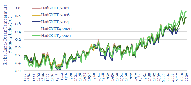
Overall, NASA’s data show temperatures have warmed by 0.02C per year over the past 50-years, 0.023C per year over the past 25-years and 0.03C per year over the past 10-years (chart above). Likewise, HadCRUT shows 0.02C per year over the past 50-years, 0.022C/year over the past 25-years and 0.024C/year over the past 10-years (below). Both data-sets suggest the rate of warming is accelerating.
How accurate are the data-sets? To answer this question, this note delves into global average surface temperature records (GASTs). It is not as simple as shoving a thermometer under the world’s armpit and waiting three minutes…
How are global average surface temperatures measures?
Surface air temperatures (SATs) are measured at weather stations. 32,000 weather stations are currently in operation and feed into various GAST indices.
Surface sea temperatures (SSTs) are measured at the surface of the sea as a proxy for immediately overlying air temperatures. Up until the 1930s, SSTs were most commonly taken by lowering a bucket overboard, and then measuring the temperature of the water in the bucket. This most likely under-estimated water temperatures in the past. From 1930-1990, SSTs were mostly measured from ships’ engine intakes. From 1990 onwards, SSTs were most commonly measured by specialized buoys and supplemented by satellite imagery.
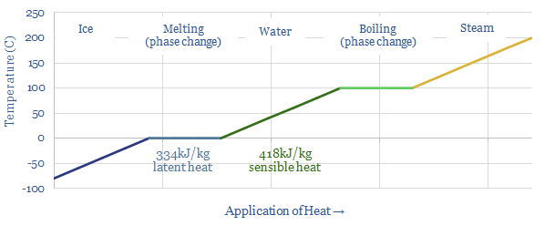
Sea ice is particularly complicated. It takes 80% as much heat to melt 1kg of ice as it takes to boil 1kg of water, which means that the surface temperatures above sea ice can be higher than 0C. But it is difficult to access locations that are iced over with permanent weather stations. So temperatures over sea ice are often modelled not measured.
Temperatures are measured at each of these sites noted above. However GAST indices do not take raw temperature data as their inputs. First, absolute temperatures vary markedly between different weather stations that are scattered over short distances (e.g., due to shade, aspect, elevation, wind exposure), making the readings too site-specific. Moreover, the global average temperature is actually 3.6C higher in July-August than it is in December and January, because land masses experience greater seasonal temperature fluctuation than oceans, while two-thirds of the world’s land is in the Northern hemisphere, experiencing summer conditions in July-August. This would introduce too much noise into the data.
Temperature anomalies are the input to GAST indices. These are calculated by comparing average temperatures throughout each day with a baseline temperature for that site at that particular time of year. These anomalies are highly correlated, site-by-site, across hundreds of kilometers. By convention the 30-year average period from 1951-1980 is used as the baseline by NASA.
Averaging is used to aggregate the temperature anomaly data from different temperature stations across regions. Regional anomalies are then averaged into a global anomaly. Each region is weighted by its proportionate share of the Earth’s surface area. Thus a GAST index is derived.
Controversies: could there be systematic biases in the data?
Very large data-sets over very long timeframes are complicated beasts. They are prone to being revised and adjusted. Some commentators have worried that there could be systematic biases in the revisions and adjustments.
More data. As an example, NOAA digitized and added more observations from the early 20th century into its methodology in 2016. This caused prior data to be re-stated. But this reason seems fair and relatively uncontroversial.
New weather stations are slightly more controversial. How do you know what the baseline temperature would have been at a site in 1950-1980, if the first weather station was only added there in 2000? Some of the baselines must therefore be derived from models, rather than hard data. Some commentators have criticized that the models used to set these baselines themselves pre-suppose anthropogenic climate change, assuming past temperatures were cooler, thereby placing the cart before the horse. This fear may be counter-balanced by looking at weather stations with longer records. For example, of the 12,000 weather stations surveyed by NASA’s 2020 data, as many as 5,000 may have records going back beyond 1930.
Urban heat islands are somewhat more controversial again. Imagine a weather station situated in the countryside outside of a city. Over the past century, the city has grown. Now the weather station has been engulfed by the city. Cities will tend to be 1-3C warmer than rural lands, due to the urban heat island effect. So for the data to remain comparable, past data must be adjusted upwards. GISS notes that the largest change in its calculation methodology over time has been to adjust for urban heat islands. Although some commentators have questioned whether the adjustment process is at risk of not being extensive enough. This fear may be counter-balanced by the relatively small portion of weather stations experiencing this engulfing effect.
The adjustment of anomalous-looking data is most controversial. Algorithms are used to sift through millions of historical data-points and filter away outliers that run counter to expectations. The algorithms are opaque. One set of algorithms ‘homogenizes’ the data of stations showing divergent patterns to its neighbours, by replacing that station’s data with that of its neighbours. As the general trend has been for a warming climate, this means that some stations showing cooling could be at risk of getting homogenized out of the data-set, causing the overall data to overstate the degree of warming.
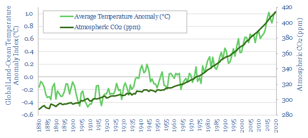
The data also do not correlate perfectly with rising CO2 levels: especially in 1880-1920, which appears to get cooler; and around the Second World War, which appears to produce a spike in temperatures then a normalization. On the other hand, no one is arguing that CO2 is the sole modulator of global temperature. El Nino, solar cycles and ‘weather’ also play a role. And despite the annual volatility, the recent and most accurate data from 1970+ rise in lockstep with CO2.
The most vehement critics of GAST indices have therefore argued that past temperature adjustments could be seen to contribute over half of the warming shown in the data. There is most distrust over the revisions to NASA’s early temperature records. One paper states “Each new version of GAST has nearly always exhibited a steeper warming linear trend over its entire history. And, it was nearly always accomplished by systematically removing the previously existing cyclical temperature pattern. This was true for all three entities providing GAST data measurement, NOAA, NASA and Hadley CRU”.
Uncertainties should not detract from the big picture
Our own impression from reviewing the evidence is that the controversies above should not be blown out of proportion. The Earth is most likely experiencing a 0.02-0.03C/year warming trend over the past 10-50-years.
Multiple independent bodies are constructing GAST indices in parallel, and all seem to show a similar warming trend. Pages could be written on the subtle differences in methodologies. For example, NOAA and the Berkeley Earth project use different, more complex methodologies than GISS, but produce similar end results. NOAA, for example, does not infer temperatures in polar regions that lack observations, and thus reports somewhat lower warming, of just 1.0C. This is because Arctic warming exceeds the global average, as minimum sea ice has declined by 13% each decade, allowing more sunlight to be absorbed and in turn, and causing more warming.
No doubt the construction of a global average temperature index, covering the whole planet back to 1880 is fraught with enormous data-challenges that could in principle be subject to uncertainties and biases. But it is nothing short of a conspiracy theory to suggest that multiple independent agencies are wilfully introducing those biases. And then lying about it. The Q&A section of NASA’s website states “Q: Does NASA/GISS skew the global temperature trends to better match climate models? A: No”.
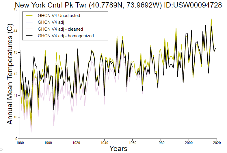
You can also review all of the adjusted and unadjusted data for individual weather stations side-by-side, here. If we take the example below, in New York’s Central Park, the adjusted/homogenized and unadjusted data are not materially different, especially in recent years. Although the uncertainty is visibly higher for the 1880-1940 data.
Criticisms of the NASA data adjustments, cited in the skeptical technical paper above, do not appear particularly well founded either. It is true that NASA’s 1980s estimates of temperatures in 1920-1980 have been progressively lowered by 0.1-0.3C from 1981 to 2017, which could be seen to over-exaggerate the warming that has occurred since that time-period. However this is mostly because of bad data back in the pre-digital world of the 1980s. In fact, NASA’s 1981 data-set did not include any sea surface temperature data and only included data from 1,219 land stations, all in the Northern hemisphere.
Revisions in more recent data-sets are minimal. For example, HadCRUT’s data are shown below.
Another review of the data concludes that the net effect of revisions has been to under-state global temperature increases, by adjusting the temperatures in 1880-1930 upwards, which would under-state warming relative to this baseline (here). This is actually a blend of effects. Temperatures on land have generally been adjusted downwards by 0.1-0.2C in the 1880-1950 timeframe. Temperatures at sea have been adjusted upwards by 0.2-0.3C over 1880-1935. The original article also contains some helpful and transparent charts.
Finally, recent data are increasingly reliable. In total, 32,000 land stations and 1.2M sea surface observations are now taken every year, across multiple data-sets. Hence GISS estimates the uncertainty range in its global annual temperature data is +/- 0.05C, rising to 0.1-0.2C prior to 1960, at a 95% confidence level. From our review above, we think the uncertainty is likely higher than this. But the strong upwards trend is nevertheless robust.
Conclusions: 30-years to get to net zero?
Global temperatures are most likely rising at 0.023-0.03C per year, and 1.2-1.3C of warming has most likely occurred since pre-industrial times. This would suggest 30-years is an appropriate time-frame to get to Net Zero while limiting total warming to 2C, per our recent research note below.
A paradox in our research is that the $3trn per year economic cost of reaching net zero by 2050 seems to outweigh the $1.5trn per year economic cost of unmitigated climate change. One of the most popular solutions to this paradox, per the recent survey on our website below, was to consider re-optimizing and potentially softening climate targets. There may be economic justifications for this position. But the temperature data above show the result could be materially more warming.
Our own view is that the world should also decarbonize for moral reasons and as an insurance policy against tail-risks (arguments 3 and 6, above). And it should favor decarbonization pathways that are most economical and also restore nature (note below).
Our climate model, including all of the temperature data cited in this report are tabulated in the data-file below.