All the coal in China: our top ten charts?

China's coal industry

Chinese coal provides 15% of the world’s energy, equivalent to 4 Saudi Arabia’s worth of oil. Global energy markets may become 10% under-supplied if this output plateaus per our ‘net zero’ scenario. Alternatively, might China ramp its coal to cure energy shortages, especially as Europe bids harder for renewables and LNG post-Russia? Today’s note presents our ‘top ten’ charts on China’s opaque coal industry.


China’s coal industry provides 15% of the world’s energy and c22% of its CO2 emissions. These numbers are placed in context on page 2.

China’s coal production policies will sway global energy balances. Key numbers, and their impacts on global energy supply-demand, are laid out on page 3.

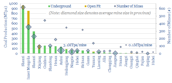
China’s coal mines are constellation of c4,000 assets. Some useful rules of thumb are given on the breakdown on page 4.

China’s coal demand is bridged on page 5, including the share of demands for power, industrial heat, residential/commercial heat and coking.

Coal prices are contextualized on page 6-7, comparing Chinese coal with gas, renewables, hydro and nuclear in c/kWh terms.

Coal costs are calculated on page 6-8. We model what price is needed for China to maintain flat-slightly growing output, while earning double-digit returns on investment.

Accelerating Chinese coal depends on policies, however, especially around a tail of smaller and higher cost mines. The skew and implications are explored on page 7-8.

China’s decarbonization is clearly linked to its coal output. We see decarbonization ambitions being thwarted in the 2020s, per page 8.

Methane leaks from China’s coal industry may actually be higher than methane leaks from the West’s gas industry (page 9).

Chinese coal companies are profiled, and compared with Western companies, on pages 10-11.

For an outlook on global coal production, please see our article here.

Battle of the batteries: EVs vs grid storage?

EVs versus grid scale storage shortage

Who will ‘win’ the intensifying competition for finite lithium ion batteries, in a world that is hindered by shortages of lithium, graphite, nickel and cobalt in 2022-25?

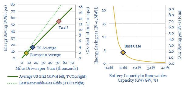
Today’s note argues EVs should outcompete grid storage, as the 65kWh battery in a typical EV saves 2-4x more energy and 25-150% more CO2 each year than a comparably sized grid battery.


Competitor #1: Electrification of Transport?

The energy credentials of electric vehicles are laid out in the data-files below. A key finding is their higher efficiency, at 70-80% wagon-to-wheel, where an ICE might only achieve 15-20%. Therefore, energy is saved when an ICE is replaced by an EV. And CO2 is saved by extension, although the precise amount depends on the ‘power source’ for the EV.

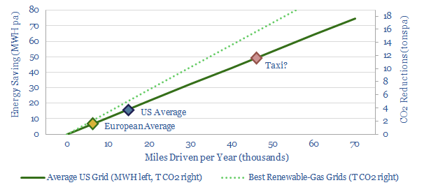
When we interrogate our models, the single best use we can find for a 65kWh lithium ion battery is to electrify a taxi that drives 20,000-70,000 miles per year. This is a direct linear pass-through of these vehicles’ high annual mileage, with taxis in New York apparently reaching the upper end of this range. Thus the higher efficiency of EVs (vs ICEs) saves 20-75MWH of energy and 7-25 tons of CO2 pa.

More broadly, there are 1.2bn cars to ‘electrify’ in the world, where the energy and CO2 savings are also a linear function of miles driven, but because ordinary people have their cars parked around 97% of the time, the savings will usually be 10-20MWH per vehicle pa.

(Relatedly, an interesting debate is whether buying a ‘second car’ that is electric is unintentionally hindering energy transition, if that car actually ends up under-utilized while consuming scarce LIBs, which could be put to better use elsewhere. As always, context matters).

Competitor #2: Grid-Scale Batteries?

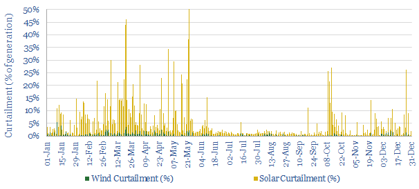
The other main use case for lithium ion batteries is grid-scale storage, where the energy-saving prize is preventing the curtailment of intermittent wind and solar resources. As an example, curtailment rates ran at c5% in California in 2021 (data below).

The curtailment point is crucial. There might be economic or geopolitical reasons for storing renewables at midday and re-releasing the energy at 7pm in the evening, as explored in the note below. But if routing X renewable MWH into batteries at midday (and thus away from the grid) simply results in X MWH more fossil energy generation at midday instead of X MWH of fossil energy generation at 7pm, then no fossil energy reductions have actually been achieved. In order for batteries to reduce fossil energy generation, they must result in more overall renewable dispatch, or in other words, they must prevent curtailment.

There are all kinds of complexities in modelling the ‘energy savings’ here. How often does a battery charge-discharge? What percent of these charge-discharge cycles genuinely prevent curtailment? What proportion of curtailment can actually be avoided in practice with batteries? What round-trip efficiency on the battery?

To spell this out, imagine a perfect, Utopian energy system, where every day, the sun shone evenly, and grid demand was exactly the same. Every day from 10am to 2pm, the grid is over-saturated with solar energy, and it is necessary to curtail the exact same amount of renewables. In this perfect Utopian world, you could install a battery, to store the excess solar instead of curtailing it. Then you could re-release the energy from the battery just after sunset. All good. But the real world is not like this. There is enormous second-by-second, minute-by-minute, hour-by-hour, day-by-day volatility (data below).

Thus look back at the curtailment chart below. If you built a battery that could absorb 0.3% of the grid’s entire installed renewable generation capacity throughout the day, then yes, you would get to charge and discharge it every day to prevent curtailment. But you would only be avoiding about 10% of the total curtailment in the system.

Conversely, if you built a battery that could absorb 30% of the installed renewable generation capacity throughout the day, you could prevent about 99% of the curtailment, but you would only get to use this battery fully to prevent curtailment on about 5 days per year. This latter scenario would absorb a lot of LIBs, without unleashing materially more energy or displacing very much fossil fuel at all.

This is all explored in more detail in our detailed modelling work (data file here, notes below). But we think an “energy optimized” middle ground might be to build 1MW of battery storage for every 100MW of renewables capacity. For the remainder, we would prefer other solutions such as demand-shifting and long-distance transmission networks.

Thus, as a base case, we think a 16kW battery (about the same size as in an EV) at a 1.6MW solar project might save 5MWH of energy that would otherwise have been curtailed, abating 2T of CO2e. So generally, we think a typical EV is going save about 2-4x more energy per than a similarly-sized grid-battery.

Another nice case study on solar-battery integration is given here, for anyone who wants to go into the numbers. In this example, the battery is quite heavily over-sized.

Other considerations: substitution and economics?

Substitution potential? Another consideration is that an EV battery with the right power electronics can double as a grid-scale storage device (note below), absorbing excess renewables to prevent curtailment. But batteries affixed to a wall or on a concrete pad cannot usually double as a battery for a mobile vehicle, for obvious reasons.

Economic potential? We think OEMs producing c$70-100k electric vehicles will resist shutting entire production lines if their lithium input costs rise from $600 to $3k per vehicle. They will simply pass it on to the consumer. We are already seeing vehicle costs inflating for this reason, while consumers of ‘luxury products’ may not be overly price sensitive. By contrast, utility-scale customers are more likely to push back grid scale storage projects, as this is less mission critical, and likely to be more price-sensitive.

Overall, we think the competition for scarce materials is set to intensify as the world is going to be ‘short’ of lithium, graphite, nickel in 2022-25 (notes below). This is going to create an explosive competition for scarce resources. The entire contracting strategies of resource-consuming companies could change as a consequence…

Energy shortages: medieval horrors?

Medieval energy shortages

Energy shortages are gripping the world in 2022. The 1970s are one analogy. But the 14th century was truly medieval. Today’s note reviews its top ten features of Medieval energy shortages. This is not a romantic portrayal of pre-industrial civilization, some simpler time “before fossil fuels”. It is a horror show of deficiencies, in lifespans, food, heat, mobility, freight, materials, light and living conditions. Avoiding devastating energy shortages should be a core ESG goal.


(1) 300-years of progress. Per capita income in England had trebled between 1086 and 1330. It was stoked by trade, including via Europe and the Hanseatic League. And by technology, including world-changing innovations such as plowing with horses, vertical overshot wheels, windmills (introduced from Iran in the late 12th century), wool spinning wheels, horizontal pedal looms, flying buttresses, compasses, sternpost rudders, larger sailing ships and spectacles. Note about two-thirds of these are about ways of harnessing or using energy. To a person born in 1250, it must have looked as though human civilization was on an ever-upwards trajectory.

(2) Downwards trajectory. Europe’s population fell from 70M in 1300 to 52M in 1400. In the UK, numbers fell from 5M in 1300 to 2.5M in 1400, shrinking by 10% during the famines of 1315-1325, 35% in the Great Plague (1347-1351) and 20% in famines of the 1360s. Unrest accelerated too, culminating in the ‘Peasants Revolt’, the first mass rebellion in English history, in 1381. These were dark times, a “lost century”.

(3) Climate and energy. Some accounts say Britain cooled by 1ºC in the 14th Century. There are records of vineyards in 1300, but they have disappeared by 1400. The greatest danger was when two years’ crops failed in succession. 1315-17 is known as the ‘great famine’. But bad years for wheat occur in 1315-17, 1321-3, 1331-2, 1350-2, 1363-4, 1367-8, 1369-71 and 1390-1. As muscle power was the main motive energy source of the world, medieval energy shortages were effectively food shortages, curtailing human progress. And this would last until the industrial revolution.

(4) Living conditions. Life expectancy was lower and more variable than it is today. Half died before adulthood. The median age was 21. Only 5% were over 65. The average man was 5’7”, the average woman 5’2”. Only c10% of Europe’s population lived in towns. Even the largest cities only had 20-200k people (Paris, Venice, Ghent, Milan, Genoa, Florence, Rome, London). Literacy was about 5-10%. Again, many of these are symptoms of a civilization struggling to produce enough food-energy.

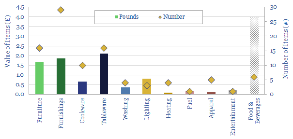
(5) Possessions were few. Up to 80% of the population comprised peasant farmers, without much formal income. A laborer earned 1-3 pence per day (£1-3 per year), a skilled laborer such as a carpenter or thatcher earned 3-4 pence (£3-5) and a mason earned 5-6 pence (£5-8). (In the upper echelons of society, a ‘knight’ had an income above £40 per year). Two-thirds of a typical worker’s wages were usually spent on food and drink. Thus a middle income urban individual might at any one time possess only around 100 items worth £5-10 in total. Most are basic necessities (chart below, inventory here). The ratio of incomes:basic products has risen by an amazing 25x since 1400. And for many commodities, costs have continued falling in real terms since 1800 (data-file below).

(6) Mobility. Many manorial subjects (aka villeins) were effectively bound to 1-2 acres of land and lived their entire lives in one cottage. They traveled so little that they did not have or need surnames. Freemen, who could travel, would usually know what was to be found at market towns within a 20-30 mile radius. Horse mobility was much too expensive for the masses, with a riding horse costing maybe £4, around a year’s wages, plus additional costs to feed, stable, ride and toll. So most would travel on foot, at 2-4 mph, with a range of c15-20 miles per day. Horse travel was closer to 4-5 mph. Thus in 1336, a youthful Edward III rode to York covering 55 miles in a day. The ‘land speed records’ of the era varied by season, from 50 miles/day in winter to 80 miles/day in summer, and were determined as much by the roads as the ‘movers’. Again, this would persist until industrial times.

(7) Freight was very limited. Carts existed to transport goods not people. But they were particularly slow, due to bad road conditions, and expensive. Grain was imported during famines, but it physically could not be moved inland. The same trend operated in reverse, as candles (made from animal fat) cost 2x more once transported into a city than they did the countryside. The rural economy revolved around small market towns, which attracted hundreds of people on market days from a 1-5 mile radius, as it was not practical to walk c25-miles to a city, except for crucial specialist goods.

(8) Long-distance travel outside of Europe was practically unknown. So much so that myths abounded. The Terra Australis was rumored to be a vast Southern land, where men could not survive because it was too hot; instead inhabited by “sciopods”, who would lie on their backs and bask in the shade beneath their one giant foot. This mythical level of remoteness made spices from the East among the ultimate luxuries. Pound for pound, ginger might cost 2s (6-days’ wages) cloves 4s (12-days) and saffron 12s (60-days).

Medieval energy shortages
“where spices come from” (Source: Wikimedia Commons)

(9) Biomass was the only heating fuel. The right to gather sticks and timber was granted by manorial lords to their tenants. Every last twig was used. Heavy harvesting reduced woodlands to 7% of England’s land area (they have recovered to 13% today). Winter’s skyline was particularly bleak, as no evergreens have yet been introduced from Scandinavia. Heavy use of wood in construction also made fires a devastating risk, so many cities banned thatched rooves or timber chimneys. Ovens were communal. In a similar vein, the cost of lighting has fallen by 99.99% since these pre-industrial times.

(10) Appearances? “The prime reason to avoid medieval England is not the violence, the bad humour, the poor roads, the inequality of the class system, the approach to religion and heresy or the extreme sexism. It is the sickness”. Havoc was wrought by smoke, open cesspits and dead animals. Dental care was not about preserving teeth, only masking the scent of decay. Soaps were caustic and induced blisters. Excessive combing of hair was frowned upon. Moralists especially castigated the Danes who were “so vain they comb their hair everyday and have a bath every week”.

Medieval energy shortages
This incredible painting is displayed at Niguliste Church, in Tallinn Old Town, from the late medieval workshop of Bernt Notke. Over 30-meters long, it showed the ubiquity of death. A common destination shared by Kings, Queens, Bishops, Knights, Merchants and Peasants (although the former appear to be enjoying a kind of “priority boarding” system).

To an energy analyst, the list above simply translates into energy shortage after energy shortages. We are not left smiling at a romantic image of pre-industrial society, but grimacing at woeful deficiencies in food, light, heat, mobility, freight, materials. It has become common to talk about the 1970s as the stock example of global energy shortages. But the 14th century was truly medieval.

Sources:

Crouzet, F. (2001). A History of the European Economy. 1000-2000. University Press of Virginia, Charlottesville and London.  

Mortimer, I., (2009). The Time Traveller’s Guide to Medieval England. Vintage Books. London.

Wickham, C. (2016). Medieval Europe. Yale University Press.

Helion: linear fusion breakthrough?

Helion linear fusion technology

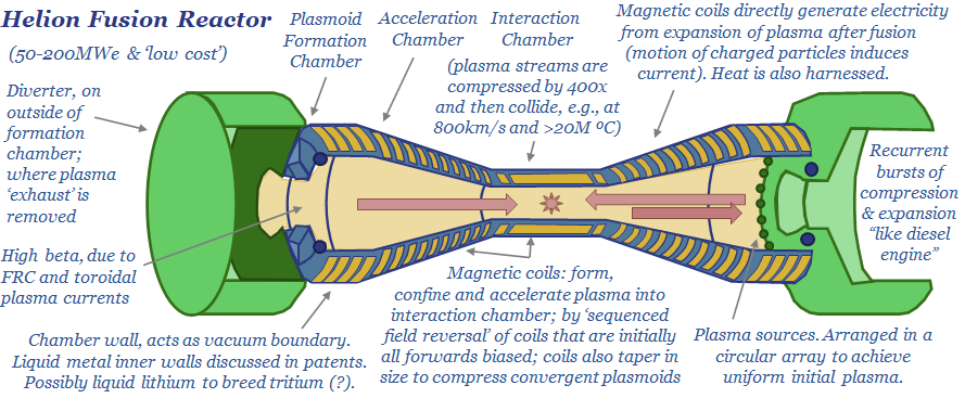
Helion is developing a linear fusion reactor, which has entirely re-thought the technology (like the ‘Tesla of nuclear fusion’). It could have costs of 1-6c/kWh, be deployed at 50-200MWe modular scale and overcome many challenges of tokamaks. Progress so far includes 100MºC and a $2.2bn fund-raise, the largest of any private fusion company to-date. This note sets out its ‘top ten’ features.

Our overview of nuclear fusion is linked above, spelling out the technology’s game-changing potential in the energy transition. However, fourteen challenges still need to be overcome.

Self-defeatingly, many fusion reactor designs aim to deal with technical complexity via adding engineering complexity. You can do this, but it inherently makes the engineering more costly, with mature reactors likely to surpass 15c/kWh in delivered power.

Helion has taken a different approach, to engineering a fusion reactor. Our ‘top ten features’ are set out below. If you read back through the original fusion report, you will see how different this is…

(1) Costs. Helion has said the reactor will be 1,000x smaller and 500x cheaper than a conventional fusion reactor, with eventual costs seen at 1-6c/kWh. This would indeed be a world-changer for zero carbon electricity (chart below).

(2) Linear Reactor. This is not a tokamak, stellarator or inertial confinement machine (see note). It is a simple, linear design, where pulsed magnetic fields accelerate plasma into a burn-chamber at 1M mph. Colliding plasma particles fuse. The fusion causes the plasma to expand. Energy is then captured from the expanding plasma. It is like fuel in a diesel engine.

(3) Direct electricity generation. Most power generators work by producing heat. The heat turns water into high-pressure steam, which then drives a turbine. Within the turbine, electricity is generated by Faraday’s law, as a moving magnetic field induces a current in stator coils of the turbine (see our note below for a primer on power-electronics). However, a linear reactor containing can exploit Faraday’s law directly. Plasma particles are electro-magnetically charged. So as they expand, they will also induce a current. Some online sources have suggested 95% of the energy released from the plasmas could be converted to electricity, versus c40% in a typical turbine.

(4) Reactor size. The average nuclear fission plant today is around 1GW. Very large fusion plants are gearing up to be similar in size. However, Helion’s linear reactor is seen on the order of c50MW. This is something on the magnitude that can be deployed by individual power consumers, or more ambitiously, on mobile applications, such as in commercial shipping vessels or aviation.

(5) Fewer neutrons. Helion’s target fuel is Helium-3. This is interesting because fusing 2 x Helium-3 nuclei yields a Helium-3 nucleus plus two hydrogen nuclei. There are no net neutron emissions and resultant radioactivity issues (see fusion note). However, the Helium-3 would need to be bred from Deuterium, which is apparently one of the goals in the Polaris demonstration reactor (see below).

(6) Beta. Getting a fusion reactor to work energy-efficiently requires maximizing ‘beta’. Beta is the ratio of plasma field energy to confining magnetic field energy. Helion’s patents cover a field reversed configuration of magnets which will “have the highest betas of any plasma confining system”. During compression, different field coils with successively smaller radius are activated in sequence to compress and accelerate the plasmoids “into a radially converging magnetic field”.  Helion is targeting a beta close to 100%, while tokamaks typically achieve closer to 5%.

(7) Capital. In November-2021, Helion raised a $2.2bn Series-E funding round. This is the largest private fusion raise on record (database below). It is structured as a $500M up-front investment, with an additional $1.7bn tied to performance milestones.

(8) Progress so far. In 2021, Helion became the first private fusion company to heat a fusion plasma to 100MºC. It has sustained plasma for 1ms. It has confined them with magnetic fields over 10 Teslas. Its Trenta prototype has run “nearly every day” for 16-months and completed over 10,000 high-power pulses.

(9) Roadmap to commerciality? Helion is aiming to develop a seventh prototype reactor, named Polaris, which will produce a net electricity gain, hopefully by 2024. It has said in the past that fully commercial reactors could be ‘ready’ by around 2029-30.

(10) Technical Risk. We usually look to de-risk technologies by reviewing their patents. This is not possible for Helion, because we can only find a small number of its patents in the usual public patent databases. Developing a commercial fusion reactor still has enormous challenges. What helps is a landscape of different companies exploring different solutions. For a review of how this has helped to de-risk, for example, plastic pyrolysis, see our recent update below: 60% of the companies have face steeper setbacks than hoped, but a handful are now reaching commercial scale-up.

Other exciting next-generation nuclear companies to cross our screen our highlighted in the data-files below…

https://thundersaidenergy.com/downloads/nuscale-small-modular-reactor-breakthrough/

To read more about our outlook on nuclear flexibility and how we see nuclear growth accelerating, please see our article here.

Oil and War: ten conclusions from WWII?

Oil and war

The second world war was decided by oil. Each country’s war-time strategy was dictated by its availability, its quality and attempts to secure more of it; including by rationing non-critical uses of it. Ultimately, limiting the oil meant limiting the war. This would all re-shape the future of the oil, gas and midstream industries, and also the whole world. Today’s short essay about oil and war outlines out top ten conclusions from reviewing the history.

(1) War machines run on oil products

Fighter planes, bombers, tanks, battleships, submarines and supply trucks are all highly energy intensive. For example, a tank achieves a fuel economy of around 0.5 miles per gallon. Thus, Erwin Rommel wrote that “neither guns nor ammunition are of much use in modern warfare unless there is sufficient petrol to haul them around… a shortage of petrol is enough to make one weep”.

If the First World War was a war of stagnation, then the Second World War was one of motion. Overall, America’s forces in Europe would use 100x more gasoline in World War II than in World War I. Thus in 1944, General Patton berated Eisenhower that “my men can eat their belts, but my tanks have gotta have gas”.

The fuel for Germany’s war machine was imported from Romania’s Ploiesti fields (c30-40% of total use) and earlier in the War, from the Soviet Union (10-20%). Another achievement of ‘blitzkrieg’ warfare was that the German army initially captured more fuel than it used. Its remaining oil was produced in Germany, as synfuel (c50-60% of total).

Synfuel. Germany had always been an oil-poor, coal-rich nation, relying on the latter for 90% of its energy in the 1930s. But it could manufacture synthetic gasoline by hydrogenating the coal at high temperatures and pressures. The industrial methods were developed by IG Farben, with massive state subsidies (Hitler stated “the production cost [is] of no importance”). In 1936, Hitler re-doubled the subsidies, expecting to be at war by 1940, by which time, 14 hydrogenation plants were producing 72kbpd. By 1943, this was increased to 124kbpd. It was over half of Germany’s total war-time oil use and 90% of the aviation gasoline for the Luftwaffe.

On the other side, America provided 85% of the allies’ total oil. US output rose from 3.7Mbpd to 4.7Mbpd. 7bn bbls were consumed by the US and its allies from 1941-45, of which 6bn bbls was produced in the US.

(2) Securing oil dictated each country’s war strategy.

In 1939, Hitler and Stalin had carved up Europe via the Molotov-Ribbentrop pact, declaring mutual non-aggression against one another. But oil was a key reason that Hitler reneged, and went to war with the Soviet Union, in Operation Barbarossa, in June 1941. Stalin had already occupied Northern Rumania, which was too close for comfort to Ploiesti. Hitler would tell Mussolini that “the Life of the Axis depends on those oilfields”.

Moreover, Hitler wanted the oilfields of the Caucasus, at Maikop, Grozny and Baku. They were crucial. At the end of 1942, Hitler wrote “unless we get the Baku oil, the war is lost”. Even Rommel’s campaign in North Africa was the other arm of a large pincer movement, designed to converge on Baku.

Similarly for Japan, the entire Pacific War (and necessarily antecedent attack on Pearl Harbor), was aimed at capturing crucial oil fields of the Dutch East Indies, to which Japan would then commit 4,000 oilfield workers.

For the Allies, one of the most pressing needs was to ensure clear passage of American Oil across the Atlantic, without being sunk by German U-boats. Hence the massive step-up of cryptography at Bletchley Park under Alan Turing. In March-1943, the Allies broke the U-boat codes, allowing a counter-offensive. In May-1943 alone, 30% of the U-boats in the Atlantic were sunk. Increased arrivals of American oil would be a turning point in the war.

(3) Limiting the oil meant limiting the war.

Germany’s initial blitzkrieg warfare was particularly effective, as the Germans captured more fuel than they used. But they had less luck on their Eastwards offensives. Soviet tanks rank on diesel. Whereas the German Panzers ran on gasoline. And it became increasingly difficult to sustain long, Eastwards supply lines. Stalingrad became Germany’s first clear ‘defeat’ in Europe in 1942-43. 

Fuel shortages were also illustrated in North Africa, where Rommel later said his tactics were “decided more by the petrol gauge than by tactical requirements”. He wrote home to his wife about recurring nightmares of running out of fuel. To make his tank numbers look more intimidating, he even had ‘dummy tanks’ built at workshops in Tripoli, which were then mounted on more fuel-efficient Volkswagens.

Similarly in Japan, oil shortages limited military possibilities. ‘Kamikaze’ tactics were named after the ‘divine wind’, a typhoon which disrupted Kublai Khan’s 13th century invasion fleet. But they were motivated by fuel shortages: no return journey was necessary. And you could sink an American warship with 1-3 kamikaze planes, versus 8-24 bombers and fighters. It made sense if you had an excess of personnel and planes, and a shortage of fuel.

Similarly, in 1944, in the Marianas campaign’s “great turkey shoot”, Japan lost 273 planes and the US lost 29, which has been attributed to a lack of fuel, forcing the Japanese planes to fly directly at the enemy, rather than more tactically or evasively.

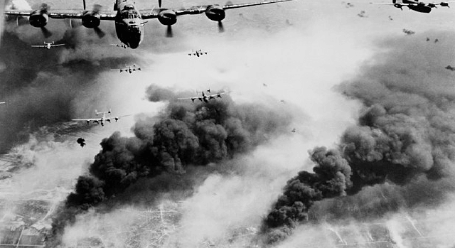
Remarkably, back in Europe, it took until May-1944, for Allied bombers to start knocking out Germany’s synthetic fuels industry, in specifically targeted bombing missions, including the largest such facility, run by IG Farben at Leuna. “It was on that day the technological war was decided”, according to Hitler’s Minister of War Production. In the same vein, this note’s title image above shows B-24s bombing the Ploiesti oilfields in May-1944.

By September-1944, Germany’s synthetic fuel output had fallen to 5kbpd. Air operations became impossible. In the final weeks of the War, there simply was no fuel. Hitler was still dictating war plans from his bunker, committing divisions long immobilized by their lack of fuel. In the final days of the War, German army trucks were seen being dragged by oxen.

Swiftly halting oil might even have prevented war. Japan had first attached Manchuria in 1931. As tensions escalated, in 1934, executives from Royal Dutch and Standard of New Jersey suggested that the mere hint of an oil embargo would moderate Japanese aggression, as Japan imported 93% of its oil needs, of which 80% was from the US. In 1937, an embargo was proposed again, when a Japanese air strike damaged four American ships in the Yangtze River. It was 1939 before the policy gained support, as US outrage grew over Japan’s civilian bombings in China. By then it was too late. In early 1941, Roosevelt admitted “If we stopped all oil [to Japan]… it would mean War in the Pacific”. On December 7th, 1941, a Japanese attack on Pearl Harbor forced the Americans’ hand.

(4) Fuel quality swayed the Battle of Britain?

The Messerschmitt 109s in the Luftwaffe were fueled by aviation gasoline derived from coal hydrogenation. This had an octane rating of 87. However, British Spitfires often had access to higher-grade fuel, 100-octane aviation gasoline, supplied by the United States. It was produced using catalytic cracking technology, pioneered in the 1930s, and deployed in vast, 15-story refinery units, at complex US refineries. The US ramped its production of 100-octane gasoline from 40kbpd in 1940 to 514kbpd in 1945. Some sources have suggested the 100-octane fuel enabled greater bursts of speed and greater maneuverability, which may have swung the balance in the Battle of Britain.

(5) The modern midstream industry was born.

Moving oil by tankers turned out to be a terrible war-time strategy. In 1942, the US lost one-quarter of all its oil tanker tonnage, as German U-boats sunk 4x more oil tankers than were built. This was not just on trans-Atlantic shipments, but on domestic routes from the Gulf Coast, round Florida, and up the East Coast. Likewise, by 1944-45, Japan was fairly certain that any tanker from the East Indies would be sunk shortly after leaving port.

The first truly inter-continental pipelines were the result. In 1943, ‘Big Inch’ was brought into service, a 1,254-mile x 24” line carrying oil from East Texas, via Illinois, to New Jersey. In 1944, ‘Little Inch’ started up, carrying gasoline and oil products along the same route, but starting even further south, at the US Gulf Coast refining hub, between Texas and Louisiana. The share of East Coast oil arriving by pipeline increased from 4% in 1942 to 40% by the end of 1944.

The first subsea pipeline was also deployed in the second world war, known as PLUTO (the Pipeline Under the Ocean). It ran under the English channel and was intended to supply half of the fuel needs for the Allies to re-take Europe. One of the pumping stations, on the Isle of Wight, was disguised as an ice cream shop, to protect it from German bombers. However, PLUTO was beset by technical issues, and only flowed 150bpd in 1944, around 0.15% of the Allied Forces’ needs.

Other mid-downstream innovations were small portable pipeline systems, invented by Shell, to transport fuel to the front without using trucks; and the five gallon ‘jerry can’. The Allies initially used 10-gallon portable fuel cannisters, but they were too heavy for a single man to wield. The smaller German convention was adopted. And improved, with a spout that prevented dirt from being transferred into vehicle engines.

(6) The modern gas industry was also born.

As the US tried to free up oil supplies from its residential heating sector, Roosevelt wrote to Harold Ickes, his Secretary of the Interior, in 1942, “I wish you would get some of your people to look into the possibility of using natural gas… I am told there are a number of fields in the West and the Southwest where practically no oil has been discovered, but where an enormous amount of natural gas is lying idle in the ground because it is too far to pipe”.

(7) Rationing fuel became necessary everywhere.

In the UK, war-time rationing began almost immediately, with a ‘basic ration’ set at 1,800 miles per year. As supplies dwindled, so did the ration, eventually towards nil. The result was a frenzy of war-time bicycling.

In Japan, there was no domestic oil use at all. Even household supplies of spirits or vegetable oils were commandeered to turn into fuel. Bizarrely, millions were sent to dig up pine roots, deforesting entire hillsides, in the hope that they could be pyrolyzed into an fuel-substitute.

Curtailing US demand was slower. In 1941, Ickes did start implementing measures to lower demand. He recommended a return to the ‘Gasoline-less Sundays’ policy of WWI and ultimately pressed oil companies to cut service station deliveries by 10-15%. Homeowners who heated their houses with oil were politely asked to keep their temperatures below 65ºF in the day, 55ºF at night.

Outright US rationing occurred later, starting in early-1942. First gasoline use was banned for auto-racing. Then general rationing of gasoline started on the East Coast. Even later, nationwide rationing was brought in at 1.5-4 gallons per week, alongside a 35mph speed limit and an outright ban on “non-essential driving” in 1943.

General US oil rationing provoked outrage. Interestingly, it was motivated just as much by rubber shortages as oil shortages. Japan’s capture of the East Indies had cut off 90% of the US’s rubber imports, and what little rubber was available, was largely needed for military vehicles. Ultimately, the consumption of fuel per passenger vehicle was 30% less in 1943 than in 1941.

(8) War-time measures tested civilian resolve.

In WWII, ambivalence was most clearly seen in the US, where support for the War was initially marginal, and conflicted with domestic economic interests.

The State of New Jersey denounced fuel rationing, lest it hamper tourism at its summer resorts. Likewise, in Miami, the tourism industry rebuffed a campaign to turn off 6-miles of beach-front neon lights, which were literally lighting up the coastal waters, so German U-boats could easily pick off the oil tankers.

In direct opposition to war-time interests, some US gasoline stations openly declared they would make as much fuel available to motorists as required, advertising that motorists should come “fill it up”. There will always be a few idiots who go joy-riding during a crisis.

(9) The map of the modern World

The entire future of the 20th century would also be partly decided by ‘who got there first’ in the liberation of Nazi Europe. Thus, Russia’s sphere of influence, was decided in particular by oil supplies in the final months of the War.

The Allies’ path to Berlin in 1944-45 was 8-months slower than it should have been, hampered by logistical challenges of fueling three separate forces, on their path to the heart of Europe. General Patton wrote home in 1944 that “my chief difficulty is not the Germans, but gasoline”.

The lost time was important. It is what allowed the Soviet Union to capture as much ground as it did, including reaching Berlin before the Western Allies. This would help decide the fate of Republics such as East Germany, Poland, Czechoslovakia, Hungary and Yugoslavia. All ended up being ‘liberated’ by the Soviets. This sealed their fate, ending up as part of the greater Soviet Empire.

Further East, oil-short Japan also approached the Soviet Union as a potential seller of crude. However, Churchill and Roosevelt made Stalin a better offer. The return of territories that Czarist Russia had lost to Japan in the humiliating War of 1905, such as Northern Manchuria and the Sakhalin Islands. The latter, ironically, now produces 300kbpd of oil and 12MTpa of LNG.

(10) Scorched Earth after capture (but NOT BEFORE)

Scorched Earth is a phrase that now conjures images of giant plumes of smoke, rising into the air from 600 large Kuwaiti oil wells, as Iraqi forces retreated during the 1990-91 Gulf War.

However, scorched earth policies were implemented everywhere in the Second World War. The Soviets absolutely destroyed Maikop before it was captured, so the Germans could only produce 70bpd there by the following year.

In 1940-42, in the Dutch East Indies, a Shell team was drafted in to obliterate the oil fields and refinery complex at Balikpapan before it could fall into Japanese hands, with fifteen sticks of TNT affixed to each tank in the tank farm. It burned for days.

Back at Shell-Mex House, the British also drew up plans to destroy their fuel stocks if invaded. Most incredibly, at the Start of World War II, France even offered Rumania $60M to destroy its oilfields and deprive their Prize to the Germans.

Strangely, some policymakers and investors appear to have had something of a ‘scorched earth’ policy towards the West’s oil and gas industry in recent years. As war re-erupts in the Western world, the history may be a reminder of the strategic need for a well-functioning energy industry. Energy availability has a historical habit of determining the course of wars.  

End note. The world’s best history book has provided the majority of anecdotes and data-points for this article. Source: Yergin, D.(1990). The Prize: The Epic Quest for Oil, Money & Power. Simon & Schuster. London. I cannot recommend this book highly enough. The cover image is from Wikimedia Commons.

Russia conflict: pain and suffering?

Russia's conflict implications in energy markets

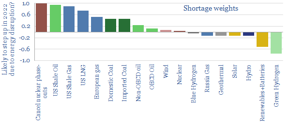
This 13-page on note presents 10 hypotheses on Russia’s conflict implications in energy markets. Energy supplies will very likely get disrupted, as Putin no longer needs to break the will of Ukraine, but also the West. Results include energy rationing and economic pain. Climate goals get shelved in this war-time scramble. Pragmatism, nuclear and LNG emerge from the ashes. 

For an overview of economic ratios from different models across conventional power, renewables, conventional fuels, lower-carbon fuels, manufacturing processes, infrastructure, transportation and nature-based solutions, please see our article here.


Energy transition: hierarchy of needs?

Energy transition could fall apart

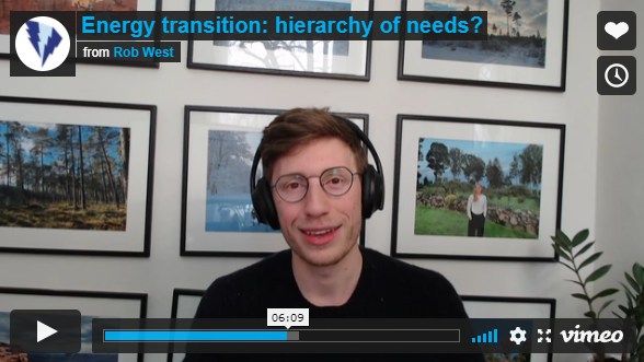
This gloomy video explores growing fears that the energy transition could change direction in the mid-late 2020s, due to energy shortages and geopolitical discord. Even more worryingly, could energy transition fall apart? Constructive solutions will include debottlenecking resource-bottlenecks, efficiency technologies and natural gas pragmatism.

To view the video directly in Vimeo, please click here. For a more recent video, taking a more front-footed approach to these energy transition dilemmas, please see here.

Sitka spruce: our top ten facts?

sitka spruce benefits

Sitka spruce is a fast-growing conifer, which now dominates UK forestry, and sequesters CO2 up to 2x faster than mixed broadleaves. It can absorb 6-10 tons of net CO2 per acre per year, at Yield Classes 16-30+, on 40 year rotations. This short note lays out our top ten conclusions; including benefits, drawbacks and implications.


(1) Origins. Sitka spruce trees (Picea sitchensis) were first found in Baranof Island, in the Gulf of Alaska, in 1792, by Scottish Botanist Archibald Menzies. They was first brought to Europe in 1831, by another Scottish botanist, David Douglas (namesake of the Douglas fir). And they were named Sitka, after the headquarters of the Russian-Alaskan fur trade, which was the main reason Europeans were exploring the region at the time.

(2) Commercial Forestry Areas. In the UK, Sitka now comprises 30-60% of forest areas, following extensive planting since the 1970s (estimates vary). Likewise, in Ireland’s forests, Sitka Spruce represents 50-75% of all carbon stored and 90% of all wood harvested, across 300,000 hectares planted. Sitka is also grown to a lesser extent in Denmark, Iceland, France and Norway (although the latter now considers it invasive and is trying to phase it back).

(3) Growing Conditions. Sitka spruce naturally extend from Alaska down into Northern California, but seldom >200km inland or above 1,000m altitude. It is demanding of air and soil moisture, therefore grows best in temperate rainforests, coastal fog-belts or river-stream flood plains. It is also surprisingly light-demanding for a spruce, whereas one of the main advantages of Norwegian spruce in the forestry projects we are evaluating is that it is shade-tolerant, and can thus grow in below a pine canopy, adding carbon density. As usual, the right tree needs to be matched to the right climate to maximize CO2 removals (note below).

(4) Tree Sizes. Sitka is the tallest-growing spruce species in the world, usually reaching 45-60m height. Yet the world record is 96m. This is huge. The world’s largest Norwegian spruce (Picea abies) on record has reached 62m (in Slovenia), and the largest pine (Pinus sylvestris) is 47m (a 210-year old specimen in Southern Estonia). Sitka is the fifth largest tree in the world, behind usual suspects such as Giant Sequoia, where the tallest tree on record has reached 116m.

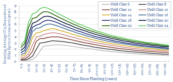
(5) Carbon Credentials. In Scotland, Sitka usually grows at 16-22 m3/ha/yr. In forestry, it is common to refer to a tree stand’s peak ‘Mean Annual Increment’ in m3/ha/year as its Yield Class. So 16-22 m3/ha/year would translate into Yield Class 16-22. In turn, the UK’s Woodland Carbon Code publishes excellent data for computing CO2 sequestration from yield classes (here). Yield classes 16-22 would translate into 6-8 tons of CO2 sequestration per acre per year.

sitka spruce benefits

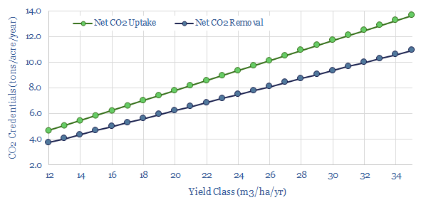
(6) Even Higher Yield Classes have been reported by foresters growing Sitka, however, in the range of 30-45. For example, one source states that in Ireland Sitka yields can reach “34 tonnes per hectare per year of stem wood”, which would translate into a yield class in the 40-70 range. Some plots have reported the largest individual trees adding a full m3 of wood each year, which might translate into yield classes 50-100. But let’s not get carried away. It is not too difficult to translate yield class into CO2 uptake. For example, we would typically assume 450kg/m3 density for spruce, 50% of which is carbon. Each kg of elemental carbon is equivalent to 3.7 tons of CO2, and maybe 80% of absorbed CO2 can be prevented from returning to the atmosphere over the long run (note here, model here). This yields the chart below, suggesting 10 tons of CO2 removal per year at Yield Class 30.

sitka spruce benefits

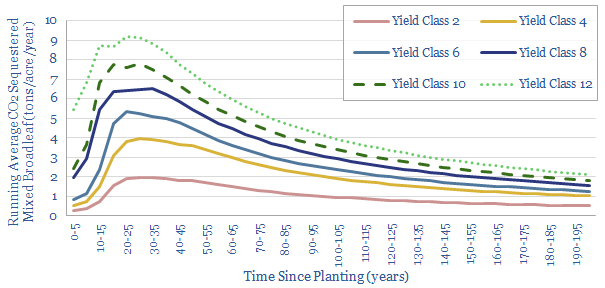
(7) Carbon Comparisons. Sitka spruce has been called 2x as effective at carbon removals as traditional broadleaf woodland. Again, data from the UK Woodland Carbon Code would seem to bear this out, positing 4-6 tons of CO2 sequestration per acre per year for mixed broadleaves in their typical yield classes 4-8 (chart below). This matters because we tend to assume 5 tons of CO2 removal per acre per year for reforestation projects our roadmap to net zero.

sitka spruce benefits

(8). Commercial Forestry Practices. Underpinning our assumptions above for Sitka spruce are relatively dense plantings, at 1.5 – 2.0m spacings, which will translate into an extremely dense 1,000-1,800 trees per acre, grown over a 40-year rotation. Our numbers are averaged across thinned and unthinned stands, although the latter absorb 50% more CO2. This might all deflate the cost of a typical forestry project (including land purchase costs) from $40/ton CO2 pricing to around $25-30/ton CO2 pricing, while also lowering land requirements, which also matters for CO2 removals (notes and models below).

(9) Timber Uses. Sitka’s wood is light, strong and flexible, with a dry density around 450kg/m3. For comparison, hardwoods like oak are more typically 750kg/m3. Hence the Wright brothers’ Flyer was built using Sitka spruce, as it made the world’s first powered flight in 1903. In WWII the British even used it instead of aluminium to produce parts of the de Havilland DH.98 Mosquito military aircraft. Products derived from spruce range from packaging materials to construction timber. We think this presents an opportunity in the materials space, including in Cross Laminated Timber, where spruce is the most commonly used input material…

(10) Biodiversity Drawbacks. Biodiversity versus CO2 removal is always going to require trade-offs. A mono-culture Sitka spruce plantation will clearly be less bio-diverse than mixed broadleaf, but certainly more biodiverse than a Direct Air Capture plant. Overall, Sitka-heavy forests seem to be OK at promoting biodiversity. In America’s North-West, Sitka naturally grows alongside Western hemlock, Western re-cedar, Yellow cedar, mosses, horsetails, blueberries and ferns. In the spring, new growth can be eaten by mammals; while in the winter, needles can comprise up to 90% of the diet of bird species such as blue grouse.

https://thundersaidenergy.com/downloads/forest-carbon-biodiversity-impacts-productivity/

Our conclusion for decision-makers is that Sitka spruce will help to accelerate prospects for nature-based carbon removals in the energy transition, creating direct opportunities in the forestry value chain, through to indirect opportunities in equities (notes below).

On a personal note, for the reforestation projects that we are undertaking in Estonia, we are mostly considering bio-diverse mixes with a backbone of pine and spruce. Attempts to grow Sitka in Estonia are more chequered. A 120-year old stand has reached 36m average height on the Island of Hiiumaa. This implies the ability to achieve 3,000m3/ha timber density, which is around 2.5x Norwegian spruce. However, other attempts to grow Sitka in Estonia have had mixed results, especially away from the Coast. So I would like to incorporate some Sitka in my plans here, but I am just not sure I can rely on them in this climate.

Coal versus gas: explaining the CO2 intensity?

Coal versus gas CO2 intensity

Coal provided 25% of the world’s primary energy in the past three years, but 40% of all global CO2 emissions. Gas also provided 25% of the world’s primary energy but just 15% of the CO2 (data below). In other words, gas’s CO2 intensity is 50% less than coal’s. The purpose of today’s short note is to explain the different carbon intensities from first principles.

Explanation #1: half the energy in gas is from hydrogen

Burning coal releases energy as carbon is converted into CO2. In other words, substantively all of the energy from coal combustion is associated with CO2 emissions.

Burning gas releases energy as methane (CH4) is converted into CO2 and H2O. In other words, just over half of the energy from gas combustion is associated with innocuous water vapor, and just less than half is associated with CO2 emissions.

This is simple chemistry. For many decision-makers, this chemistry is sufficient to explain why switching all of the world’s future potential coal energy to gas energy can directly underpin one-fifth of the decarbonization on realistic roadmaps to net zero (note below). For others, who want to get into the nerdy details of bond enthalpies, we have written the note below.

Explanation #2: bond enthalpies?

If you wish to delve deeper into the numbers behind gas and coal’s CO2 intensities, then our discussion below will help you understand the thermodynamic calculations. As an ongoing reference, the numbers are also spelled out in our bond enthalpy data-file.

Bond enthalpies. Atoms are bonded together into molecules. ‘Bond Enthalpy’ denotes the total thermodynamic energy that is contained in each of these bonds (data here), as determined by fundamental electromagnetic forces that define the universe (note here). In other words, bond enthalpy is the minimum amount of energy that must be supplied in order to dissociate the atoms on either side of the bond; and the maximum amount of energy that could be harnessed when these atoms bond together.

Bond enthalpies are often quoted in kJ/mol. As a reminder, 1 Joule is the energy transferred when a force of 1 Newton acts over a distance of 1 meter; or when 1 Watt of power is exerted for 1 second; or when a current of 1 Amp flows through a resistance of 1 ohm. And 1 mol is a standard for counting the numbers of atoms or atomic reactions, described 6.022 × 10²³ units. This precise number, in turn, was chosen so that 1 mol of protons would have a mass of 1g, and all larger molecules would have an atomic mass that effectively matches their atomic number of protons and neutrons.

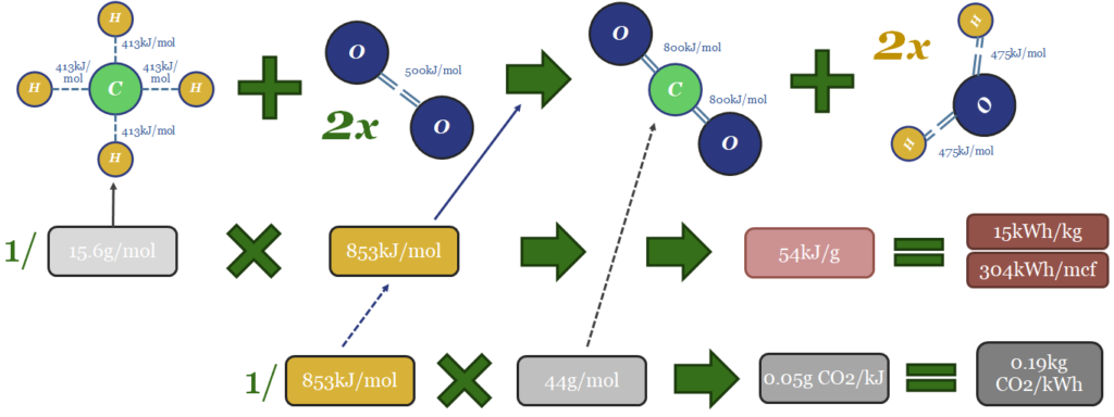
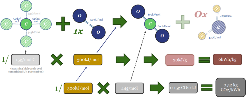
Thus the thermodynamics of gas can be computed from bond enthalpies in the image below. Breaking the bonds in the methane molecule requires 1,652 kJ/mol of input energy. Breaking the bonds in 2 x O2 molecules requires 996kJ/mol. Total bond-breaking energy is 2,648kJ/mol. On the other side of the equation, forming the bonds in 1 CO2 molecule releases 1,598kJ/mol. And forming the bonds in 2 x H2O molecules releases 1,903kJ/mol. Total bond-making energy is 3,501kJ/mol (of which 54% is from forming water molecules). Subtract 2,648 from 3,501, and the result is 853kJ/mol of total energy being released. 1 kJ = 0.2778 Wh. So with some unit juggling, we arrive at 15kWh/kg of energy generation, or 304kWh/mcf of gas (at 48.7mcf of gas per ton; or 48.7bcf per MTpa for those who prefer LNG units).

The CO2 emissions will include 1 mol of CO2 per mol of methane. That mol of CO2 weighs 44 grams. Hence if you divide 44 grams by 853kJ, the result is 0.05 g of CO2 per kJ. Divide by 0.2778kWh/kg and the result is 0.19kg of CO2 per kWh. Multiply by 304kWh/mcf and the result is 56kg of CO2/mcf.

Coal versus gas CO2 intensity

Likewise the thermodynamics of coal can be computed in the same way. Forming each mol CO2 from C and O releases releasing 1,598kJ/mol. That side of the equation of the easy. Next, if the coal was perfect, pure carbon then the energy that would need to be supplied for bond breaking would be 50% x 4 x C-C bonds at 346kJ/mol (692kJ/mol total), plus 1 x O=O bond (498kJ/mol), for a total bond-breaking energy of 1,190kJ/mol. But in practice, we assume that coal is usually only 80% carbon, while remaining impurities include water (which must be evaporated off), sulphur, nitrogen and other ashy impurities. It will vary grade-by-grade. But on average we think 300kJ/mol is a sensible assumption for the energy release. This yields some important conclusions…

Coal versus gas CO2 intensity

(a) 300kJ of energy is released when 1 mol of coal combustion occurs. This is 65% less than when 1 mol of gas is burned. The main reason, as stated above, is that the coal combustion reaction does not generate any energy from producing water vapor.

(b) 20kJ/gram or 6kWh/kg of energy is released per unit mass of coal consumption. This is c60% less than when an equivalent mass of methane is burned.

(c) Minimal extra mass, as we assume methane weighs 15.6g/mol, versus coal at 15g/mol of combustible carbon (pure carbon is 12g/mol, but we assumed high-grade coal has only 80% carbon). To re-iterate, this means that 1 kg of natural gas is generating 2.5x more energy than 1kg of coal. Again, the reason comes down to hydrogen atoms in methane, which generate 54% of the energy release when they are oxidized to H2O, but in a very dense package of mass. At 1g/mol, hydrogen atoms are much lighter than carbon atoms at 12g/mol and oxygen at 16g/mol. (The hydrogen industry is currently looking for the perfect hydrogen carrier — is it ammonia? is it toluene? — in our view, a near-perfect one already exists, it is called natural gas, and it comes straight out of the ground).

(d) 1 mol of CO2 is released when 1 mol of coal is combusted. This is the same as the amount of CO2 released when 1 mol of gas is combusted. But to re-iterate gas combustion generates around 2.5x more energy.

(e) CO2 intensity can be as high as 0.5kg/kWh for coal combustion. Again this is 2.5x higher than gas combustion, and we have derived the result that gas provides the same amount of energy as coal despite emitting 60% less CO2. There is nothing here except maths and science.

Explanation #3: advanced thermodynamic considerations?

We have glossed over some important thermodynamic concepts in our explanation above. For completeness, we address them here. Those who are bored of abstruse academic details can probably skip ahead to the next section.

Strictly, the useful energy that can be obtained from combusting a fuel is not a pure function of bond enthalpies. You must also deduct a small amount for the change in entropy (Gibbs Free Energy = Enthalpy – T-Delta-S). We have not considered entropy changes in our numbers above. Neither coal nor gas combustion increase entropy by increasing the number of molecules in circulation. But both coal and gas combust with a flame temperature around 1,950C, which is going to increase the entropy of their surrounding thermodynamic systems and prevent their full bond enthalpies from being harnessed.

Another issue is higher versus lower heating values. Specifically, our schematic above showed the combustion of methane releasing 54kJ/g of energy, via the formation of CO2 and H2O. However, 5-10% of this ‘gross calorific value’ energy that is released will be lost in the water vapor. Water is a liquid at ambient temperatures and pressures. Vaporizing that water into an exhaust gas will absorb some of the energy from the combustion reaction. The amount depends on the atmospheric conditions. This is why textbooks quote the ‘net calorific value’ of methane closer at 50kJ/g at standard conditions of 0C and 1-bar. Vaporizing water is not an issue for coal combustion as there is effectively no water produced in that reaction. This narrows the ‘energy gap’ between gas and coal in practice.

Another issue is that our bond enthalpies for coal above were not quite right. We used the average bond enthalpies for Carbon-Carbon single bonds. But the carbon in coal may contain ring structures, aromatic compounds, unsaturated bonds, and particles that are not chemically bound together at all. All of this will most likely lower the bond enthalpies within coal. So our numbers for coal combustion enthalpy are imprecise, and probably a little bit too conservative. Moreover, the rocks found out in the world that we call “coal”, tend to physically contain other hydrocarbons, such as methane, within them. Overall, real world coal grades come in closer to 0.37 kg/kWh (data below).

Another issue is that ‘coal’ is a broad term, covering a range of different fuels, with different carbon contents and different impurities. These will vary. One useful online resource, suggests that energy content can range from 32.6kJ/g for the highest-grade pure anthracite coals, through to 30kJ/g for bituminous, 24kJ/g for sub-bituminous and 14kJ/k for lignite. In 2020, the average ton of coal produced in the US had a grade of 19.8 mmbtu/ton, equivalent to 5,800kWh/tonne, or 23kJ/g. This is probably a bigger issue for energy density per kg than it is for CO2 emissions per kWh.

Finally, coal may be moderately less likely to combust completely, producing small portions of soot and carbon monoxide, especially when burned in small-scale furnaces. This will detract from both the energy content and has a debatable impact on CO2 credentials.

(1) What about emissions across the supply chain?

One potential issue with the numbers we have presented above is that we also need to consider the CO2-equivalent emissions from the supply chains of producing gas and coal, respectively. If, for example, the emissions of producing natural gas were materially higher than the emissions of producing coal, then we would need to factor this in.

However, our analysis finds that often the total full-cycle emissions footprint of producing and distributing coal (usually 50kg/boe or higher) will be similar or higher than the emissions footprint of producing and distributing gas (10-60kg/boe). The free note below gives a full overview of the data we have reviewed here.

(2) What about efficiency of combustion?

A second potential issue with our analysis could be if it were easier to extract the energy from coal than from gas. For example, capturing 80% of the energy from a 0.52kgCO2/kWh fuel would result in lower emissions than capturing 20% of the energy from a 0.2kgCO2/kWh fuel.

Yet again, the data we have reviewed points to higher combustion efficiencies on gas. Our models for a coal-fired power plant assume c40% efficiencies, while our models of combined cycle gas plants average 57% efficiencies, and we are particularly excited about emerging gas-fired CHP systems that can reach 80-90% total thermal efficiencies (note below).

(3) What about ease of carbon capture and offset?

A third factor that is worth considering is the ease of capturing the carbon from combusting coal and gas. We think there is nothing wrong with continued fossil energy use in a fully decarbonized global energy system, as long as the CO2 emissions from that fossil energy is fully captured or offset.

Across our work, we find there are mixed opportunities and challenges for integrating CCS with coal and gas, but it is 2.5x easier to integrate gas with nature-based carbon removals, because there is 60% less CO2 that needs to be offset in the first place.

CCS momentum has also stepped up impressively in the past year (notes below). Coal combustion might seem to have a natural advantage, as its CO2 exhaust stream tends to be c10% concentrated, versus 4% for gas combustion. However, we also find gas’s exhaust CO2 can be concentrated towards 10% by combustion technologies such as exhaust gas re-circulation, gas benefits from fewer impurities that can poison amine cocktails, emerging technologies such as blue hydrogen can decarbonize gas at source, and there are also practical ways of blending gas back-ups with renewables in fully decarbonized power grids (notes below).

(4) What about the costs?

The dimension that has most kept coal burning in the world’s energy mix is its absurdly low cost. A new mine requires $60/ton for a 10% IRR, equivalent to producing thermal energy for 1c/kWh (model below). Natural gas can actually beat this cost, as the best gas fields are economical below $1/mcf (0.3c/kWh), and we estimate that $2/mcf pricing can support passable IRRs in the shale industry (model also below). But on top of this, global gas value chains can bring delivered cost to $6-8/mcf (2-3c/kWh). The biggest challenge, we find, is that starving gas value chains of capital may have re-inflated marginal costs to $12-16/mcf (4-5c/kWh) (third note below).

Conclusion: coal to gas switching cuts CO2 by 50%

The conclusion across our analysis above is that each TWH of energy that is generated from gas rather than coal will result in 50% less CO2, which will lower the burden that is placed on other decarbonisation technologies in our roadmap to net zero. Stated another way, each MTpa of LNG that is developed will likely go on to obviate 5MTpa of CO2 emissions.

So far in the energy transition, however, our depressed observation is that ideological fantasies may have delayed the implementation of real, low-cost and practical CO2 reductions, such as coal-to-gas switching. We think this may change in 2022, as energy shortages deepen (note below), and the world needs more pragmatic options, to accelerate its path towards net zero. Our lowest-cost roadmap to net zero by 2050 requires global gas output to rise by 2.5x.

Decarbonized supply chains: first invent the universe?

Decarbonising complex carbon-emitting supply chains’

“If you wish to make an apple pie from scratch, first you must invent the universe”. This Carl Sagan quote also applies to the decarbonization of complex supply chains. If you truly want to decarbonize an end product, you must decarbonize every single component and input, which may be constellated across hundreds of underlying suppliers. Hence this note argues that each company in a supply chain should aim to drive its own Scope 1&2 CO2 emissions towards ‘net zero’. The resulting products can be described as “clear”, “transparent” or “translucent”.


The complexity of global supply chains

A key focus of our recent research has been materials that are needed in the energy transition. Examples are carbon fiber (used in wind turbine blades and hydrogen storage tanks), photovoltaic silicon (used in solar panels), lithium (used in batteries), neodymium magnets (used in wind turbines and EVs), dielectric gases (used in electricity distribution) or even something as simple as cleaning up 2GTpa of global steel production.

What has stood out is how complex different supply chains are. It would be nice if there was a button you could press, somewhere in a steel mill, with a big shiny label that said “decarbonize steel”. The reality in our model (below) is that CO2 emissions originate from around a dozen processes and inputs, each of which would need to be decarbonized in turn.

The value chain is also shown below for producing another material, carbon fiber. It is unbelievably complex. Our “simplification” only contains 25 different stages. The most energy intensive is rejecting the nitrogen groups from poly-acrylonitrile (23 tons of CO2 per ton of carbon fiber) at 1,000-3,000°C, in atmospheres composed of pure industrial gases, such as argon and nitrogen. But again, every single material in the schematic has an increasing CO2 footprint, as it is made from whatever preceded it.

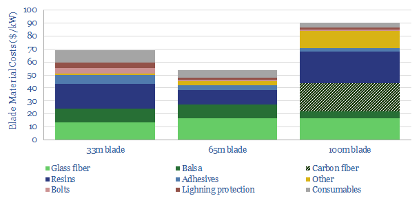
So if you wanted to make a truly zero-carbon wind turbine, how on Earth would you do it? A rule of thumb is that each MW of turbine capacity uses 150 tons of steel (discussed above, an annoyingly complex value chain). And the blades of a cutting-edge 11MW wind turbine are apt to weigh about 50 tons each, of which 5% is carbon fiber (discussed above, with an even more complex value chain). The remainder of the blades are also made up of 20 other input materials (chart below, data-file here), which will all have their own complex supply chains. And this is just one product, out of millions of products that needs to be decarbonized.

Decarbonized supply chains

The challenge, we think, is that producing ‘carbon neutral’ wind turbines does not just require the turbine manufacturer to drive down the emissions in its manufacturing facilities to net zero. If they are purchasing CO2-emitting steel from one supplier, CO2-emitting carbon fiber from another supplier, and CO2-emitting Xs from dozens of other suppliers, then the end product will embed that CO2 as a consequence. The same goes for any manufactured product you might care to consider in detail.

It might be tempting to shy away from the challenge of decarbonizing complex supply chains. “Who needs to decarbonize wind turbines, they are already green?”. However, this logic is dangerous. Net zero means net zero. Globally. Universally. I.e., every single supply chain needs to get to net zero. That is the definition of net zero. It would be fair to adapt the Carl Sagan quote as follows. “If you wish to decarbonize an apple pie from scratch, first you must decarbonize the universe”.

A Roadmap for Decarbonizing Complex Supply Chains?

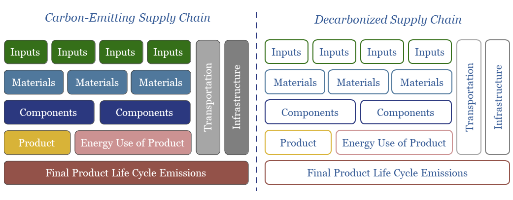
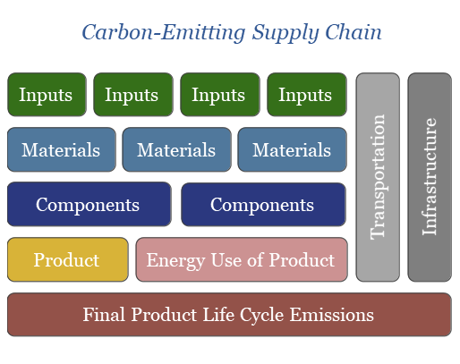
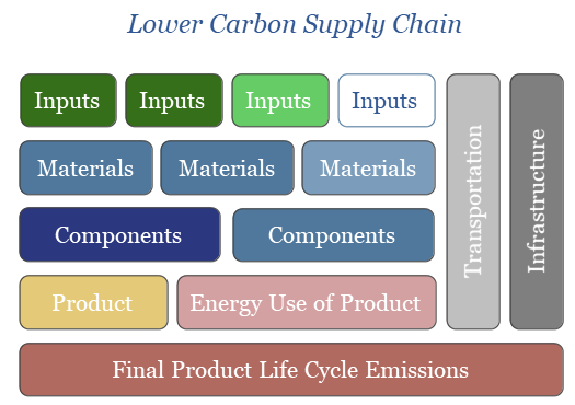
In order to simplify the complexity, let us move away from any specific example and consider the schematic below, which builds up the total life-cycle emissions of a generic product. The first step is producing primary materials, which are grown on land or extracted from the Earth. These will be upgraded or refined into usable materials. This materials will be formed or combined into components. The components will be manufactured into an end product. The end production will consume energy, in various forms, over its useful life.

In addition, at every step along this chain, the different components need to be transported from one location to another. And all of this supervenes on an infrastructure network of roads, rails, ports, electricity distribution networks and computer servers.

The total life-cycle CO2 emissions of a product is the sum of every single component step in the value chain. If the product uses 1kg of Material A, and Material A has a CO2 intensity of 2 kg/kg, then the product will embed 2kg of CO2, simply due to Material A. And so on, for all of the other component steps. Of course, the exact numbers will vary product-by-product.

Decarbonized supply chains

The challenge that we noted above, is that a typical product will gather tens-hundreds of inputs from tens-hundreds of suppliers. However, in the chart below we consider what happens if one of the input-producing companies in this value chain aims to become ‘carbon neutral’, possibly using the mixture of options available to them on Thunder Said Energy’s roadmap to net zero. Their product will have no embedded CO2. This means there will be less CO2 embedded in the materials made from that product, and in turn less CO2 embedded in the components made from that material, and so on, cascading up the chain.

Decarbonized supply chains

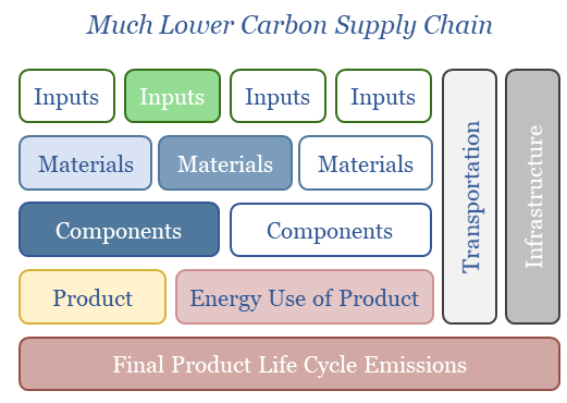
It is not difficult to imagine that more and more companies across the chain might also make progress with net zero ambitions, lowering (lighter color) or removing all of the net CO2 from their production process (clear blocks). Again, this can cascade up the chain and lower the net CO2 emissions embedded in the final product.

Decarbonized supply chains

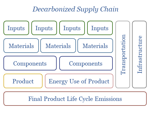
The end goal, we might hope, is that every single supplier across the value chain reaches net zero, and thus the entire value chain combines to produce a completely carbon-neutral product (chart below).

Decarbonized supply chains

Implications and conclusions?

If we use the simple schematics above as a roadmap for decarbonizing complex value chains, then several conclusions are likely to leap out…

For companies, you have direct control over your facilities and processes. Your primary objective should be to drive down net CO2 emissions from your facilities and processes, ideally towards zero; as this will cascade constructively through overall supply chains. We are currently working with dozens of companies to help them evaluate the most economical and practical route to do this.

For procurement teams, you have control over where your components, materials and inputs come from. Your objective should be to procure lower-CO2 products and services, where that is practical. Again, this will cascade constructively through overall supply chains.

For consumers, you have control over your purchasing and your emissions. You can act to minimize and offset both if you want to (screen of options below).

For critics, it may be unfair to ‘bash’ companies for emissions that are downstream of their facilities and processes. For example, an oil and gas company might aim to remove all of the net Scope 1&2 CO2 from their operations, but then get criticized by environmental groups for not tackling their Scope 3 emissions too. In some cases, this criticism may be fair: for example when the words in company marketing materials have been poorly chosen (more on this topic below). But more broadly, we think the approach is right. Global supply chains are complex. They are so complex that the only way to decarbonize them is if each company takes responsibility for their own link in the chain. In our own schematics for decarbonizing complex supply chains, oil and gas companies’ Scope 3 emissions are the responsibility of energy consumers further down the value chain, to displace, reduce, capture and offset.

For policy-makers, it would be helpful to impose an economy-wide carbon price, which in our view, should be set in the range of $50-100/ton. Its goal is to incentivize any and all actions that can lower net CO2 intensity at a cost below $50-100/ton. Ideally it should be combined with tax breaks elsewhere, so that the overall tax burden across the economy does not rise, as this would be inflationary. Ideally it should tax CO2 on a net basis, after deducting the impacts of CCS and high-quality nature-based CO2 removals, otherwise the total costs of reaching net zero are around 10x higher (15% of global GDP vs 1.5% of global GDP). Ideally it should promote carbon-labelling, as products that do not report transparent CO2 intensities would be assumed to have higher CO2 intensities than products that do report it. And ideally it would include a border-adjustment mechanism, to prevent carbon leakage. These are views based on all of our research to-date.

For the tech industry, we are sure that there is a clever, billion-dollar solution to indexing the embedded CO2 across entire value chains; so that one day, a consumer could pick up a product from a shelf, and instantly get a reading of its precise, embedded CO2 content, and its exact breakdown, along a complex value chain. The process might use a blockchain technology, or a simple set of relational databases, although the CO2 intensity of the blockchain should be minimized (note below).

For the global economy, adding a cost of decarbonization to every step of a value chain is going to inflate the overall costs across that value chain. This is inflationary. It is why we think low cost decarbonization is crucially important, and we have now conducted over 750 pieces of analysis to find the lowest cost options to reach net zero.

New Terminology: Lost for Words?

A constructive conclusion from our ongoing discussions with dozens of companies is the growing appetite to reach ‘net zero’. Genuinely, measurably, in the most practical and cost-effective way.

A major hindrance, however, is that the terminology does not yet exist to describe the kind of supply chains we have outlined above, where each company strives to ensure that its own individual link of the chain is carbon-neutral.

For example, imagine you are a producer, and you have worked to drive the net Scope 1 & 2 emissions of your product down to zero. You have integrated renewables into your operations as best you can, sought as many efficiency gains as possible, you may be sequestering CO2 back into the sub-surface, and/or you may be offsetting residual CO2 emissions using nature-based carbon removals. What should you call the resultant product?

“Zero carbon” or “Carbon Neutral”. Our view is that this is not the right terminology for such a product, because there could still be CO2 embedded in input materials, and associated with the use of the product. For example, if an auto-maker had removed all of the Scope 1&2 emissions from its auto plant, it would be misleading to call this a “carbon neutral car”, because there would still be CO2 associated with fueling the car, and CO2 embedded in the materials and components arriving at the auto plant.

“Lower-carbon”, “Clean” or “Green”. Our view is that this is not the right terminology, because it is imprecise. It does not capture the absolute nature of having driven Scope 1 & 2 emissions down to zero, but suggests something that is a matter of degrees. Moreover, if a coal-producer had removed all of the Scope 1&2 emissions from their coal production process (50kg/boe), then it might also be misleading to label the product as “clean coal”, because it would still contains 750kg/boe of Scope 3 emissions, which would be 2.3x more than “non-clean” natural gas, confusingly.

“Clear”. There has been a recent trend towards describing energy products with colors, especially in the hydrogen industry. At the risk of exacerbating this colorful trend, we think the best terminology is to describe a product with zero net Scope 1 & 2 emissions embedded within it as “clear”. Clear means that the product is “clear” from embedded CO2 emissions. For example, “clear steel” means steel whose production has not emitted any net Scope 1 & 2 emissions (and the same goes for “clear carbon fiber” or “clear natural gas”). In other words, labelling a product as “clear” advertises to its purchaser that there is no Scope 1 & 2 CO2 embedded in the product. The purchaser may emit CO2 via their use or processing of the product. But if they can capture or offset this CO2, in turn, then their own end product can also be described as “clear”. This is the only way we can see to create carbon-neutral products across the complex value chains we described above.

Transparent”. It would also be useful to have a word for production processes that have not added any net Scope 1 & 2 CO2, but where the products still embed whatever CO2 was already embedded in their own input materials. For example, a manufacturing facility might be run entirely off of renewable electricity as its sole electricity source. This means it has not added any net CO2 into its product. Although there may have been CO2 embedded in the components and input materials that were brought into the manufacturing facility. The manufacturing process is “transparent” in the sense that whatever CO2 was embedded in the input materials still shows through.

“Translucent” might be used to connote a process that is almost transparent, but has still added some small amount of CO2. Ideally, this CO2 can be quantified. For example, a manufacturer might have lowered its CO2 intensity by over 80%, compared to some baseline; but wish to honestly reflect that there are still some residual CO2 emissions that cannot be quantified or have not been entirely offset yet.

“Opaque” might be used for a product or process where there is clearly CO2 embedded, but it cannot even be quantified. One of the biggest present challenges in complex global supply chains is that almost all of the products are opaque.

Our conclusion on is that using these terms, consistently, across hundreds of decarbonizing companies, would be helpful for avoiding misunderstandings and building trust in the decarbonization of complex supply chains. Our own work in 2022 will start using the three terms — “clear”, “transparent” and “translucent” — in line with the definitions above.

Copyright: Thunder Said Energy, 2019-2024.