-
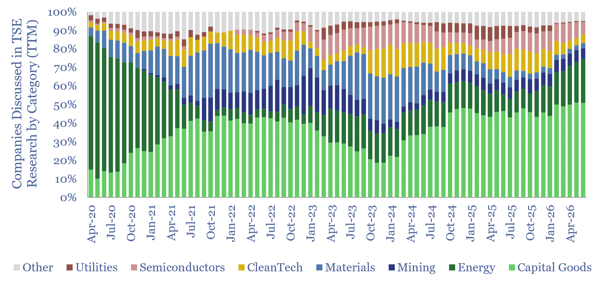
Ten themes for energy in 2H26

This 12-page report looks back at all of our research from the past year, to draw out our top ten conclusions in energy, industrials and materials. Energy volatility buoys solar and batteries. The ‘AI energy transition’ boosts the physical AI ecosystem more than the data center ecosystem?
-
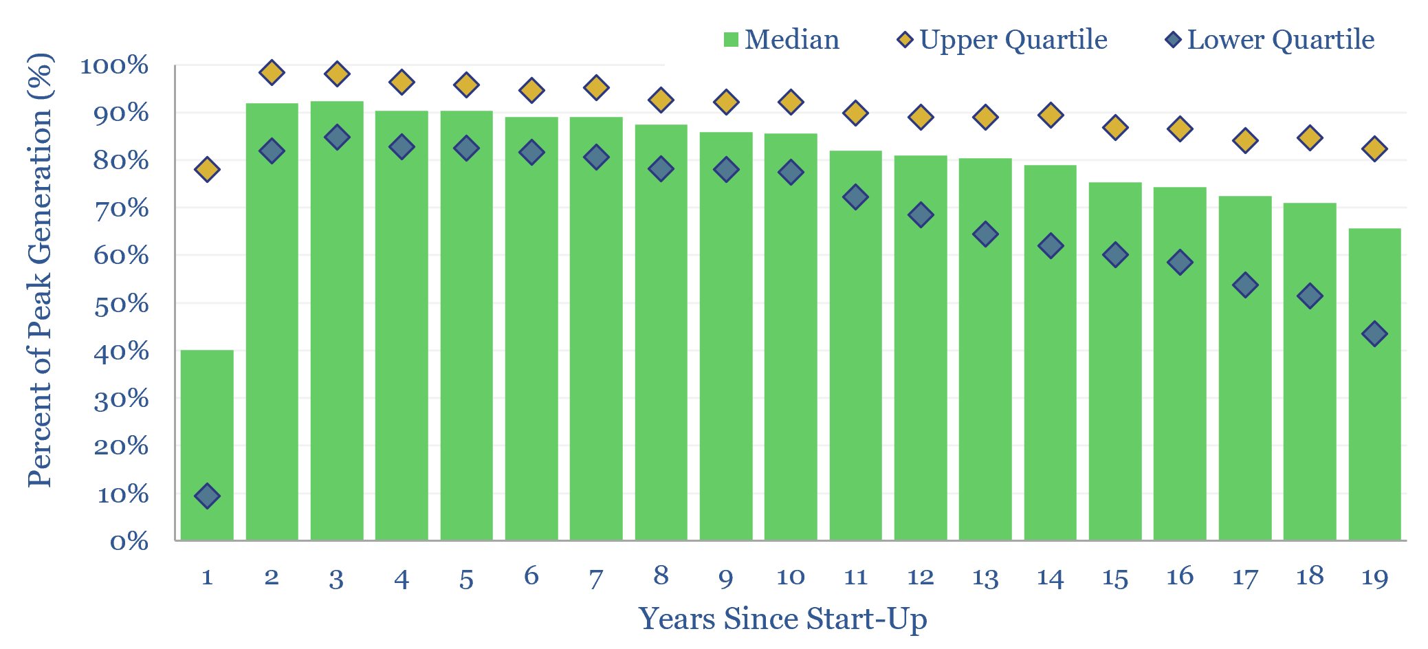
Solar power: decline rates?

This data-file tabulates the ‘decline rates’ of 6,600 US solar power plants, going back to 2001. Solar power decline rates average -1.5% up to year 12, after which decline rates increase. This matters for the economics of solar projects.
-
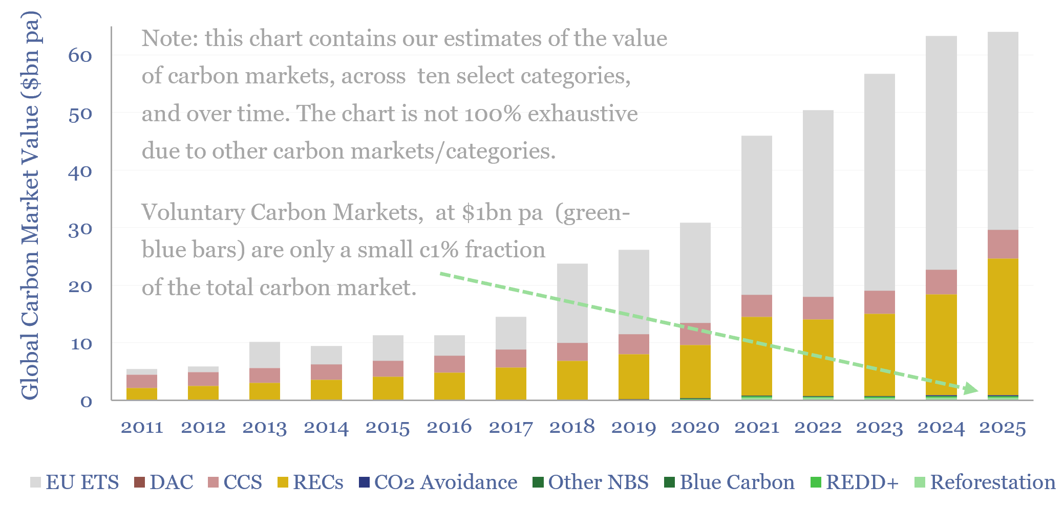
Carbon markets: by category over time?

This data-file quantifies global carbon markets by category over time, including the EU ETS as an example of a compliance market, RECs, CCS and VERRA-certified “carbon credits”, across categories such as REDD, reforestation and other “carbon offsets”. We also draw analogies with charitable giving and forecast carbon markets out to 2050.
-
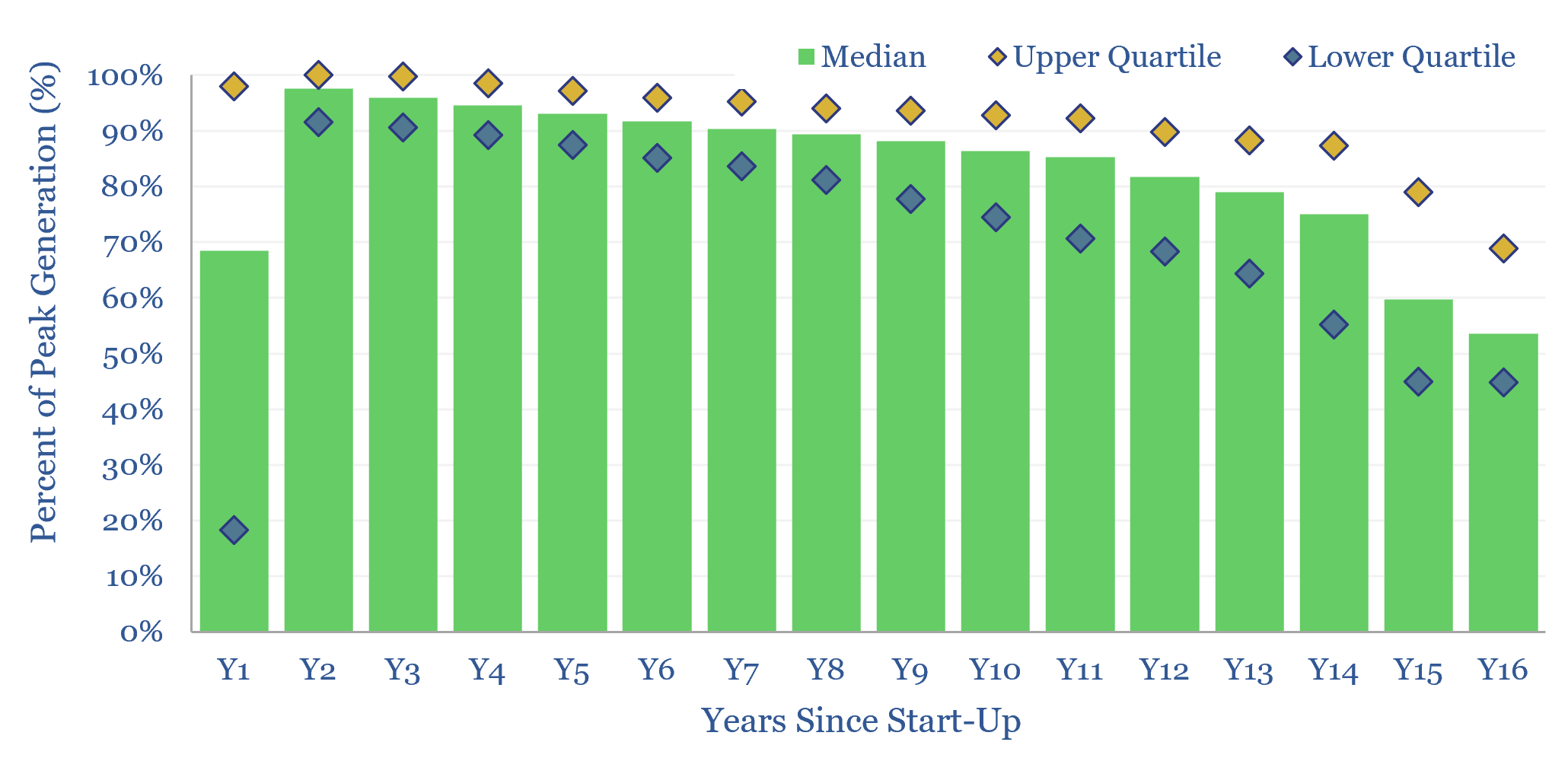
Wind power: decline rates?

This data-file aggregates wind generation by facility, across the US, at 1,500 wind farms, going back 25-years. Wind power decline rates average 1.8% per year, then accelerate to 2% per year in years 10-20. However wind generation is also noisy, typically varying +/- 7% YoY. This matters for the economics and ultimate share of wind.
-
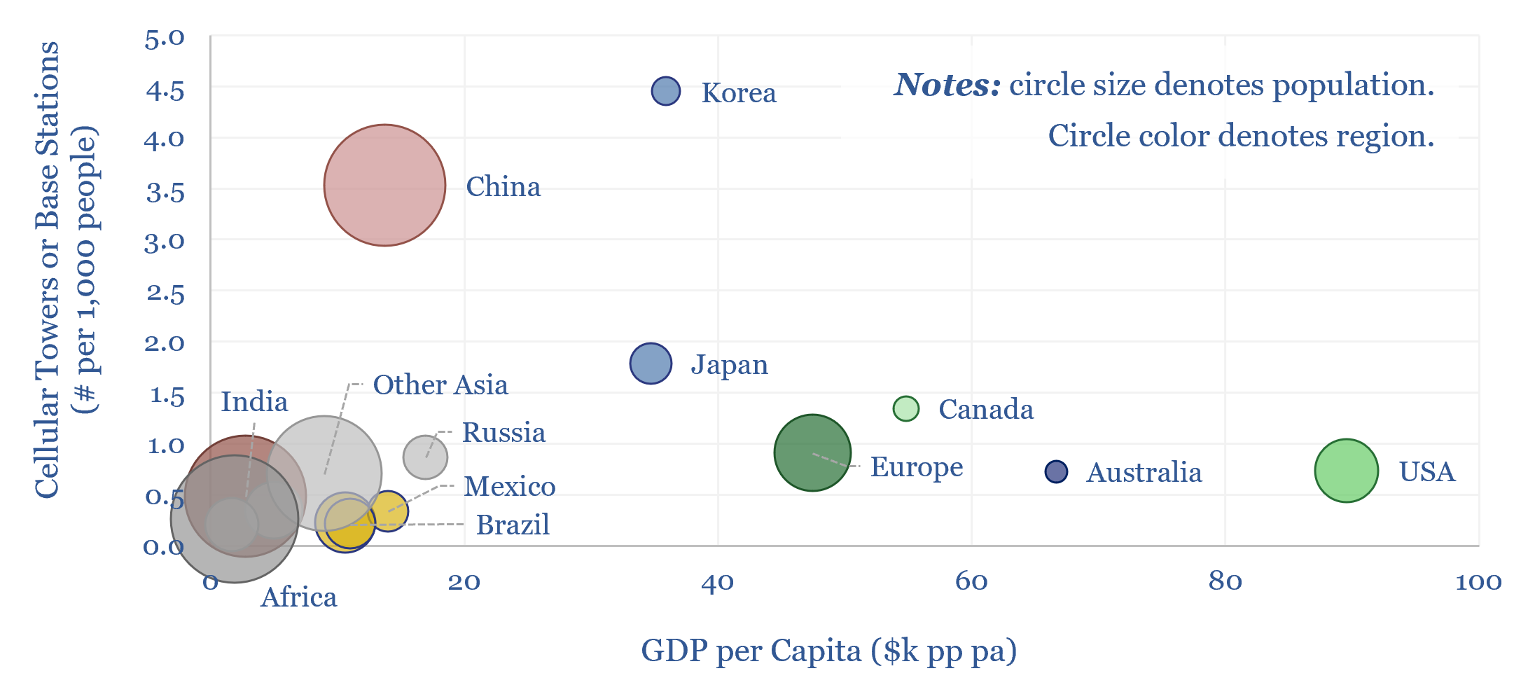
Cellular networks: how much energy consumption?

The energy consumption of global cellular networks is estimated at 250TWH pa in this data-file, by tabulating the deployment of 5G base stations, and other cellular towers, region-by-region. This matters as physical AI may require more cellular connections, across autonomous vehicles, drones and robotics.
-
Energy economics: an overview?

This data-file provides an overview of energy economics, across 175 different economic models constructed by Thunder Said Energy, in order to put numbers in context. This helps to compare marginal costs, capex costs, energy intensity, interest rate sensitivity, and other key parameters that matter in the energy transition.
-
LNG: top conclusions in the energy transition?

Thunder Said Energy is a research firm focused on economic opportunities that drive the energy transition. Our top ten conclusions into LNG are summarized below, looking across all of our research.
-
Hydrogen: overview and conclusions?

We think the best opportunities in hydrogen will be to decarbonize gas at source via blue and turquoise hydrogen, displacing ‘black hydrogen’ that currently comes from coal, and to produce small-scale feedstock on site via electrolysis for select industries. Others see green hydrogen as a cornerstone of the future energy system. We think there may…
-
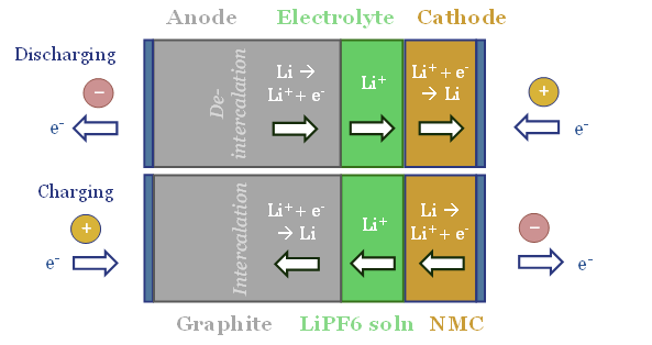
Energy storage: top conclusions into batteries?

Thunder Said Energy is a research firm focused on economic opportunities that can drive the energy transition. Our top ten conclusions into batteries and energy storage are summarized below, looking across all of our research.
-
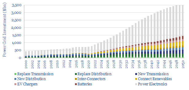
Power grids: opportunities in the energy transition?

Power grids move electricity from the point of generation to the point of use, while aiming to maximize the power quality, minimize costs and minimize losses. Broadly defined, global power grids and power electronics investment must step up 5x in the energy transition, from a $750bn pa market to over $3.5trn pa. But this theme…
Content by Category
- Batteries (96)
- Biofuels (44)
- Carbon Intensity (48)
- CCS (64)
- CO2 Removals (9)
- Coal (41)
- Commentary (65)
- Company Diligence (105)
- Data Models (925)
- Decarbonization (162)
- Demand (131)
- Digital (89)
- Downstream (47)
- Economic Model (221)
- Energy Efficiency (76)
- Hydrogen (63)
- Industry Data (309)
- LNG (56)
- Materials (86)
- Metals (88)
- Midstream (45)
- Natural Gas (161)
- Nature (76)
- Nuclear (28)
- Oil (176)
- Patents (39)
- Plastics (44)
- Power Grids (156)
- Renewables (153)
- Screen (138)
- Semiconductors (35)
- Shale (58)
- Solar (72)
- Supply-Demand (53)
- Vehicles (94)
- Video (24)
- Wind (46)
- Written Research (408)