This data-file is an Excel visualizer for some of the key headline metrics around renewables’ share of global energy: such as total global energy use, electricity generation by source, wind penetration and solar penetration; broken down country-by-country, and showing how these metrics have changed over time, in an easy-to-compare visual format.
Global useful energy consumption exceeded c90,000 TWH in 2025, rising at 2.5% per year in the past decade. It will most likely continue rising to over 140,000 TWH pa by 2050 (historical data here and region by region forecasts here).
Electricity comprises 36% of total useful energy, with c32,200 TWH generated in 2025, and the remainder is for heat, motion, materials.
Electricity’s 36% share (as a percent of total useful energy) has changed remarkably little over the past decade, in our assessment, although electricity did increase from 16% to 18% of total primary energy.
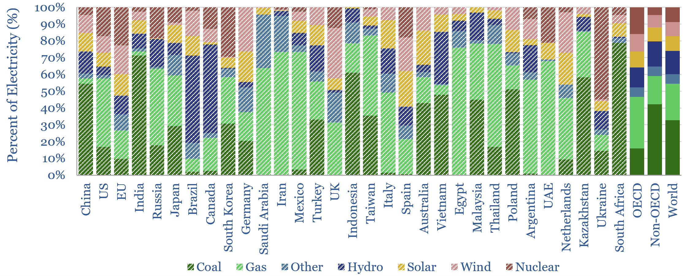
Wind and solar now make up 17% of all global electricity, of which 8% is wind and 9% is solar. A decade ago, the mix was 3% wind and 1% solar, so this shows how solar growth has accelerated.
Wind and solar’s 17% share of global electricity is up from 4% a decade ago. This 11% increase has displaced coal (41% to 33%), but more disappointingly for CO2 intensity, also nuclear (11% to 9%) and hydro (16% to 14%), while natural gas remains at 22%.
France makes an interesting but also slightly depressing case study from a Scope 4 CO2 perspective. From 2012->2022, wind and solar increased from 3% to 12% of the total grid (+9%), but over the same timeframe, nuclear declined from 75% to 63% (-12%) so the share of clean energy in the grid mix actually fell by 4pp overall.
The “renewables frontier” is that ten European countries generated over 30% of their electricity from wind and solar in 2025. California is similar, although the US overall generated 18% of its electricity from wind and solar in 2025 (TSE model here).
The world leader for wind is Denmark, supplying 58% of its grid, and the world-leader for solar is Chile, at 23% of its grid. There are limited signs of these countries capping out for technical reasons. YoY growth in renewables in 2024-25 was actually +60% correlated with 2023 share of renewables.
But wind and solar penetration may slow down for economic reasons, as their deployment inflates total system costs by 50-100%, which are often overlooked in over-simplified LCOE analysis. Renewables deployment does correlate with higher electricity costs (data here). As a concrete example, Denmark, lauded as a wind+solar leader above, has the highest retail electricity price of any country in our sample, and the UK has the highest industrial electrical prices.
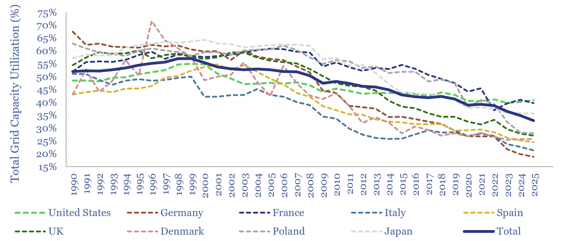
How does grid utilization change as renewables ramp up? The main reason increasingly renewables-heavy grids have seen higher costs is that the ramp of renewables reduces the average utilization factor of infrastructure across the grid. In the average grid in our chart below, the aggregated utilization factor has fallen from 55% at peak in 1998 to 33% in 2025. The declines are sharpest in countries that have ramped renewables fastest. This spreads the fixed costs of generation, transmission and distribution infrastructure across fewer units of output per MW of capacity, which in turn is inflationary.
There is only one good antidote to renewables inflating system costs, and that is where new, smart, flexible demand absorbs wind/solar output. We think this will be enabled by AI and a key feature of much physical AI.
Utilization factors (aka availability factors) are also plotted for wind, solar and hydro, in a dozen core countries, going back to 2010. A key finding is that the annual utilization of renewables is volatile, especially when considering smaller areas, or more limited subsets of renewable assets. Hence we see growing volatility in energy markets as renewables gain share, creating opportunities for traders and midstream companies. The data-file contains a ‘calculator’ to estimate the growing volatility of supply balances as renewables gain share.
The cleanest grids in the world, however, belong to Norway (88% hydro, 9% wind) and Sweden (40% hydro, 29% nuclear, 24% wind, 2% solar), where nuclear and hydro can also buffer renewables (note here).
China, India and Indonesia together comprise c40% of global electricity, comparable to the entire OECD’s electricity generation, and retain 60% coal in their power mixes, or higher.
Despite rising renewables, coal-fired electricity, gas-fired electricity, total oil, coal and gas use all made new highs in 2021-25. Our outlook on China’s future coal trajectory is here.
A main source for this visualizer into renewables’ share of global energy is the exceptionally useful and thorough data provided in Energy Institute (linked here) and before that, BP’s Statistical Review of World Energy (linked here), supplemented by capacity data from ENTSO-E and the UK Department of Energy. The analysis, data-scrubbing and visualizations are our own. The data-file was last updated in 2026, with FY25 data.