Forest fires: what climate conclusions?

Global CO2 emissions from wildfires

Global CO2 emissions from wildfires could be c25% as large as anthropogenic CO2 emissions, while burnt areas in the US reached an joint all-time record in 2020. Hence this note reconsiders some nature-based solutions to climate change. Hands-off forest conservation may do more harm than good in fire-prone areas. Sustainable forestry, carbon-negative materials, biochar and biomass energy also look more favorable.


Forest conservation: the advantages?

I took the photo below on New Years Day from the top of a mountain in Vermont, looking East over the forest, which stretches all the way to New Hampshire. If you had asked me then, I would have insisted that forest conservation was a crucial component of the world’s roadmap to Net Zero; and a virtuous source of generating carbon credits, albeit slightly less virtuous than incremental reforestation.

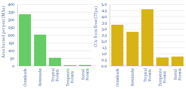
Forests store 200-300 tons of carbon per hectare. Moreover, deforestation contributes 6.5GTpa of emissions, as 10M hectares of the world’s 3.5bn hectares of forests are torn down every year. This is the singles largest anthropogenic emissions source globally (data below).

Viewed from this perspective, stemming the wanton destruction of nature seems like an important climate objective. We have even gone so far as to argue the US could end up placing sanctions on Brazil by the end of 2021, for Bolsonaro’s recent renewed assault on the Amazon.

Forest conservation: the disadvantages?

But there is another side of the coin. This has become more apparent for me, after spending 3-months in Oregon, Utah, Nebraska, California, Colorado, South Dakota and Montana amidst a stint of nomadic working this year. You see a lot of landscapes like this. They are beautiful (especially with a smiling dog in the foreground). But they are bone dry.

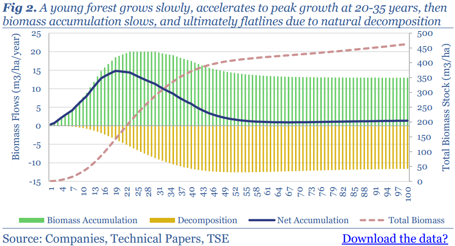
Mature forests also stop sequestering CO2 at some point between 50-200 years of age. First the rate of tree growth slows down by 50% (chart below). Moreover, the rate of CO2 release from the decomposition of dead matter eventually catches up to the rate of CO2 fixation via photosynthesis. And other dead matter accumulates on the forest floor and dries out…

This amplifies the risk of forest fires in older forests. One estimate in the technical literature is that 600M hectares of the Earth burns each year, emitting 12GTpa of CO2e. For perspective, this equates to 0.3% of the world’s forests burning every year, and the total toll of wildfires may be as large as 25% of global anthropogenic CO2.
In the United States, 2020 saw 10.1M of acres burning in wildfires, which is the joint-highest of any year on record (chart below). Interestingly, the prevalence of wildfires has actually fallen by 20%. But the average fire is around 3x larger, when fire does break out.
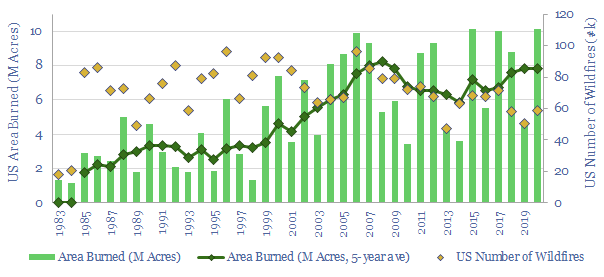
The single largest cause, cited in technical papers that we reviewed, was the accumulation of biomass in unmanaged forests. US forest cover has grown for 70 continuous years. And a second cited cause is climate change.

Seen from this lens, forest conservation policies may need to be re-thought. Is it possible, especially in dry geographies, that forest conservation simply encourages the accumulation of biomass that will later lead to life-threatening conflagrations and carbon releases?

Wildfires in theory?

Three elements are needed for a fire to occur: heat, fuel and oxygen. There is little chance of controlling heat or oxygen in the environment. Hence the only practical option to prevent wildfires is to remove fuel. Note this is totally at odds with the strictest forest conservation practices, which restrict any removal of biomass from a natural ecosystem.

There are also different types of fire, but crown fires are most expansive and most devastating. Specifically, ground fires consume mostly duff layers, produce few visible flames and can even go undetected, smoldering for days or weeks. Surface fires produce small flaming fronts that consume needles, moss, lichen and vegetation. They can kill up to 75% of trees, but can also be fought by ground crews. Full blown crown fires become active when there is enough heat and a “ladder” for the fire to climb up into tree canopies. They can kill 100% of trees and also burn off 10-60% of the carbon in soils beneath forests.

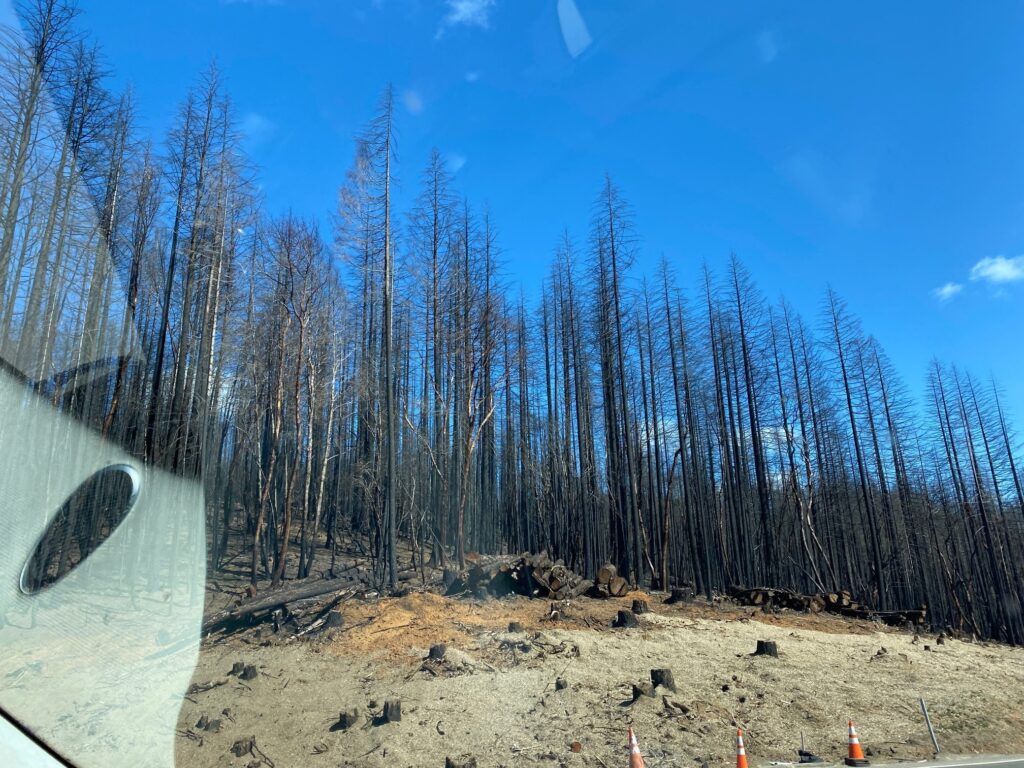
Fire kills trees by killing the cambium layer of living cells inside the tree bark that produces new wood and bark.  Foliage is also scorched, buds are killed off and roots are damaged. Thus what remains is a charred stock of dead biomass (as pictured from the car window below, East of the Cascade mountains, in Oregon). It can take 125-years for a forest to “recover” the carbon stocks burned off in such a conflagration.
Finally, a “Crowning index” is a metric used to quantify fire proneness. It is defined as the minimum wind speed that is necessary to sustain a crown fire in the canopy layer. 25mph translates into high hazard, 25-50mph is moderate and >50mph is low hazard.

How are wildfires prevented?

The only practical way to prevent wildfires is to remove surface fuels. But this can take many different approaches.

One common approach is controlled burning or “underburning” of specific areas, or the gathering and burning off of “slash”. The idea is to remove biomass (fuel). (I witnessed a controlled burn project last week in Oregon, in April-2021, where a dry summer is anticipated). It is justified as a form of ‘carbon insurance’, giving up the carbon in the burned off material, in order to safeguard the remainder. But clearly, burning off forest carbon is not the best option from a CO2 removals perspective.

Thinning is another approach that fells small and vulnerable trees, while leaving behind larger trees with thicker bark (that insulates the cambium). A related approach, thinning from below, removes trees of intermediate height, which could enable a fire to jump from the ground level to the canopy layer. Lower limbs below 10-12′ may also be pruned for similar reasons. Again, this biomass may be burned in a controlled fire, or piled up to decompose. Again, from a CO2 perspective, there should be better options.

Mastication is a mechanical technique for fuels reduction, chopping, mowing and mulching ladder fuels such as brush and smaller trees. The resultant wood chips form a compact layer of material, which can be distributed evenly around a site and may make the area more resistant to fire. An advantage is that the carbon is not burned off. But it does decompose over time. Another drawback is the potential to wound trees if the operator is not skilled. The duration of fires in masticated fuels may also be higher than other fires. 

Species selection may be a practical way to improve fire resistance. For example, Ponderosa pine is noted as a good fire species as it has an open crown, high moisture content in the foliage, and thick bud scales that help it survive fire. Some hardwoods, such as bigleaf maple, red alder, Oregon white oak, have high moisture content, less volatile oils in their foliage and as a result, they burn at low intensities, if they do catch alight.

Digging a fire line down to mineral soil deprives the fire of fuel and will stop its progress. This requires harvesting all of the fuel from a particular area. It can integrate well with sustainable forestry, if a line is cleared through a large forest stand each year, during harvesting, forming a natural break for fires (example below).

Comprehensive forest management is likely to be most effective, based on the studies we reviewed. This encompasses the systematic removal of biomass until tree coverage is only 40-50ft2 per acre, primarily comprising the largest and most fire-resistant trees. One study showed that this strategy increased the crowning index of a high-hazard lands from around 25mph to 82% mph, moving 90% of all treated acres into low-hazard conditions, while 73% of the land would still be classed as low-hazard 30-years afterwards. This was substantially more effective than thinning or fifty percent biomass removals. It also generated a profit of $675/acre, while the other methods cost -$300-700/acre. The disadvantage is that you have lessening the risk of forest fires by lessening the extent of the forest. So this option may need to be reserved for select areas.

What conclusions for forest conservation carbon credits?

Our conclusion from evaluating wildfires is that forest conservation projects have very debatable carbon credentials, especially in fire-prone areas, and as the Earth warms. This adds to our prior fear that they are the least “incremental” for of nature based solution.

Active forestry, with periodic harvesting and re-planting can sequestering around 2x more CO2 over a century than a simple approach of restoring a forest and walking away.

This realization is also what we are seeing, when we assess the nature-based carbon offsets being undertaken by 35 large corporations. Reforestation projects are now 3x more prevalent than forest conservation projects in 2018-20.

We argue corporations will increasingly establish new internal groups to vet and procure the most reliable and cost-effective carbon removals. This will likely de-prioritize forest conservation, and instead prioritize reforestation, and a variety of active forestry initiatives.

Active forestry as an effective tool for climate mitigation?

“Active and responsible forest management is more effective in capturing and storing atmospheric carbon than a policy of hands off management”, according to one technical paper that we reviewed. Hence what are the best options that align with our research?

Comprehensive biomass removals from select, high-risk forest areas is likely to be the most effective fire-prevention method of the options reviewed above. An advantage is that larger trees can be used to make carbon-negative construction materials, such as cross-laminated timber, for use in buildings, or even in novel applications such as wind turbines. Our note below reviews the opportunity, which is among the most favored in our research, and even more so after this review of mitigating forest fire risks.

Forest residues can also be gathered and turned into biochar, a miracle material with uses in agriculture. Our models yield 20% IRRs without any policy support, at biochar prices of $600/ton, while allowing producers to pay $40/ton for biomass feedstocks (including transportation). An advantage is that biochar can be made from offcuts and other forest debris.

We are also growing more constructive on biomass power, in small quantities, where the burned material comes unequivocally from forest debris, which might otherwise exacerbate the risk of fires. But it is still debatable. The chart below shows how CO2 credentials vary: the left-hand of each range assumes all biomass fuel would otherwise have decomposed, while the right-hand assumes all forest carbon would otherwise have remained standing.

Sources

Bowyer, J., Bratkovich, S., Frank, M., Fernholz, K., Howe, J. & Stai, S. (2011). Managing Forests for Carbon Mitigation.

Fiedler, C. E., Keegan, C. E., Woodall, C. W. & Morgan, T. A. (2004). A Strategic Assessment of Crown Fire Hazard in Montana: Potential Effectiveness and Costs of Hazard Reduction Treatments. United States  Department of  Agriculture, Forest Service.

Fitzgerald, S. & Bennett, M. (2013). A Land Manager’s Guide for Creating Fire-Resistant Forests. University of Oregon, EM 9087

Loehman, R. A., Reinhardt, E. & Riley, K. L. (2014). Wildland fire emissions, carbon, and climate: Seeing the forest and the trees – A cross-scale assessment of wildfire and carbon dynamics in fire-prone, forested ecosystems. Forest Ecology and Management 317 9–19

Renewables: can oil and gas assets “demand shift”?

Shifting electricity demand in oil and gas

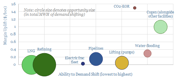
Industrial facilities that can shift electricity demand to coincide with excess renewables generation will effectively start printing money as renewables get over-built. They also help more renewables integrate into the grid. Oil and gas assets are generally less able to demand-shift than other industries. But this note outlines the best opportunities we can find, uplifting cash margins by 3-10%.


What is demand shifting and who benefits?

Demand-shifting is one of the most exciting opportunities for companies in the energy transition. Specifically, the idea is that renewables are going to get ‘over-built’ (chart below). In turn, this means that power prices will become increasingly volatile. Around one-third of the time, when the wind is blowing and the sun is shining, power could effectively be free. Another one-third of the time, when these renewable assets are not generating, power prices will likely spike to 15-30c/kWh.

Why does this create an opportunity? If you run an industrial asset where the electricity demand is flexible, you can lower your overall operating costs by timing the demand for when power prices are very low and NOT timing the demand for when power prices are high. This could lower aggregate power prices, and help accommodate another 10pp of renewables in the grid (note below).

The number of industries that can demand shift is much larger than one might expect at first glance. They include electric arc furnaces, industrial gases, internet companies, EV chargers, greenhouse agriculture, water utilities, commercial heating. Generally, the more you look for these opportunities, the more you find. And to re-iterate, these demand shifting opportunities are going to come into the money long before grid-scale batteries or hydrogen come anywhere close.

Not all industries can demand shift. It is not a good idea for life-support machines! It is only going to work where there is minimal operational disruption. Ideally, there may also be an energy saving for electrifying and demand-shifting a process (examples below).

Who is best placed? The ideal demand-shifting opportunity has four criteria, based on our models. (1) Electricity is one of the largest input costs (2) cash margins are low (3) the industry is not highly capital intensive and (4) utilization rates are naturally constrained by some other factor. The reason that (1) and (2) matter is that a reduction in electricity costs will have a disproportionately large impact. The reason that (3) and (4) matter is that demand shifting requires an asset NOT to run at the times when renewables are not generating and power prices are expensive. But amortizing high capex costs over fewer units of output cost can dramatically increase unit costs.

Can the oil and gas industry demand shift?

The purpose of this report is to assess whether the oil and gas industry can generate any incremental income via demand-shifting. We find oil and gas assets are generally less capable of demand-shifting, compared with other industrial assets. This means the over-building of renewables places other industries at a greater relative advantage

Oil and gas assets generally have some of the highest utilization rates of any assets, as quantified in our data-file below. The average manufacturing facility in the US runs at a 78% utilization rate. Refineries and oil and gas processing plants actually lead the screen, with utilization rates sometimes surpassing 90%. It takes days to re-start a refinery or an LNG plant after an outage. This makes them poorly placed for demand shifting.

Oil and gas assets have some of the highest capital costs of any assets. We all know the stories of $50bn+ mega-projects. Once you have built an LNG plant costing $750/Tpa (chart below), you want to run it flat out to recover your capex costs.

Oil and gas assets may be less likely to use electricity, because they naturally have a cheap alternative on site (i.e., oil and gas). For example, in our model below of an ethane cracker, the natural energy source to power the two most energy intensive units (feedstock pre-heater and main ethane cracker unit) is the off-gas coming out of the reactor itself, which would otherwise need to be cleaned up and recirculated, at a cost.

Can some oil and gas processes become demand-flexible?

The best examples we can find around the oil and gas industry are in lifting and in EOR at mature oilfields. These processes actually meet all of the criteria we laid out above for good demand-shifting opportunities.

CO2-EOR operation is the best of the best examples we can find. Across CO2-compression and lifting operations, we estimate there could be as much as 35kWh of electricity used per barrel of oil production. CO2 injection does not need to take place constantly, but compressors may have spare capacity to dial up and dial down their activity over a period of days-weeks, as long as the overall volume of CO2 injection hits a monthly target. Lowering the average electricity price from 7.5c/kWh to 3c/kWh uplifts cash margins by around 10%. Our note on CO2-EOR is below.

Water injection operations have a similar demand flexibility, but the economics are not as compelling. Specifically, a water-flood will aim to inject 0.75-1.25 barrels of water per barrel of fluid that is lifted out of a reservoir, in order to achieve a particular voidage replacement ratio. But again, this is only a monthly basis, allowing the injection rates to vary day-by-day. Only 12kWh/bbl of electricity is assumed in our model below. Hence the margin uplift from flexing demand is a mere 3%.

Similarly, at mature fields, pumps may not operate all of the time lifting oil out of the reservoir. They may periodically turn on and turn off, in order to allow the reservoir near to the wellbore to ‘re-charge’. Or there may be an optimal production rate that is well below the full-time production capacity of the pump. Maybe these pumps use 1.5kWh/bbl on average, and it is possible to save around 5c/bbl.

https://thundersaidenergy.com/downloads/esp-optimisation-opportunities/

Finally, pipelines may have spare capacity, and may be able to dial-up or dial-down their power draw depending on grid prices. Generally, we assume pipelines run at high utilization rates, while the energy needed to move each mcf of gas through a 1,000km pipeline is relatively low, at around 0.5kWh per mcf. While the power may not be very material in absolute terms, it could yield a 2-5% uplift, when you think that the average cash margin for a 1,000km pipeline is around $1/mcf.

Co-generation: the best of both worlds?

Despite their high uptime requirements and their usual reliance on on-site oil and gas for the majority of process energy, many industrial facilities in the oil and gas industry also use electricity. Often this electricity is generated on site, using a co-generation facility. This is an excellent opportunity for grid-smoothing.

The idea is to absorb cheap renewable electricity from the grid when it is available in abundance (i.e., whenever the power price is cheaper than your on-site generation costs). And then produce your own power whenever renewables are not available. Our economic model for a gas-fired co-gen facility are here. If your baseline power price is 7c/kWh, you might be able to generate 2c/kWh overall savings by absorbing cheap renewables and running the gas turbines less frequently?

Returning to our ethane cracker example above, we estimate that each ton of ethane requires 24mcf of gas (around 7,000kWh of energy) to provide process heat, but the plant also uses around 1,200kWh of electricity to power compressors and coolers. If we can lower our overall power price from 7c/kWh to 5c/kWh, this is equivalent to uplifting cash margins by around 3%, or around $1/bbl. This is a good opportunity.

If this is correct, then we would expect an expansion of cogen capacity at large industrial assets, as a counter-balance to the overbuilding of renewables. We argue this remains one of the most exciting and direct ways to gain exposure to the theme. Our research note on the topic is linked below. Within it, there is a screen of relevant turbine makers.

Please contact us, if you would like to discuss other demand-shifting opportunities, or if you would be interested in a deeper-dive into the demand-shifting opportunities within your own asset base or portfolio.

Carbon accounting: philosophical investigations?

This short essay argues current carbon accounting frameworks may not be entirely helpful. Metrics like “Scope 1”, “Scope 2” and “Scope 3” only make sense for a small subset of companies, but they lack applicability, comparability, completeness, and reliability across the broad landscape of global emissions. We prefer granular carbon accounting which can be compared to counterfactuals. Our argument is illustrated with examples; and based on the philosophy of language, from Wittgenstein through to the present day.


Philosophy of language: an overview?

Many moons ago, I was awarded a degree in Philosophy and Neuroscience at the University of Oxford. It turns out that the philosophy of language is surprisingly helpful for carbon accounting, as explored in this short research note…

At the turn of the twentieth century came the logical positivists. They sought to codify language into symbols and logical operations. For example, to say that “my car emits CO2” can be analyzed as a proposition (P), and broken down into the words “my car” which specially references a particular hunk of metal sitting in the driveway, the property of “emitting” (which in this case applies to the car) and a type or class called “CO2” which represents all molecules with the chemical structure O=C=O. My car runs on gasoline and so P is true. All language, and all of the problems of philosophy, the logical positivists claimed, could be analyzed as logical statements like this, which will be true or false depending on the state of affairs in the world. Some went so far as to claim that these kinds of logical statements were all there was to language. 

Then came Wittgenstein (1889-1951), still to my mind the greatest philosopher of all time, who shattered logical positivism, and philosophy more broadly. To Wittgenstein, the strict rules proposed by logical positivists have nothing to do with how language is actually spoken and understood by people in the real world. Language is no more than an imprecise set of customs. These customs work because users of the language are generally like-minded, and tend to interpret utterances in similar ways. In a few circumscribed cases, utterances in a language might have a logical structure like “my car emits CO2”. But language is complex, and many other meaningful utterances totally defy this framework, like answering a question with a thumbs up. Other utterances in language appear to make sense, such as “if it’s 6am in New York, what time is it on the sun?”. But on closer inspection, all that is shown by these kinds of philosophical problems is the boundaries of our linguistic customs. No philosophical questions have proper answers.

Then came modern philosophy, reeling, and trying to justify its existence in the aftermath of Wittgenstein. Yes, many questions of philosophy are at risk of being unanswerable. But philosophy can nevertheless provide some useful ways of thinking about things. One of my favorite  writers was David Lewis (1941-2001), famous for “possible world semantics”, where language can be analyzed by considering the world around us, but also other hypothetical worlds. “If I switch my car to an EV, my CO2 emissions will fall” means that in the vast majority of possible worlds where I switch my car to an EV, my CO2 emissions fall. Then we can start considering what these possible worlds look like (including worlds where I am charging my EV from the grid, or from a diesel generator, or even the broader range of possible worlds where I sell my car altogether and take public transport). 

If you have made it this far, thank you for not giving up already. We argue below that traditional carbon accounting frameworks are like logical positivism. They are subject to holes and philosophical muddlings that could bring Wittgenstein back from the grave. But useful carbon accounting can be salvaged, especially via a “possible worlds” approach.

CO2 accounting frameworks: logical positivism revived?

The logical positivism of the CO2 accounting world is the Greenhouse Gas Protocol. It starts with Scope 1 emissions, which covers all of the CO2 emitted directly by a company, such as the fuel combusted at company facilities. It then adds Scope 2 emissions, which cover the CO2 embedded in the heat and electricity purchased by the company. Finally, it adds Scope 3 emissions, which covers all the CO2 indirectly emitted through the use of the company’s products.

CO2 accountants, like logical positivists before them, invariably seem to believe that all of the challenges of CO2 accounting can be solved by strong-arming companies into hiring CO2 accountants; moreover that climate progress can best be achieved in the form of corporate promises to reduce these emissions categories; and most brazenly, that CO2 accounting simply comes down to Scope 1, Scope 2 and Scope 3.

That’s not how companies work, any more than logical positivism is how language works. It is tempting to conceptualize ExxonMobil as a single giant furnace in Texas, and then ask the company why it can’t simply tell us how much CO2 is being emitted out of its furnace. But the reality is a Super-Major with a presence in over 200 countries globally, and many activities in each country. In many of these, it is not the owner or operator of assets, but a minority shareholder, in a joint venture operated by a third-party (which may or may not even relay the requisite data back to other JV partners). In many others, it does not do its own drilling, construction or maintenance, but hires third-party contractors (e.g, oil service companies).

That’s not how financial accounting works either. Back when I was a sell-side analyst, I remember downgrading another Oil Major to a ‘Sell’ because I discovered they had over $15bn of debt “off their balance sheet”, hidden away from their gearing calculations. As the company correctly pointed out, IFRS accounting rules do not require them to consolidate the debt in these entities, as they are minority shareholders. Only their share of income must be consolidated. Obviously, the financials of contractors and service providers are not consolidated either. And so it is with CO2 disclosures that are published by companies today. These disclosures are usually limited to consolidated assets, or even more narrowly, to consolidated AND operated assets.

Limiting CO2 disclosures to a subset of assets, however, limits the comparability of these disclosures. Companies with concentrated portfolios (few assets, large controlling stakes, operations performed in-house) will appear to have more CO2 emissions than otherwise identical companies with sparse portfolios (many assets, non-controlling stakes, operations performed by contractors).

Scope 1 & 2 emissions can also be “gamed” by giving up control of an asset, such as selling a corporate headquarters then leasing it back (it is no longer “our asset”); or by outsourcing activities that used to be performed in house (it is no longer “our maintenance crew”).

Some industries also defy measurement via the Scope 1, 2 and  3 framework. Also back when I was a sell-side analyst, I would be sent on punishing ‘marketing trips’, where over the course of ten days, I would participate in 70 meetings, in 10 different cities, going Coast to Coast in the United States. (By the end, you didn’t know which way was up or down!). But I once tried adding up the CO2 emissions from one of these trips. The calculations became pretty hairy. I would be trying to figure out what model plane or taxi I was travelling on, how to allocate its emissions between myself and my co-passengers, and whether to adjust for nuances such as business class seating. I think these are genuine challenges for carbon accounting, and they were part of my CO2 footprint as an analyst. Whereas the Greenhouse Gas Protocols effectively ignore them. Under their frameworks, these are simply the Scope 1 emissions of transportation companies, from airlines (who report them) to individual Uber drivers (who do not).

As a general rule, the smaller the entity, the less likely they will have the resources to calculate their Scope 1, 2 and 3 emissions. (I may calculate a look-through of all our CO2 emissions on behalf of the West household, but I suspect I am somewhat unusual!). Are we thereby saying that only big corporations need to reduce their emissions, while smaller corporations, and the 8bn people in the world are somehow exempted?

Scope 3 emissions can be a totally meaningless concept. Imagine you are that airline or Uber driver, trying to quantify how your service has indirectly contributed to a customer’s CO2 footprint? You have delivered me to my destination. How are you supposed to know if I am in town to discuss energy stocks in an office building (low carbon) or set fire to the local library (high carbon). If the latter were the case, then the law would not hold you responsible, but the carbon accountants might! For a more real example, consider the Tesla photographed below, towing a diesel generator, which if used to charge the Tesla would result in 30% higher emissions per mile than simply driving an ICE car (data here).

Scope 2 emissions can also be meaningless and hard to measure. For example, renewable energy credits are legal contracts where all parties agree to pretend that gas and coal electrons are wind and solar electrons and vice versa. As per our recent research, these RECs can create some very strange implications for carbon accounting (below).

Scope 1 emissions are also debatable, for example, where Scope 1 emissions sources are only inferred, not measured directly. For example, we estimate that 2% of all methane is leaked across the entire global value chain, from producer to consumer, but if a company genuinely knew whenever it was unintentionally leaking methane, it would be a lot easier to fix the leaks (note below, including some interesting new technologies to help).

Other important emissions categories are not captured at all in this framework. For example, our research also shows that almost two-thirds of CO2 emissions are embodied in materials and products (data below), not in purchased fuel and electricity. But the emissions associated with purchasing raw materials do not appear to be captured by Scope 1, 2 or 3 categories.

The destruction of nature, or CO2 fluxes caused by deforestation or environmental degradation do not seem to be captured either. Nor is there an elegant solution in these carbon accounting frameworks to capture the positive impacts from nature-based solutions that are sponsored by companies (do they offset Scope 1, 2 or 3, or go in their own separate bucket?).

Most pressingly, from our own CO2-accounting models, it is not even particularly helpful to know the absolute number of Scope 1 or 2 emissions, unless you have a “per unit” metric, on which to compare different companies. In some industries, these “units” are inherently apples and oranges (e.g., how do you compare the CO2 per iPhone to the CO2 per hamburger to determine whether Apple is a more sustainable company than McDonalds).

Even when competitors in an industry are producing highly similar products, care is warranted. We have seen this, for example, in our screen of refiners below. Some of the apparent laggards are simply producing cleaner fuels (e.g., to meet California fuel standards), or they are also co-producing petrochemicals, a fundamentally different product. Hence our analysis has been very careful to adjust for these effects, before declaring true “leaders and laggards”.

Is carbon accounting a useless endeavor: homage to Wittgenstein?

To re-iterate, carbon account frameworks seem to make sense, in a very circumscribed set of contexts, especially where a company operates a single, large asset, like a blast furnace, and we can measure the Scope 1, 2 and 3 emissions of this operation. This is a little bit reminiscent of how logical positivism seems to make sense, in a very circumscribed set of contexts, such as very simple propositions in a language.

There are also many examples of companies that seem to defy meaningful measurement via Scope 1, 2 and 3; categories of emissions that are altogether missed; reductions in Scope 1&2 emissions that do not actually have any bearing on CO2 emissions; and on closer inspection, the concepts of Scope 1, 2 and 3 are a little bit fuzzy.

To say that Scope 1, 2 and 3 emissions conceptually capture everything that needs to be captured in carbon accounting is like saying that all of language boils down to logical operations. This might all make carbon accounting questions seem unanswerable.

Our own approach to carbon accounting: homage to Lewis?

Carbon accounting is not useless. It simply needs to be done right. And this involves a mixture of data-crunching and philosophy. Below are a dozen principles we have found helpful, illustrated with examples, where possible. Our conclusion is that companies that want to promote climate progress should publish granular, asset-level emissions data, and strive to reduce the emissions of these underlying processes; rather than focusing on headline data at the corporate level.

(1) Companies do not emit CO2, processes do. To re-iterate, ExxonMobil is not a single giant furnace in the center of Texas.  It is a company that owns interests in various assets. Each asset uses various processes to make various products. It is these processes that cause CO2-equivalent fluxes and need to be decarbonized in the most cost-effective way, regardless of whether the process is undertaken in-house or by a contractor. The same goes for any company. Carbon accounting would be vastly better if numbers were published at the asset- or process-level, not the company level.

(2) CO2-equivalent fluxes should be the primary unit of account, not just emissions. Climate change is caused by the accumulation of greenhouse gases in the atmosphere.  Hence accounting for climate impacts should ideally capture the motion of all greenhouse gases into, and out of, the atmosphere (model below). These fluxes should all be converted into the common currency of CO2-equivalents (1 ton of methane is equivalent to 25 tons of CO2 and 1 ton of N2O is 298 tons of CO2).

(3) Processes can be combined like building blocks. For example, the total CO2 intensity of a gallon of gasoline can be calculated from the CO2 intensity of development, production, transport, refining and marketing (data below). The CO2 intensity of a mile of vehicle travel can then be calculated from the CO2 intensity of a gallon of gasoline, plus the process of manufacturing the vehicle and the process of ultimately scrapping the car. This allows our build-ups to assess entire value chains, and not just the companies in specific portions of the value chain.

(4) CO2 considerations are usually relative. It is tempting to dichotomize the world into “carbon emitting” and “non-carbon emitting” categories. The reality is a spectrum (below).

(5) Relativity requires a baseline. I like to think about the counterfactual to a process as the closest possible world(s) in which that process does not occur. I.e., the world(s) that are as similar as possible to the actual world, but with the one process in question changing. For a simple example, when we talk about the CO2 emissions of driving a mile, we usually mean relative to the counterfactual of not driving that mile. When we talk about the CO2 of Factory A’s product, the counterfactual might be factory B’s product. No process on Planet Earth occurs in a vacuum.

(6) Counterfactuals matter. All of this discussion of counterfactuals might seem academic. Here is an example for why they matter. Planting a biofuel crop has a totally different CO2 flux if the alternatives are (a) leaving that agricultural land fallow (b) tearing down a rainforest. Where these counterfactuals get really useful, is in considering the relative CO2 fluxes that can be achieved with 1MWH of renewables (displacing coal power is best, conversion to hydrogen is materially worse) or 1kg of waste biomass (deep burial or biochar are superior to biofuels, note below).

(7) Some processes are lower-carbon. Specifically, this means that the process results in a smaller flux of CO2 into the atmosphere, relative to the closest possible worlds in which the process is not undertaken. As an example, green plastics are generally lower-carbon than fossil plastic, (but still materially higher-carbon than not using plastic at all).

(8) Some processes are carbon-negative. Specifically, this means that the process results in a net flux of CO2 out of the atmosphere, into some other sink, relative to the closest possible worlds in which the process is not undertaken. For example, an acre of seaweed cultivation project results in 2 net tons of CO2-equivalent being sequestered in the deep ocean every year, relative to the alternative of not undertaking the seaweed cultivation project (note below).

(9) Some processes are carbon-neutral. Specifically, this means that the process results in zero net flux of CO2 into or out of the atmosphere, relative to the closest possible worlds where the process is not undertaken. This definition matters, because honestly, we see many projects claiming to be “carbon neutral” which are nowhere close on our numbers.

(10) If in doubt, build a ledger.  The best way I have found to calculate these carbon fluxes is to put two columns side-by-side in a spreadsheet, one reflecting the process, the other reflecting the counterfactual, and then go line-by-line, sub-process-by-sub-process. For a recent example, please see our data-file into biochar below.

(11) Counterfactuals will sometimes be debatable, but these are good debates to be having. By definition, a counterfactual is a fiction, a scenario that has not happened. Sometimes it is appropriate to consider a range of counterfactuals rather than a single counterfactual.  

(12) Accounting for nature-based solutions is no more complicated than accounting for any other process.  Some commentators criticize that carbon accounting is much more complicated for nature-based solutions. In our experience, it is no more complicated than the carbon accounting for any other carbon-reduction technology.

Please treat TSE data-files as building blocks. We now have over 500 research notes, data-files and models on our website. We have around 35 separate CO2 screens linked here. Often, doing the CO2 accounting for a large project is a function of combining the data from many of these pre-existing data-files. If we can help you with CO2-accounting please let us know.

Conclusions: what should companies do?

If companies want to help decision-makers understand their CO2 intensities, in our view, they should go a long way beyond blanket, company-level disclosures of Scope-1, and Scope-2 emissions. Instead, give us the underlying data: i.e., an asset-by-asset list of each facility, its output, its combustion emissions, methane emissions, electricity purchases, estimated CO2 intensity per unit of electricity, and other relevant data. This would make for vastly more meaningful comparisons.

Wooden wind turbines?

wooden wind turbines

Carbon-negative construction materials derived from wood could be used to deflate the levelized costs of a wind turbine by 2.5 – 10%, while sequestering around 175 tons of CO2-equivalents per turbine. The opportunity is being progressed by Modvion and Vestas, as discussed in this short note below.


Introduction: the quest for lower-cost and lower-carbon wind?

Our roadmap towards net zero requires global wind and solar additions to treble from 160GW per year towards 500GW per year by mid-decade, so that renewables can reach 40-50% ultimate shares of power grids. The vast build-out makes it important to lower the costs and CO2 intensity of constructing renewable assets.

For onshore wind turbines, our model below captures these costs in detail. Our base case is a 6.75c/kWh levelized cost, for a farm of 100 x 3MW turbines costing $1,850/kW. Costs in the model are sub-divided into 30 distinct categories. A 10% reduction in capex confers a 10% reduction in levelized cost of electricity, all else equal.

The tower supporting the blades and nacelle explains c$300/kW of the cost, of which $60/kW is the cost of steel and the remainder is largely in fabrication, transport and installation. Moreover, producing 300 tons of steel likely has a CO2 footprint of 450T (data here). Supporting this heavy structure also requires around 1,300 tons of concrete, explaining another 150T of CO2 (data here).

Overall, we estimate that the embedded CO2 in a wind turbine gives its power generation a CO2 intensity of 0.02kg/kWh (data here). This is low by comparison to the 0.4kg/kWh CO2 intensity of today’s US power grid. Low CO2 intensity of the grid matters in itself, and for electric vehicles which will ultimately be charged from the grid (below).

There are also logistical challenges, which preclude the scaling-up towards larger and more cost-effective wind turbines. A conventional steel tower of 100+ meters will have a 4.5m diameter at its base, which is a size limit for road transportation in the US and Europe. 

Build the towers out of wood not steel?

An alternative to lower both the costs and CO2 intensity of wind turbines is to use carbon-negative construction materials, such as glulam or cross-laminated timber. We are excited by this opportunity, featured in our recent research note (below), yielding 20-30% IRRs turning sustainably sourced forest products into alternatives for steel and cement, which together comprise 10% of global CO2.

To re-iterate, if mature forests are sustainably harvested, then it is ‘carbon negative’ to lock up their wood in construction materials, then re-plant younger and faster growing forests (chart below).

Modvion is a private company, based in Gothenburg, Sweden, founded in 2015 and with c20 employees. It is aiming to build wind turbines’ towers out of glulam, a material that is stronger than an equivalent weight of steel.

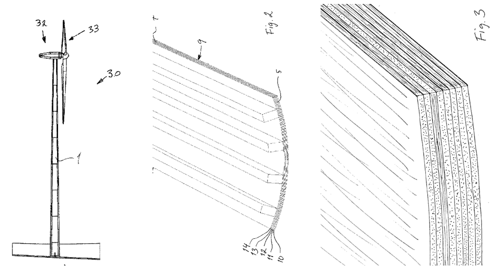
Three patents have been granted, for a fibre composite section (2018), a laminated wood tower and method for assembly (2020) and a wood connection used in a laminated wood tower (2020). An objective in the patents is to improve the strength and inter-connections between modular wooden tower components (below).

Advantages. Because the material is stronger and lighter, it could enable taller and more powerful turbines. Modvion cites that its technology “enables significantly decreased cost… [and] increased cost efficiency in the harvesting of wind turbines”. CO2 emissions in the construction of a wind turbine can be reduced by at least 25%.

Progress. A 30-meter prototype has already been built in Sweden, at Moelven’s glulam factory in Töreboda. Funding included a SEK69 ($8M) investment from the European Innovation Council in June-2020, as one of 72 companies that were granted funding, out of 3,700 applicants. The grant is being used to build a development facility for the first >100m towers. Preliminary contracts are in place to build a 110m tower for Varberg Energi and 10 x 150m towers for Rabbalshede Kraft. A collaboration agreement was also signed with Vattenfall in September-2020. In June-2020, Modvion stated “we are seeing enormous demand for our wooden wind turbine towers”. The first commercial structures could be built in 2022.

Vestas also invested in Modvion in February-2021 to accelerate the adoption of wooden wind turbine towers. Vestas launched a ventures fund in November-2020 to incubate disruptive technologies. This is a strong endorsement, as our patent analysis paints Vestas as the technology leader in onshore wind (below).

Elsewhere, Stora Enso, a large-cap materials company featured in our CLT screen (here) has supplied cross-laminated timber to Timber Tower GMBH, in order to construct the world’s first CLT wind tower, over 100m high, in Hannover, in 2012.

Disadvantages are that there is little established supply chain or prior experience with wooden towers. Some commentators may question their long-term durability.

Economic impacts: what cost savings?

70% materials cost savings? Ton-for-ton, cross-laminated timber and glulam is likely to cost 2x more than steel, at around $1,200/ton, in order to earn a 20% IRR building a CLT facility (mode below). However, the material is also lighter, and overall, we estimate that 85% fewer tons of CLT are required. This could cut the capex cost of a wind turbine by $40/kW, or around 2%.

Further savings are possible in fabrication and logistics, which are estimated to comprise $220/kW in our wind cost model. Ultimate savings here are less certain, but handling lighter modules might save 5-20%, which would be worth $11/kW, or 0.5-2.0% of total turbine costs.

Higher turbines could also be facilitated. As a rough rule-of-thumb, the power that can be harvested from the wind rises as a linear function of height (data below). Hence 5% taller turbines achieve 5% more power output, albeit incurring some higher costs in the process.

More details here: https://worldwide.espacenet.com/patent/search?q=Modvion

Conclusions: 2.5 – 10% cost deflation in carbon negative turbines?

If we add up all of the considerations above, we estimate there is potential to deflate the levelized costs of wind turbines by 2.5 – 10%, from 6.75c/kWh to 6 – 6.5c/kWh. The cost savings will be proportionately higher on challenging wind farms that have very high transport and logistics costs, but this is mainly a base effect. At the same time, around 175T of CO2-equivalents could be sequestered in each turbine.

One hundred years of carbon offsetting?

CO2 uptake per century

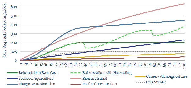
An acre of land can absorb 40-800 tons of CO2 over the course of a century. Today’s note ranks different options for CO2 sequestration over 100-year timeframes. Active management techniques and blue carbon eco-systems are most effective.


Nature based solutions to climate change are among the largest and lowest cost opportunities in the energy transition, with potential to absorb well over 20GTpa of CO2e for costs around $3-50/ton. We argue they will disrupt the entire new energies industry and will increasingly be adopted in the decarbonization strategies of climate-conscious organizations (research below).

One of the question marks over nature-based solutions is their impact over long time-frames. Another is the CO2 that can be offset per unit of land (note below)

Hence the purpose of this short research note is to quantify how much CO2 is most likely to be removed from the atmosphere and sequestered for different negative-emissions technologies, over the course of a century. Our answers are laid out below and we will run through the options in order.

Peatlands are most likely to absorb around 40 tons of CO2 emissions over the course of a century. This is the lowest volume shown in our chart, as an acre of peatland tends to absorb around 0.4T of CO2 per acre per year. Where peatland stands out, however, is that they continue accumulating CO2 at this rate for millennia. Hence an acre of peatland typically contains over 1,600 tons of CO2-equivalents, which is 4-8x more than a terrestrial forest and more than other blue carbon ecosystems (data below). This means that preserving pre-existing peat bogs is debatably more important than establishing new ones.

Restoring soil carbon in agriculture is next in our chart. It can absorb 75 tons of CO2 emissions over the course of a century. This number remains lower than other CO2-offsetting technologies. But it has the advantage of being compatible with crop-based agriculture and could therefore be implemented across a vast 4bn acres of croplands, where soil carbon has likely fallen from 4% in pre-industrial times to 1% today, due to mechanized agriculture, and explaining 20-30% of all anthropogenic CO2 emissions. We are seeing exciting evidence that CO2 markets could incentivize farmers to change their practices (note below).

Carbon capture and storage technologies, including direct air capture, are next on our list and are expected to sequester around 100 tons of CO2 per acre in our base case. In turn, this is derived from technical papers in our model below. However the range is broad, spanning from 5 tons to 1,000 tons of CO2 per acre, depending on reservoir quality. Injectivity is also expected to follow a decline curve, over a c50-year sequestration project. Total CCS or DAC costs will likely range from $70-200/ton, which is generally higher than nature based solutions.

Simple reforestation comes next, expected to sequester 200 tons of CO2 per acre over the course of a century. This has all been achieved after c40-years, as a typical forest’s growth follows a sigmoidal trajectory (chart below, data here).

After c40-years, the rate of trees’ growth has approximately halved (data below) while the rate of biomass decomposition will cancel out new carbon uptake. We note our numbers here are on the conservative side, as forest biomass is generally estimated between 200-400 tons of CO2e per acre in technical papers. To be clear, for reforestation projects to absorb CO2, you must start with an area that is not forested (e.g., sourced from the world’s 2.5bn hectares of degraded lands), re-forest them, then the forests must remain intact.

Active forestry can almost double the net CO2 absorption from forests over a 100-year timeframe. Specifically, our recent research considers the opportunity turning forest products into carbon-negative construction materials, such as cross-laminated timber, locking up the carbon in the wood products for centuries (note below). Our numbers assume that one-third of the forest’s carbon is lost due to harvesting and in processing forest products. Then a new cycle of reforestation can begin immediately. This explains the “saw-tooth” profile for sustainable forestry in our chart above.

Most of the carbon-absorbing systems considered above tend to mature and slow down their rates of CO2 sequestration. But three further examples in our chart continue their rate of CO2 absorption almost unabated.

Seaweed aquaculture has been the focus in our recent research, underpinning a vast carbon sink, forming 20 tons of dry biomass per acre per year, of which c10% tends to detach and sink into the deep ocean, where it is thought to be effectively sequestered for millennia. Seaweed and kelp biomass turns over around 10 times per year. Hence the flywheel of ocean carbon sequestration keeps spinning indefinitely. Over a century, seaweeds should sequester around 230 tons of CO2 per acre of seaweed cultivation per year.

Mangrove forests may absorb 450 tons of CO2-equivalents over the course of a century, helped by two factors. First, they are fast growing plants, absorbing around 9 tons of CO2 per acre per year, compared with our base case of 5 tons of CO2 per acre per year for terrestrial forests. Second, they shed material into swamp-like blue carbon eco-systems that lie among their thick roots. Material continues accumulating in this eco-system, which actually turns shallow waters into swamps, then from swamps into land. Again our numbers may be conservative, as some technical papers estimate that mature mangrove forests contain around 1,000 tons of CO2e per acre. Mangrove restoration costs $3-130/ton, depending on the location and the hurdle rate (note below).

Biomass burial can likely sequester the most CO2 per acre of any option in our chart. This involves fast-growing crops, which absorb 10-20 tons of CO2 per acre per year, then harvesting this biomass, and burying it 10-meters underground, so that the carbon is effectively trapped. We estimate that two-thirds of the fixed CO2 could be buried, the buried material will decompose at a rate of c1% per annum, and with a $15-50/ton CO2 price the practice could sequester around 8x more CO2 than converting the crops into biofuels (note below).

Biochar? While adoption of this biomass burial practice is currently negligible, a similar feat can be accomplished via biochar. This is already a $1-2bn per year market, accelerating at 10-30% per annum. Instead of burying the biomass, it is pyrolyzed into an inert material, which in turn can be scattered onto soils, as a one-off, or year after year.

Our conclusion is that vast amounts of carbon can be removed from the atmosphere, in natural ecosystems, over the course of the next century. Each acre of land can absorb 40-800 tons of CO2e. Active management techniques such as biomass burial and sustainable forestry are most effective, while blue carbon eco-systems can also yield rapid and sustained CO2 uptake. Please contact us for any questions on nature-based carbon offsets.

Renewable Energy Certificates?

Renewable energy credits challenges

Renewable Energy Certificates are legal contracts where all parties agree to pretend that gas and coal electrons are wind and solar electrons and vice versa. At best, these RECs incentivize incremental renewables projects to drive the energy transition. At worst, they may crowd out genuine decarbonization. At any rate, this note discusses some strange implications for energy analysts, as RECs have been commercialized over the past 20-years. Our view is that nature-based carbon credits may be superior to RECs.


Introduction: renewable energy credits in corporate decarbonization?

Increasing numbers of companies are embracing nature-based carbon offsets, as a part of their decarbonization strategies. We believe this will emerge as one of the largest and lowest cost opportunities to help the world reach ‘Net Zero’ CO2. Our data-file below, for example, quantifies the approaches of thirty leading companies.

But another strategy seen in companies’ decarbonization strategies has been to purchase “100% renewable energy”, especially for tech companies, where electricity dominates their CO2 emissions. At first glance, this is a strange claim to be making. Wind and solar only comprise c10% of the grid globally, c20% in Europe, and there are vast intermittency challenges in scaling wind and solar past 40-50% of any functioning system (see below).

Claims for 100% renewable electricity revolve around renewable energy certificates. These financial instruments also go by alternate names, such as ‘renewable energy credits’, ‘green tags’, ‘green energy certificates’, ‘tradable renewable certificates’, et al. But for the remainder of this article, we will abbreviate them as RECs.

Renewable Energy Credits (RECs) are the right to claim the environmental attributes of renewable electricity. They are traded in 1 MWH units. And they are sold by wind, solar, hydro and other green electricity producers.

An example for 100% renewable electricity.  Let us assume a small island grid generates 100MWH of electricity in a given year. 10MWH is generated by solar, and 90MWH is generated by diesel. Company X consumes 10MWH of energy from the grid, which statistically comprises 1MWH of solar and 9MWH of diesel. However, Company X then purchases 10MWH of renewable energy credits from the solar plant. In other words, Company X has purchased the legal rights to attribute all 10MWH of solar energy to its own operations, and thus claim that 100% of its electricity purchases are renewable.

Who benefits? The positive interpretation is that purchasing RECs supports renewables and will accelerate their deployment. Indeed, a $1-5/MWH (0.1-0.5c/kWh) premium for a typical wind or solar asset likely increases the base case IRR on a typical project by 0.1-1.5 pp (models below). At best, this may incentivize new renewable projects that otherwise would have been stranded.

Who suffers? The negative interpretation is that the CO2 intensity rises for everyone who does not purchase RECs. Let us assume I am a resident on the island discussed above. All 10MWH of renewable generation on the island has legally been claimed by Company X. The electricity I am buying, therefore is sourced from the remaining 90MWH generated by diesel. Bizarrely, even if I am drawing my electricity directly from the solar panels, I cannot claim to be using clean electricity. The attribution rights for that clean electricity have already been claimed by Company X and must not be double-counted.

Open to interpretation? The interpretation above is actually not ours, but that of the US Federal Trade Commission, i.e. the US’s foremost consumer protection agency. Its guidance document gives the following example: “A toy manufacturer places solar panels on the roof of its plant to generate power, and advertises that its plant is ‘‘100% solar-powered.’’ The manufacturer, however, sells renewable energy certificates based on the renewable attributes of all the power it generates. Even if the manufacturer uses the electricity generated by the solar panels, it has, by selling renewable energy certificates, transferred the right to characterize that electricity as renewable. The manufacturer’s claim is therefore deceptive. It also would be deceptive for this manufacturer to advertise that it ‘‘hosts’’ a renewable power facility because reasonable consumers likely interpret this claim to mean that the manufacturer uses renewable energy”.

Market metrics: how widespread and reliable are RECs?

How widespread? NREL tracks the REC market. It estimates that in 2019, 197,000 customers purchased 69TWH of unbundled RECs. For comparison, US wind and solar generation were around 400TWH in 2019. About 360 corporate offtakers also purchased about 42TWH directly through PPAs, which suggests corporations are buying 1.5x more renewable energy ‘indirectly’ through RECs than directly through using renewables, which would be a somewhat surprising finding.

Average REC pricing was around $1/MWH ($0.1c/kWh) in 2019-20, although some RECs were commercialized for as much as 15-40c/kWh. In our view, paying a mere 0.1c/kWh for a REC makes it challenging to claim that your purchase has been the decisive factor that caused a wind or solar project to go ahead, when the wind or solar power is also selling its power to the grid at 6-8c/kWh. This is different from a nature-based carbon credit, where the $3-50/ton CO2 price comprises the vast majority, or potentially all, of a reforestation project’s revenues (models below).

How reliable? Each REC is given a unique identification code, to ensure it is not double-counted. Ideally, RECs are also certified by independent consumer protection bodies, such as Green-E. And when purchased, you will receive a legal assurance that the RECs have been retired, so they cannot be re-sold multiple times over.

Finally, some of the largest purchasers of RECs (Google, Amazon, the US Department of Defence) have written policies favoring direct renewables purchases, while ensuring that purchased RECs are “additional” (i.e., they support new, incremental projects) and ideally also geographically proximal. Nevertheless, there can be some strange implications to RECs, discussed below.

Strange Implications: accounting for RECs?

Rooftop solar: what implications? Many rooftop solar installations in the US are leased. By law, the solar installer often retains the right to sell RECs originating from that solar panel. To re-iterate, if those RECs are sold to a third-party, then that third party is the legal “user” of the green energy attributes from the solar panel. So even if my electric vehicle is charging directly from the solar panel – even if I am holding the direct cable linking the two; even if I can see that the vehicle’s charging rate falls when a cloud passes overhead — I may no longer be able to claim that my electric vehicle is being charged by solar energy, as I am no longer the owner of that claim.

Electric vehicles: what implications? RECs matter for the greenness of electric vehicles and other electrically powered devices. We estimate that a typical electric vehicle has 50% lower CO2 intensity per mile than an ICE car, if it is charged from the US grid today (model below). But in fact, the EV numbers will be slightly worse than we are showing below. Our estimates assume an overall CO2 intensity of 0.42kg/kWh for the US grid, which blends the share of coal, gas, nuclear, renewables, et al. However, due to the sale of RECs, debatably, I can no longer claim some of those renewables are part of my grid mix, as they have already been claimed by the purchasers of those RECs. Because of RECs, you cannot simply assume that the electricity pulled from a grid with 20% renewables itself comprises 20% renewables.

Green hydrogen: what implications? The blending of RECs with green hydrogen could become a minefield of complexity. For example, imagine a hydrogen electrolyser that is powered by a wind turbine. If you sell RECs against the wind turbine, does this transform the green hydrogen into grey hydrogen?! Conversely, if you power a hydrogen electrolyser around the clock using a coal plant, and then buy enough RECs, could you claim that the hydrogen was green?! My personal intuition is that green hydrogen projects will likely need to be very careful around any REC involvement and should probably avoid them altogether.

Coal power: what implications? Another strange implication is that RECs could be seen to slow the shift away from CO2 intensive coal to lower carbon electricity sources, in the way that is required on our ‘roadmap to net zero‘. For example, if I buy my power from a coal plant, then legally, I can ‘decarbonize’ my power purchases for a cost of $1-6/ton of CO2-equivalents, by buying RECs ($1-5/MWH cost divided by 0.8-1.0 T CO2/MWH CO2 intensity in coal power). This is an order of magnitude cheaper than, say, installing CCS at the coal plant, which is likely to cost well over $75/ton; or improve its thermal efficiency with heat-exchangers ($50/ton); or switch to a 50-60% lower-carbon gas plant ($0-80/ton). Thus one might fear that paying to “have my coal plant legally treated as a solar plant” is actually crowding out genuine decarbonization.

Nature based carbon offsets versus renewable energy credits?

My own personal intuition is that RECs may have a role for some consumers that want to incentivize renewable energy projects, but nature-based carbon offsets feel “more valid” as a means to drive global decarbonization.

For example, the certificate below gives me the legal right to claim I purchased 20MWH of renewable electricity in 2020, which covers 100% of the estimated electricity from Thunder Said Energy’s 2 full time employees, working in heated and air conditioned (home) offices, and sending 1M emails per year (our distribution list is getting quite large). So legally, for the mere cost of $100, I can now claim Thunder Said Energy was fully powered by renewable energy in 2020.

But at some level, I know full well I was sitting in New Haven, Connecticut in 2020, buying electricity that was mostly sourced from natural gas (I used to walk past the generating plant on the way to the swimming pool). And I also doubt that my purchase has incentivized any new renewable projects to go ahead, at a price of 0.5c/kWh (which in turn has been sub-divided between commercial entities, REC traders and renewable projects themselves).

This simply “feels different” from my nature-based carbon offset purchases. Last year I engaged two tree planting charities to plant a set number of incremental trees to offset all of TSE’s CO2 (note below). Nature based solutions can also be used to offset broader CO2 emissions, beyond just electricity purchases.

Nature based solutions do have challenges. It is important to ensure they are additional, reliable, long-lived and biodiverse. But the largest pushback we have tabulated (below) is that they are a distraction from true decarbonization. Some of their most vehement critics of NBSs call them “modern day indulgences”. Puzzlingly, some of the critics making this argument have had no issue advocating for RECs over the past twenty years.

Our own view, to be clear, is that NBSs will comprise c25% of the heavy-lifting on the road to net zero. They must also be combined with efforts to develop 500GW pa of renewables, improve global energy efficiency by c25% and develop 10GTpa of CCUS opportunities. But NBSs may slowly overtake RECs as the most favored carbon offset option globally.

The laws of thermodynamics: what role in the energy transition?

Laws of thermodynamics

The laws of thermodynamics are often framed in such arcane terms that they are overlooked. This note outlines these three fundamental laws of physics and why they matter for energy transition. Renewables are so good that they practically break the second law of thermodynamics. Hydrogen is so poor that it halves the pace of energy transition. Industrial efficiency technologies are crucial across the board.


The First Law of Thermodynamics: Never Created or Destroyed.

The first law of thermodynamics is the law of conservation of energy. It states that energy cannot be created or destroyed. It can only transformed from one form into another.

The simple example is combusting a fuel, converting the chemical energy in the fuel into thermal energy. If we take natural gas as an example, 1mcf contains 304kWh of chemical energy. This can be transferred into 274kWh of useful heat energy in a 90% efficient boiler. The chemical energy released equals the enthalpies of new bonds formed during combustion minus the enthalpies of bonds in the fuels (chart below).

The best debating point around the first law of thermodynamics is the nuclear energy industry, which creates energy from the controlled decay of Uranium-235. To all intents and purposes, nuclear energy is “creating energy”. But the first law of thermodynamics is upheld by claiming that all matter is really just condensed energy (via the law of special relativity, E = mc2).

Another debatable example is natural gas flaring, which ran at 122bcm in 2019. To all intents and purposes the useful energy in the gas is being destroyed, as the gas is simply wasted. Again, the first law of thermodynamics would claim that flaring is not actually destroying the energy in natural gas, but converting it into heat, which then leaks into the atmosphere, and then from the atmosphere into outer space.

Where the first law of thermodynamics is most useful is to dismiss tall tales about perpetual motion machines or powering the world off of biomass. For example, you may have spent time on an exercise bike during lockdown and wondered how much power you are generating. If a person eats 2,500 calories per day, this is equivalent to around 3kWh of chemical energy. Even if your body was 100% efficient at absorbing this energy, then converting it into electricity on a stationary exercise bike, you would not be able to do more than 3kWh of useful work, by the first law of thermodynamics. To put this in perspective, 1 gallon of gasoline contains 35kWh. And for video confirmation of this disappointing thermodynamic equivalency, please see below.

The Second Law of Thermodynamics: Efficiency Losses.

The second law of thermodynamics states that entropy invariably increases in a closed system. Entropy, in turn, is defined as a state of “disorder, randomness or uncertainty”. This definition is itself somewhat disorderly, random and uncertain. But bear with me.

Mathematically, entropy is more rigorously defined in the context of a Carnot cycle heat engine, which does useful work by transferring heat from a heat source into a cooler reservoir. Entropy is the ratio of heat energy flux to absolute temperature. When the heat energy leaving the heat source divided by the absolute temperature of that heat source matches the heat energy arriving at the cooler reservoir divided by the temperature of that cooler reservoir, then entropy has been preserved. When the heat energy leaving the heat source divided by the absolute temperature of that heat source exceeds the energy arriving at the cooler reservoir divided by the temperature of that cooler reservoir, then entropy has increased.

Re-stated in human English, the second law of thermodynamics effectively says that an energy consuming process will be less than 100% efficient. And in aggregate the universe invariably progresses from a state of concentrated and useful energy towards diffuse and useless energy. Billions of years from now, the entire universe will thus devolve into an entropic soup devoid of any life.

Again the second law of thermodynamics sometimes seems debatable. Effectively a solar panel or a wind turbine is capturing diffuse and useless wind or solar energy, and converting it into concentrated, useful electrical energy. To all intents and purposes, useful energy is being created out of thin air (or sunny or windy air as the case may be). However, strictly, the second law of thermodynamics is not being violated, from a total systems perspective, which considers the electromagnetic energy that was present in the sunshine or the kinetic energy that was present in the wind. Solar panels are only 15-25% efficient at converting incoming solar energy into electricity, with the best test-cells recently hitting 50% (chart below). No one is arguing that wind or solar efficiency will ever exceed 100% capture rate of the energy that reaches them.

As another example, a heat pump will generally yield 2-8 units of useful energy per unit of energy that is supplied in the form of electricity. The heat pump uses diffuse energy to evaporate a refrigerant (absorbing the heat) and then compresses that refrigerant onto a surface where it condenses (releasing the heat). Thus it can move diffuse heat from a low-grade and useless source to a concentrated and useful sink. However, again, from a total systems perspective, which considers the size of the heat reservoir in the air/ground, the system is not strictly violating the second laws of thermodynamics.

Where the second law of thermodynamics is useful, if properly understood, is in encouraging efficient energy use, with as few unnecessary conversion steps as possible. By the second law of thermodynamics, more conversion steps and processes will amplify efficiency losses. This is why it takes 160,000TWH of energy supplies to meet 70,000TWH of useful energy demand each year globally, per our energy market models (below).

The second law of thermodynamics means that energy efficiency is a crucial focus in our research into decarbonization, to avoid wasting energy (see below).

Green hydrogen is likely most challenged by this thermodynamic argument, out of any technology in the energy transition. Converting renewable energy into hydrogen energy in an electrolyser will likely be 60-70% efficient, with an inevitable over-voltage at the anode. Turning that hydrogen back into useful kWh of energy in a fuel cell will likely be 60-80% efficient. There is also an energy cost of transporting and storing the hydrogen. So at best, the round-trip on green hydrogen will waste c50% of all of the renewable energy that is generated. This is one factor that hurts our hydrogen economics below, and it has nothing to do with the costs of electrolysers or fuel cells, but basic laws of physics.

Conversely the best thermodynamic way to use renewable energy to drive decarbonization is to find ways of using that renewable energy directly, including through demand shifting. If renewable energy can be integrated directly into industrial processes, each generated kWh will achieve around 2x more decarbonization than if it is converted into hydrogen, with all of the associated energy penalties. Likewise, shifting power demand to when renewables are generating is always going to be more efficient than storing renewable energy and re-releasing it later (note below). On the other hand, if your goal is simply to maximize the amount of renewable assets you can develop, then hydrogen pathways help you – you will get to develop 2x more renewables for the same amount of decarbonization. Welcome to the cobra effect.

The Third Law of Thermodynamics

The third law of thermodynamics states that a system’s entropy approaches zero as the temperature approaches absolute zero (-273°C). In turn, this means that it is not possible to lower the temperature of an object to absolute zero. And by the second law of thermodynamics, more entropy will be created outside of the cooled substance than is removed from that cooled substance (i.e., cooling cannot be 100% efficient).

The third law of thermodynamics is more removed from everyday energy use. Although the energy requirements of liquefying natural gas to -160C does emit 15-25kg of CO2 per boe of energy in the gas, equivalent to around 5-7% of the energy in the natural gas in the first place (chart below). Much worse, we estimate that cryogenically liquefying hydrogen at -253C, then transporting the hydrogen, would absorb around half of the energy content in the hydrogen in the first place. Transportation is the other key challenge for hydrogen, in our assessment.

Conclusions: thermodynamics matter

There is a strange and growing sentiment that thermodynamics, physics, or economics do not matter in the energy transition. Or at least they do not matter as much as ever-larger subsidies. Our own assessment is that policymakers set the laws within their borders, but not the laws of economics or thermodynamics. Focusing on these factors may help you find opportunities and avoid growing bubbles in the energy transition.

Farming carbon into soils: a case study?

Conservation agriculture

“The key to climate change is not in the air, it’s in the ground. As a no till farmer, I’m doing my part… If [the carbon market] grows it will enact change. Farmers will change their practices”. These were the comments of an Iowa farmer that has now commercialized $330,000 of carbon credits from conservation agriculture. The case study shows how the carbon market is causing CO2-farming to expand and advance.


The opportunity farming carbon into soils?

We recently discussed the importance of agricultural carbon sequestration on the ‘Business of Agriculture’ podcast. This is one of the largest and lowest cost carbon sinks on the planet, albeit one that is mired in policy-controversies. (link here, video below).

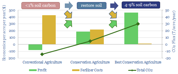
To summarize, the organic carbon content of agricultural soils has fallen from c4% in pre-industrial times to around 1-2% today, due to mechanized agriculture, across the world’s 3bn acres of croplands. A practice called conservation agriculture restores soil carbon, through no till practices, crop rotations and cover-cropping (note below).

The economics can be transformational, increasing crop yields by 10-30%, while also cutting input costs by 50-80% (model below). Moreover, at a $35/ton CO2 price, a mid-West farmer could make more money farming carbon than farming corn.

Two side consequences are that we expect a vast uptick in activity to measure soil carbon (screen of companies below), while the global fertilizer industry could be disrupted, as some adoptees of conservation agriculture have been able to cut their fertilizer usage by 50-100% (screen also below).

Selling carbon credits from agriculture: a case study?

Another recent episode on the Business of Agriculture illustrated a detailed case study of how Conservation Agriculture is being adopted, resulting in the commercialization of carbon credits (link here, video below). Our own summary follows.

The podcast features Kelly Garrrett, a fifth-generation farmer in Iowa, whose family farms 6,300 acres, growing corn, soybeans, winter wheat and 420 beef cows. Mr Garrett states “The key to climate change is not in the air, it’s in the ground. As a no till farmer, I’m doing my part… If [the carbon market] grows it will enact change. Farmers will change their practices”. This claim may sound exaggerated, but note that all of the words soils store around 2,500bn tons of carbon, which is 3x more than the world’s atmosphere (sources and sinks data below).

Specifically, a group of carbon brokers, Nori, and an agricultural trade body, Xtreme Ag, have certified that Mr Garrett’s farm has sequestered an average of 1.15 tons of CO2 per acre per year, from 2015-2019, across 3,800 acres of the farm (For context, we estimated a lower bound of 1T of CO2 per acre per year in our own numbers into conservation agriculture).

The certification included reviewing the farm’s FSA records, crop insurance records and the use of no till, cover cropping and crop rotations. Hence, 22,000T of carbon is deemed to have been captured over this period, through conservation agriculture. These certified carbon credits are now being sold.

e-Commerce company, Shopify, the purchased 5,000 tons of the carbon credits, to offset the CO2 from their Black Friday sales in 2020, at a price of $15/ton. Additional buyers have recently bought 2,620 credits so far in 2021, but have not agreed to be named publicly. If Mr Garrett sells all 22,000 tons of carbon credits at $15/ton, that is $330,000 of income.

Supply and demand: an increasing source of carbon offsets?

A carbon price is expanding conservation agriculture. The ability to monetize carbon has led Mr Garrett to expand his focus on carbon farming. Another c3,300 acres across his farm is thus being transitioned to this carbon-restoring practice. Hence Mr Garrett plans to re-assess additional carbon capture on the farm, again through Nori, in 2022, when the additional carbon credits from 2020-22 will be sold.

A carbon price is increasing carbon absorption in soils. The ability to monetize carbon credits has also directly led Mr Garrett to explore new technologies that can sequester additional CO2 per acre. For example, Locus Ag commercializes a microbial additive called Rhizolizer Duo, which increases soil health, and thus increases both soil carbon (24% increase in root mass for corn crops) and crop yields (8-10bu/acre for corn). Acreage that sequesters 1T CO2 per acre per year can be trebled to sequester 3T CO2 per acre per year, Locus claims. More examples are featured on the Locus website

Conclusions: agriculture and the road to net zero?

Our own roadmap to ‘net zero’ assumes that restoring the carbon content of degraded agriculture soils can sequester 4bn tons of CO2 per year, at the bottom of the CO2 cost curve (below). The case study above shows the model is beginning to work in practice, and capable of snowballing.

We consider companies that can improve agricultural productivity and carbon sequestration potential to be among the non-obvious opportunities to drive the energy transition (screen below).

Illustrating industrial energy efficiency in the context of cooking?

Illustrating industrial energy efficiency

Industrial energy efficiency is basically impossible to define or measure. This means economy-wide CO2 prices may be the most effective way to incentivize efficiency gains, whereas specific policies may miss the mark. This note illustrates the argument, in the context of ‘home cooking’ a process technology with which most readers are likely familiar…


Improving energy efficiency is crucial to decarbonizing the global energy system and explains 20% of the bridge towards ‘net zero’ in our research (chart below).

Our recent research has also focused on the topic of energy efficiency in the context of industrial heating, arguing that granular and case-specific efficiency gains are needed, rather than over-simplified statements such as “electrify everything” (below).

But what is efficiency? Measuring the efficiency of an energy-consuming process is conceptually complex. In order to illustrate the complexity, this note will consider efficiency in home-cooking. It is a process with which we are all familiar (more so than, say, ethane cracking, below).

Ideally you will also come away from this article with some interesting insights for the next time you are in the kitchen. Cooking is responsible for 4.5% of a home’s energy use, according to the DOE, and this number excludes refrigeration or dishwashing electricity. So efficicency gains here cannot hurt either.

Standard tests for measuring cooking efficiency?

The first way to measure the energy efficiency of heating technologies is to estimate the percent of incoming energy that is converted into heat. The problem with this definition is that all combustion technologies and resistive heating technologies score close to 100% efficient. Combusting gas on a gas stove released almost all of the energy in the gas as heat (and a very very small portion of light). Passing a current through the electrically resistant nichrome coil also releases almost all of the energy as heat. But as we will see below, it would be grossly incorrect to use this definition and label cooking as 100% efficient.

Instead, one of the DOE’s standard tests for the efficiency of a cookstove technology is to place a solid aluminium test block on a stove on maximum power, until the temperature in the block has risen by 144° F (80° C). Then the the heat is reduced to 25% of maximum and held for 15-minutes. Efficiency is calculated as the ratio of thermal energy absorbed by the block divided by the energy consumed by the cooker.

On these heat-up tests, typical results might be that an electric stove would achieve 70-80% efficiency and a gas stove might achieve 30-40% efficiency. Burning gas is less efficient at heating up the aluminium block, as a large portion of energy from the flame heats the surrounding air, which then convects defiantly around the kitchen. However, as long as the pan covers the entire electric coil, electric stoves do not suffer this drawback.

But a similar problem may already have occurred in the power station that generated the electricity powering the electric stove. If that power station was only c40% efficient at converting natural gas energy into usable electricity, a reasonable number (data below), then the total efficiency of the electric stove will be 25-30% overall, and actually less efficient than the gas stove, once the electricity generation is considered.

Is the waste heat really wasted? If it is a cold day, you might regard the energy leaked into your kitchen by the gas (or electric) stove as “useful” after all, reducing the load on your home heating system. However, if it is a hot day, it may be exacerbating the load on your air conditioner, hurting efficiency further. Similarly, if the cooker is close to the fridge, waste heat may be increasing refrigeration loads.

Another problem with the aluminium heat-up test is that it cannot be used to test induction heaters, which induce eddy currents in ferromagnetic cooking vessels. Those currents generate heat in proportion to the electrical resistivity of the cookware (by the Joule effect). But aluminium blocks are non-ferromagnetic. They are not heated up by electromagnetic induction. Hence the standard test need to be modified, placing the aluminium blocks in ferromagnetic pans. Because induction heaters generate their heat directly in the pan, their efficiency is usually 80-90% on these modified tests.

The biggest problem with the heat-up test is that most people do not eat aluminium blocks for dinner. Hence, one technical paper measured the energy requirements to boil 200g of potatoes, in 200ml of water and a 700g stainless steel pan, obtaining the CO2 and cost profiles below. This further complicates our assessment of efficiency. The ultimate goal here is to produce cooked potatoes, not to produce hot pans and hot water (which will ultimately be poured down the sink). Since the potatoes comprise just 20% of the mass of the system being heated, the efficiency of this potato cooking process cannot be more than 20%. We estimate 9% efficiency in the gas cooker, 14-16% in the electric cooker, and c10% in the induction cooker (although this was not a fair test, as the induction cooker was run at a higher overall heat rate, saving time, but using more power).

This also highlights that efficiency is a function of behaviour. Cooking faster wastes more heat. Cooking half (or double) the number of potatoes in the pan would have approximately halved (or doubled) the process efficiency. As would using a 2x larger (or 50% smaller) pan. Simply covering the pot with a lid lowers the energy consumption by 12-16%. Specialized cooking equipment also helps, as boiling water in an electric kettle uses 50% less energy than in a pot on an electric stove. A pressure-cooker slashes stovetop energy by 50-75%. An egg cooker may use 60% less energy than boiling eggs in a pot. And a rice cooker can use 77% less energy versus cooking rice in a pot. Ultimately, this means that cooking behaviours are much more important to overall cooking energy and CO2 emissions that whether you are cooking on a gas or electric stove top.

Another efficiency question-mark is the risk of over-cooking or burning food. Technically, in these cases, the heater has efficiently transferred heat into the food, but it was not useful heat in the sense of achieving a desired outcome. If the dish is ruined, then all prior heat transfer now needs to be “written off” in your efficiency calculation. This is where electric cooktops are more prone to problems. The heating element holds large quantities of heat and is relatively unresponsive to changing the heat rate. In one study, induction cookers can be set to very precise temperatures, gas burners tended to overshoot desired temepratures by 1C, while electric cookers tended to overshoot the desired temperature by 2-5C, and then take several minutes to cool back down again. Induction cookers also have the advantage of being less likely to cause burns to people (as long as you are not made of ferromagnetic metal).

The final question mark is whether qualitative factors matter for efficiency. Back to the potato test, noted above, cooking times ranged from 6 minutes in the microwave through to 26-minutes in a Termomix. The best flavor and texture was assessed to come from the boiled potatoes, while the worst was in the microwave. However, soluble nutrients such as vitamin C and potassium are actually lost when cooking in water, meaning the final product is debatably less nutritious. Surely no analyst can factor these subtleties into their efficiency calculations.

Why this matters: industrial efficiency is complex?

Our recent research has noted a very wide range in useful energy efficiencies of industrial heating technologies (data below). The landscape is so complex that we concluded the only way to maximize industrial efficiency was to avoid over-simplified maxims such as “electrify everything” and impose economy-wide CO2 prices, which will incentivize individual process engineers to explore ways to boost efficiencies and lower CO2 emissions.

If you are willing to grant the complexity around measuring efficiency in a process as simple as cooking potatoes, I can promise you, it is more complex in the industrial production of steel, cement, plastic, glass or paper products. All of which are explored in our note below.

Analogies can nevertheless be drawn from our cooking examples above. For example, there is a risk that efficiency mandates are as strangely detached from actual operating conditions as the aluminium block test above, or similarly that they cannot be implemented in particular sub-industries. Specific efficiency tests could be prone to being gamed at the expense of real-world efficiency. Another risk is that forcing the phase-out of one fuel in favor of another may not drive any decarbonization, if the underlying problem is inefficient processes and behaviours.

Now imagine you are trying to regulate the energy efficiency of cooking. This is a genuine question and challenge to anyone reading: what specific policies would you implement as a regulator to improve the efficiency of people cooking in their kitchens? Personally, I can think of a lot of bad answers, and only a few good ones (maybe a tax credit for taking an interactive educational course into energy efficient cooking behaviours?).

Industrial efficiency is just as complex and just as challenging to improve with specific policy measures. Again, this is the argument for a flat, fair and generalized CO2 price, incentivizing each industrial facility to seek efficiency gains where they can.


Which cooking technologies are lowest cost and lowest carbon?

Our own attempt to estimate the costs and CO2 intensities of different home cooking systems is show below. At a CO2 intensity of 0.35kg/kWh across the grid (reflecting c20% renewables penetration), we estimate a gas cooker is c15% higher carbon overall, in a household where heating and air conditioning loads balance out across the year. Gas and electric stoves have comparable costs. Induction stoves may be more powerful, sensitive, and professional, but they are likely 2x more expensive, when reflecting the $1.2-2.4k purchase prices on leading units from Frigidaire, GE and Samsung. Their payback periods on energy bills are estimated at around 44-years in one paper.

Numbers and data-points from underlying technical papers can also be stress-tested in the data-file above.

Sources

Das, T., Subramanian, R., Chakkaravarthi, A., Singh, V., Ali, S. & Bordoloi, P (2006) Journal of Food Engineering 75 pp 56–166

Korzeniowska-Ginter, R. (2019). Energy consumption by cooking appliances used in Polish households. Conf. Ser. Earth Environ. Sci. 214 012096.

Livchak, D., Hedrick, R. & Young, R. (2019). Residential Cooktop Performance and Energy Comparison Study. Frontier Energy Report # 501318071-R0

Sweeney, M., Dols, J., Fortenbery, B. & Sharp, F. (2014) Induction Cooking Technology Design and Assessment. Electric Power Research Institute, ACEEE Summer Study on Energy Efficiency in Buildings.

Global average temperatures: are the data robust and reliable?

Global average surface temperatures

Global average surface temperatures have risen by 1.2-1.3C since pre-industrial times and continue rising at 0.02-0.03C per year, according to data-sets from NASA, NOAA, the UK Met Office and academic institutions. This note assesses their methodologies and controversies. Uncertainty in the data is likely much higher than admitted. But the strong upward warming trend is robust.


2020 is said to be the joint-hottest year on record, tied with 2016, which experienced a particularly sharp El Nino effect. 2020 temperatures were around 1.2C warmer than 1880-1900, on data reported by NASA’s Goddard Institute for Space Studies (GISS), and 1.3C warmer on data reported by the UK Met Office’s Hadley Center and East Anglia’s Climatic Research Unit (HadCRUT).

2020’s hot temperatures were partly influenced by COVID-19, as “global shutdowns related to the ongoing coronavirus (COVID-19) pandemic reduced particulate air pollution in many areas, allowing more sunlight to reach the surface and producing a small but potentially significant warming effect”, per NASA. But the largest component of the warming is attributed to rising CO2 levels in the Earth’s atmosphere, which reached 414 ppm.

Overall, NASA’s data show temperatures have warmed by 0.02C per year over the past 50-years, 0.023C per year over the past 25-years and 0.03C per year over the past 10-years (chart above). Likewise, HadCRUT shows 0.02C per year over the past 50-years, 0.022C/year over the past 25-years and 0.024C/year over the past 10-years (below). Both data-sets suggest the rate of warming is accelerating.

Global average surface temperatures

How accurate are the data-sets? To answer this question, this note delves into global average surface temperature records (GASTs). It is not as simple as shoving a thermometer under the world’s armpit and waiting three minutes…

How are global average surface temperatures measures?

Surface air temperatures (SATs) are measured at weather stations. 32,000 weather stations are currently in operation and feed into various GAST indices.

Surface sea temperatures (SSTs) are measured at the surface of the sea as a proxy for immediately overlying air temperatures. Up until the 1930s, SSTs were most commonly taken by lowering a bucket overboard, and then measuring the temperature of the water in the bucket. This most likely under-estimated water temperatures in the past. From 1930-1990, SSTs were mostly measured from ships’ engine intakes. From 1990 onwards, SSTs were most commonly measured by specialized buoys and supplemented by satellite imagery.

Sea ice is particularly complicated. It takes 80% as much heat to melt 1kg of ice as it takes to boil 1kg of water, which means that the surface temperatures above sea ice can be higher than 0C. But it is difficult to access locations that are iced over with permanent weather stations. So temperatures over sea ice are often modelled not measured.

Global average surface temperatures
Data here: https://thundersaidenergy.com/downloads/refrigeration-and-phase-change-materials-energy-economics/

Temperatures are measured at each of these sites noted above. However GAST indices do not take raw temperature data as their inputs. First, absolute temperatures vary markedly between different weather stations that are scattered over short distances (e.g., due to shade, aspect, elevation, wind exposure), making the readings too site-specific. Moreover, the global average temperature is actually 3.6C higher in July-August than it is in December and January, because land masses experience greater seasonal temperature fluctuation than oceans, while two-thirds of the world’s land is in the Northern hemisphere, experiencing summer conditions in July-August. This would introduce too much noise into the data.

Temperature anomalies are the input to GAST indices. These are calculated by comparing average temperatures throughout each day with a baseline temperature for that site at that particular time of year. These anomalies are highly correlated, site-by-site, across hundreds of kilometers. By convention the 30-year average period from 1951-1980 is used as the baseline by NASA.

Averaging is used to aggregate the temperature anomaly data from different temperature stations across regions. Regional anomalies are then averaged into a global anomaly. Each region is weighted by its proportionate share of the Earth’s surface area. Thus a GAST index is derived.

Controversies: could there be systematic biases in the data?

Very large data-sets over very long timeframes are complicated beasts. They are prone to being revised and adjusted. Some commentators have worried that there could be systematic biases in the revisions and adjustments.

More data. As an example, NOAA digitized and added more observations from the early 20th century into its methodology in 2016. This caused prior data to be re-stated. But this reason seems fair and relatively uncontroversial.

New weather stations are slightly more controversial. How do you know what the baseline temperature would have been at a site in 1950-1980, if the first weather station was only added there in 2000? Some of the baselines must therefore be derived from models, rather than hard data. Some commentators have criticized that the models used to set these baselines themselves pre-suppose anthropogenic climate change, assuming past temperatures were cooler, thereby placing the cart before the horse. This fear may be counter-balanced by looking at weather stations with longer records. For example, of the 12,000 weather stations surveyed by NASA’s 2020 data, as many as 5,000 may have records going back beyond 1930.

Urban heat islands are somewhat more controversial again. Imagine a weather station situated in the countryside outside of a city. Over the past century, the city has grown. Now the weather station has been engulfed by the city. Cities will tend to be 1-3C warmer than rural lands, due to the urban heat island effect. So for the data to remain comparable, past data must be adjusted upwards. GISS notes that the largest change in its calculation methodology over time has been to adjust for urban heat islands. Although some commentators have questioned whether the adjustment process is at risk of not being extensive enough. This fear may be counter-balanced by the relatively small portion of weather stations experiencing this engulfing effect.

The adjustment of anomalous-looking data is most controversial. Algorithms are used to sift through millions of historical data-points and filter away outliers that run counter to expectations. The algorithms are opaque. One set of algorithms ‘homogenizes’ the data of stations showing divergent patterns to its neighbours, by replacing that station’s data with that of its neighbours. As the general trend has been for a warming climate, this means that some stations showing cooling could be at risk of getting homogenized out of the data-set, causing the overall data to overstate the degree of warming.

The data also do not correlate perfectly with rising CO2 levels: especially in 1880-1920, which appears to get cooler; and around the Second World War, which appears to produce a spike in temperatures then a normalization. On the other hand, no one is arguing that CO2 is the sole modulator of global temperature. El Nino, solar cycles and ‘weather’ also play a role. And despite the annual volatility, the recent and most accurate data from 1970+ rise in lockstep with CO2.

Global average surface temperatures

The most vehement critics of GAST indices have therefore argued that past temperature adjustments could be seen to contribute over half of the warming shown in the data. There is most distrust over the revisions to NASA’s early temperature records. One paper states “Each new version of GAST has nearly always exhibited a steeper warming linear trend over its entire history. And, it was nearly always accomplished by systematically removing the previously existing cyclical temperature pattern. This was true for all three entities providing GAST data measurement, NOAA, NASA and Hadley CRU”.

Uncertainties should not detract from the big picture

Our own impression from reviewing the evidence is that the controversies above should not be blown out of proportion. The Earth is most likely experiencing a 0.02-0.03C/year warming trend over the past 10-50-years.

Multiple independent bodies are constructing GAST indices in parallel, and all seem to show a similar warming trend. Pages could be written on the subtle differences in methodologies. For example, NOAA and the Berkeley Earth project use different, more complex methodologies than GISS, but produce similar end results. NOAA, for example, does not infer temperatures in polar regions that lack observations, and thus reports somewhat lower warming, of just 1.0C. This is because Arctic warming exceeds the global average, as minimum sea ice has declined by 13% each decade, allowing more sunlight to be absorbed and in turn, and causing more warming.

No doubt the construction of a global average temperature index, covering the whole planet back to 1880 is fraught with enormous data-challenges that could in principle be subject to uncertainties and biases. But it is nothing short of a conspiracy theory to suggest that multiple independent agencies are wilfully introducing those biases. And then lying about it. The Q&A section of NASA’s website states “Q: Does NASA/GISS skew the global temperature trends to better match climate models? A: No”.

You can also review all of the adjusted and unadjusted data for individual weather stations side-by-side, here. If we take the example below, in New York’s Central Park, the adjusted/homogenized and unadjusted data are not materially different, especially in recent years. Although the uncertainty is visibly higher for the 1880-1940 data.

Global average surface temperatures
Source: https://data.giss.nasa.gov/cgi-bin/gistemp/stdata_show_v4.cgi?id=USW00094728&dt=1&ds=14

Criticisms of the NASA data adjustments, cited in the skeptical technical paper above, do not appear particularly well founded either. It is true that NASA’s 1980s estimates of temperatures in 1920-1980 have been progressively lowered by 0.1-0.3C from 1981 to 2017, which could be seen to over-exaggerate the warming that has occurred since that time-period. However this is mostly because of bad data back in the pre-digital world of the 1980s. In fact, NASA’s 1981 data-set did not include any sea surface temperature data and only included data from 1,219 land stations, all in the Northern hemisphere.

Revisions in more recent data-sets are minimal. For example, HadCRUT’s data are shown below.

Global average surface temperatures

Another review of the data concludes that the net effect of revisions has been to under-state global temperature increases, by adjusting the temperatures in 1880-1930 upwards, which would under-state warming relative to this baseline (here). This is actually a blend of effects. Temperatures on land have generally been adjusted downwards by 0.1-0.2C in the 1880-1950 timeframe. Temperatures at sea have been adjusted upwards by 0.2-0.3C over 1880-1935. The original article also contains some helpful and transparent charts.

Finally, recent data are increasingly reliable. In total, 32,000 land stations and 1.2M sea surface observations are now taken every year, across multiple data-sets. Hence GISS estimates the uncertainty range in its global annual temperature data is +/- 0.05C, rising to 0.1-0.2C prior to 1960, at a 95% confidence level. From our review above, we think the uncertainty is likely higher than this. But the strong upwards trend is nevertheless robust.

Conclusions: 30-years to get to net zero?

Global temperatures are most likely rising at 0.023-0.03C per year, and 1.2-1.3C of warming has most likely occurred since pre-industrial times. This would suggest 30-years is an appropriate time-frame to get to Net Zero while limiting total warming to 2C, per our recent research note below.

A paradox in our research is that the $3trn per year economic cost of reaching net zero by 2050 seems to outweigh the $1.5trn per year economic cost of unmitigated climate change. One of the most popular solutions to this paradox, per the recent survey on our website below, was to consider re-optimizing and potentially softening climate targets. There may be economic justifications for this position. But the temperature data above show the result could be materially more warming.

Our own view is that the world should also decarbonize for moral reasons and as an insurance policy against tail-risks (arguments 3 and 6, above). And it should favor decarbonization pathways that are most economical and also restore nature (note below).

Our climate model, including all of the temperature data cited in this report are tabulated in the data-file below.

Copyright: Thunder Said Energy, 2019-2024.