European gas: anatomy of an energy crisis?

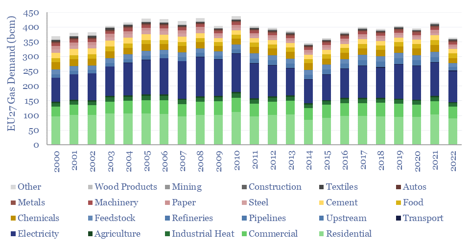
European gas demand across residential heat, commercial heat, electricity and a dozen industries.

Europe suffered a full-blown energy crisis in 2022, hence what happened to gas demand, as prices rose 5x from 2019 levels? European gas demand in 2022 fell -13% overall, including -13% for heating, -6% for electricity and -17% for industry. The data suggest upside for future European gas, global LNG and gas as the leading backup to renewables. Underlying data are available for stress-testing in our gas and power model.


Energy data from Eurostat have pros and cons. The pro is 100 lines of gas market granularity across 27 EU member countries. The cons are that the full 2022 data were only posted online in March-2024, and require careful scrubbing in order to derive meaningful conclusions. We have scrubbed the data and updated our European gas and power model (below).

European gas demand (EU27 basis) fell from 414 bcm in 2021 to 363 bcm in 2022, for a decline of -52 bcm, or -13%. The first conclusion is about price inelasticity. Gas prices averaged $29/mcf in 2022, up 110% YoY, and up 5x from 2019 levels, yet gas demand only fell by 13%. Energy price inelasticity allows for energy market volatility, which we think is structurally increasing in the global energy system, benefitting energy traders, midstream companies and load-shifters (note below).

Heating comprises 40% of Europe’s gas demand, of which 24pp is residential, 11pp is commercial, 3pp is heat/steam sold from power plants to industry and 1pp is agriculture (yes, 1% of Europe’s gas is burned to keep livestock warm). Total heating demand fell -13% in 2022, in line with the total market trend, and demonstrating similar price-inelasticity.

The temperatures of processes used in different economic sectors and their contribution to total global heat demand in TWH per year.

Electricity comprises 30% of Europe’s gas demand, and our thesis has been that gas power will surprise to the upside, entrenching as the leading backup for renewables (note below). 2022 supports this thesis. Gas demand for electricity only fell by -6%, the lowest decline of any major category; and total gas demand for power, at 105bcm was exactly the same as in 2012, despite 3x higher gas prices and doubling wind and solar from 9% to 22% of the mix. These are remarkable and surprising numbers.

Industry comprises 30% of Europe’s gas demand. What is fascinating is how YoY gas demand varied by industry in 2022. Most resilient were the production and distribution of gas itself (-1% YoY), manufacturing food products (-6%) and auto production (-6%). The biggest reductions in gas demand were refineries (-41%) and wood products (-26%) because both can readily switch to other heat sources amidst gas price volatility. Other large reductions in gas demand occurred for chemicals (-26%) and construction (-24%) due to weak economic conditions.

Most strikingly, the European chemicals industry shed a full 1bcfd of gas demand YoY in 2022. This is the portion of European gas demand that seems most at risk to us in the long-term, as the US can produce the same materials, at lower feedstock costs, while possibly also decarbonizing at source, via blue hydrogen value chains (examples below).

The latest data from Eurostat and the IEA both imply that Europe’s total gas demand fell by a further -7% in 2023, due to exceptionally mild weather (heating degree days are also tabulated in our gas and power model). In other words, total European gas demand remains -8bcfd lower than in 2021, equivalent to 60MTpa of LNG, and we wonder how much of this demand can come back with LNG capacity additions, thereby muting fears of over-supplied LNG markets.

LNG ramp-rates: MTpa per month and volatility?

What are the typical ramp-rates of LNG plants, and how volatile are these ramp-ups? We have monthly data on several facilities in our LNG supply-demand model, implying that 4-5MTpa LNG trains tend to ramp at +0.7MTpa/month, with a +/- 35% monthly volatility around this trajectory. Thus do LNG ramps create upside for energy traders?


Qatar is expanding its LNG capacity from 77MTpa to 142MTpa, by adding 8 x 8.1MTpa mega-trains into the 400MTpa global LNG market.

For perspective, 65MTpa of new LNG capacity is almost 1,000 TWH pa of primary energy, whereas the total global solar industry added +400 TWH of generation in 2023 (our latest solar outlook is linked here).

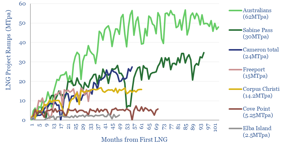
Hence we wonder how fast large LNG projects ramp up? Month-by-month ramp-ups of different LNG facilities are plotted above, where we can get the data, as an excerpt from our LNG supply-demand model.

The historic precedent sees LNG facilities ramp up 4-5MTpa trains at 0.2-2MTpa/month, with an average ramp rate of 0.7MTpa/month.

The ramp-ups are also volatile, with a +/- 35% standard error around the trajectory implied by a perfectly smooth ramp-up. Volatility may benefit energy traders? Let us review some examples below.

Australia ramped up 7 mega-projects with 62MTpa of capacity from 2015 to 2019, over four-years (+1.1MTpa/month), and with surprisingly high volatility (+/- 35% standard error above/below the 1.1MTpa ramp rate). In bottom quartile months, annualized output fell by -1.2MTpa and in bottom decile months if fell by -4.3MTpa.

Sabine Pass ramped up 6 x 5MTpa trains from 2016 to 2022, which also took five years (0.4MTpa/month), and included volatility (+/- 55% standard error), a -2MTpa annualized decline in one-quarter of the months and -3MTpa decline in one-tenth. For example, the facility shut down in August 2020 due to Hurricane Laura.

Freeport LNG ramped up at 0.7MTpa/month with +/- 45% standard error, with a particularly disrupted ramp-up, due to an explosion in June-2022, which took 9 months to remedy. The incident was blamed on deficient valve-testing procedures, which allowed LNG to become isolated, heat up, expand, breach the pipeline and explode. US regulators asked for information on 64 items before permitting a restart, which speaks to the complexity of these ramp-ups (!).

Other LNG facilities have also had volatility during their ramp-ups. Elba Island LNG went offline in May-2020 after a fire. Sabine, Corpus and Freeport cut volumes by 70% peak-to-trough during the worst of the COVID crisis. The average project in our data set ramped up 4-5MTpa LNG trains at 0.7MTpa/month with +/- 35% standard error.

Hence our conclusion is that the start-up of Qatar’s first two LNG trains in 2026 will be gradual, rather than a sudden 16MTpa shock to LNG markets, while LNG traders could even benefit from the volatility? For more perspectives, please see our outlook on the LNG industry.

Email deliverability: who broke the internet?

One of our goals at Thunder Said Energy is to help make everyone smarter on the amazing world of energy, by sending out a daily email to our distribution list. But sending a daily email to 10,000 people turns out to be harder than youโ€™d think. This video explains research email deliverability, SPF, DKIM, DMARC and lessons learned over 15-years.

We also endured an unfortunate issue in December that prevented 4,000 subscribers from receiving our research. We’re very sorry. We hope we’ve fixed it! And some comments follow below to make sure important research reaches you in the future.

This story goes back over fifteen years. In my first ever research job, we used to send research emails to a list of 2,000 investorsโ€ฆ via Outlook. At the time, there was a limit that you could only BCC 800 people per email. And so we had to โ€˜blast outโ€™ each research note in three separate batches, in a somewhat horrific process.

Hence today, large mailing lists tend to be managed by email marketing platforms. An amazing amount of computation goes on behind the scene, in an attempt to ensure emails reach you safely. This explains the common statistics that an email embeds 1Wh of electricity, emits 0.3 grams of CO2, and in aggregate the energy consumption of the internet runs to 800 TWH pa, or 2.5% of all global electricity.

An email list of 10,000 people becomes a somewhat unwieldy beast, and we worry that our research might not reach our clients, who genuinely want to receive it. We send out an email most days to our distribution list at 6:45am Eastern time. If you would like to receive this email, but are for some reason not receiving it, then please contact us, and we will help you resolve the issue.

The most common resolution for clients that are not receiving our emails is for your company’s IT administrator to whitelist our mailing list sending-domain, which is ml.thundersaidenergy.com. For GDPR reasons, the emails are sent from servers in Europe, which has also historically caused some of our US clients to screen out these emails. If your IT department needs any further details, then please do contact us.

We did have a major issue with our research email deliverability in December-2023. We had 3,500 users unsubscribe from our mailing list in a single day, all precisely one minute after our email was sent out. We understand that the cause was client-side mail servers checking all of the links in our outgoing emails (to make sure they are safe), including, unhelpfully, the one-click unsubscribe link that is now required by Google. Apparently we were not alone, and hundreds/thousands of other mailing lists have suffered from this issue. The issue is still under discussion in some angry Reddit threads!

Not all of our research reached all of our clients in December-2023 and early January-2024. What upset us about this, in particular, was that this timing happened to coincide with some of the most important and actionable research we have published over the past five years. In case you missed it, the three most important research notes are copied below.

Energy transition from first principles?

Our top three questions in the energy transition are depicted above. Hence we have become somewhat obsessed with analyzing the energy transition from first principles, to help our clients understand the global energy system, understand new energy technologies and understand key industries. 


Our research notes aim to make smart decision-makers even smarter, covering the key concepts and numbers, while being clear and concise, and dissecting the energy transition from first principles…

Energy theory from first principles: energy units, thermo-dynamics, electricity, electrochemistry, magnets and motors and semiconductors.

Decarbonization technologiesย from first principles: renewables, batteries, EVs, EV charging, lithium batteries, flow batteries, thermal batteries, SSBs, heat pumps, fusion, geothermal, CCS, DAC, blue hydrogen, green hydrogen, electrofuels, biofuels, landfill gas, biomass, biochar, nature.

Energy efficiency technologies from first principles: EROEI, electric vehiclesLED lighting, VFDs, CHPs, insulation, methane mitigation.

Energetic industries from first principles: the internetindustrial gases, hydrogen, ammonia, steel, battery recycling, trucks, transport, compressors.

The new age of electricity from first principles: transmission, transformers, transistors, harmonic filters, capacitors, reactive power.

The new age of volatility due to renewables, geopolitics, politics, policies.

Latest views on global energysolar innovationwind recalibration, nuclear, grid bottlenecks, shale and how AI is going to save the world.

We would be delighted to help you understand the energy transition from first principles. Please consider joining our distribution list or signing up to access our research.

Energy transition: three reflections on 2023?

In October-2022, we wrote that high interest rates could create an ‘unbridled disaster’ for new energies in 2023. So where could we have done better in helping our clients to navigate this challenging year? Our energy reflections on 2023 suggest some new year’s resolutions for 2024. They are clearer conclusions, predictions over moralizations, and looking through macro noise to keep long-term mega-trends in mind.


What has prompted this self-reflection is looking back on a report from October-2022, where I wrote โ€“ direct quote โ€“ that โ€œeach 1% increase in interest rates re-inflates new energies costs by 10-20%โ€ and hence 2023 could be โ€“ again direct quote — an โ€œunbridled disasterโ€ for wind, solar, clean-tech (note below).

I am not bringing this up to do some kind of victory lap. Actually, the opposite, I think could have done a better job of helping my clients to navigate 2023.

The first self-reflection is about big conclusions. I did write that note above about interest rates. But then I also went on to write 37 other notes about different battery chemistries and CCS technologies. Hence a first resolution is to publish clearer summaries, which are clear, concise and regular. For those that do not have time to read all of our publications. Examples below.

The second self-reflection is a distinction, between predictions and normative aspirations. Honestly, I think one of the reasons I did not push harder on the idea that clean technologies could have a tough 2023 was to avoid ruffling feathers. I run a research firm focused on energy transition. I would like to see the worldโ€™s energy system materially improve over the course of my lifetime.

If I have a fear for, well, basically all long-term energy analysis being published today, it is that almost all energy forecasters have been brow-beaten into publishing normative aspirations about what should happen, as though they were predictions for what will happen. Really they are very different things. So for 2024, please donโ€™t take it personally, but I am going to try to do less forecasting about what should happen, and more about what will happen.

Predictions of what will happen, not what we ‘want to’ happen?

The third self-reflection is about purpose. Research is about helping decision-makers to make good decisions and build cool stuff. Including in the face of macro turbulence, and going back to first principles (summary below).

After our energy reflections on 2023, we feel very lucky to help 260 world-class decision makers to build cool stuff. In a world that increasingly needs it. So here is wishing you a great wind-down to 2023, and I am looking forward to helping you build cool stuff in 2024.

Thermodynamics of prime movers: energy from first principles?

A highlight of 2023 has been going back to first principles, to study the underpinnings of prime movers in the global energy system. Context matters. There is no energy source to rule them all. However, if you understand the thermodynamics of prime movers, you will inevitably conclude that the world is evolving towards solar, semi-conductors, electro-magnetic motors, lithium batteries and high-grade gas turbines.


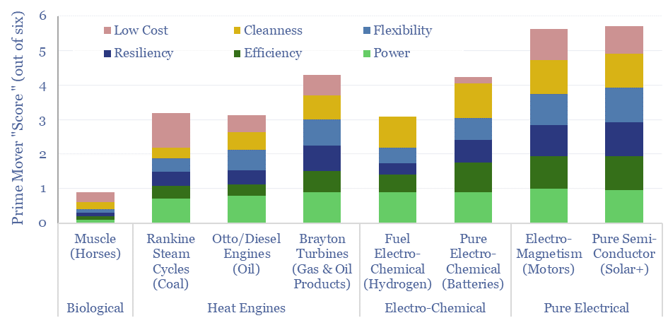
Muscle power was the original prime mover in the pre-industrial energy system (chart below). But a typical horse outputs 0.75 kW of power, converts only c10-30% of food energy to useful work (depending on how hard you work the horse), can only cover 25-40 miles in a day, must be treated humanely and annoyingly poops everywhere. So we would score horses as a 1 out of 6 on our score of prime movers. It is remarkable that despite these limitations, the total global population of horses remains flat on 1960, with around 60 million horses in the world today, showing how hard it is to disrupt established technologies.

Heat engines changed the world, starting with coal-fired steam engines, then oil-fired engines, and later gas turbines. What is remarkable and under-appreciated when homogenizing coal, oil and gas as “fossil fuels” is that they each tend to harness totally different thermodynamic cycles. We think every serious decision-maker in energy should know the laws of thermodynamics and the basics of heat engines (primer below).

Solid fuels tend to be harnessed using the Rankine Cycle, which suffers from the limitations of steam as the working fluid, and typically achieves an efficiency of 38% (model below, again from first principles). Fuel must constantly be added, ash residue, dusts, NOx and SOx must be constantly removed. A cold start takes 6-hours and the ramp-rate is only 1-5% per minute. CO2 intensity averages 0.8-1.0 kg/kWh. So overall, we score steam cycles as a 3 out of 6 on our score of prime movers.

Gas-phase fuels can be harnessed using the Brayton Cycle, which generates work by expanding super-hot and high-pressure gases across a turbine. They can run at 1,600ยบC, versus steam cycles at 300-500ยบC, hence achieving simple-cycle efficiencies of 45% (data here). Then for stationary plants, an entire further steam cycle can be run on the exhaust gases exiting the turbine at 600ยบC, boosting total efficiency to 60%. Dust/NOx/SOx emissions are minimal. Start times are low. Ramp rates are 5-20% per minute. Combustion is continuous. There is only one dimension of rotational movement. The turbines are compact. Insanely reliable. It is for this reason that Brayton Cycle gas turbines can be strapped to the sides of airplanes, misted with jet fuel, and safely underpin 7 trn passenger-miles of air travel per year. A strongly held view based on this theory is that Brayton cycle turbines will be a major workhorse of the 21st Century energy system, help to backstop renewables, and we score them as a 4.3 our of 6 on our score of prime movers.

The engineering of Brayton cycle gas turbines comes down to high-grade materials, which can withstand insanely hot T-max temperatures, in order to maximize efficiency.

Semi-conductors are the best prime movers in the world, jumping to the top of our ranking, with a score of 5.7 out of 6. Solar semiconductors harness the photovoltaic effect absorbing diffuse sunlight and then emitting a concentrated and useful direct current, which other semiconductors can then manipulate into an alternating current, then further conductors can transmit and distribute, and even further semi-conductors can manipulate into emitting light, heat or performing computational work. We have now written primers on all of these value chains below.

But for something truly remarkable, consider that this entire chain — from solar generation to Microsoft Excel model — might have ZERO moving parts. Only moving electrons. Nothing is burning. Nothing is turning. Nothing needs maintenance. Nothing is emitted. Total system efficiency is above 90%. As long as the sun is shining. If you understand the underlying theory of semiconductors, you will find it deeply uncomfortable to bet against the long-run rise of semiconductors.

Electric motors are also highly effective prime movers, awarded a score of 5.6 out of 6 on our scorecard, converting electrical energy into rotational energy, using the principles of electromagnetism. This is covered in our overview of electro-magnetism (below). Strictly, Rare Earth magnets are best, for electric vehicles and in wind turbines. And improved semi-conductors can also optimize the performance of motors that comprise around half of all global electricity consumption today.

Where electrical value chains struggle amidst the thermodynamics of prime movers is with storing electrical excitation. For this, it is necessary to turn to electrochemistry (primer below). Pure electro-chemical cells such as lithium-ion batteries have high efficiency but low energy density, which precludes their use in heavy-duty long-distance transportation, and probably always will. Plus they suffer from battery degradation. There are moving parts in a battery, in the form of ions, shuttling across the cell, and intercalating at the electrodes, undergoing unwanted side reactions along the way. Overall, we score batteries as a 4.2 out of 6 on our score of prime movers.

Finally electro-chemical fuels can have similar energy densities to hydrocarbons and low emissions. However, their round-trip efficiency is lower than Brayton cycle turbines. The key benefit of electrical systems is that they do not need to store and manage fuel, including the inevitable needs for maintenance, valves, pipes and moving parts. Resiliency is low, degradation is high, electrochemical cells perform poorly outside carefully controlled conditions such as temperature and humidity, somewhat like the Goldilocks of prime movers. This has come up in our patent screening (examples here and here). Today’s costs are also, in our view, prohibitively high. And without a willingness to pay very high green premia, we expect it may be hard to displace hydrocarbons using electro-chemical fuels.

Grid-scale battery costs: $/kW or $/kWh?

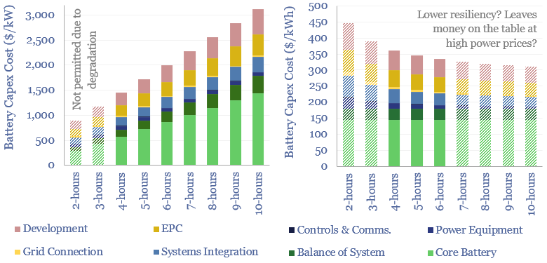
Battery capex costs per kW and per kWh of power, depending on hours of capacity. Also included are the sources of that capex.

Grid-scale battery costs can be measured in $/kW or $/kWh terms. Thinking in kW terms is more helpful for modelling grid resiliency. A good rule of thumb is that grid-scale lithium ion batteries will have 4-hours of storage duration, as this minimizes per kW costs and maximizes the revenue potential from power price arbitrage.


Quantum mechanics asks us to think of the electron as both a particle and a wave. Despite the obvious fact that a particle is not a wave, and a wave is not a particle. This is probably a reason that most people do not love quantum mechanics.

Battery models similarly ask us to think about a battery as a ‘per kW’ device and as a ‘per kWh’ device. Where 1 kWh is the supply of 1 kW for precisely 1-hour (or some similar multiplication, such as 0.5 kW for 2-hours, or 0.25 kW for 4-hours, per our overview of energy units). Clearly, kW are not kWh and kWh are not kW.

Our own grid-scale battery model is guilty of this dualistic behaviour, quantifying the costs of grid-scale batteries both in $/kW terms and in $/kWh terms. Our view is that it makes marginally more sense to think about a grid-scale battery in kW terms, when modelling the costs of integrated power systems. But there is some flexibility.

Standalone batteries in kWh terms?

Battery costs are often quoted in $/kWh on a standalone basis, tabulated here, charted below, and showing the amazing deflationary profile of moving the mass manufacturing of batteries over the past decade and leaving mostly material costs (note the units of the y-axis).

The costs of producing a lithium ion battery have fallen from $800/kWh in 2012 to $150/kWh in 2022. Almost all of the drop has come from manufacturing costs.
Lithium ion battery costs breakdown between materials and manufacturing

Especially in the realm of electric vehicles, this is the cost at which battery packs tend to be procured, for integration into a vehicle. And $/kWh is the most relevant cost metric when thinking about the enormous impending ramp-up of EV batteries.

Grid-scale systems in kW terms?

The output from a battery module is DC electricity at a voltage level driven by electrochemistry. However, circuits in the power grids consist of AC electricity at a very specific and pre-defined voltage. Hence power electronics are required to connect a battery into the grid.

An inverter containing multiple layers of MOSFETs is used to synthesize an AC sine wave from the DC output of a battery. Inverters are sized in kW terms, and priced in kW terms.

A transformer then steps up the voltage of the AC electricity to whatever level is required by the specific grid loop downstream. Transformers are sized in kW terms, and priced in kW terms.

A physical connection is then made between the step-up transformer and the circuitry of the power grid, using cables and other power electronics. These connections are usually rated in kW terms and their costs are best quantified in $/kW terms, or even per kW-km of transmission and distribution distance.

Resolving Duality: $/kW or $/kWh?

When we add up the total installed costs of a grid-scale battery, about 40% is the core battery, best measured in $/kWh; another 30-40% is the power electronics and grid connection, best measured in $/kW; and the remainder includes costs such as engineering, permitting, land-leasing, construction, which are best measured in absolute $ terms.

It is a philosophical choice how to present battery costs. You can add all of the cost lines together (in $) and divide them by the total power rating in kW (yielding a $/kW metric). Or you can add all of the cost lines together (in $) and divide them by the total energy storage in kWh (yielding a $/kWh metric).

Our own capex numbers are tabulated below for different systems, assuming that each one stores 4kWh of electricity per kW of rated storage capacity. This is not to say that all batteries must have 4-hours of storage, but just a simplification to enable apples-to-apples cost-benchmarking.

Capex costs and their buildup for different battery technologies.
Cost of medium duration energy storage solutions from lithium batteries to thermal pumped hydro and compressed air

Energy storage and power ratings can be flexed somewhat independently. You could easily put a bigger battery into your lithium LFP system, meaning the costs per kWh would go down, while the costs per kW would go up; or you could connect your LFP battery to a bigger inverter and transformer, meaning costs per kW would go down, while costs per kWh would go up.

“Somewhat independently” and the 4-hour battery?

A limitation of lithium batteries is that the faster you charge them and discharge them, the faster they degrade. The reasoning is explained in the note below. But in short, when a battery is charged and discharged, lithium ions physically need to move through the cell, intercalating and de-intercalating from electrodes. The faster you push this process, the more side-reactions will occur.

For safe and long-lasting batteries, it is recommended not to exceed a 0.25 C-rate. This means that no more than 25% of the battery’s total electricity storage will be cycled per hour. Or in other words, the charge time of a lithium ion battery should not be less than 4-hours, and the total discharge time at full capacity should be 4-hours. Faster charging and discharging are possible, but they may invalidate the battery’s warranty.

Grid modelling: why we prefer kW and $/kW metrics?

When we start modelling the integration of renewables into power grids, we are looking at grid loads (in MW) supplied moment to moment by different power generation sources (in MW). If a cloud passes over a solar array, or if some large power plant trips out during a heatwave, then the grid is going to be short of MW. If the grid does not have capacity to rapidly add MW, then the grid is going to fall over. This is why we care predominantly about batteries producing MW.

Grid-scale batteries will tend to minimize duration?

Today, sizing batteries is mostly about ensuring resiliency of the grid. Hence companies developing wind and solar, or consumers using wind and solar, tend to focus on the MW capacity ratings of batteries. And longer duration lithium ion batteries become more expensive on a $/kW basis (as they need to contain more battery cells priced in $/kWh).

Battery capex costs per kW and per kWh of power, depending on hours of capacity. Also included are the sources of that capex.
Capex costs of a lithium ion battery at longer duration in $ per kW and $ per kWh

Costs per unit of energy storage do fall as battery duration increases. The reason is that you are adding more battery cells priced in flat $/kWh terms, while other $/kW cost lines are being amortized across more energy storage. But is this leaving money on the table, in a way that will tend to incentivize building out the power electronics too?

It is 7-8pm in California. Power prices are high. And you have stored 100kWh in your battery. You really want to fill the gap at 7-8pm. If you can discharge all 100kWh at 8pm, that is going to generate the best economic results. But if you have undersized the power-electronics, and can only discharge 10kWh at 8pm, then money has been left on the table.

The old adage in traded commodity markets, is that the majority of the profit potential comes in the volatility, not in the core day-to-day spread. It does not cost materially more (in $/kWh terms) to build out the power electronics and buy the capability to run batteries at a 0.25C charge/discharge rate. It also helps to ensure resiliency.

Overall we still think most grid-scale lithium batteries will aim at around 4-hours of duration. At longer duration, we prefer redox flow batteries among electrochemical solutions. Even better backups are thermal energy storage and demand shifting. While for economic reasons, we think clean natural gas turbines will ultimately end up being the most widely used backup for renewables’ volatility.

Energy transition: active duty?

After five years researching the energy transition, we believe it favors active managers. Within the energy transition, active managers can add value by ranging across this vast mega-trend, balancing risk factors in a portfolio, timing volatility, understanding complexity, unearthing specific opportunities and benchmarking ESG leaders and laggards.

We recently enjoyed exploring this topic on the Capital Cyclists podcast. The theme matters because total associated investment needs to treble to $9trn per year to achieve an energy transition, and this is not going to happen if capital is misallocated. This short note explores ten advantages for active managers in the energy transition.


(1) Energy transition is a structural mega-trend. Not an isolated niche. It is the largest construction project in the history of human civilization, impacting markets worth $25 trn per year today and doubling them to $50 trn per year by 2050; re-shaping terms of trade for industrial eco-systems across the entire global economy; re-shaping ever more sectors that at first glance have nothing to do with the energy transition (note below). Net Zero means zero net CO2 emissions for every sector in the market. Hence in our view, the impacts of energy transition need to be considered across entire portfolios.

(2) Managing risk factors. Investing involves being paid to take risk. Energy transition investing involves at least ten risks (below). Constructing a portfolio involves minimizing overall risk via diversification. And on top of this, at any given point in time, the market may be willing to over-pay you to take some risks and under-pay you for taking others. The role of an active manager is that they are constantly appraising these risks, their balance and their relative attractiveness (as explored in the link below).

(3) Times are changing. We are told that we are one of few research firms with a fully modeled roadmap to net zero, including the resultant pull on all of the different themes, sectors, materials and commodities. The average one gains in size by 3-30x in the energy transition. Vast new markets scale up in Wind, Solar, Electric Vehicles, Batteries, underlying Metals and Materials, next-gen Nuclear, Electrification, the Rise of AI, Hydrogen, CCS, Nature. And yet vast value remains in oil, gas, LNG, plastics, possibly even coal. Vast changes — and the expectation of vast changes — are particularly likely to create dislocations in the ‘correct’ market prices of securities.

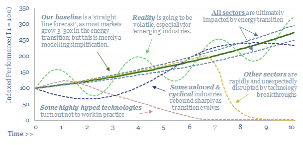
(4) Timing matters. There are many themes that we want to scale up as part of the energy transition. And ultimately they will scale up. But the trajectory will not be a straight line. We have recently seen share prices crushed in offshore wind (forewarned here) or PV silicon (forewarned here). Active managers can add value by avoiding looming walls of over-supply, or conversely, by finding industries that may pivot from unloved to station central (we have some ideas on this front too).

(5) Technical expertise is rewarded. Many of the big questions in energy transition come down to technology, which frankly, can only be understood by building up technical expertise. Will the rise of the solar industry add 40% to total global silver demand, or will silver be entirely thrifted out? (note here). Will the entire lithium mining industry be rendered obsolete by direct extraction from brines? (note here). Does CCS actually work? (note here). Our perspective is that active managers can add value where they build up a technical understanding of complex market debates (video below).

(6) Second order consequences? In an efficient market, obvious opportunities are quickly seized. Thus in our experience, the best opportunities are non-obvious opportunities, which markets have not yet fully grasped. If you are constructive on electric vehicles, then clearly “most obvious” is to own Tesla (the fact that it is 2% of the S&P 500 at 73x PE perhaps indicates the “obviousness”). Next most obvious is to own bottlenecked battery materials. Less obvious is the possibility that the rise of EVs will unexpectedly double the margins of polyurethane and textile fiber producers, which can source increasingly cheap BTX feedstocks as demand for gasoline declines (note below). Across all of our work, our biggest focus is to help our clients find non-obvious market dislocations.

(7) Fast evolving. We noted above that some markets in the energy transition are changing vastly. But others are also changing rapidly. Technology is advancing faster than ever before with 7M patents now filed each year and accelerating further due to AI. One thing we have observed in our research is that new themes can emerge very quickly. For example, in the past twelve months, after passing IRA regulations, the US is seeing a boom in blue hydrogen, blue ammonia, blue steel, blue chemicals. This has come out of nowhere. We think active managers can add value by latching on to new themes quickly.

(8) Bubble risks. It is also important to latch onto the right themes. Fantasy thinking can become commonplace during times of vast changes. We have worried that some themes in the energy transition show similarities with past bubbles (note below). A strange feature of index fund is that the more a security price inflates, the more of the security the index fund will own (by definition). Our favorite antidote to getting ruined by bubbles is sound economic modeling, hence we have built up a library of 170 economic models.

(9) Benchmarking leaders and laggards. Within individual sectors, markets are likely to reward ESG leaders and punish ESG laggards. But appraising leaders and laggards is not always simple. Our favorite example is illustrated in the refinery database below, as well as c50 broader data-files appraising CO2 intensity by industry.

(10) Technology opportunities? Finally, earlier-stage companies are increasingly raising capital, even becoming listed in public equity markets, despite being quite a binary ‘bet’ on an unproven technology. Is the technology real? Will it work? Does it have a moat? Will it change the world? Or could it be another Theranos? Index funds often do not get to ask these questions. But active managers do. And so do our patent screens.

Energy transition: active managers? Our view is that energy transition favors active managers, to appraise the market dislocations and complexities discussed above. For more information on our energy transition research, how we work with our clients, or if we can help you with an introduction on this front, then please do contact us.

Levelized costs: real issues?

real levelized costs

Real levelized costs can be a misleading metric. The purpose of today’s short note is simply to inform decision-makers who care about levelized costs. Our own modelling preference is to compare costs, on a flat pricing basis, using apples-to-apples assumptions across our economic models.


What are levelized costs?

What are levelized costs? Levelized costs, sometimes abbreviate as LCOEs, aim to summarize the costs of an electricity source with a single number, denoting what electricity price would be needed in order to earn an acceptable return, when constructing and operating a new electricity generating facility. This can enable useful comparisons.

Why do we hate levelized costs? All of the various advantages and disadvantages of a new electricity generation investment, within in a complex, real-world grid cannot entirely be captured by a single number. A couple of recent research notes onto this topic are linked below.

Nevertheless, with this caveat in mind, we have constructed levelized costs models for onshore wind, offshore wind, solar, hydro, nuclear, gas, coal, biomass, diesel gensets and geothermal. All of these numbers are shown on a nominal basis. If our levelized cost is quoted as 8c/kWh, then we assume the power facility will receive 8c/kWh in Year 1, 8c/kWh in Year 2, 8c/kWh in Year 3… and 8c/kWh in Years 25-100.

What are “Real” Levelized Costs?

Some commentators present levelized costs on a ‘real basis’. What this means is that there is an annual escalation factor built into the power price. For example, a levelized cost of 8c/kWh means that the power price starts at 8c/kWh in Year 0, then it increases by, say, 1-2% per year thereafter. Or alternatively, “with inflation”.

Price escalation helps to achieve higher IRRs. And hence if your hurdle rate is constant, real levelized costs (that benefit from pricing escalation) will be lower than nominal levelized costs (that do not benefit from pricing escalation) (chart below).

However, in our view, quoting levelized costs on a ‘real’ basis is misleading. It may distort the rankings of power generation sources, where these sources have different operating lives, or worse, where different cost escalation factors are built into different models.

Paradox #1. Ultimate cost is higher than levelized cost?

One reason we think it is misleading to quote levelized costs on a real basis is that it consigns consumers to higher power prices than advertized. Consumers might be quite annoyed, if an option is quoted to cost 8c/kWh, weighed up against other options, selected on the basis of this 8c/kWh cost, and then 20-years later, they are buying electricity from this 8c/kWh project at 12c/kWh (chart below). “How can the power price be 12c/kWh, when we invested in power plants costing 8c/kWh?”.

real levelized costs

Paradox #2. Levelized costs fall when future prices rise?

A second reason we think it is misleading to quote levelized costs on a real basis is that it makes today’s levelized costs dependent upon tomorrow’s inflation. Paradoxically, if inflation expectations rise, then real levelized costs seem to fall.

For example, imagine a project that needs 8 c/kWh over the life of the project to generate a passable IRR. If the base case assumption is for 1% per year inflation, then the real levelized cost is 7c/kWh. But if we raise our inflation expectations to 2% per year, our project sees its levelized costs deflate to 6c/kWh (chart below). Even though it is the exact same project, with the exact same capex and opex??

real levelized costs

Without wishing to sound accusatory, we think that some commentators are wedded to a narrative that particular energy technologies are on a path of perennial deflation. This is not entirely true, for example, in the recent case of offshore wind.

In our view, it would be unhelpful for such commentators to preserve their deflation narrative, for example, by systematically revising up their future inflation expectations, so that their quoted cost estimates continue “falling” from one year to the next, even when project developers are very clearly signalling that their costs are rising. Ultimately, we think decarbonization progress requires openly acknowledging challenges, so that decision makers can work to resolve those challenges.

Paradox #3: defeating the purpose of a simple model?

“All models are wrong, but some models are useful”. This is the mantra underlying the 170 economic models that we have built and published into different technologies, power sources and materials, as part of our energy transition research. The other mantra is to make these models as simple as possible, and no simpler!

Hence across all of our models, we have opted to model pricing on a flat basis. This allows the models to ask “what price is needed for an acceptable IRR?”, on a simple, easily understandable, and comparable basis. This also avoids the risk of different models embedding potentially different cost escalation factors, impairing their comparability.

But what about inflation? Yes commodity prices change over time, as is well-captured in our various commodity price databases. But the drivers of these annual pricing variations are difficult to predict ex-ante (including wars, weather, pandemics, recessions). And there are also good arguments that some commodity prices resist inflation over the very long term. Of course, if you wish to adjust our different models, and add annual pricing variations, then you are welcome to do that.

For the reasons above, we will continue favoring flat pricing, and simple, apples-to-apples assumptions, in our economic models.

US natural gas: blue hydrogen tightens global LNG markets?

Blue hydrogen value chains are starting to boom in the US, as they are technically ready, low cost, and are now receiving enormous economic support from the Inflation Reduction Act. But maybe blue hydrogen tightens global LNG markets by as much as 60MTpa by 2030, keeping global LNG prices above $20/mcf, impacting all global energy markets?


World changing themes often emerge from niches, which initially seem peripheral, technical, easy to overlook (‘the internet’ in the 1990s, ‘sub prime mortgages’ in 2007, some strange new virus cases in January-2020). We increasingly think that US blue hydrogen may be a world changing theme. Something that every serious decision maker in energy really needs to understand.

Blue hydrogen value chains are booming in the US. We recently reviewed these value chains in a deep-dive report into ATRs versus SMRs. Without any incentives, blue hydrogen can be economical at around $1/kg, with CO2 intensity less than 1 kg/kg (90% below grey hydrogen) and in turn, the hydrogen can be used to produce blue ammonia, blue steel, blue chemicals and as a low carbon fuel in itself.

How does the inflation reduction act change US hydrogen economics? Substantively all of the US’s merchant hydrogen today is produced using steam methane reformers, where new production facilities require a $0.8/kg hydrogen price for a 10% IRR. Our model is linked below. But autothermal reformers are likely to gain market share, as they allow for greater portions of the CO2 to be captured, and lowering total CO2 intensity below 1 kg of CO2 per kg of hydrogen. Assuming that these autothermal reformers can sell their clean hydrogen at $1/kg, plus two thirds of the $85/ton CO2 disposal credits available under the Inflation Reduction Act, plus $1/kg hydrogen production incentives (for hydrogen with a CO2 intensity of 0.5-1.5 kg/kg CO2 intensity), this will uplift ATR IRRs above 40% (chart below).

How will the blue hydrogen boom impact US gas demand? This is hard to quantify, because we have seen 20MTpa of blue ammonia projects “come out of nowhere” in the past 12-months, and we expect new projects to continue being announced. We think the US can effectively deliver as much gas as is required for the foreseeable future if producers are offered incentive pricing above $3/mcf (model here). Others are worried about resource depletion. Our US shale production forecasts by basin are here. And clearly demand is going to be tightened by flowing more gas into low-carbon hydrogen products. The blue hydrogen boom is constructive for US gas producers.

How does the US blue hydrogen boom impact US LNG economics? Natural gas is the key input for both blue hydrogen ATRs and LNG plants. Effectively, both types of facility are competing for natural gas. At the same gas input prices, it might take an $8/mcf long-term LNG sale price to earn a 10% IRR on a new liquefaction facility costing $750/Tpa, based on our LNG liquefaction models. But to rival the 40% IRRs available on a blue hydrogen ATR requires internal gas buyers to be willing to pay around $25/mcf. And this is for a full-carbon product, whereas blue hydrogen is already over 90% decarbonized.

How does the US blue hydrogen boom impact US LNG supplies? Our global LNG supply model sees global LNG supplies ramping up by 280MTpa to almost 700MTpa by 2030, and even this is insufficient to meet global LNG demand, we think.

Of our 280MTpa LNG supply ramp by 2030, almost half, or +130MTpa is meant to come from the US; and of that almost 60MTpa is pre-FID. The 60MTpa is on a ‘risked basis’, for example, a 10MTpa project with 50% chance of proceeding is counted as 5MTpa. In other words, if a boom in US blue hydrogen outcompetes new LNG plants for gas feedstocks, then this could realistically lower total global LNG supplies in 2030 by almost 10%. In what was already set to be an under-supplied market. You can look project by project in the model below.

What does it mean for global gas markets? Europe ramped up its LNG imports from 8bcfd to 15bcfd in 2022, due to Russia’s invasion of Ukraine. We see Europe potentially requiring 15bcfd of gas supplies through 2030, which is equivalent to 110MTpa of LNG supplies. Our European gas and power model is linked below.

Overall, the boom of US blue hydrogen compounds our fears that international energy markets could be very tight throughout the 2020s and 2030s. Our best note into this topic, and our global energy supply demand models are copied below.

In an unexpected way, these industry trends might seem to be very supportive for LNG incumbents, with LNG demand remaining higher for longer, and medium-term supply growth from US LNG being suppressed by competition from booming blue hydrogen value chains. All of our broader conclusions on LNG in the energy transition are linked here.

Copyright: Thunder Said Energy, 2019-2024.