Renewable-heavy grids: dividing the pie?

Renewable-heavy grids

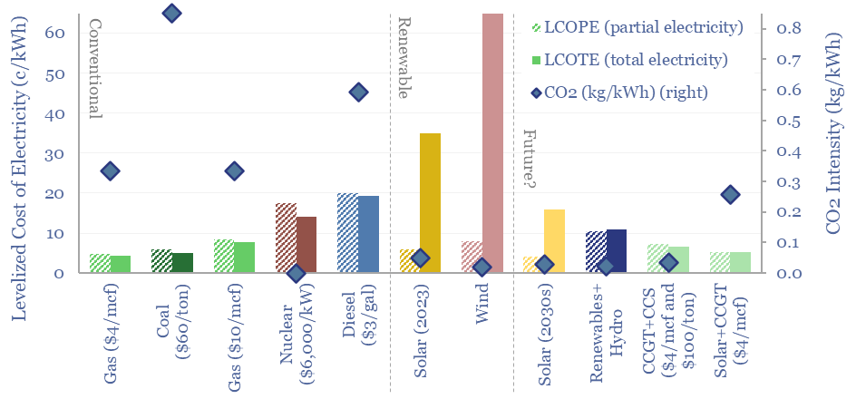
The levelized cost of partial electricity (LCOPE) is very different from the levelized cost of total electricity (LCOTE). This 21-page note explores the distinction. It suggests wind and solar will peak at 30-60% of renewable-heavy power grids? And gas is particularly well-placed as a back-up, set to surprise, by entrenching at 30-50% of renewables-heavy grids?


Modelling power grids is one of the most challenging analytical exercises in the energy transition. However, in five years since starting TSE, we think this report contains our most important conclusions.

The report centers on a distinction between LCOPE and LCOTE. LCOPE is the cost to produce Partial Electricity, a partial share of a grid’s electricity, valuing renewable electricity simply “whenever it happens to be generated”. LCOTE is the cost to generate Total Electricity, the total needs of a grid, for example, supporting a 100MW load, 24-hours per day, 7-days per week. LCOPEs and LCOTEs are very different (pages 2-8).

Battery backstops cannot take solar and wind beyond a 30-40% share of most power grids, without excessively high system costs, in the range of $500/ton of CO2 abatement. This is not a normative comment about the importance of decarbonizing, or a comment that is ‘anti-renewables’ (we still think solar is a world-changing technology, whose costs will deflate by another 30-50% from here). It is simply a prediction, driven by economic analysis, per pages 8-15.

The other inescapable conclusion is that natural gas is going to emerge as the most pragmatic and cost-effective backstop for the volatility in renewable-heavy grids. Hence gas is going to ‘surprise’ by entrenching at a 30-50% market share within renewable-heavy grids. Again, this is not some normative comment about what should happen for ideological reasons. It is a prediction, for which our clients can hold us accountable, driven by numbers, per pages 16-21.

The work draws on five-years of modelling of solar costs, onshore wind, offshore wind, gas turbines, coal plants, nuclear plants, hydro and diesel gensets, grid-scale batteries, redox flow batteries, hydrogen backstops, and more broadly in conventional energy and new energies. Please note that the most cost-effective way to access our research is via a TSE subscription.

Market concentration: what impacts on margins?

Market concentration

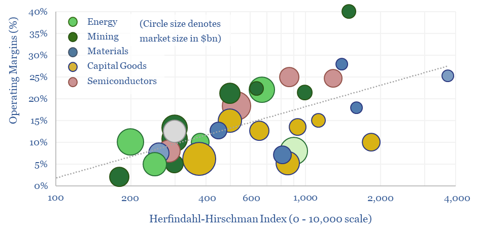
We have assessed over 100 markets in energy, materials, manufacturing and decarbonization across our research. More concentrated industries achieve higher margins across the cycle. But not always. This 10-page report draws out seven rules of thumb around market concentration to help decision-makers.


The usual format of a TSE research note is to explore a particular topic that matters for the energy transition: How does it work? What does it cost? What supply-demand outlook? What are the key technology challenges? And who are the leading companies? This means we now have a library of almost 100 company screens.

What can we conclude about profitability and concentration, by reviewing these screens? We want to derive some conclusions to improve our future research, and help decision-makers appraise opportunities in the energy transition.

The concentration metrics that we find most helpful are the โ€˜top five market shareโ€™ and the โ€˜Herfindahl Hirschman Indexโ€™, which are explained on pages 2-3, including examples from our database, such as industrial gases and the recent consolidation in US E&P.

What is the typical concentration of industries across energy, metals, materials, semiconductors and capital goods sectors? The Herfindahl Hirschman Index and top five market share are on page 4.

Do more concentrated industries generate higher margins? The answer appears to be ‘yes’, across the board, with a correlation coefficient of 50%. From this, we can also predict likely operating margins from market concentration metrics, per page 5.

But not always. 75% of the variance in different industries’ margins is explained by industry conditions and across the market cycle. This underscored the opportunity for active managers in the energy transition. We look at why lithium miners will tend to over-earn and wind turbine manufacturers will tend to under-earn (pages 6-8).

There is value in niches. Smaller markets are inherently less concentrated and higher margin. Sometimes we get feedback from our readers asking why we look at so many ‘niche industries’. This is the reason. Indeed, the epitome of a potentially low-competition and high-margin niche is in breakthrough technologies (page 9).

Mean reversion? Some industries have recently generated higher or lower margins than might be expected from their concentration. Hence which industries stand out as potentially ‘reverting to the trend line’ and what opportunities for decision-makers? (page 10).

This turned out to be one of our favorite research notes of 2023, and we think it adds useful context for investors in public markets, private equity and VC; across energy, materials, capital goods and emerging clean-tech.

Redox flow batteries: for the duration?

Redox flow batteries

Redox flow batteries have 6-24 hour durations and require 15-20c/kWh storage spreads. They will increasingly compete with lithium ion batteries in grid-scale storage. Does this unlock a step-change for peak renewables penetration? Or create 3-30x upside for total global Vanadium demand? This 15-page note is our outlook for redox flow batteries.


By now everybody knows that renewables have a volatile generation profile, which requires building backups, demand shifting, larger power grids, and energy storage.

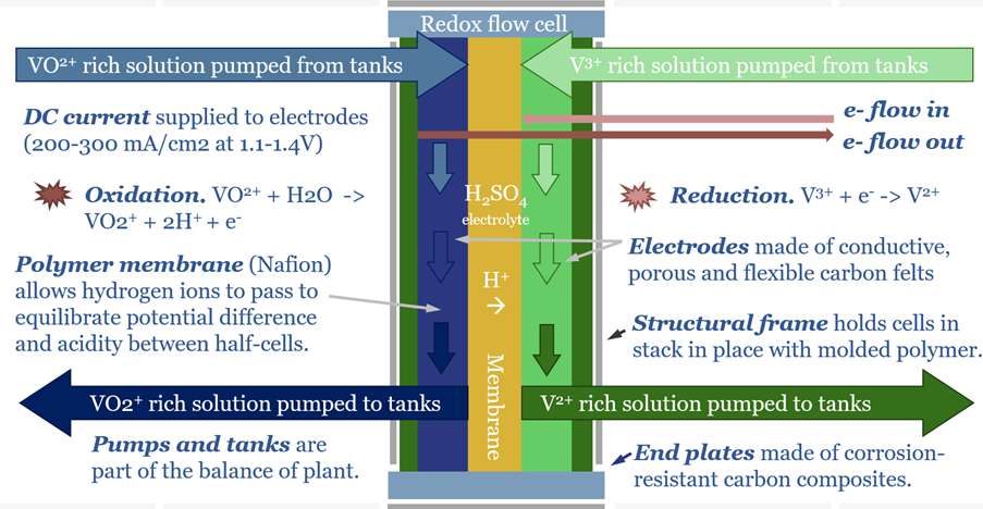
Flow batteries are fundamentally different from lithium batteries. They store and re-release energy as two separate electrolytes oxidize and reduce, at two separate electrodes, either side of a permeable membrane.

The image above shows how a Vanadium flow battery is charged, storing up energy in the ‘higher energy’ V2+ and V5+ oxidation states. The cell simply runs in reverse to discharge.

There are many different types of flow batteries, but this note focuses on the current front-runner chemistry, using Vanadium as the key reagent, which can exist in oxidation states from 2+, 3+, 4+ and 5+. The technology is explained on pages 2-4.

Capex costs of redox flow batteries depend on the system size. Costs per kW rise with battery sizing, but costs per kWh fall, per pages 5-6.

The levelized costs of storage for redox flow follow, after reflecting hurdle rates, efficiency losses and other opex. Flow batteries can be competitive with lithium ion batteries in grid-scale storage, per pages 7-8.

Why do flow batteries not dominate grid storage, if our numbers above are correct? What are the main drawbacks for redox flow batteries? Our answers and key ‘debating points’ are on pages 9-10.

How will redox flow rates re-shape the peak penetration of wind and solar in increasingly renewables-heavy grids? Our answers and key debating points are on pages 11-12.

Who are the leading companies in flow batteries? We can find smaller specialists, some listed, some private, and growing activity from listed large-caps on pages 13-14.

Global Vanadium Production runs at 100kTpa according to data from the USGS. We have quantified Vanadium demand and profiled some leading Vanadium producers on pages 14-15.

Hydrogen evolution: outlook for industrial gases?

hydrogen outlook

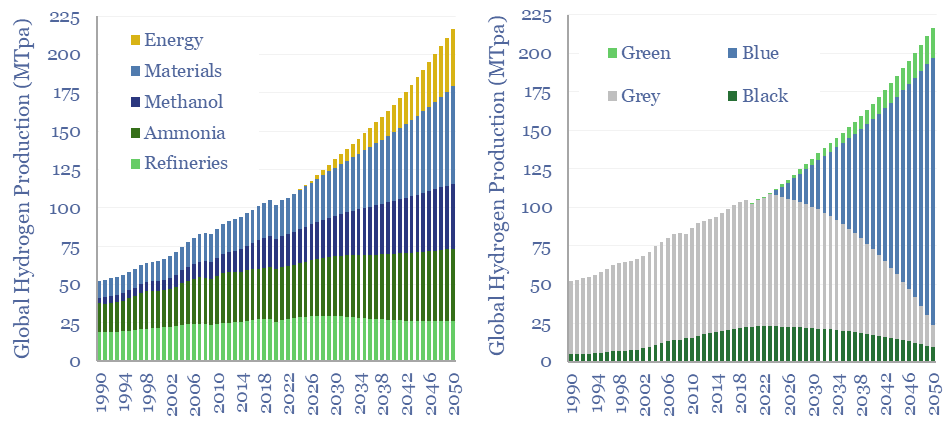
110MTpa of hydrogen is produced each year, emitting 1.3GTpa of CO2. We think the market doubles to 220MTpa by 2050. This is c60% โ€˜below consensusโ€™. Decarbonization also disrupts 80% of todayโ€™s asset base. Our outlook varies by region. This 17-page hydrogen outlook explores the evolving market and implications for industrial gas incumbents?


Today’s 110MTpa hydrogen market is first broken down by product type, end use, geography, supply sources and hydrogen cost ranges (pages 2-4).

Producing 110MTpa of hydrogen in 2023 emits 1.3 GTpa of CO2, which is 2.5% of total global CO2 emissions, at an average CO2 intensity of 12 tons/ton (page 5).

There is no shortage of commentary into how the world should decarbonize. Every commentator is entitled to their views. Our goal in this report is to guess what will actually happen, to black, grey, blue, turquoise and green hydrogen (pages 6-8).

Five recommendations for industrial gas companies follow from this view, some for the 2020s, others for the 2030s and beyond (page 9).

Refining industry disruption creates downside to hydrogen demand in some geographies. Refineries use 25-30% of the world’s hydrogen, mainly for hydroprocessing. While oil demand is flatlining in some geographies and declining in others (pages 10-11).

Hence our hydrogen outlook varies by region. The trajectory looks very different in US hydrogen markets, Europe, the broader OECD and non-OECD (pages 12-16).

Blue hydrogen value chains are now booming in the US, to decarbonize ammonia, steel, petrochemicals and other materials. More broadly, other commentators have published huge forecasts for green hydrogen. But what is actually realistic in our hydrogen supply model? And what implications for the gas industry, power industry and CCS industry? (pages 12-16).

Large industrial gas companies and technology providers are pursuing different strategies amidst this evolving landscape (page 17).

Semiconductor physics: piรจce de resistance?

Semiconductor physics

Semiconductors underpin solar panels, electric vehicles and electronics. Hence this 20-page note aims to explain semiconductor physics from first principles: their conductivity and resistance, their use in devices, plus implications for materials value chains and the energy transition itself?


Semiconductors are a true workhorse of the energy transition, especially if solar efficiency doubles again, to enable AI, and for electrification.

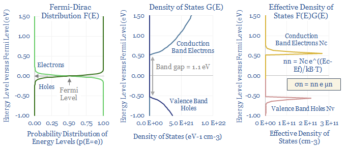
A salty observation might be that commentators love to make sweeping statements about all of these initiatives, without really understanding how semiconductors work or “what is a Fermi Level?”.

We have read several textbooks and technical papers into semiconductor physics. The purpose of this note is to distil the underlying theory, into 20 concise pages, which are relevant to semiconductor devices, materials value chains and energy transition itself.

The resistance of metals is explained on pages 2-3. From first principles, why does the copper used in electronic devices have a conductivity of 5.9 x 10^5 S/cm and a resistivity of 1.7 x 10^-6 ฮฉcm.

The resistance of semiconductors is different from the resistance of metals, because of the complexity of their charge carriers. Pages 4-7 cover the physics: the Pauli Exclusion Principle, the Fermi-Dirac distribution, the Density of States, the Boltzmann constant, bandgaps, and key formulas for semiconductor conductivity (calculations here).

Semiconductors are really not very good conductors. This is why a solar panel contains more copper than silicon and always will (page 8).

Doping can be used to achieve different conductivity and resistance profiles in semiconductors, introducing precise amounts of pentavalent impurities (N-type) or trivalent impurities (P-type). How does doping change the physics? How much dopant is introduced? Why has the solar industry shifted from P-type cells to N-type cells? (please see pages 9-10).

Semiconductor theory allows you to understand PN junctions (page 11), light emitting diodes (page 12), solar modules (and their inevitable progress towards being the world’s lowest cost energy supply source, pages 13-14), transistors (page 15), their combination into MOSFETs, inverters, and converters (page 16) and the rise of wide bandgap technologies such as silicon carbide (SiC) (page 17).

The value chain for silicon wafers is summarized on pages 19-20, covering silica mining, silicon metal, polysilicon production, polysilicon markets, and 20 companies across this entire value chain.

War and commodities: how do conflicts impact prices?

Commodity prices during conflicts

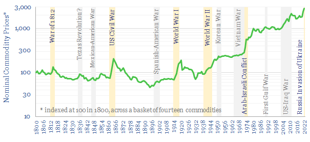
What happens to commodity prices during conflicts? This 10-page note charts how fourteen commodities were affected, across a dozen conflicts, going back to 1800. During major conflicts, 95% of commodities saw higher prices. The average commodity doubled. A strong role is implied for commodities hedging portfolios and even entire nations against conflicts.


Supply-demand models for global energy and materials have long worried us. We think the world has under-invested in energy by $1trn since 2016, portending 2-6% global energy shortages from 2024-30.

This is assuming everything goes right. What is not factored into our numbers is the possibility of a catastrophic disruption to global supply chains. News flow in 2023 seems to provide a constant ominous rumbling.

Hence the purpose of this report is to gather data into how global conflicts have impacted commodity markets in the past, using our database of very long term historical commodity prices, which covers fourteen commodities – energy, materials, manufactured goods and agricultural products – going back to 1800.

There were five major global conflicts during this time period: the War of 1812, the US Civil War, World War I, World War II and a global shock in 1973-74 at the height of the Cold War.

During these five major conflicts, 95% of commodities saw higher prices, and the median commodity price rose by 110% from pre-conflict annual trough to mid-conflict annual peak (page 3).

No two conflicts were the same. However, a pattern across all of the conflicts is that the commodities seeing the most supply disruption also saw the highest price eruptions. Disrupted commodity prices often rose 2-10x. Examples and implications are on pages 4-6.

Another form of disruption is that conflicts tend to suck in attention, people, energy, materials, capital and other resources. Impacts on the prices of manufactured goods are discussed on page 7.

What implications for decision-makers in the energy transition and beyond? Our own perspectives on protecting portfolios, and even entire nations, are discussed on pages 8-10.

DAC to the future?

Direct air capture

A new wave of direct air capture (DAC) companies has been emerging rapidly since 2019, targeting 50-90% lower costs and energy penalties than incumbent S-DAC and L-DAC, potentially reaching $100/ton and 500kWh/ton in the 2030s. Five opportunities excite us and warrant partial de-risking in this 19-page report. Could DAC even beat batteries and hydrogen in smoothing renewable-heavy grids?


Direct air capture (DAC) aims to pull CO2 out of atmospheric air in order to mitigate climate change caused by the greenhouse effect.

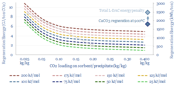
Historically, we have found DAC challenging to de-risk, due to high costs and high energy penalties, which are quantified on pages 2-4.

But the physics of DAC suggest that next-generation sorbents could deliver $100/ton costs and 500kWh/ton energy use (page 5).

Liquid DAC (L-DAC) uses alkali solvents to react with ambient CO2, and has gained prominence through Carbon Engineering and Occidental. Advantages and challenges of L-DAC are reviewed on page 6.

Solid DAC (S-DAC) uses sorbents to react with ambient CO2. Advantages and challenges of S-DAC are reviewed on page 7.

Next-generation sorbents are where we see the greatest potential for DAC to improve in the future. Exciting numbers on page 8.

Passive DAC and mineralization are two further options to lower the costs of blowing air and compressing CO2 for disposal (pages 9-12).

Can DAC demand shift to backstop renewables? Interestingly, we think the costs and energy penalties of decarbonizing hydrocarbons with DAC could be materially less than via green hydrogen (page 13).

Can DAC costs get to $100/ton? Our DAC economic model captures the capex costs, utilization rates, energy use, energy cost and opex that would be needed (pages 14-15).

Leading DAC companies have trebled in number over the past five years, concentrating around the next-generation opportunities above. Highlights from our DAC company screen are on pages 16-19.

New energies: the age of materials?

new energies costs

Over the past decade, costs have deflated by 85% for lithium ion batteries, 75% for solar and 25% for onshore wind. Now new energies costs are entering a new era. Future costs are mainly determined by materials. Bottlenecks matter. Deflation is slower. Even higher-grade materials are needed to raise efficiency. This 14-page note explores the new age of materials, how much new energies deflation is left, and who benefits?


Over the past decade, new energies have seen remarkable deflation. Installed costs of a utility-scale solar project have fallen 75% from $4,000/kW to $1,000/kW. Lithium ion batteries have fallen by 85% from over $800/kWh to $150/kWh. Onshore wind has deflated by 20% from $1,900/kW in 2012 to $1,500/kW in 2022, although offshore wind, as an exception, has reinflated. How has this happened? And what happens from here?

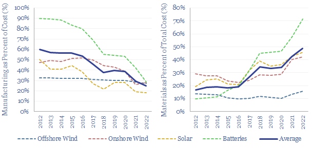
The scale-up to mass manufacturing has been the largest driver of new energies deflation, reducing the manufacturing costs by up to 90% over the past decade. This is quantified on pages 2-4 for each new energies technology. However, manufacturing costs are now just c25% of total new energies costs and so future deflation must come from elsewhere.

The age of materials has arrived. For the first time, in 2022, materials were over 50% of the total installed cost of new energies, in aggregate, up from just 17% of total costs a decade ago, and mainly because manufacturing costs fell away. Our outlook for these materials and their bottlenecks are presented on pages 5-6.

Efficiency gains offer the best opportunity for further deflation. Rising efficiency lowers all cost lines. Including materials costs. This is illustrated in detail for solar. But we think the outlook for efficiency gains is very different among different new energies, per pages 7-10.

High-grading versus thrifting. A change of view in this report is that we see high-grading of materials to be more likely than thrifting. This helps improve efficiency. For example, there are routes to using 20-30% less silver in solar modules, but new HJT cells are actually using 80-100% more silver, because this helps to deliver efficiency gains that deflate all of the other cost lines. The same is true in batteries. And does this make advanced materials less commoditized and higher margin? Further examples and discussion on pages 11-12.

Which emerging new energies technologies could see more versus less deflation? Some ideas are on page 13.

Advanced materials companies for the energy transition have stood out in our research, especially as new energies enter the new age of materials. Our top ten ideas are summarized, with links to further research, on page 14.

Jevons Paradox: what evidence for energy savings?

Jevons Paradox

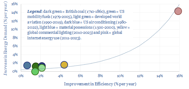
Using a commodity more efficiently can cause its demand to rise not fall, as greater efficiency opens up unforeseen possibilities. This is Jevons’ Paradox. Our 16-page report finds it is more prevalent than we expected. Efficiency gains underpin 25% of our roadmap to net zero. To be effective, commodity prices must rise, otherwise rebound effects raise demand.


Jevonsโ€™ Paradox was articulated by William Stanley Jevons, in 1865, after observing a +8x improvement in steam engine efficiency from 1710 to 1860, causing British coal use not to fall, but to rise +18x to 80MTpa, and +6x in per capita terms.

The Jevons Effect is a particular type of rebound effect. All rebound effects involve new demand counteracting the impacts of efficiency improvements (i.e., 3% efficiency gain – 1% rebound effect = 2% net energy reduction). But in the Jevons Effect, specifically, the new demand is of a larger magnitude than the efficiency gain itself (i.e., 3% efficiency gain – 5% rebound effect = 2% overall increase in energy demand).

The Jevons Effect matters as our roadmap to net zero wants to see 25% of all decarbonization coming from efficiency gains, while other forecasters have even proposed that a large step-up in efficiency gains will see net global energy demand decline by as much as 20% by 2050 (although this assumption looks dangerously wrong to us, note here).

This report aims to quantify the Jevons Effect, objectively, using as much data as possible from our library of 1,000 data-files and models, built up over the past five-years. Overall, we found the Jevons Effect to be much more prevalent than we expected.

Where the Jevons Effect occurs, across seven large areas reviewed in the report, each 1% improvement in energy efficiency has coincided with a 0.7% net increase in energy demand. In other areas, we also find rebound effects, where each 1% improvement in energy efficiency is muted by a c0.5% rebound. These may be useful rules of thumb.

Examples considered in the report include the rise of the internet (pages 5-6), commercial lighting (pages 7-8), material possessions (page 9), US automotive fuel economy standards (pages 10-11), developed world aviation (page 12), US air conditioning (page 13-14) and US residential electricity use (page 15).

Our conclusions from the analysis suggest it will be harder to use energy efficiency initiatives as a route to decarbonization, unless underlying commodity prices also trend higher over time.

Otherwise energy demand will surprise to the upside. Vast new markets will also be unlocked by efficiency initiatives. Some of these new and evolving markets are also linked to human progress and it would be quite sad if they were stifled by decarbonization aspirations.

Shale oil: fractured forecasts?

US shale outlook

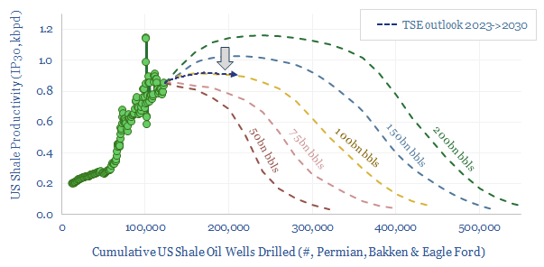
This 17-page note makes the largest changes to our shale forecasts in five years, amidst evidence that productivity growth is slowing. Productivity now peaks after 2025, precisely as energy markets hit steep undersupply. Our shale outlook still sees +1Mbpd/year of liquids potential through 2030, but it is back loaded, and requires persistently higher oil prices?


We spent summer of 2017, reading several hundred technical papers from the US shale industry, and published a 200-page book arguing shale was a โ€œnew technology paradigm, a digital revolution, offering 50-70% further productivity gainsโ€ as ever-improving productivity unlocked the potential to add 2Mbpd of supply each year, and ultimately ramp past 25Mbpd by 2030 in a completely unconstrained scenario. This was 2017. Most people believed shale was โ€˜deadโ€™ at $60/bbl. Indeed, forecasters such as the EIA/IEA were projecting 5-7Mbpd of shale oil in 2025-30.

This 17-page note contains the largest revisions to our shale outlook since 2017. It is hard to โ€˜fit a depletion curveโ€™ onto US shale productivity. But in 2017, we would have picked the dark green line (chart above), with 200bn bbls of liquid resources remaining, which simplistically, at a 20-year RP ratio, would land in the 25-30Mbpd production range. Our latest forecasts are shown by the dark blue line and maybe 100bn bbls remain.

Quantitative evidence for slowing productivity is discussed on pages 4-7. Productivity data has moved sideways for 3-years now in the Permian, but there are also important trends and data interpretation issues.

Qualitative evidence for slowing productivity is discussed on pages 8-10. We reviewed the technical papers from URTEC in 2023 (one E&P really stood out). Productivity improves more slowly from here?

Changes to our forecasts for productivity, shale production growth, ultimate production potential, year-by-year supply, activity, oil prices and shale E&P free cash flow are all discussed on pages 10-16.

How wrong were we? In 2017, we heavily caveated our shale forecasts, noting that “world-changing trends are rarely realized in smooth trajectories” and the most likely reason we would be wrong would be because shale’s smooth production growth would be disrupted by “periodic oil price volatility”. At the time we envisaged the volatility to stem from OPEC policies. Ironically, it was COVID, war, rate rises and the ESG movement, while OPEC itself has recently been acting as a stabilizing force! The de-railing impacts of volatility may be important to consider for other energy transition technologies that are widely hoped to ramp up in a perfect, uninterrupted straight line (pages 17-18).

Copyright: Thunder Said Energy, 2019-2025.