Tree seedlings: costs and economics?

Costs of tree seedlings

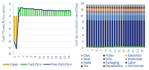
The US plants over 1.3bn tree seedlings per year. Especially pine. These seedlings are typically 8-10 months old, with heights of 25-30mm, root collars of 5mm, and total mass of 5-10 grams, having been grown by dedicated producers. This data-file captures the costs of tree seedlings, to support afforestation, reforestation or broader forestry. Costs should average 13.5c/seedling. A detailed cost breakdown of tree seedlings is also given in $/m2 and $/seedling terms.


Growing practices vary. We think bare root seedlings, grown in open fields, in warmer climates, have a typical cost of 7c/seedling. Conversely, in colder climates, seedlings maybe grown in containers, in heated greenhouses, which also has the advantage of permitting earlier growing and better transportability, despite higher costs, closer to 15c/seedling. Typical costs of tree seedlings are disaggregated in $/m2 and $/seedlings for both categories.

At 13.5c/seedling prices, and a typical planting density of 500 seedlings per acre, seedling costs might explain $70/acre of the total up-front costs in a reforestation project, which might run around $300-400/acre (ex land acquisition).

Operational leverage is very high in the seedling industry. At least compared with other industries captured in our economic models. Net margins are likely in the low single digit percentages in normal times, as costs are spread across labor, packaging materials, soil materials, seeds, herbicides, fertilizers, irrigation, maintenance G&A; and in greenhouses, also heat and electricity. Labor is the large cost line, but the other lines add up too.

This does raise the question whether a rapidly growing market for reforestation could create meaningful upside. A 1c/kWh (c7%) increase in end pricing, e.g., due to under-supply, might flow through to double the net margins of a seedling producer.

ArborGen stood out as one of the leading pure-play companies producing seedlings, in the US and Brazil. It is listed. And it has historically sold 80% of “Mass Control Pollinated” seedlings, which are selected from the best cultivars, adapted to regional conditions, especially in the Southern US. High-quality seedlings should command a premium.

This data-file also includes our notes from technical papers, with some details into the differences between bare-root and greenhouse growing. Weyerhaeuser is another company up in the works, which is backwards integrated and produces tens of millions of seedlings per year.

Thermodynamics of CO2 at different temperatures and pressures?

Heat Capacity Ratio (Cp/Cv) of CO2 at different temperatures and pressures

This data-file aggregates important thermodynamic properties of CO2 at different temperatures and pressures. Specifically, how do different pressures and temperatures dictate CO2’s density, Cp, Cv, Heat Capacity Ratio (gamma), Entropy, and Compressibility. These variables matter for CO2 compression, CCS and sCO2 power cycles.


Our overview of compressors shows how the energy needed to compress a gas varies as a function of its temperature, compressibility, heat capacity ratio (Cp/Cv) and its molar mass.

Our overview of thermodynamics explains how the efficiency of a gas-fired power cycle (i.e., a Brayton cycle) depends on the ability to heat gases to high temperatures and achieve high compression ratios (in turn, a function of Cp/Cv, compressibility, etc).

Hence what are the thermodynamic properties of CO2 at different temperatures and pressures? This data-file aims to aggregate some data in a user-friendly format.

The density of CO2 at different temperatures and pressures is plotted below. Liquefied CO2 will be in the range of 1,000-1,200kg/m3, which is over 2x more dense than LNG. Moreover, the density of heated CO2 at 300-bar and 600C is 170kg/m3, which is 2x higher than the equivalent density of steam. This explains why CO2 can be an interesting working fluid for decarbonized gas power (e.g., the NET Power cycle), because higher densities mean small plant sizes.

Density of CO2 in kg/m3 at different pressures and temperatures

The isobaric heat capacity of CO2 (Cp) at different temperatures and pressures is plotted below. This is a truly strange graph, with Cp fluctuating wildly at low-intermediate temperatures. This has a strange result for heating CO2 in a heat exchanger. As energy is transferred from a hot CO2 stream to a cold CO2 stream, temperatures will drop 1.5x faster on the hot side than they rise on the cold side. In other words, it can be quite challenging to heat exchange CO2 compared to other gases.

Isobaric heat capacity of CO2 (Cp) at different temperatures and pressures

The heat capacity ratio of CO2 (gamma = Cp/Cv) at different temperatures and pressures is plotted below. Fluctuations in gamma follow from fluctuations in Cp (above). The energy needed to compress a gas rises with heat capacity ratio. This shows that it is quite easy to compress CO2 to liquefaction temperatures (around 6-10 bar is envisaged for CO2 trucking or CO2 shipping). But there are some unexpected spikes in the heat capacity ratio in the ranges relevant to CO2 pipelines (100-bar) and CO2 gas turbines (300-bar).

Heat capacity ratio of CO2 (gamma) at different temperatures and pressures

The compressibility of CO2 at different temperatures and pressures is plotted below (Z factor). More energy is required to compress gases with higher compressibility (linear relationship). What is interesting about CO2 is the wide variability in its compressibility. Compared to air, it is easier to compress at low temperatures and intermediate pressures.

Compressibility of CO2 at different temperatures and pressures

The entropy of CO2 at different temperatures and pressures is plotted below. As a rule of thumb, the entropy of CO2 is around one half the entropy of air and steam, at comparable pressures and temperatures. This also helps the efficiency of CO2 power cycles.

Entropy of CO2 at different pressures and temperatures

Underlying data on the thermodynamic properties of CO2 at different temperatures and pressures are presented in a user-friendly format in this data-file.

Energy transition: the very hungry caterpillar?

energy transition stocks

The universe of energy transition stocks seems small at first. 50 clean tech companies have $1trn in combined value, less than 1% of all global equities. But decarbonizing the world is insatiable. Consuming ever more sectors. In our attempt to map out all of the moving pieces, we are now following over $15trn of market cap across new energies, (clean) conventional energy, utilities, capital goods, mining, materials, energy services, semiconductors.

Hillcrest: ZVS inverter breakthrough?

Hillcrest Technology Review

Hillcrest Energy Technologies is developing an ultra-efficient inverter, which has 30-70% lower switching losses, up to 15% lower system cost, weight, size; low thermal management needs, high reliability, and confers up to 13% higher range than today’s inverters, especially for use in EV powertrains; but also in wind, solar, batteries and fast-chargers. It is based on SiC semiconductors. This Hillcrest technology review presents our conclusions from patents and technical papers.


Hillcrest was founded in 2006, is based in Vancouver, Canada with c15-20 employees. It is publicly listed, with market cap of $25M (Feb-23) and shares traded on the OTCQB Venture Market and Frankfurt Stock Exchange.

It is developing a Zero Voltage Switching (ZVS) inverter. What does this mean, and why does it matter?

Inverters convert DC power to AC power via pulse width modulation, which is covered in our primer into electricity. Specifically, electrical switches create bursts of current, of increasing frequency, then decreasing frequency, then increasing frequency, then decreasing frequency. When these power bursts are averaged out, they resemble an AC sine wave (chart below). This AC power signal can be used to feed power into the grid, or to drive the electric motors in an electric vehicle. The switches are MOSFETs or IGBTs.

The quality of the AC power signal depends on the switching frequency. Fewer pulses (each with longer length and longer gaps) creates a jagged AC sine wave. Whereas more pulses (with shorter length and shorter gaps) produces a smoother sine wave. A nice analogy is thinking about how video quality increases with a higher frame rate. So why don’t inverters dial up the switching frequency to the max?

Switches incur a small power loss every time they switch on and switch off. The reason is that when the switch is off, there is a potential difference (aka a voltage) across the junction (dark green, chart below). When the switch starts to turn on, current starts to flow from source to drain (light green, chart below). The current ramps up as the voltage ramps down. And thus, in the middle, power is dissipated, as power = voltage x current (yellow line, chart below). And so usually, the higher the switching frequency, the higher the switching losses.

Zero Voltage Switching, as the name implies, cuts the voltage from source->drain towards zero BEFORE the current from source->drain ramps up. Thus the power dissipated per switching event (VxI) is very close to zero (chart below). This is conventionally done using active snubber circuits or software on micro-controllers. In principle, ZVS enables faster switching frequencies without astronomical switching losses.

Hillcrest’s technology includes Zero Voltage Switching algorithms, which can be implemented in a micro-controller, and coupled with next-generation SiC semiconductor, which are creating an exciting jolt forwards in the power electronics behind practically all of the core areas of the energy transition (TSE research note here).

Hillcrest’s white papers show that its algorithms achieve 30-70% lower switching losses than others using similar semiconductor, especially at higher switching frequencies (chart below). They are also shown to operate over a wider operating range than existing solutions, and produce a particularly high quality output (low ripple, low harmonics, low EMI) .

Another benefit highlighted is that higher quality power signals should allow for downsizing of other components in the traction inverter; especially the DC link capacitor, which typically comprise 21% of the weight of the inverter, 14% of its cost, and 30% of the failures (chart below). This should be interesting for manufacturers of electric vehicles, and others in wind, solar, batteries, fast-charging, power grids.

The data-file linked below is our Hillcrest technology review. As usual, our goal is to review the company’s patents, and its White Papers, to assess (a) can we understand precisely how the company is achieving a technical breakthrough? (b) can we de-risk that breakthrough and (c) can we find a clear moat around the technology, conferring an edge for the company.

Energy transition stocks: holdings in clean energy funds?

Energy Transition Stocks

Which stocks are most considered to be energy transition stocks? In this data-file we have aggregated the holdings of ten well-known energy transition ETFs and clean tech ETFs, in early 2023. The average ETF has 80 holdings. The entire file contains 300 companies. Our conclusions follow below.


50 companies are most clearly energy transition stocks. They comprise 60% of the total AUM of these 10 ETFs that we reviewed. And each of these 50 companies is featured in six out of ten of the energy transition ETFs on average.

Predictable sectors. Of these top 50 companies, 17 are solar companies, from around the solar supply chain. 14 are renewable energy developers. 6 are hydrogen or fuel cell companies. 5 are companies in the battery supply chain. 4 are wind companies. 2 are EV producers.

Energy Transition stocks

Energy transition stocks tend to be younger, smaller and more highly valued than the broader market. The average energy transition stock in our screen was founded in 2001, has $3.4bn in market cap and $1.1bn in revenues (3x price-to-sales). By contrast, the average constituent of the S&P500 is 50 years old, has $30bn pa of sales and $70bn of market cap (2.1x price-to-sales, note the numbers above are rounded).

These disparities were most pronounced for hydrogen companies, which were the smallest of any category in the group but also the most highly valued.

Interestingly, for wind and solar companies, price-to-sales valuations were materially lower than the broader market, especially for wind companies.

Pure-plays. Two-thirds of the top fifty energy transition stocks can be considered to be pure-plays. Pure-play companies are apparently more likely to be included in clean tech ETFs. Whereas diversified companies with growing exposure to the energy transition are more likely to be overlooked.

Many of the companies have specifically been covered in our energy transition research and our patent assessments.

Please download the data-file for an overview of which stocks are most considered to be energy transition stocks. For each company, we have tabulated their domicile, some listing details, market cap, revenues, employee count and a brief description.

Grid-scale battery costs: the economics?

Grid-scale battery costs

Grid-scale batteries are envisaged to store up excess renewable electricity and re-release it later. Grid-scale battery costs are modeled at 20c/kWh in our base case, which is the ‘storage spread’ that a LFP lithium ion battery must charge to earn a 10% IRR off $1,200/kW installed capex costs. Other batteries can be compared in the data-file.


Grid-scale batteries are often envisaged to store up excess renewable electricity at one part of the day, and re-release the electricity at times when the wind is not blowing and the sun is not shining. The costs of grid-scale battery storage are captured in this data-file.

Different grid-scale battery types include lithium ion, redox flow, lead acid, pumped hydro, compressed air, thermal and other gravitational systems.

Capex costs of grid-scale batteries depend on what you build. But a nice apples-to-apples comparison is charted below, using third-party data from PNNL. This is assuming a 10MW system with 4-hours duration, across the board. We have also written a longer note explaining the strange duality of measuring battery costs in both $/kW an $/kWh.

Grid-scale battery costs
Cost of medium duration energy storage solutions from lithium batteries to thermal pumped hydro and compressed air

The costs of a grid-scale battery are generally around 2x higher than the underlying battery, after reflecting the balance of system, power equipment, controls and communication, systems integration, grid installation, EPC concentrators and development costs. For example, a lithium ion battery might cost around $150/kWh ($600/kW), but a grid-scale lithium ion battery is shown at $300/kWh ($1,200/kW).

Utilization also strongly determines the costs of grid-scale storage. A nice simplifying assumption for benchmarking different batteries is that they might be lucky to charge and discharge precisely once per day (this is even specified as a limit in the warranties of some battery suppliers). This means 365 charge-discharge cycles per year. But there may not be sufficient supply or demand on all days. Especially for larger batteries. This inflates costs (chart below).

Sensitivity of grid scale battery storage spread to utilization and hurdle rate

Longevity and degradation. The total number of charge-discharge cycles will determine the life of the battery, and the period over which it can generate cash flows. We have argued that battery degradation is the single most important variable to debate for battery economics. The cycle life in real-world systems, standing for 10+ years, may be quite different from the results of accelerated cycling tests in the lab.

Other variables can be stress-tested in the data-file, such as different battery types, their capex costs, efficiency, operating costs, depth of discharge, degradation factors, hurdle rates and storage spreads. For our key battery conclusions, please see our overview of energy storage.

Solar surface: silver thrifting?

silver use in solar

Ramping new energies is creating bottlenecks in materials. But how much can material use be thrifted away? This 13-page note is a case study of silver intensity in the solar industry, which halved in the past decade, and could halve again. Conclusions matter for solar companies, silver markets, other bottlenecks.

Liquefied CO2 carriers: CO2 shipping costs?

costs of liquefied CO2 carriers

This model captures the costs of liquefied CO2 carriers, i.e., a large-scale marine vessel, carrying CO2 at -50ºC temperature and 6-10 bar of pressure, as part of a CCS value chain. A good rule of thumb is seaborne CO2 shipping costs are $8/ton/1,000-miles, as a total shipping rate of $100k/day must cover the capex of a c$150M newbuild tanker.


Could the LNG industry decarbonize by shipping LNG to gas consumers, then shipping the resultant CO2 away? We recently explored this concept in a detailed research note.

This work envisaged using the same vessel to transport LNG in and CO2 away. It required building new, dedicated, dual-purpose vessels, with ‘Type C’ containment (i.e., they would need to be capable of withstanding 8-10 bar pressures of liquefied CO2, whereas by contrast, today’s fleet of LNG vessels are ‘Type B’, and are not designed to hold pressurized gases).

Using the same vessel? The great advantage is that an LNG tanker is already making a deadhead journey back to the liquefaction facility, thus incremental transportation costs may be as little as $1.3/mcfe and total CO2 abatement costs as little as $100/ton. The great disadvantage is logistical risk and inflexibility. Swapping CO2 and LNG cargoes is do-able but annoying. It also limits the vessel to operating in ‘shuttle mode’ (i.e., no real flexibility to divert cargoes). And dual-purpose ships can end up as jack of both trades, master of neither.

Liquefied CO2 carriers could harness many of the same benefits, decarbonizing LNG in geographies with no nearby CO2 disposal reservoirs; while sharing marine infrastructure with an LNG regas facility; and using the cold stream from re-gassing LNG (at -160C) to chill and liquefy CO2 (-50C). But dedicated CO2 carriers could also be optimized for CO2. And this configuration also imparts more flexibility to the LNG carriers and CO2 carriers.

This data-file captures the costs of liquefied CO2 carriers. A $100k/day total shipping cost is required to recoup the capex on a $150M CO2 carrier vessel, and generate a 10% IRR. Costs are broken down in the file, including 20 different capex estimates for large, liquefied CO2 carriers (in $M, m3 and ktons).

In our base case, the total abatement costs likely end up c$25/ton higher using dedicated CO2 carriers versus back-carrying liquefied CO2 in an LNG carrier (at an apples-to-apples transportation distance around 5,000 miles). However, the higher base case costs may be diluted by lower risk, higher flexibility, and the ability to find CO2 disposal closer-by.

Costs are most sensitive to shipping distances. Shipping liquefied CO2 might cost $8/ton within 1,000-miles (i.e., intra basin), rising to c$50/ton at 6,000 miles (trans-Atlantic). Overall, we think liquefied CO2 carriers can be part of decarbonized value chains with total CO2 abatement costs around $100-125/ton, using bridges from our broader CCS research.

A challenge remains in regulation. Carbon markets or CO2 disposal incentives in developed world countries do not currently allow for cross-border transport of CO2. And it will be important to ensure that each ton of CO2 loaded onto a liquefied CO2 carrier is properly sequestered in a well-run CO2 disposal facility.

Another debate is over the size of the CO2 carriers. Today’s CO2 carriers are mostly around 10,000m3 (11kT of CO2e), and within a range of 5,000-30,000 m3. Larger vessels will be more economical. Ideally over 50,000m3. You can stress-test vessel size in the model.

Overall, we do think there is a growing opportunity for the LNG industry to develop decarbonized value chains, using CCS and nature-based solutions. Best placed to capture the opportunity are companies with existing experience in LNG, and LNG shipping. Economics of CO2 shipping in this data-file can also be compared with LNG shipping.

Model of losses in a solar cell: surface, emitter and shading?

Losses in a solar cell

This data-file calculates the losses in a solar cell from first principles. Losses on the surface of the cell are typically c4%, due to contact resistance, emitter resistance and shading. Sensitivity analysis suggests there may be future potential to halve silver content in a solar cell from 20g/kW to 10g/kW without materially increasing the losses beyond 4%.


There are three types of surface losses in a solar cell (chart below). Usually, the losses might run to around c4-5%. This is due to resistance in the contact fingers (0.5-1%), resistance in the emitter (1.5-2.5%) and resistance due to shading of the silicon by fingers and busbars (2-3%).

This data-file allows stress-testing of different impacts on solar cell efficiency. You can vary the busbar number (#), busbar spacing (mm), finger length (mm), finger spacing (mm), finger height (μm), finger width (μm), finger resistivity (Ωm), emitter resistivity (Ω/square), open circuit voltage (Voc), current density (mA/mm2). The maths are quite satisfying.

There is no real challenge thrifting silver use in a solar panel by reducing the volume of the contacts. Improved printing techniques may even allow for lower shading losses. More efficient cell designs (e.g., TOPCons) may also allow for slightly higher surface losses.

Lowering silver content from 20 g/kW to 10 g/kW over the next 5-10 years is possible, especially as more efficient new printing technologies are developed. This matters as silver could become a bottleneck in the ascent of solar and face its own challenges in ramping silver mining.

Sensitivity analysis is shown for optimizing finger spacing, narrower fingers, increasing the number of busbars and printing taller-thinner fingers, and how this will all impact losses in a solar cell.

NET Power: gas-fired power with inherent CO2 capture?

NET Power Technology Review

NET Power has developed a breakthrough power generation technology, combusting natural gas and pure oxygen in an atmosphere of pure CO2. Thus the combustion products are a pure mix of CO2 and H2O. The CO2 can easily be sequestered, yielding CO2 intensity of 0.04-0.08 kg/kWh, 98-99% below the current US power grid. Costs are 6-8c/kWh. This NET Power technology review presents our conclusions from patents.


NET Power was founded in 2010, is headquartered in Durham NC, has >30 employees, and has developed an efficient, gas-fired power generation technology with “in-built CCS”.

Specifically, the reactor produces a pure stream of H2O and CO2, which can easily be dehydrated, then a portion of the CO2 can be siphoned off for disposal, while the remainder is re-circulated, as the working fluid in the thermodynamic cycle.

In 2022, Rice Acquisition Corp II agreed to combine with NET Power, at an EV of $1.5bn, with $235M of commitments from the Rice family, Occidental Petroleum and others.

NET Power aims to generate reliable electricity from natural gas and capture the emissions. CO2 intensity is stated at 0.04-0.08 kg/kWh, comparable to utility-scale solar, and 98-99% below the current US power grid at 0.4 kg/kWh.

We first looked at NET Power in a research note in 2019, exploring how next-generation combustion technologies could facilitate easier capture of CO2 (note here).

Levelized costs of power generation are estimated in a range of 6-8c/kWh, assuming $3.5/mcf hub gas prices (and by extension, $4.5-5.5/mcf input gas prices), in our model of NET Power’s oxy-combustion process linked here. The usual caveats apply that levelized cost calculations can be materially lower, or higher, in different contexts.

How does the technology work? The technology is a modified and heavily recuperated super-critical CO2 Brayton cycle. As helpful background reading, we would recommend to start with our overview of thermodynamics, and our overview of super-critical CO2.

The patents give some helpful details on pressures, temperatures, heat exchange, Cp/Cv ratios, and innovations to maximize efficiency; including recuperating waste heat from the air separation plant (which produces the pure O2 for the combustion process) back into the CO2 stream. Details are in the data-file.

What challenges for super-critical CO2 Brayton Cycles? There are six core challenges with super-critical CO2 Brayton cycles. They are outlined in the data-file, along with our assessment of how NET Power addresses the challenges, based on its patents.

Can we de-risk Net Power’s technology? Our NET Power technology review shows over ten years of progress, refining the design of efficient power generation cycles using CO2 as the working fluid. The patents show a moat around several aspects of the technology.

Copyright: Thunder Said Energy, 2019-2024.