Energy transition: top commodities?

Commodities needed for energy transition

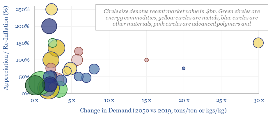
This data-file summarizes our latest thesis on the top thirty commodities needed for the energy transition. We estimate that the average commodity will see demand rise by 3x and price/cost appreciate or re-inflate by 60%. The scatter is broad. Upside ranges from 2x to 30x for different metals, materials, plastics and capital goods markets.


The data-file contains a 6-20 line summaries of our view on each commodity, and ballparks numbers on the market size, future marginal cost, CO2 intensity and pricing.

As a useful summary, summarizing all of our research into energy technologies and energy transition to-date, we have also ‘ranked’ these 30 top materials and commodities, according to our long-run outlook in this data-file in the ‘Materials’ tab of the data-file.

The median average commodity sees its demand treble in the energy transition. The mean average commodity sees its demand rise 1.5x. Top quartile commodities see growth of 5-30x, although this is most often because they are smaller markets to begin with.

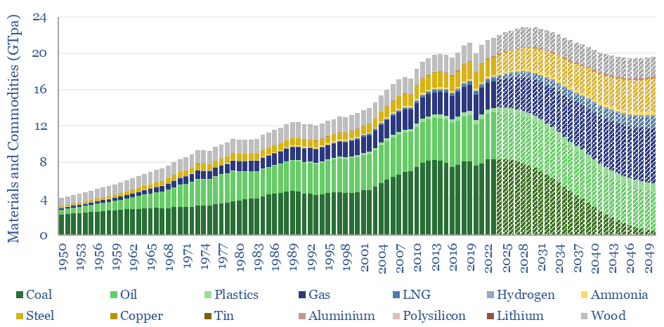
Although many commodities require sharp growth curves, if the world is going to reach net zero by 2050, this is not unprecedented. Some of the largest commodities are plotted below, from 1950-2050, with a weighted average growth CAGR of 2.5% per annum.

Long Run Structural Growth of Commodities Needed in Energy Transition

An apparent paradox in our energy transition roadmap, however, is that after rising at a 2.5% CAGR for the past 70-years, our aggregate models require the total tonnage off these commodities, as consumed by human civilization to move sideways from here. The main reason is phasing out higher carbon coal. This is only really realistic amidst a vast step up in solar, wind, power grids and natural gas as alternatives.

Commodities needed for energy transition
Total Tonnage of Commodities Needed in Energy Transition

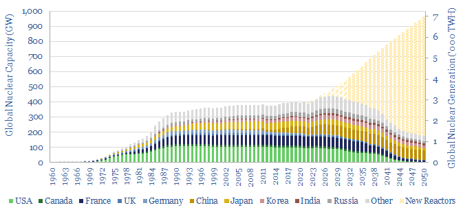
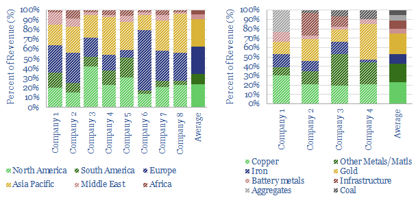
Commodities needed for the energy transition and covered in this data-file include Aluminium, Ammonia, Carbon Fiber, Coal, Cobalt, Copper, Ethylene Vinyl Acetate, Fluorinated Polymers, Fluorspar, Glass Fiber, Graphite, Hydrogen, Indium, Lithium, LNG, Mass Timber, Methanol, NdFeB Rare Earths, Nickel, Oil, Polyurethanes, PV Silicon, Silicon Carbide, Silver, STATCOMs, Steel, Sulphuric Acid, Tin, Uranium, Vanadium.

Further details on each commodity can be found by browsing our supply-demand models.

Another observation is that many of the commodities that excite us most, are strictly, becoming less commoditized, as we increasingly see evidence that the ramp-up of new energies – solar, wind, lithium ion batteries, electric vehicles – calls for advanced materials that confer higher performance and longevity. This is our new age of materials thesis. Leading examples are tabulated in the data-file.

Beware volatility! Soft bottlenecks can be defined as markets that will be tightened by the desire to accelerate the energy transition ever faster. Thus their prices and margins will generally rise. Supply will be available, prices will simply have to rise. Hard bottlenecks, however, may not be surmountable at any price, and we especially think this is the case for power grids. But inverse bottlenecks are most frightening. These materials are needed for the ascent of energy transition technologies, but whose demand and pricing unexpectedly collapse, because for a few months-years, these commodities are in a position of relative over-supply, due to another material being the hard bottleneck. For example, in a research report published in January-2023, we wrote “We are wondering whether PV silicon could see this kind of pricing action in 2023, as it said that China’s fabs will ramp from 300 GW at YE22 to 540 GW at YE23, while global gas shortages are going to disrupt production of silver and FPs“. In our view, timing volatile commodity bottlenecks is one way that active managers can add value as the energy transition impacts practically every supply chain on the planet.

We will continue adding to this data-file over time, as part of our ongoing energy transition research. Please contact us any time if you are a TSE client, and you think there is a particular commodity we should be adding while tracking commodities needed for the energy transition.

Nuclear capacity: forecasts, construction times, operating lives?

Breakdown of global nuclear capacity

How much nuclear capacity would need to be constructed in our roadmap to net zero? This breakdown of global nuclear capacity forecasts that 30 GW of new reactors must be brought online each year through 2050, if the nuclear industry was to ramp up to 7,000 TWH of generation by 2050, which would be 6% of total global energy.


Our outlook for nuclear energy is evolving. Adding 30GW pa of new nuclear capacity per year would be a massive escalation from, as the world has only added around 6 GW per year of new capacity in the past decade.

However, there is precedent, as the world installed 25-30 GW pa of new nuclear reactors at peak, during the mid-1980s, and after a wave of project-sanctioning that followed major energy crises in 1973-74 and 1979-80.

The total base of active, installed nuclear capacity is around 400 GW today, for perspective. Leading countries include the US, with c100 GW of capacity, France with 60GW, China with 50GW and Russia with 30GW. Japan’s nuclear capacity is presently around 45GW, but a large portion of the installed base remains offline post-Fukushima.

Moreover, the average nuclear plant in the world today has been running for 36-years, which means that 10GW of reactor capacity could shut down each year through 2050.

Underlying the analysis is a database of 700 nuclear reactors, including c440 in operation, c200 that have been shut down or decommissioned and around 60 that are in construction. A helpful source in compiling our forecasts is publicly available data from the IAEA, which we have aggregated and cleaned.

The data also show operating lives of nuclear plants, and construction times of nuclear plants, which average 7.5 years from breaking ground through to first power; across different reactor designs and across different countries.

Finally, this breakdown of global nuclear capacity data-file allows you to filter upon individual countries, such as the US, Germany, France of China.

Weird recessions: can commodities de-couple?

Can commodities de-couple from GDP?

In a ‘weird recession’, GDP growth turns negative, yet commodity prices continue surprising to the upside. This 10-page note explores three reasons that 2022-24 may bring a ‘weird recession’. There is historical precedent, prices must remain high to attract new investment and buyers may stockpile bottlenecked materials. How will this affect different industries?

How do commodities perform during recessions?

How do commodities perform in recessions?

How do commodities perform in recessions? Industrial metals are usually hit hardest, falling 35% peak-to-trough. Energy price spikes partly cause two-thirds of recessions, then typically trade back to pre-recession levels. Precious metals, mainly gold, tend to appreciate in financial crises. Data are compiled in this file, across recessions back to 1970.


Industrial metals are typically hit hardest, declining 35% peak-to-trough and still trading -20% lower in the year after the recession ended compared to the year before it began.

Energy is more mixed, typically declining -23% peak-to-trough, but in two-thirds of the recessions, energy prices continued spiking for an average of 6-months after the recession started, suggesting that energy shortages were a cause.

Gold is an outlier. In the median average recession, real gold prices have been +5% higher in the 12-months following the end of the recession, compared to the 12-months preceding its start. Other precious metals tended to be 10-15% lower, industrial metals tended to be 20-30% lower, and energy commodities tended to be “flat”.

Each recession is unique, hence while the averages are useful, we think it may be even more useful to delve into the underlying tabs of this data-file, to review individual commodities in individual recession contexts.

The Great Recession of 2008-09 has become an archetype for asset price performance during recessions, for those of us who lived through it. However, in commodity terms, it was unusually severe. Six of the twelve commodities in this data-file experienced their worst peak-to-trough decline of any recession, while another three of the twelve experienced their second worst declines.

How do commodities perform in recessions?

Methodology. We downloaded monthly commodity prices from the World Bank pink sheets. We then translated these nominal prices into real terms using the US CPI. Next, we downloaded a list of recession dates from the NBER. We indexed commodity prices at 100 at the start of each recession. Then we plotted the pricing performance 12-months prior to the start of the recession through to 12-months after the end of each recession. We computed three metrics for each commodity in each recession: peak-to-trough price decline, TTM average-to-trough price decline, and average pricing in the year after the recession had ended versus average pricing in the year before the recession began. Finally, we aggregated the data for each recession and took an average.

How do commodities perform in recessions? Commodities assessed in the data-file include oil, natural gas, coal, corn, iron ore (precursor to steel), aluminium, copper, zinc, nickel, platinum, silver and gold.

Recessions assessed in the data-file include the Global Financial Crisis of 2007-09, the collapse of the Dot Com bubble in the early 2000s, after the First Gulf War in the early 1990s, after the 1980+ oil shock, after the 1973-74 oil price shock, and the monetary-induced recession of 1969-70. We have also published detailed reviews into energy crisis and bursting bubbles.

Nitric acid: production costs?

Nitric acid production costs

Global production of nitric acid is 60MTpa, in a $25bn pa market, spanning c500 production facilities. c80% of the world’s nitric acid is used to make ammonium nitrate, for fertilizers and explosives in the mining sector. This data-file is a breakdown of nitric acid production costs, based on evaluating the energy economics, capex and other operating costs.


A nitric acid price of $350/ton is needed to generate a 10% IRR in our base case model, assuming a plant costing $500/Tpa in capex. Economics can be stress-tested in the data-file.

The largest input costs is ammonia, which is progressively oxidized using the Ostwald process, a high-temperature catalytic oxidation reaction, using a platinum-rhodium catalyst, at low-medium pressures (further details in the notes tab). Unfortunately, this means nitric acid prices will spike to $600/ton in a gas crisis or times of severe gas shortages.

CO2 intensity is estimated at 1.8 tons/ton, but can realistically vary from 1 to 4 tons/ton. The process itself is not energy intensive. We estimate that the electricity consumption per ton of nitric acid is below 25 kWh/ton (you can compare all of our economic models).

However, one-third of the CO2 intensity is inherited from ammonia inputs. And most significantly, the production process can emit anywhere from 0.1 kg/ton to 10 kg/ton of N2O, a powerful greenhouse gas, which a 298x higher global warming potential (GWP) than CO2.

Companies in the nitric acid value chain are mentioned in the ‘notes’ tab. It may be interesting to explore companies such as Clariant, Johnson Matthey and BASF for their catalyst technologies (Clariant is marketing a post-processing catalyst that can break down 95% of the N2O).

There are also specialist manufacturers of blasting explosives for the mining industry, such as Dyno Nobel and Orica, further down in the value chain; adding to our recent work into specialist mining equipment companies.

Please download our nitric acid production costs model, in order stress test capex, opex, and other cost lines.

CO2 removals: teak plantations, Nicaragua?

Nicaragua reforestation case study

The “Nicaragua High Impact Reforestation Program” should remove over 100,000 tons of CO2 from the atmosphere, by row-planting teak trees across >500 hectares of former pasture land in Nicaragua. It is our fourth detailed case study of nature based CO2 removals in 2022, with a price of $45/ton, and a passable score of 70/100 on our framework. But this Nicaragua reforestation case study also illustrates some challenges and debates around nature-based solutions.


Great virtues of this project are that it is real, incremental and measurable. The CO2 credits are certified by Gold Standard, and we were able to review 100 pages of documentation from independent auditors, verifying the CO2 removals; which seem to be measured conservatively, including a 20% ‘buffer’ for reversals.

This region of Nicaragua has been 80% deforested for cattle-grazing. There is a clear CO2 benefit to reforesting former pasture-land. GDP per capita is below $2,000 in the country. Hence it is also helpful for well-meaning investors to provide capital to convert degraded land into carbon-absorbing forests. CO2 credits contribute to the return on that investment.

Furthermore, around 25-30% of the total area in the project is residual forest, especially around water-courses, which will be preserved. This is nature-positive. Although CO2 credits are not being issued against this forest conservation.

However, this particular reforestation project is 100% row-planted teak, which will be harvested and re-planted on a 20-year cycle. Teak is not even native to Central America, but originates from South-East Asia. Some critics might argue that a short-life, row-planted mono-culture is not really ‘a forest’. And if you are not creating a forest, is it really re-forestation?

This is the logic behind the project achieving a score of 70/100 on our framework. Further details and debates are laid out in the data-file, exploring whether this Nicaragua reforestation case study can be considered ‘permanent’ (yes and no!), ‘biodiverse‘ or ‘nature positive’. So are the key numbers from our review.

We have made a $1,000 allocation to this project, in order to offset 22 tons of CO2. Our goal is to support one nature-based CO2 project each month, and to size the allocation according to the ‘score’ each project achieves on our framework.

Silver and gold: medal winners?

Overview of gold and silver production

Gold and silver are stores of value, especially in a world of persistently high inflation and low rates. Silver is also likely to be the main bottleneck for solar in the 2020s. Hence our 18-page note models the end-to-end mining and refining of these metals. We find very steep energy/CO2 curves, and fear supply shortages. What upside for well-run gold-silver incumbents?

Overview of mining equipment companies?

Overview of mining equipment companies

This data-file is an overview of mining equipment companies, as mined materials increasingly seem like a bottleneck in the energy transition. For each company, we have noted its location, size, age, number of employees, number of patents, latest revenues, operating margins, exposure to the mining equipment industry, and a few short summary sentences. Where possible, we have also broken down the company’s revenues by end-market or by commodity.


Seven companies stand out as they are larger, institutional quality companies with differentiated product offerings and >20% exposure to the metals and mining. This includes well-known titans of the mining industry, such as Caterpillar, Komatsu, Metso-Outotec, Epiroc and Sandvik.

Operating margins average 15% across this landscape of mining equipment companies, which is a good baseline for appraising the sector.

After-market sales contribute to strong margins. Some companies in our screen are generating 65% of their total revenue from after-market, as mining equipment requires an ongoing supply of replacement parts and servicing.

Much of the sector is dividend-generating, with targets to pay out 40-50% of earnings over the cycle.

A breakdown of revenues is given where possible. As a rule of thumb, the mining equipment industry generates 35% of its revenue in the Americas, 25-30% in Europe and 25-30% in Asia. Another 25-30% is usually associated with the copper industry, 25-30% with the gold-silver industry, and the remainder is diversified (charts below).

Overview of mining equipment companies

Direct focus on the energy efficiency is a core theme. One specialist company notes its HPGR units can cut energy consumption by 40% in crushing-grinding circuits, especially by lowering re-processing. Another specialist company noted that its autonomous drilling units can achieve 29% lower CO2 and 40% lower cost per meter of progress.

Electrification and hydrogen. Many of the companies in our screen are highlighting an increasingly electric product offering. One specialist company notes the benefits of electrifying underground mining equipment, which saves 30% of the mine’s ventilation costs and energy use. However, one of the largest mining equipment manufacturers in the world has noted challenges with hydrogen fuel cells, which is that they may not operate brilliantly in the extremely dusty and high-vibration mining applications.

Supporting the energy transition is also acknowledged by many companies. One firm notes its ‘handprint’ is 10x larger than its ‘footprint’. I.e., the products that it helps to produce will abate 10x more emissions than the company emits directly. Another of the largest mine equipment manufacturers in the world notes that its product suite will naturally extend to electrification of frac fleets and the CCS industry.

Please download our overview of mining equipment companies, for full details, looking company by company.

CH4 context: the largest methane leaks of all time?

largest methane leaks of all time

Global methane emissions amount to 360MTpa. 40% is from agriculture, 40% from the energy industry and 20% from the landfill industry. Within energy, over 30% of the leaks are from coal, 30% are from oil, 27% are from gas, and 7% are bio-energy. This data-file provides context by quantifying some of the largest methane leaks of all time.


Our roadmap to net zero requires a reasoned, pragmatic focus on minimizing all methane leaks. Consider that 40% of global emissions are from agriculture. Precisely no one is arguing that the world should therefore dismantle the global agricultural complex, leaving 8 bn humans to subsist upon foraging. We need to find effective ways of minimizing and reversing the impacts of methane leaks. Our best single note on this topic is linked here.

What about super-emitters? Some sources have estimated that the worst 1-10% of leaks account for around 50% of methane leaked from the energy industry. Hence in this data-file, we have aimed to tabulate, and contextualize some of the largest methane leaks of all time. The recent Nord Stream 1-2 sabotage attacks in Europe are likely near the top of the list (chart below, left).

largest methane leaks of all time

However, for context, the ongoing methane emissions from some of the world’s largest energy assets are likely even larger than the emissions from Nord Stream, or Aliso Canyon, or other famous blow-outs. The world’s largest oil field, or the world’s largest gas field each likely emit around 700kTpa of methane. This is because they are very, very large, producing 1%, 2% of the world’s total useful energy. Yet, on a per kWh basis, they are 10x less methane intensive than some of the methane-emitting coal mines plotted above-right.

Coal mines often leak more gas than gas assets themselves. One coal mine in Russia is said to be leaking 760kTpa. So, numerically, Nord Stream is not some kind of “climate bomb”, despite the media hysteria. This is all covered in our coal research.

In our view, one key reason to be unhappy about giant leaks like Nord Stream is not the volumes of methane being leaked. It is their pointlessness. It is pure environmental downside. At least coal mines produce coal.

Second, there are companies working hard to lower their methane emissions, especially in US shale. For example, they are replacing the pneumatic devices that tend to leak 0.01 – 10 Tpa of methane. Or they are deploying an incredible array of new sensing technologies, so they can immediately identify fugitive emissions sources, then remedy valves, seals, compressors, tanks, which in turn might leak up to 100 Tpa of methane when they fail. When faced with a choice, it would be nice if we could source supplies from ESG-positive suppliers, rather than wantonly leaky and ESG-negative suppliers.

The third reason to be unhappy about the Nord Stream 1-2 leaks is that they represent a direct attack on European infrastructure, further deepening what could be a decade-long energy shortage, a gutting of European industry. This also cements the likelihood that Europe will phase out all Russian gas by 2030, as it becomes ‘first in the firing line’ to be displaced by renewables.

An observation from compiling the data-set is that many methane-leaking events over the history of the industry are opaque. The methane leaked was never quantified. Or even today, it cannot be precisely quantified: estimates of the Nord Stream leaks range from 70kT to 500kT.

Finally, many regions with large-scale oil and gas production have no historical disclosure of large methane leaks. In our view, the most likely explanation is that the methane leaks have not been publicized. Consider, for example, that the US energy industry produces c20% of the world’s useful energy, but only c10% of the global energy industry’s methane emissions. The US is transparent. Methane leaks come to light. They get addressed. Perhaps you cannot say the same about all other countries.

Data. A useful resource estimating methane emissions, by country, by source, is the IEA’s methane emission database. The aggregation of individual large-scale leaks is our own.

Runaway train: energy, interest rates and inflation?

energy transition versus interest rates

In the strange world of 2022-30, raising interest rates would not mute inflation, but would actually deepen it. By deepening the very energy shortages that are driving inflation itself. Each 1% increase in capital costs re-inflates new energies 10-20%, infrastructure 2-20%, materials 2-6%, and conventional energy 2-5%. What implications? How to position?

Copyright: Thunder Said Energy, 2019-2024.