Electrostatic precipitator: costs of particulate removal?

Electrostatic precipitator costs

Electrostatic precipitator costs can add 0.5 c/kWh onto coal or biomass-fired electricity prices, in order to remove over 99% of the dusts and particulates from exhaust gases. Electrostatic precipitators cost $50/kWe of up-front capex to install. Energy penalties average 0.2%. These systems are also important upstream of CCS plants.


This data-file captures electrostatic precipitator costs, in order to remove particulate dusts from exhaust gases, especially in coal-fired power plant applications. As usual, we model what power plant increment is required to earn a 10% IRR on the up-front capex, opex and other costs of an air pollution control installation.

What is an electrostatic precipitator? ESPs flow exhaust gases through a honeycomb of tubes. Each tube contains a high-voltage wire, creating an electrical corona, imparting a charge to passing dust particles. The charged dust particles will then be attracted towards collecting plates, from which the dust can later be collected via rapping the plates (dry precipitators) or spraying the plates (wet precipitators).

Our base case cost estimate is that an electrostatic precipitator can add 0.5 c/kWh to the costs of a coal-fired power plant, to earn a 10% IRR on an ESP costing $50/kW, and incurring a 0.2% total energy penalty.

However, two-thirds of our cost build-up reflects subsequent disposal of captured dusts and particulates, especially where these dusts contain heavy metals. Not all facilities will incur these costs. Landfill costs vary by region. Trucking costs depend on distance. And different coals have different contaminants. Thus disposal costs can be flexed in the model.

The Electrostatic Precipitator market is approaching c$10bn per annum. It is increasingly important in the energy transition, as exhaust gases require large amounts of clean-up upstream of post-combustion CCS plants, to prevent releases of amines or their breakdown products, which can be problematic for air permitting and air quality. Also important for CCS stability are flue gas desulfurization (remove SO2) and selective catalytic reduction (remove NOXs).

Leading companies in electrostatic precipitators are briefly discussed on the ‘notes’ tab. The market includes industrial giants (Mitsubishi, GE, Siemens Energy, Alstom) through to more specialized companies that have historically installed over 5,000 air pollution control systems worldwide (Babcock, FLSmidth, Ducon, Wood Group).

Super-alloys: what role in energy transition?

Super-alloys role in energy transition

Super-alloys have exceptionally high strength and temperature resistance. They help to enable 6GTpa of decarbonization, across efficient gas turbines, jet engines (whether fueled by oil, hydrogen or e-fuels), vehicle parts, CCS, and geopolitical resiliency. Hence this 15-page report explores nickel-niobium super-alloys, energy transition upside, and leading companies.

Direct reduced iron: costs and projects?

Direct reduced iron costs

Direct reduced iron (DRI) is produced by reacting iron ore with H2-rich syngas, fueled by natural gas, in over 150 facilities worldwide. Direct reduced iron costs $300/ton, consuming 3,000kWh/ton of energy and 0.6 tons/ton of CO2. The process can be decarbonized via low-carbon hydrogen, as the world strives towards decarbonized steel.


This data-file is an economic model of direct reduced iron (DRI) costs, including a breakdown of capex, opex, natural gas, electricity, iron ore, other materials, labor and taxes.

Direct reduced iron underpins 6% of global steel production, running to 120MTpa of the world 2GTpa global steel production and ramping up steadily since the 1970s (chart below).

How does the direct reduction iron process work? Iron ore is heated in a shaft furnace, alongside syngas, which contains CO and H2 derived from natural gas, thereby reducing the iron oxide, while forming waste gases of H2O and CO2. The product can later be upgraded into steel in an electric arc furnace.

Leading DRI technologies include Midrex and Tenova HYL, and the data-file contains a database of all the deployments to-date, plus future low-carbon plans.

DRI products include Hot DRI (converted straight into an EAF before it is cooled down), Cold DRI that is cooled down to below 60C before subsequent processing, and ‘Hot Briquetted Iron’ (HBI), which is a stabilized product and can be shipped globally in a bulk tanker.

Base case costs for producing DRI most likely run to $300/ton of iron, to earn a 10% IRR on a 2MTpa production facility costing $600M. Energy intensity is most likely around 3,000 kWh/ton and CO2 intensity is modelled at 0.6 tons/ton of iron, although this will vary according to the percent of iron reduction delivered by hydrogen versus CO (chart below).

CO2 intensity for the overall value chain is currently estimated at around 1.1 tons/ton, which is 50% lower than the blast furnace/basic oxygen furnace route.

For decarbonization of the steel industry, we think that direct reduced iron can increasingly be made with hydrogen comprising almost all of the reducing agent, and renewables-heavy electricity. Ultimately, this can reduce the total CO2 intensity to 0.6 tons/ton, which is 75% below higher-CO2 steel.

Metals and materials: strength and temperature resistance?

Metals and materials strength

This data-file aggregates information into the strength, temperature resistance, rigidity, costs and CO2 intensities of important structural metals and materials. It shows why nickel-based super-alloys are used in gas turbines and jet engines; why glass fiber and carbon fiber are used in wind turbine blades; why traces of Rare Earth metals are introduced into high-pressure pipelines for gas transportation or CCS; why overhead power lines are blends of aluminium and steel.


Strength is the ability to withstand forces? 1 Pascal means that a force of 1 Newton is acting over an area of 1 m2. When applied to gases, 1 Pascal of force per m2 of area denotes pressure. But when applied to solid materials, 1 Pascal of force per m2 of area denotes stress.

Stress and strain. As more stress is applied to materials, they begin to deform. For example, under ‘tensile stress’, where the force is pulling a material apart, the strain may occur as elongation. 

Elastic Deformation. The type of strain caused by low levels of tensile stress is ‘elastic deformation’, which means that the material will revert to its original shape when the stress is removed. 

Young’s Modulus. During elastic deformation, there will be a fixed ratio of stress-to-strain. Each additional unit of stress (in GPa) causes a fixed degree of elongation (dimensionless). High Young’s Modulus means a more rigid and less elastic material.

Yield Strength. Beyond a certain degree of stress, additional stress will not cause further elastic deformation, but instead, will cause plastic deformation. When this stress is removed, then the material does not return to its original shape. Yield strength is measured in MPa.

Ultimate Tensile Strength. If stress increases further, then ultimately the material will fail. It will ‘neck open’ and then tear. The point at which this begins to happen is the Ultimate Tensile Strength.  And it is also measured in MPa. In other words, a tensile strength of 500 MPa means that it will take a mass of 50kT tons to tear apart 1m2 of a material.

Poisson’s Ratio. Also during elastic deformation, as a material stretches, it will become narrower. A very stretchy material, such as rubber, has a Poisson’s Ratio close to 0.5. Conversely, a material such as paper has a very low Poisson’s Ratio, around 0.1, and will ‘give’ very little before tearing.

Other Metrics. There are other types of stress, such as compressive, shear and rotational stress. We are not going to catalogue all of these properties in this file, but use tensile stress as a proxy.

This data-file aggregates information into the strength, temperature resistance, rigidity, costs and CO2 intensities of important structural metals and materials, which matter increasingly in the energy transition.

The data show why nickel-based super-alloys are used in gas turbines and jet engines, due to their resistance to deformation, even at high temperatures. The efficiency of a gas turbine/jet engine is a direct function of the hottest temperature in the Brayton Cycle.

In the wind industry, glass fiber and carbon fiber are used in wind turbine blades, as they are exceptionally light and rigid.

In CCS and gas transportation, traces of Rare Earth metals such as Niobium are introduced into high-pressure pipelines, to impart higher strength, and enable higher volumes of flow, even of mildly corrosive fluids, without requiring overly thick pipeline walls.

In power grids, overhead power lines are not made from conductive copper, but blends of aluminium and steel, for structural reasons.

Biogas: the economics?

Biogas costs are broken down in this economic model, generating a 10% IRR off $180M/kboed capex, via a mixture of $16/mcfe gas sales, $60/ton waste disposal fees and $50/ton CO2 prices. High gas prices and landfill taxes can make biogas economical in select geographies. Although diseconomies of scale reward smaller projects?


Biogas is a mixture of 50-70% methane and 30-50% CO2, produced from the anaerobic digestion of organic matter, such as manure, sewage or crop residues, or other organic waste. Archaea notes that 72% of US renewable natural gas comes from landfills, 20% from livestock, 5% from organic waste and 3% from wastewater.

This economic model captures the costs of biogas production, informed by 20 case studies, covering yields, capex, opex, IRRs and sensitivities.

Biogas yields average around 4 mcf per ton of input material, although smaller plants may find it easier to source high-quality feedstocks, with greater quantities of volatile organic matter, and greater conversion of that matter into biogas (chart below).

The capex costs of biogas plants are also tabulated from the 20 case studies in this data-file. Costs vary. But good rules of thumb might be $200/Tpa of feedstocks. In energy industry terms, this is equivalent to around $180M/kboed, or around 6x the costs of offshore hydrocarbons, or around $2,500/kW-th, which again is around 2x higher than the per kW-e costs of solar or onshore wind.

Biogas production facilities need to earn around $35-40/mcfe of methane-equivalent production in order to generate a 10% IRR on their up-front capex. There are four main revenue streams: gas, waste disposal fees, CO2 prices or incentives, and the value of residual digestate, which can be used as fertilizer or bedding in agriculture.

Our base case biogas cost model sees a 10% IRR from a combination of $16/mcf methane, $60/ton disposal fees and a $50/ton CO2 incentive. However, $120/ton landfill taxes can take the methane-equivalent price down to as little as $2.5/mcf. Hence the economics depend on landfill taxes and gas prices in different countries.

Revenue breakdown at 10% IRR for biogas production depending on the price of methane, disposal fees, and carbon tax. This suggest greatly varying profitability in different geographies.

Biogas production in Europe currently comprises around 1-2% of the total gas grid, although some studies have estimated that total biogas production could reach 10-20% of total, or around 50-100bcm pa in Europe, via a “huge scale-up”.

One interesting observation from the charts above is that unlike other economic models in our library, biogas facilities may not benefit from economies of scale. Smaller facilities seem to cost less in capex terms and achieve higher yields. This suggests an opportunity for middle-markets private equity and companies with many small facilities?

Please download the data-file to stress-test biogas production costs. We are also constructive on some of the economic opportunities in landfill gas and biochar.

What is the energy consumption of the internet?

Energy consumption of the internet

Powering the internet consumed 800 TWH of electricity in 2022, as 5bn users generated 4.7 Zettabytes of traffic. Our guess is that the internet’s energy demands double by 2030, including due to AI (e.g., ChatGPT), adding 1% upside to global energy demand and 2.5% to global electricity demand. This 14-page note aims to break down the numbers and their implications.

Global electricity prices vs. CO2 intensities?

electricity prices vs CO2

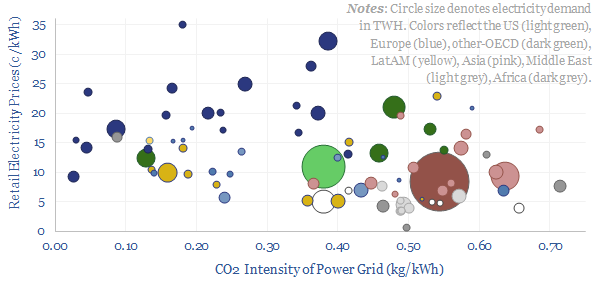
This data-file compares electricity prices (in c/kWh) vs power grids’ CO2 intensities (in kg/kWh), country-by-country. Retail electricity prices average 11c/kWh globally, of which 50-60% is wholesale power generation, 25-35% is transmission and 10-20% covers other administrative costs of utilities. The CO2 intensity of the global average power grid is 0.45 kg/kWh. Variations are wide. And there is a -35% correlation between electricity prices vs CO2 intensities in different countries globally.


Electricity Prices and CO2 Intensity Data

Retail electricity prices average 11c/kWh globally, across 28,500 TWH of global electricity demand in 2021, which is mostly composed of electricity consumption in 80 larger countries. The lower quartile is 7c/kWh and the upper quartile is 17c/kWh. The lower decile is 4c/kWh and the upper decile is 22c/kWh.

Some countries and regions do report retail, commercial and industrial electricity prices, such as the US EIA, Eurostat, or gov.uk, And we have aggregated some useful indices in our data-file. However, we think there are also data-challenges here.

Data challenges. Electricity prices are a minefield because they vary region-by-region within each country. They can also increasingly vary season-by-season, day-by-day or hour-by-hour. Prices for residential and commercial customers are usually around 2x higher than industrial customers. Tax regimes differ. There is often a ‘fixed charge’ plus a ‘variable tariff’, which means that total costs fall as usage rises. And finally, the end cost paid by consumers often reflects other variables such as their specific location and power factors.

We think the best data sources for electricity prices globally are therefore found via the tariffs actually charged to end customers. There are numerous price comparison websites that aggregate the data. For example, cable.co.uk is an excellent resource, comparing prices by country.

Good data on the CO2 intensity of different grids can also be found from sources such as Our World in Data. We have calculated CO2 intensity of different power grids directly, in other work, but for our cross-plot above, we want to avoid being accused of manipulating the data-sets, so we will take the average numbers from this independent resource. The average electricity generation globally has a CO2 intensity of 0.45 kg/kWh, with a lower quartile of 0.21 kg/kWh and upper quartile of 0.51 kg/kWh.

Correlation between electricity prices vs CO2 intensities?

Across our entire data-set, there is -35% correlation between retail electricity prices in different countries and their CO2 intensities. However, the correlation jumps to -50% if we exclude certain outliers.

Hydro-heavy countries. The global average is that 15% of all electricity in 2021 was generated from hydro. But four countries are unusual, because they generate the majority of their electricity from hydro, which has almost no embedded CO2 intensity. They are Norway (91% hydro), Canada (59%), Brazil (55%) and Sweden (45%). Electricity prices in these countries are just below the global average. Thus if we strip out these four countries from the analysis, then the correlation coefficient is -39%.

Nuclear-heavy countries. The global average is that 10% of all electricity in 2021 was generated from nuclear. But three countries are unusual, because they generate the majority of their electricity from nuclear, which has almost no embedded CO2 intensity. They are France (69%), Ukraine (55%) and Slovakia (52%). Remove these three countries as well, and the correlation coefficient is -41%.

Oil-heavy islands. Many islanded grids lack the size and scale for conventional power infrastructure, and thus rely heavily on diesel generators, with high costs above 20c/kWh and high CO2 intensity of 0.6 kg/kWh (data-file here). If we also exclude Caribbean Islands from our cross-plot, then the correlation coefficient is -45%.

Germany is another outlier on the chart. Its grid has the same CO2 intensity as Russia’s or Pakistan’s, yet its retail electricity prices are 5-7x higher. Or stated another way, Germany’s retail electricity prices are similar to Denmark’s — a nation that famously has the highest electricity prices at around 35c/kWh and the highest share of wind power of any country in the world at c50% — yet Germany’s CO2 intensity is over 2x higher. Remove Germany from our cross-plot, and the correlation coefficient is -46%.

Conclusions: what do the data mean?

We want to draw out important conclusions from our data-set. But we also want to do this objectively. There is no agenda. We are simply trying to interpret data here.

Our first interpretation is a simple rule-of-thumb. Energy prices get cheaper when countries invest in low-cost resources, especially domestic resources; while energy prices inflate when they cannot, or do not.

For example, the countries with the lowest cost electricity in the world, which is often below 6c/kWh on a fully-loaded retail basis, include OPEC countries running oil-heavy grids (e.g., Saudi Arabia, Kuwait, Libya), gas-rich countries running gas-heavy grids (Qatar, Russia, Algeria, Kazakhstan), and coal-rich countries running coal-heavy grids (e.g., Poland, South Africa).

Conversely, countries with the most expensive electricity seem to lack low-cost domestic resources, are highly reliant upon imports, or worse, have historically shut down low-cost domestic resources, and failed to invest enough in energy infrastructure.

Resist over-simplification. We often hear over-generalizations in energy, as though there will ultimately emerge “one energy source to rule them all”. This seems unlikely. The most economical energy sources very often depend upon context (note here).

Another interpretation is that countries with larger, more complex and more diversified energy systems tend to have higher electricity costs than countries that focus on simple domestic resources. This might seem surprising. But consider how ‘rate of return regulation’ works in the utility industry (note here). Consumers clearly have to pay more when a utility is earning 10% statutory returns on a large and low-utilization asset base, compared to a small and high-utilization asset base (power grid research here).

Generation opportunities? Generally, as global electricity prices are high, and there is reason to fear they may rise even further, some decision-makers may be increasingly interested in energy generation, or even self-generation to meet their own demand needs. This may augur favorable for rooftop solar, gas turbines, CHPs, storage or diesel gen-sets.

These interpretations also present a challenge in the energy transition, which is that price-sensitive countries may choose not to shut down low-cost but high-carbon domestic resources (coal deep-dive here). Hence, in turn, we expect more border tax adjustments to be introduced from countries seeking to encourage global decarbonization (note here).

We also remain worried about under-investment in energy (note here), resultant leakage of industrial activity to geographies with low energy prices (note here), or even outright backsliding in countries where energy prices become overly expensive (note here).

Our research remains focused on the best opportunities to achieve an energy transition. The best antidote to the challenges above will be if new technologies can lower the costs and expedite the deployment of wind, solar, power grids, efficiency, CCS and nature based solutions.

Bulk shipping: cost breakdown?

Bulk shipping cost

Bulk carriers move 5GTpa of commodities around the world, explaining half of all seaborne global trade. This model is a bulk shipping cost breakdown. We estimate a cost of $2.5 per ton per 1,000-miles, and a CO2 intensity of 5kg per ton per 1,000-miles. Marine scrubbers increasingly earn their keep and uplift IRRs from 10% to 12% via fuel savings.


Bulk carriers and global trade. 13,000 bulk carriers, with 100MT of carrying capacity, transport over 5GTpa of bulk commodities ever year, in vessels with deadweight tonnage (dwt) of 4,000 – 400,000 tons. This is c50% of all global trade by mass. Of this dry bulk, c25% is iron ore, 20-25% is coal, c10% is grain, while the remaining 40-45% spans other metals and materials.

Economic modelling. This data-file models the economics of bulk carriers, including a breakdown of bulk shipping cost, across capex, opex costs, fuel, crew charges, port charges, maintenance, and insurance.

In our base case a large Capesize (or Newcastlemax) bulk tanker, with 200,000 dwt of capacity, must charge a total day rate of $67,000 per day to earn a 10% IRR (chart above) off of $60M pa capex costs (chart below).

Bulk shipping cost per ton? Costs per ton are estimated at $2.5 per ton per 1,000 miles, while CO2 intensity is estimated at 5kg per ton per 1,000 miles, as a large bulk carrier will consume 300-500bpd of oil products. Inputs and outputs can be flexed in the model.

Which oil products as used by bulk tankers? Oil products will comprise 30-50% of total shipping costs for a bulk carrier, depending on whether the vessel is consuming marine gasoil (0.1% sulphur, EU/North American limits), low sulfur fuel oil (0.5%, IMO limit) or heavier fuel oil (3.5% sulphur, but this requires a scrubber to be IMO-compliant).

Marine scrubbers are increasingly being installed. They might cost $2-6M (depending on the ship size), but pay for themselves in subsequent fuel savings. Numbers can be stress-tested in the model, but we estimate that a vessel with a scrubber will either earn 35% higher cash margins, 2% higher IRRs overall, or achieve 7% lower total shipping costs. Our flue gas desulfurization (scrubber) model is linked here.

Costs can also be compared to our models of container shipping, LNG shipping, and CO2 shipping.

Leading companies in bulk shipping? Some of the largest bulk shipping fleets are associated with global mining companies, such as Vale, which operates the largest vessels in the world, above 400,000 tons, ferrying iron ore from Brazil to China. Leading pure-plays include Golden Ocean (listed, US/Norway), Oldendorff (private, HQ’ed in Germany) and Star Bulk (listed, HQ’ed in Greece).

Power cuts: how frequent are grid disruptions?

Are US power cuts becoming more frequent data by disruption cause and duration

This data-file aggregates significant US power grid disruptions, based on data from the DOE. On average, there are 250 power cuts per year in the United States, lasting for a median average of 5-hours, and affecting a median average of 80,000 customers. 20% of the power cuts last longer than 1-day. 15% affect more than 1M customers. What implications?


Power grids are a wonder of the modern world, and crucial enabler of the energy transition (TSE overview here). But how reliable are power grids? To answer this question, we have aggregated and cleaned-up data into 3,000 significant power disruptions, from the US Department of Energy.

How frequent are power cuts? The United States incurs an average of 250 power cuts per year, each impacting an average of 80,000 customers, for an average of 5-hours. Note that a “customer” can range from a studio apartment to a 400-bed hospital, but our guess from the data is that c20% of the US population endures a serious power cut each year.

What are the causes of power cuts? Over the past decade, 40% of US power cuts can primarily be attributed to weather events, such as storms or heatwaves, 35% can be attributed to physical incidents, vandalism or sabotage, and 25% can be attributed to failure of grid infrastructure itself.

Different outages have different characteristics. The median sabotage event impacts 2,000 customers and is remedied within 1-hour. The median average grid failure impacts 20,000 customers and is remedied within 2-hours. The median average weather issue impacts 90,000 customers and is remedied within 1-day.

The worst power cuts can occur in the aftermath of major weather events such as hurricanes, leaving “millions” of customers without power for 5-30 days. The database contains 27 power cuts (i.e., >2 per year) that impact more than 1M customers, and 97 that last longer than 5-days (i.e., 8 per year). The impacts of such power cuts have been poignantly dramatized in Apple TV’s recent series Five Days at Memorial.

Seasonality also contributes. There are 30% more disruptions than average in August, which is prone to heatwaves and hurricanes, and 13% more than average in February, which is prone to winter storms. Conversely, there are 30% fewer disruptions than average in November, amidst mild autumn weather.

Are US power cuts becoming increasingly prevalent? The DOE’s power grid disruption database saw a trough of 141 incidents in 2016, rising to a new peak of 390 incidents in 2022. This is all the more remarkable because 2022 was a year with fewer weather-related disruptions than average.

What is causing the uptick in power grid disruptions? Grid disruptions attributed to the grid itself (i.e., not directly caused by weather or physical incidents) have increased from 36 incidents per year in 2012-17 through to 125 per year in 2020-22 (below).

Implications? This suggests increasing investment is needed in power grid infrastructure, and possible upside for transmission utilities and companies constructing power transmission. It may also create rising demand for backup solutions, from batteries to CHPs to diesel generators. Finally it illustrates the need for smart grid and power electronics technologies.

Our cleaned-up interpretation of the raw data, some analytics, averages, and charts are available in the data-file. The data-file has been updated for 2023 data in March-2024. Our best ideas in power grids are linked here.

Selective catalytic reduction: costs of NOx removal?

Selective catalytic reduction costs

This data-file captures selective catalytic reduction costs to remove NOx from the exhaust gas of combustion boilers and burners. Our base case estimate is 0.25 c/kWh at a combined cycle gas plant, which equates to $4,000/ton of NOx removed. Capex costs, operating costs, coal plants and marine fuels can be stress-tested in the model.


NOx pollution, mainly NO, is formed during combustion of fuels, when temperatures exceed 1,200ºC, and nitrogen gas in the air can oxidize. This matters as NOx gases are precursors to PM2.5 and ground-level ozone, which can exacerbate risks of premature death from cardiovascular disease, lung and kidney diseases.

NOx also matters in the energy transition. If you want to fit a combustion facility with CCS, it may be necessary to strip out the SOx then the NOx upstream of the amine unit, to avoid the formation of highly toxic nitrosamines (note here). High adiabatic flame temperatures of hydrogen will also form NOx. Meanwhile, using low-carbon ammonia as a fuel may release higher-than-normal NOx emissions as the NH3 molecule combusts (note here).

Selective catalytic reduction (SCR) has been used since the 1970s, using a metal oxide catalyst on a honeycomb ceramic or pleated metal sheet, to reduce NOx into harmless N2 and H2O. 4 NO + 4 NH3 + O2 ↔ 4 N2 + 6 H2O. The reaction uses ammonia or urea as a reducing agent.

History. The US already has about 1,000 SCR plants running, including at 650 CCGTs and 300 coal plants. We compiled data into the emissions of real world combustion facilities. Hence what are the costs?

Our base case model captures Selective Catalytic Reduction costs at a combined cycle gas-fired power plant. Untreated emissions might be 50-75ppm, and a $50/kW SCR can reduce this to 2-5ppm. Our base case cost increment is 0.25 c/kWh for a 10% IRR. This equates to a NOX removal cost of $4,000/ton. The numbers also include a 1.3% energy penalty and a 0.005 kg/kWh uptick in CO2 intensity.

Variations of the model capture the costs of NOx removal at a coal-fired power plant (about 2x higher, at 0.5c/kWh) and at a marine diesel engine (0.7c/kWh). Although as is shown in the chart below, capex costs and ultimate costs are very sensitive to context, specifically, how much NOx is in the exhaust gas to begin with, and how much is removed.

Please download the data-file to stress tests Selective Catalytic Reduction costs for NOx removal, in c/kWh and $/ton of NOx. The model is configured so that you can flex the capex, opex, catalyst costs, NOx removal, maintenance, labor, CO2 prices, tax rates and capital costs (hurdle rate).

Copyright: Thunder Said Energy, 2019-2024.