Solar module production by company?

The world produced over 400GW of solar modules in 2023, which is up 10x from a decade ago. This data-file breaks down solar module production by company and over time, comparing the companies by solar module selling prices ($/kW), margins (%), efficiency (%), transparency, and technology development.


Solar modules are produced when photovoltaic silicon (model here, company screen here) is sliced into wafers, then processed into cells using semiconductor manufacturing techniques, and then finally combined with front contacts, encapsulants, frames, reinforced glass, backsheets and wiring (cost build-up here).

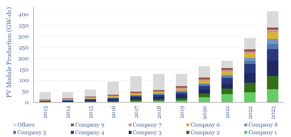
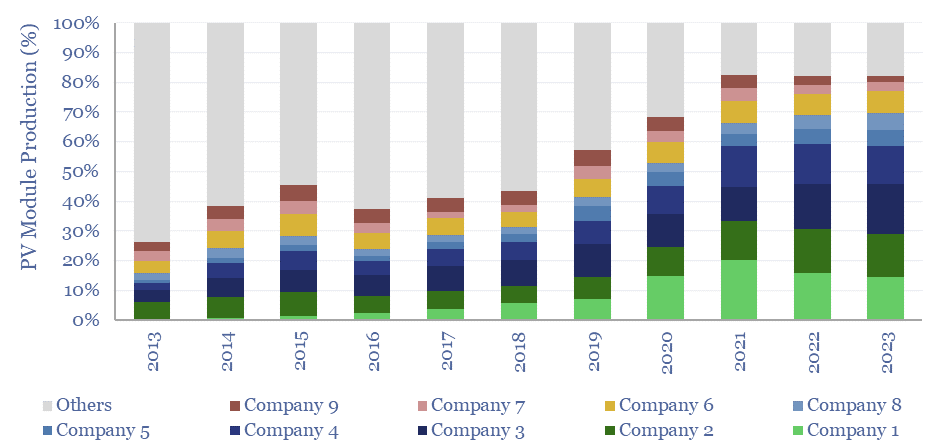
Six Chinese companies (e.g., Longi, Trina) now produce two-thirds of the world’s solar modules, with 2023 output of 20-70GW each. Their growth has been enormous, ramping up by 7x in the past half-decade, and doubling their collective market share (chart below).

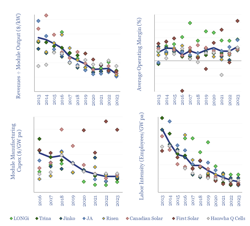
High levels of competition are shown by similar module selling prices across the companies in the screen ($/kW numbers in the data-file), and low EBIT margins (numbers also in the data-file by company).

The data also strongly imply that module shipments exceeded module sales in 2021-23, perhaps by as much as 5-10%, creating an overhang for the industry. The overhang was worst in 2021-22 and may have softened in 2023, as the excess was drawn down.

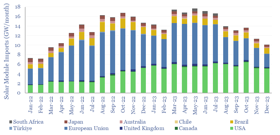
Hence 2023 was a terrible year for the solar industry, with many large PV module manufacturers seeing share price declines of 40-70%, due to interest rates and an overhang of modules, as the US and Europe imported 30-100% more modules than they deployed (chart below). Interestingly, companies with better reporting transparency were more resilient.

Solar module imports by country by month over 2022 and 2023. Imports peaked in late-2022/early-2023 and have fallen roughly 40% since.

Another trend is the shift from P-type towards N-type solar cells, such as TOPCons and HJTs, often to boost efficiency. Different numbers are noted for different companies in the data-file.

The full data-file aims to break down solar module production by company, annually, back to 2013, including useful metrics into their revenues per GW of module production, operating margins, capex intensity and labor intensity (charts below).

Data from the financial reports of solar module producing companies. Charts include: revenues per kW of modules produced, average operating margins, module manufacturing capex per GW produced, and employees per GW produced. Revenues, capex, and labor intensity have fallen over the past decade.

Companies can be differentiated by their technology focus and their geographic focus, with some prioritizing US expansions, and others retrenching to China.

India: electricity demand and power grid over time?

India’s electricity demand is growing by 6-8% per year (+100-140 TWH per annum). But 75% of India’s power still comes from coal, which has itself grown at a 5% CAGR over the past half-decade, and by +9% YoY in 2023. Wind and solar would need to grow 4x faster than 2023 levels for thermal generation to flatline. What do India electricity demand data mean for global energy markets?


India is now the largest country in the world by population, with 1.4bn people (18% of the global total), $3.5 trn of GDP, and GDP per capita of $2,500 pp pa. However, India only uses 6% of total global energy, 6% of total global electricity and emits 6% of global CO2. What implications for energy markets and energy transition as India grows? And could India’s energy demand move global energy markets in the late 2020s as China’s moved global energy markets in the mid-2000s?

This data-file has tabulated, cleaned and estimated India’s electricity demand data, and power grid capacity data, monthly, by generation source, back to 2015, using data from India’s Ministry of Power.

We think emerging world countries are going to prioritize energy security over energy shortages, as discussed in our outlook for 2024. And the data from India seem to support this conclusion, strengthening the conclusions published in the original note.

Electricity consumption in India grew by 8% in 2023, rising +120 TWH YoY, to surpass 1,700 TWH. The growth rate exceeded its trailing 5-year rate of +6% pa, but slowed from 2021-22 levels (chart below).

75% of India’s total power generation comes from combusting coal, which is even higher than China’s 60% share for coal in China’s power mix. Coal-fired power generation in India grew by 9% YoY in 2023, exceeding a trailing 5-year growth rate of 5% per annum (chart below).

Russia’s invasion of Ukraine has not helped, as Europe’s sudden thirst for LNG has pulled gas away from emerging world geographies. India’s total gas-fired power generation in 2023 was 40% lower than in 2019, which has required ramping up coal instead.

India’s total power grid has grown by 15GW per annum over the past half decade, of which 10 GW pa has been from solar (at an average availability factor below 20%), while 3GW pa has been from coal (at an average availability factor of 60%). This implies that new capacity additions have added solar and coal-fired electricity in equal proportions.

But the shift to coal is higher, as the utilization rates of coal plants also stepped up from 53% in 2019 to 68% in 2023. Thus coal fired generation has grown at a 1.5% pa CAGR over the past five years. If anything, high utilization rates at existing coal plants may augur for a step-up in construction for coal-fired generators, per our coal outlook. Mathematically, wind and solar would need to be growing 4x faster than in 2023 to have kept total thermal generation flat.

Another opportunity to improve CO2 credentials in India’s power grid would be strengthening the efficiency of transmission and distribution, where losses are estimated as high as 20% of electricity that is generated, or 3x higher than in the developed world. Some of this is due to climate, as power losses are amplified in hot and wet conditions, as covered in our overview of power transmission.

A final stand-out feature of India’s power grid is extreme seasonality. Hydro availability is 20% in the dry season (December-January) but exceeds 50% after the monsoon season (August-September). Wind’s availability profile is similar (chart below). While the call on thermal generation is highest in December-January.

Wind and solar availability also vary +/- 3-6% each year, hence demand for backups, as per broader energy markets, will be volatile.

This data-file has tabulated, cleaned and estimated India electricity demand data, and power grid capacity, monthly, by generation source, back to 2015, using data from India’s Ministry of Power. Please download the data for granularity on the numbers.

Global oil production by country?

Global oil production by country over time in Mbpd, correlates heavily with Brent crude oil prices in $/bbl

Global oil production by country by month is aggregated across 35 countries that produce >80kbpd of crude, NGLs and condensate, explaining >96% of the global oil market. Production has grown by almost +1Mbpd/year over the past two-decades, led by the US, Iraq, Russia, Canada. Oil market volatility is usually very low, at +/- 1.5% per year, of which two-thirds is down to conscious decisions over production levels.


Monthly global oil production by country is aggregated in this data-file, aggregating data from JODI, the International Energy Agency, the Energy Institute and individual countries’ national hydrocarbon registries, then extensively scrubbing and cleaning the data. This gives us month-by-month visibility on about 97% of the global oil market.

In particular, the data cover 35 countries with over 80kbpd of production (crude, NGL and condensate), which comprise 96% of the global oil market. Of this sample, 25 countries with over 600kbpd of production comprise 93% of the global oil market; 10 countries with over 2.5Mbpd of production comprise 75% of the global oil market; and 4 countries with over 5Mbpd of production comprise 50% of the global oil market (the United States, Saudi Arabia, Russia and Canada).

Global oil production has grown by almost +1Mbpd per annum over the past 20-years, matching the trend in global oil demand by country.

The largest increases in oil production have come from the United States (+0.6Mbpd/year, due to US shale growth), Iraq (>0.1Mbpd/yr), Russia (>0.1Mbpd), Canada (>0.1Mbpd), Brazil (0.1Mbpd), UAE (<0.1Mbpd), Saudi Arabia (<0.1Mbpd), Kazakhstan (<0.1Mbpd).

Conversely, the largest declines in oil production by country have come from Venezuela, Mexico, the UK, Norway (all <0.1Mbpd/year).

The volatility of global oil markets is low compared to new energies. Across the 20-year period from 2003-2023, the standard deviation of YoY monthly oil production is 3Mbpd, for a standard error of 3.4%. However, excluding the volatility during the COVID-19 pandemic from 2020 onwards, the standard deviation of YoY monthly oil production is 1.8Mbpd, for a standard error of 2%. And after smoothing out over a TTM basis, this falls even further to 1.2Mbpd, for a 1.5% standard error.

Volatility or voluntary? Countries such as Saudi Arabia, Kuwait, UAE, the US, Canada and Russia very clearly adapt their growth/output to market pricing signals, which actually dampens down supply volatility. Countries with the highest volatility in their production are Libya (standard error of +/- 35% of average output, on a TTM basis), Iran, Iraq, Venezuela and Nigeria (all around +/- 10%). Full details in the data-file.

Energy market volatility: climate change?

Wind and solar produce power intermittently. As they ramp to provide higher shares of total grid power, they will also increase the magnitude low likelihood volatility events. This will increase the overall volatility of global energy markets.

This 14-page note predicts a staggering increase in global energy market volatility, which doubles by 2050, while extreme events that sway energy balances by +/- 2% will become 250x more frequent. A key reason is that the annual output from wind, solar and hydro all vary by +/- 3-5% each year, while wind and solar will ramp from 5.5% to 30% of all global energy. Rising volatility can be a kingmaker for midstream companies? What other implications?

Electric vehicle: battery life?

Electric vehicle battery life will realistically need to reach 1,500 cycles for the average passenger vehicle, 2,000-3,000 cycles after reflecting a margin of safety for real-world statistical distributions, and 3,000-6,000 cycles for higher-use commercial vehicles. This means lithium ion batteries may be harder to displace with novel battery chemistries?


Our forecasts in the energy transition see electric vehicle sales exploding to 200M vehicles per year by 2050 (see below). But the lifetime of an EV is determined by the degradation of its battery, which can be contrasted with the c-20 year typical lifetimes of ICE vehicles.

Hence what requirements for electric vehicle battery life? This question matters if electric vehicle chemistries are going to switch away from incumbent lithium ion battery chemistries, to more novel and more energy dense battery chemistries (see below) such as solid state batteries, silicon anode batteries or sodium-ion batteries.

This data-file contains simple estimates for the number of battery cycles required over the life of different electric vehicles, with back-up workings. For example, a US electric car, driving 10,000 miles per year, at an effective fuel economy of 3 miles/kWh is going to endure around 1,500 battery charging-discharging cycles over a 15-year life.

Commercial vehicles are going to endure 3,000-6,000 charging-discharging cycles over their effective lives, because they are more heavily utilized. For example, a typical taxi covers 45,000 miles per year, while a Class 8 electric truck might cover 200,000 miles (chart below). The data-file also covers other vehicles from e-scooters to mine trucks.

Within each category, there is also going to be a distribution, impacting the design considerations of vehicle manufacturers. For example, only a small portion of cars get into potentially fatal accidents over their operating lives, and yet all modern cars have safety features. Designs are determined not by the average conditions but by the extremes. Although we do wonder if any vehicle manufacturers will bring out cheaper EVs specifically targeted for low use urban drivers (dark green bar above).

If annual miles driven for a US passenger vehicle follow our favorite statistical distribution, the Boltzmann distribution, then an average of 10,000 miles driven per year means that c10% of cars will drive over 15,000 miles per year and 1% will drive over 20,000 miles per year. Hence vehicle manufacturers might realistically target 2,000-3,000 battery cycle lives to capture the full range of driving behaviours (chart below).

These numbers all assume that vehicle operators respect recommendations not to charge a battery beyond 80% of its state of charge, or below 20% of its state of dischange, as degradation is amplified outside of these limits, due to the physics of the Nernst Equation. Consumer behaviours will also impact battery life. We recommend our overview of battery degradation (below).

Another way to increase the cycle life of a vehicle is to add a bigger battery, as a larger battery needs to be cycled less frequently to deliver the same overall amount of energy across a given calendar year. This comes with the benefit of a longer range, but the drawback of higher battery costs, materials requirements and vehicle weight. More efficiency vehicles also help, which may accelerate the trend towards lightweighting (carbon fiber, aluminium, advanced polymers) and Rare Earth permanent magnets.

All of these considerations make us think lithium ion batteries are likely to remain the incumbent solution for electric vehicles, ramping rapidly for passenger cars, but less so for larger commercial vehicles, whose CO2 must be abated by other means in our roadmap to net zero.

Within lithium ion batteries, we are most excited by advanced materials improving cell voltage and lowering degradation, including using fluorinated polymers.

Our underlying calculations regarding electric vehicle battery life spans are available via the download button below.

US gas transmission: by company and by pipeline?

This data-file aggregates granular data into US gas transmission, by company and by pipeline, for 40 major US gas pipelines which transport 45TCF of gas per annum across 185,000 miles; and for 3,200 compressors at 640 related compressor stations.


This data-file aggregates data for 40 large US gas transmission pipelines, covering 185,000 miles, moving the US’s 95bcfd gas market. Underlying data are sources from the EPA’s FLIGHT tool.

Long-distance gas transmission is highly efficient, with just 0.008% of throughput gas thought to leak directly from the pipelines. Around 1% of the throughput gas is used to carry the remaining molecules an average of 5,000 miles from source to destination, with total CO2-equivalent emissions of 0.5 kg/mcfe. Numbers vary by pipeline and by operator.

Five midstream companies transport two-thirds of all US gas, with large inter-state networks, and associated storage and infrastructure.

The largest US gas transmission line is Williams’s Transco, which carries c15% of the nation’s gas from the Gulf Coast to New York.

The longest US gas transmission line is Berkshire Hathaway Energy’s Northern Natural Gas line, running 14,000 miles from West Texas and stretching as far North as Michigan’s Upper Peninsula.

Our outlook in the energy transition is that natural gas will emerge as the most practical and low-carbon backstop to renewables, while volatile renewable generation may create overlooked trading opportunities for companies with gas infrastructure.

In early-2024, we have updated the data-file, screening all US gas transmission by pipeline and by operator, using what are currently the latest EPA disclosures from 2022. The data-file also includes gas market volumes across 670 entities, based on Ferc 552 disclosures.

Previously, we undertook a more detailed analysis, matching up separately reported compressor stations to each pipeline (80% of the energy use and CO2e come from compressors), to plot the total CO2 intensity and methane leakage rate, line by line (see backup tabs).

major US gas pipelines ranked

US gas transmission by company is aggregated — for different pipelines and pipeline operators — in the data-file, to identify companies with low CO2 intensity despite high throughputs.

New energies: filter feeder?

Harmonic distortions have several detrimental effects on electrical systems. Harmonic filters reduce the amount of total distortions in a system, providing power savings and reducing equipment degradation.

The $1bn pa harmonic filter market likely expands by 10x in the energy transition, as almost all new energies and digital technologies inject harmonic distortion to the grid. This 17-page note argues for premiumization in power electronics, including around solar, and screens for who benefits?

Copper: the economics?

The economic cost of copper production is built up from first principles in this model, from mine, to concentrator, to smelter to 99.99% pure copper cathodes. Our base case is $7.5/kg copper cathode, with 4 tons/ton CO2 intensity, after starting from an 0.57% ore grade. Numbers vary sharply and can be stress-tested in the data-file.


70-80% of all primary copper is produced by the smelting route and mainly starting with sulphide ores. First, ore is mined, moved, crushed and concentrated to around 20-40% purity. The ‘CopperOreMine’ tab of the model captures the costs, energy use and CO2.

Further downstream, the ores may be roasted to change their crystal structure before smelting, smelted in an environment of enriched oxygen to reject sulfur as sellable sulphuric acid, yielding matte with c50-70% purity.

Even further downstream, matte is upgraded to blister with c99% purity, which is melted and cast into anodes for electrochemical refining, yielding copper cathodes with 99.99% purity. Copper cathode is one of the most traded metals on Earth, underpinning the LME copper contract, as pure copper is purchased and processed into semis, wires and cables.

The economic cost of copper production is built up from first principles in this model, from mine, to concentrator, to smelter to 99.99% pure copper cathodes. Our base case is $7.5/kg copper cathode, with 4 tons/ton CO2 intensity. Capex intensity of copper is plotted below in $/Tpa.

But the costs of copper production depend heavily on ore grade and mining/refining technology. We estimate that a 0.1% reduction in future copper ore grading increases marginal cost by around 10% and CO2 intensity by around 10%, which matters as copper demand is set to treble in the energy transition.

Moreover, each $100/ton of CO2 prices would increase marginal cost by another 5%. It is not unimaginable that copper prices could reach $15,000/ton in an aggressive energy transition scenario, if you stress-test the model.

There is no silver bullet to decarbonize primary copper production, because of the large number of processing steps described above and in the data-file. Hence the best option to decarbonize copper production are to increase the reliance on secondary production (i.e., recycling, e.g., Aurubis).

The best option to decarbonize primary copper, based on stress testing our models, is to use clean electricity for processes such as crushing and flotation, which can save over 1 ton/ton of CO2. Using these processes flexibly can potentially even help to integrate renewables. Finally, we think that electrochemical production, e.g., via solvent extraction then electrowinning (the favored route for oxide ores that cannot be floated), can reduce total CO2 intensity by a further 1 tons/ton when using clean electricity.

Pump costs: energy economics of electric pumps?

As pump power increases, pump costs per kWh decrease. The most significant reduction is in pump maintenance costs, while the total cost of electricity remains constant.

Total pump costs can be ballparked at $600/kW/year of power, of which 70% is electricity, 20% operations and maintenance, 10% capex/capital costs. But the numbers vary. Hence this data-file breaks down the capex costs of pumps, other pump opex, pump energy consumption and the efficiency of pumps from first principles.


This data-file captures the energy economics of electric pumps, which are used to move liquids in industrial applications, for commercial/domestic use such as within heat pumps, for demand shifting, for supercritical CO2, in geothermal applications, and in 15-20% of the world’s 1M oil wells globally (electric submersible pumps, or ESPs).

The capex costs of a pump are estimated from fifty commercial data-points, in $/kW, and a line of best fit suggests that pump costs approximately halve as pump size increases by 10x (chart below). In other words, larger pumps are less costly per kW of power.

Total pump costs, however, are usually only 5-20% capex, while the largest costs are for electricity use, at 50-90% of the total, depending on the pump size and utilization rate (chart below). All of these variables can be stress-tested in the ‘PumpModel’ tab.

The power consumption of a pump is modeled from first principles, using the formula that pump power consumption (in kW) equals flow rate (in m3/second) times back-pressure (in kPa) divided by pump efficiency (in %). The ‘PumpEnergy’ tab contains a simple and flexible calculator for pumping power (in kW).

Back-pressure on a pipeline, in turn, is the sum of static head (overcoming gravity), dynamic pressure (overcoming inertia) and head losses (calculated using the Darcy-Weisbach and Colebrook Equations from flow speed, Reynolds Numbers, pipeline diameter and pipeline surface roughness).

Energy costs of a pump are best minimized by using wider pipes with smoother internal surfaces (chart above). But these pipes will also have higher costs themselves. Hence a total systems approach is needed to find the lowest overall costs.

Electric submersible pumps in the oil and gas industry are also modelled in two further back-up tabs. A typical Electric Submersible Pump (ESP) will contribute $0.3/boe of cost and 5kg/boe of carbon, if powered by diesel, at a typical oilfield (chart below). And more at deeper wells with higher water cuts. Switching the ESP to run on renewable power, can readily reduce costs and CO2 intensity.

Electric Submersible Pump Optimisation Opportunities?

Please download the data-file to stress test the costs of electric pumps, as a function of lifetime (years), capex costs ($/kW), capital costs (%WACC), utilization rate (%), efficiency (%), flow rates (m3/hour) and other operating costs ($/kW/year).

Solar inverters: companies, products and costs?

This data-file tracks some of the leading solar inverter companies and inverter costs, efficiency and power electronic properties. As China now supplies 85% of all global inverters, at 30-50% lower $/W pricing than Western companies, a key question explored in the data-file is around price versus quality.


Solar inverters convert the DC output from solar modules in an AC waveform that can be transmitted across power grids or used in electronic devices. This is achieved via pulse width modulation (explained here) using IGBTs and MOSFETs (explained here).

This data-file covers solar inverter companies and the costs of solar inverters. Twenty companies account for about 90% of global inverter shipments, and the ‘top five’ account for two-thirds of inverters, of which four are Chinese companies, such as Huawei and Sungrow, while we have also explored electronics from SolarEdge.

Our utility-scale solar cost models assume $0.1/W inverter costs, and this is borne out by the data-file. Although costs per watt approximately double for every 10x reduction in inverter size.

Chinese manufacturers sell inverters for 30-50% less than Western companies, suggesting challenged margins and strong competition.

Decent inverters on the market in 2024 convert 98% of the incoming DC electricity into AC electricity, and have advanced power electronics. The ability to control reactive power with a +/- 0.8 leading/lagging power factor is typical. As is the ability to limit total harmonic distortion below 3% (charts below).

While Chinese-made inverters are 30-50% lower cost than Western-made inverters, a key question explored in the data-file is whether this also comes at the cost of lower power quality. Our views and their implications are summarized in the first tab of the data-file. The backup tabs contain the full data behind all of the other charts above.

Copyright: Thunder Said Energy, 2019-2024.