Thunder Said Energy is a research firm, focused on economic opportunities in the energy transition. Our work spans new energies, conventional energies and decarbonizing industries. You can search for keywords below. Or view our research by category, across Wind, Solar, Batteries, Vehicles, Biofuels, CCS, Coal, CO2 Intensity, Digital, Downstream, Energy Demand, Energy Efficiency, Hydrogen, LNG, Metals, Materials, Natural Gas, Nature-based solutions, Nuclear, Oil, Plastics, Power Grids, Shale and Novel Technologies.
Written Insights
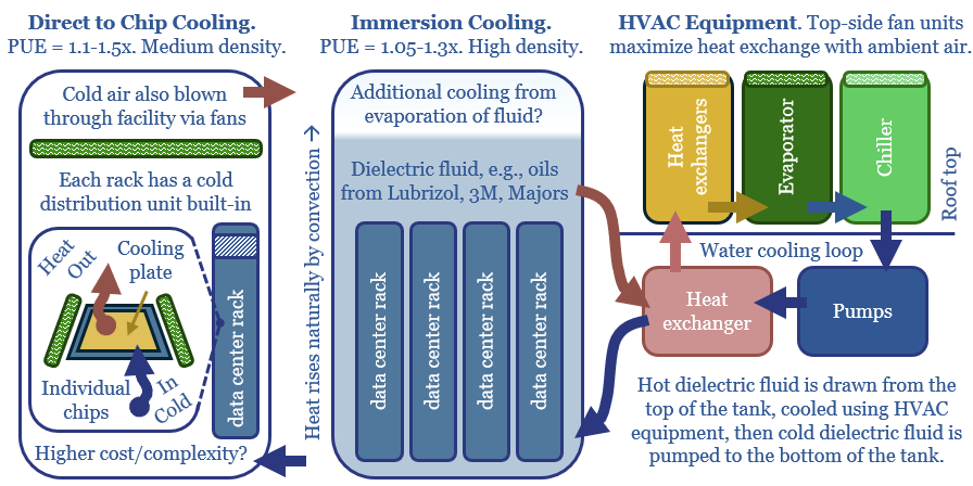
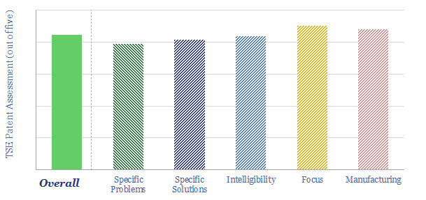
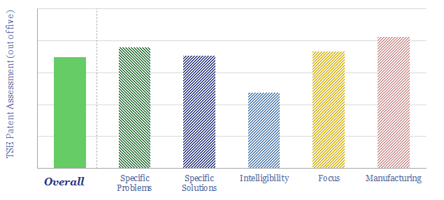
Chips must usually be kept below 27ºC, hence 10-20% of both the capex and energy consumption of a typical data-center is cooling, as explored in this 14-page report. How much does climate matter? What changes lie ahead? And which companies sell into this soon-to-double market for cooling equipment?
Read the Report?
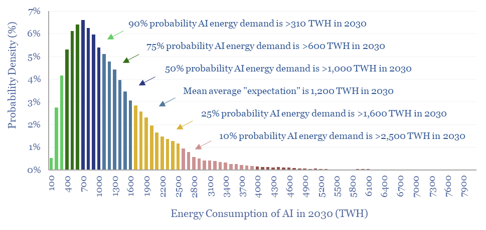
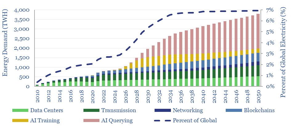
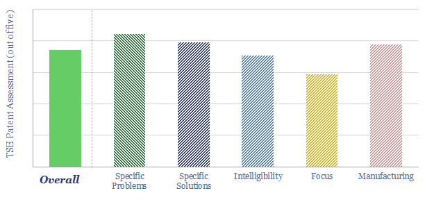
Rising energy demands of AI are now the biggest uncertainty in all of global energy. To understand why, this 17-page note explains AI computing from first principles, across transistors, DRAM, GPUs and deep learning. GPU efficiency will inevitably increase, but compute increases faster. AI most likely uses 300-2,500 TWH in 2030, with a base case of 1,000 TWH.
Read the Report?
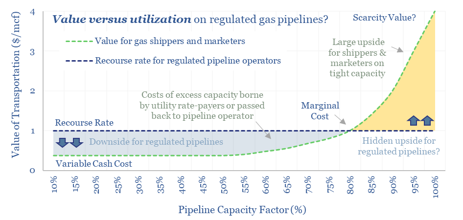
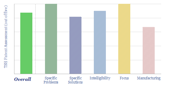
FERC regulations are surprisingly interesting!! In theory, gas pipelines are not allowed to have market power. But increasingly, they do have it: gas use is rising, on grid bottlenecks, volatile renewables and AI; while new pipeline investments are being hindered. So who benefits here? Answers are explored in this report.
Read the Report?
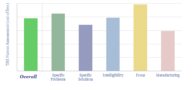
The power demands of AI will contribute to the largest growth of new generation capacity in history. This 18-page note evaluates the power implications of AI data-centers. Reliability is crucial. Gas demand grows. Annual sales of CCGTs and back-up gensets in the US both rise by 2.5x? This is our most detailed AI report to date.
Read the Report?
This 11-page note summarizes the key conclusions from our energy transition research in 1Q24 and across 1,400 companies that have crossed our screens since 2019. Volatility is rising. Power grids are bottlenecked. Hence what stands out in capital goods, clean-tech, solar, gas value chains and materials? And what is most overlooked?
Read the Report?
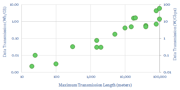
What if large quantities of power could be transmitted via the 2-6 GHz microwave spectrum, rather than across bottlenecked cables and wires? This 12-page note explores the technology, advantages, opportunities, challenges, efficiencies and costs. We still fear power grid bottlenecks.
Read the Report?
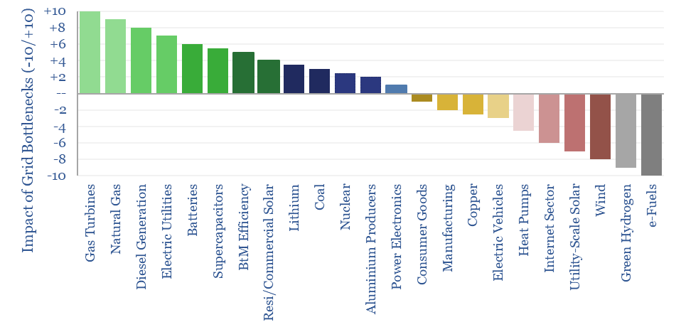
What if the world is entering an era of persistent power grid bottlenecks, with long delays to interconnect new loads? Everything changes. Hence this 16-page report looks across the energy and industrial landscape, to rank the implications across different sectors and companies.
Read the Report?
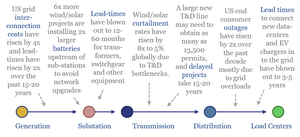
Power grids will be the biggest bottleneck in the energy transition, according to this 18-page report. Tensions have been building for a decade. They are invisible unless you are looking. And the tightness could last a decade. Further acceleration of renewables may be thwarted. And we are re-thinking grid back-ups.
Read the Report?
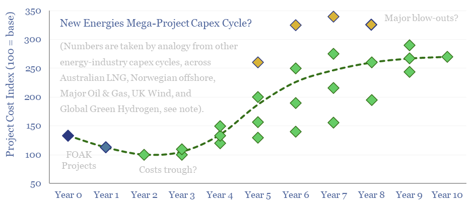
Energy transition is the largest construction project in human history. But building in boom times is associated with 2-3x cost inflation. This 10-page note reviews five case studies of prior capex booms, and argues for accelerating FIDs, even in 2024. The outlook for project developers depends on their timing? And who benefits across the supply chain?
Read the Report?
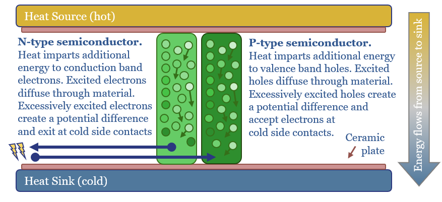
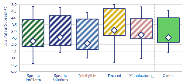
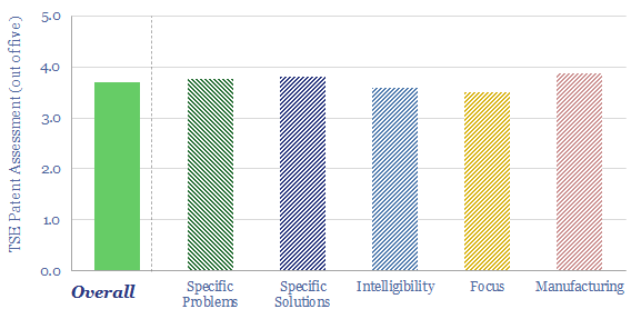
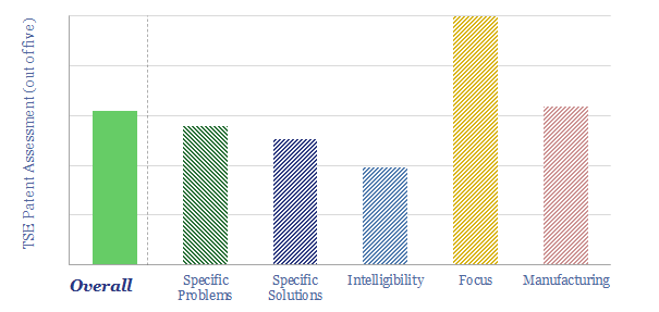
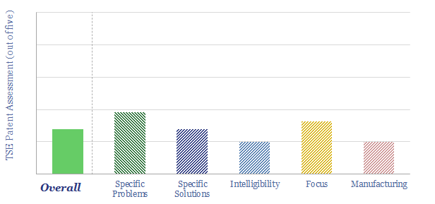
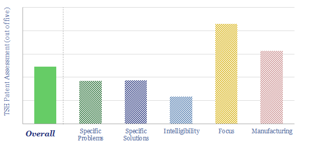
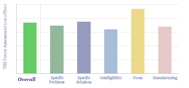
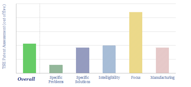
Solar semiconductors have changed the world, converting light into clean electricity. Hence can thermoelectric semiconductors follow the same path, converting heat into electricity with no moving parts? This 14-page report reviews the opportunity for thermoelectric generation in the energy transition, challenges, efficiency, costs and companies.
Read the Report?
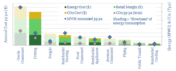
We have attempted a detailed breakdown of global energy demand across 50 categories, to identify emerging opportunities in the energy transition, and suggesting upside to our energy demand forecasts? This 12-page note sets out our conclusions and is intended a useful reference.
Read the Report?
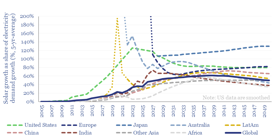
How much new solar can the world absorb in a given year? And are core markets such as the US now maturing? This 15-page note refines our solar forecasts using a new methodology. Annual solar adds will likely plateau at 50-100% of total electricity demand growth in most regions. What implications and adaptation strategies?
Read the Report?
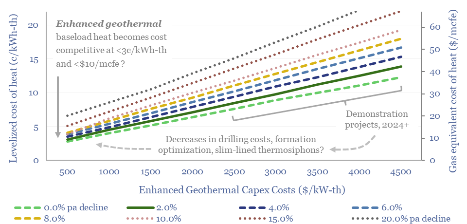
Momentum behind enhanced geothermal has accelerated 3x in the past half-decade, especially in energy-short Europe, and as pilot projects have de-risked novel well designs. This 18-page report re-evaluates the energy economics of geothermal from first principles. Is there a path to cost-competitive, zero-carbon baseload heat?
Read the Report?
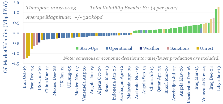
Oil markets endure 4 major volatility events per year, with a magnitude of +/- 320kbpd, on average. Their net impact detracts -100kbpd. OPEC and shale have historically buffered out the volatility, so annual oil output is 70% less volatile than renewables’ output. This 10-page note explores the numbers and the changes that lie ahead?
Read the Report?
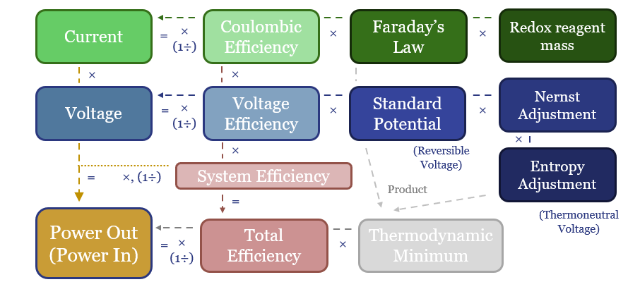
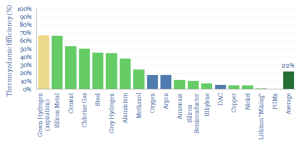
Batteries, electrolysers and cleaner metals/materials value chains all hinge on electrochemistry. Hence this 19-page note explains the energy economics from first principles. The physics are constructive for lithium and next-gen electrowinning, but perhaps challenge green hydrogen aspirations?
Read the Report?
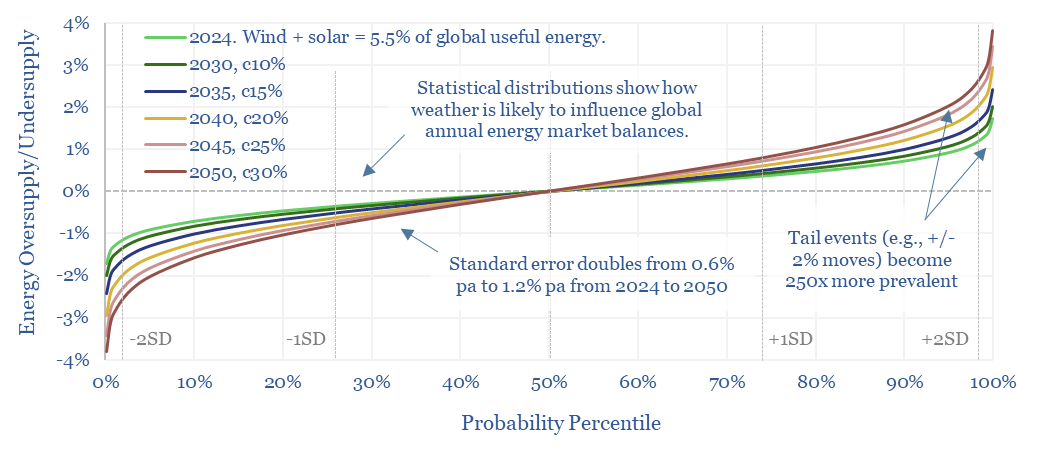
This 14-page note predicts a staggering increase in global energy market volatility, which doubles by 2050, while extreme events that sway energy balances by +/- 2% will become 250x more frequent. A key reason is that the annual output from wind, solar and hydro all vary by +/- 3-5% each year, while wind and solar will ramp from 5.5% to 30% of all global energy. Rising volatility can be a kingmaker for midstream companies? What other implications?
Read the Report?
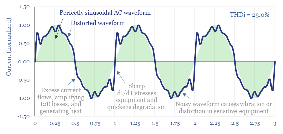
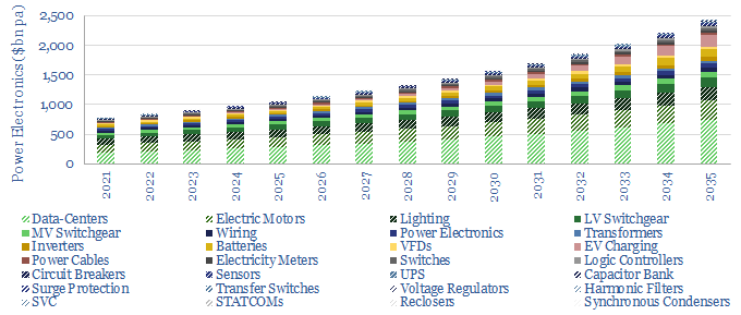
The $1bn pa harmonic filter market likely expands by 10x in the energy transition, as almost all new energies and digital technologies inject harmonic distortion to the grid. This 17-page note argues for premiumization in power electronics, including around solar, and screens for who benefits?
Read the Report?
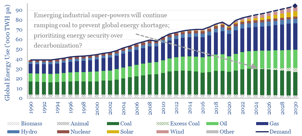
Navigating the energy transition in 2024 requires focusing in upon bright spots, because global energy priorities are shifting. Emerging nations are ramping coal to avoid energy shortages. Geopolitical tensions are escalating. So where are the bright spots? This 14-page note makes 10 predictions for 2024.
Read the Report?
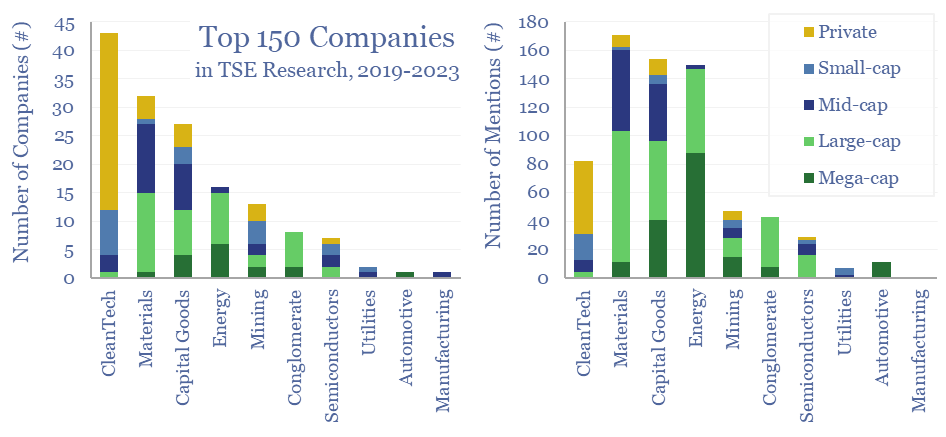
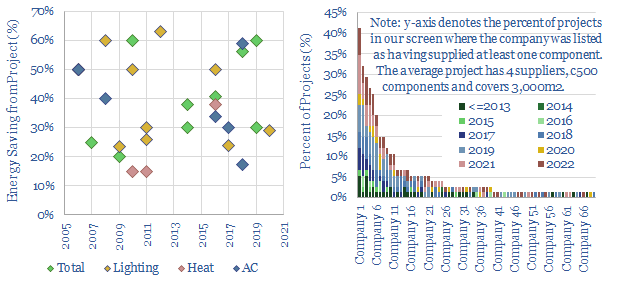
150 core companies have been mentioned 700 times across all of our research since 2019; within a broader list of 1,300 total companies exposed to energy transition, diversified by geography, by size and by segment. This 12-page note draws conclusions about the most mentioned companies in our energy transition research.
Read the Report?
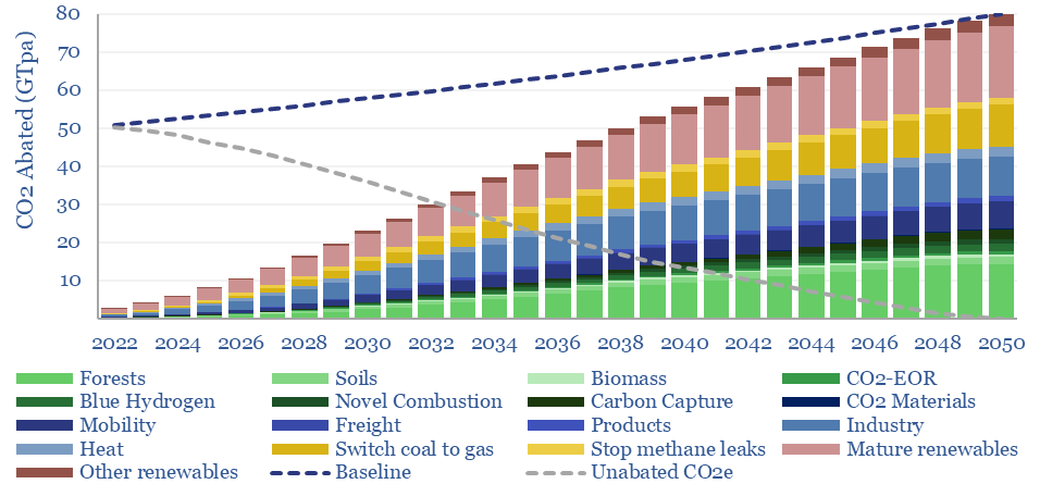
What is the most likely route to net zero by 2050, decarbonizing a planet of 9.5bn people, 50% higher energy demand, and abating 80GTpa of potential CO2? Net zero is achievable. But only with pragmatism. This 20-page report summarizes the best opportunities, resultant energy mix, bottlenecks for 30 commodities, and changes to our views in 2023.
Read the Report?
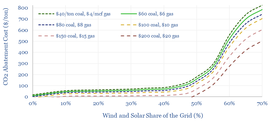
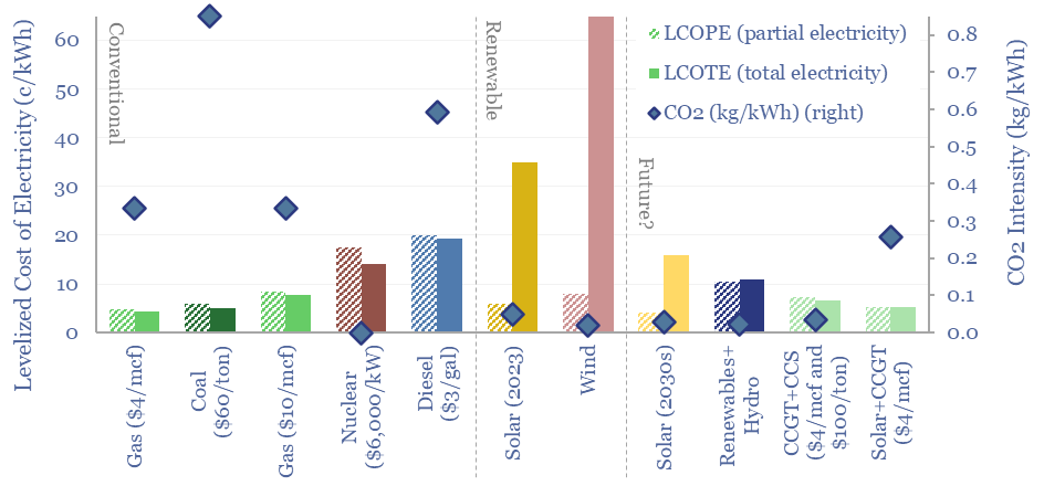
The costs of decarbonizing by ramping up solar and wind depend on the context. But our best estimate is that solar and wind can reach 40% of the global grid for a $60/ton average CO2 abatement cost. This is relatively low. Yet it raises retail electricity prices from 10c/kWh to 12c/kWh. This 7-page note explores the numbers.
Read the Report?
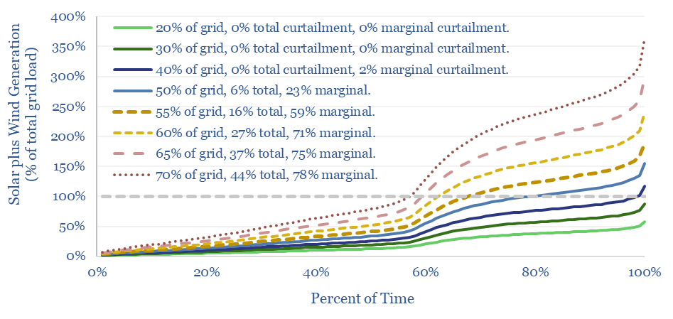
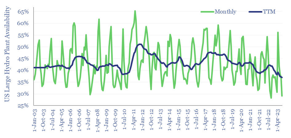
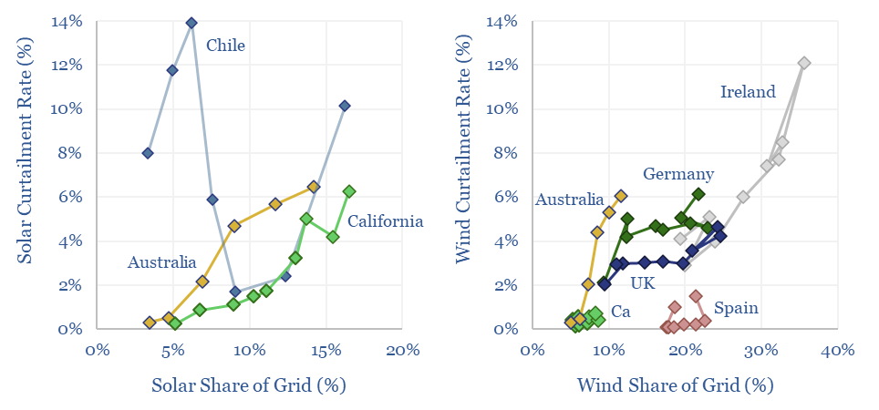
Wind and solar peak at 50-55% of power grids, without demand-shifting and batteries, before their economics become overwhelmed by curtailment rates and backup costs. More in wind-heavy grids. Less in solar heavy grids. This 12-page note draws conclusions from the statistical distribution of renewables’ generation across 100,000 x 5-minute grid intervals.
Read the Report?
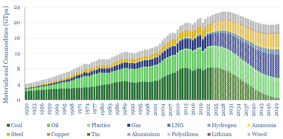
This 15-page note evaluates 10 commodity disruptions since the Stone Age. Peak demand for commodities is just possible, in total tonnage terms, as part of the energy transition. But it is historically unprecedented. And our plateau in tonnage terms is a doubling in value terms, a kingmaker for gas, plastics and materials. Outlooks for 30 major commodities are reviewed.
Read the Report?
Thermal energy storage will outcompete other batteries and hydrogen for avoiding renewable curtailments and integrating more solar? Overlooked advantages are discussed in this 21-page report, plus a fast-evolving company landscape. What implications for solar, gas and industrial incumbents?
Read the Report?
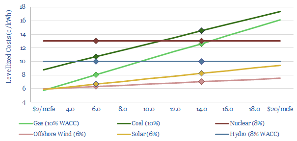
The levelized cost of partial electricity (LCOPE) is very different from the levelized cost of total electricity (LCOTE). This 21-page note explores the distinction. It suggests renewables will peak at 30-60% of power grids? And gas is particularly well-placed as a back-up, set to surprise, by entrenching at 30-50% of renewables-heavy grids?
Read the Report?
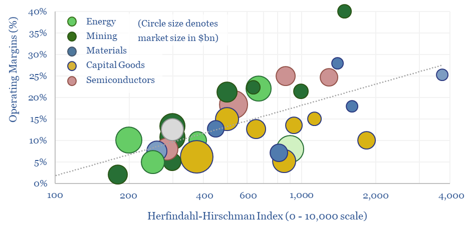
We have assessed over 100 markets in energy, materials, manufacturing and decarbonization across our research. More concentrated industries achieve higher margins across the cycle. But not always. This 10-page report draws out seven rules of thumb around market concentration to help decision-makers.
Read the Report?
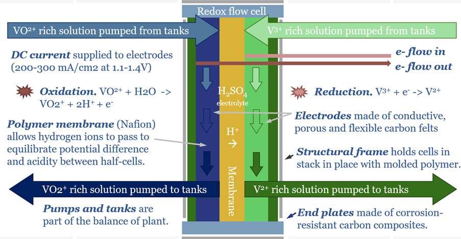
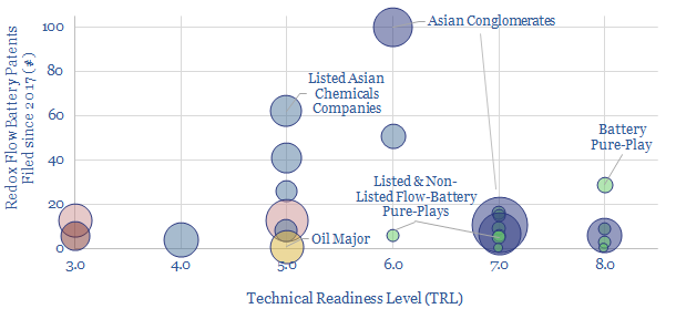
Redox flow batteries have 6-24 hour durations and require 15-20c/kWh storage spreads. They will increasingly compete with lithium ion batteries in grid-scale storage. Does this unlock a step-change for peak renewables penetration? Or create 3-30x upside for total global Vanadium demand? This 15-page note is our outlook.
Read the Report?
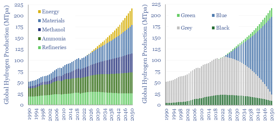
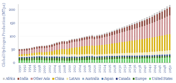
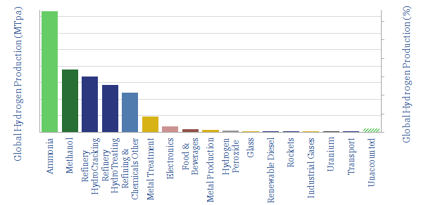
110MTpa of hydrogen is produced each year, emitting 1.3GTpa of CO2. We think the market doubles to 220MTpa by 2050. This is c60% ‘below consensus’. Decarbonization also disrupts 80% of today’s asset base. Our outlook varies by region. This 17-page note explores the evolution of hydrogen markets and implications for industrial gas incumbents?
Read the Report?
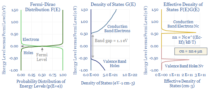
Semiconductors underpin solar panels, electric vehicles and electronics. Hence this 20-page note aims to explain semiconductor physics from first principles: their conductivity and resistance, their use in devices, plus implications for materials value chains and the energy transition itself?
Read the Report?
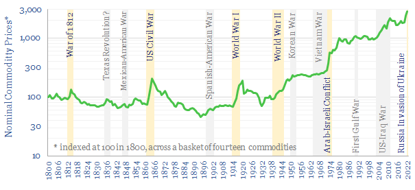
This 10-page note charts how fourteen commodities were affected, across a dozen conflicts, going back to 1800. During major conflicts, 95% of commodities saw higher prices. The average commodity doubled. There is a strong role for commodities hedging portfolios and even entire nations against conflicts.
Read the Report?
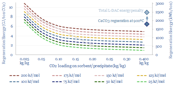
A new wave of DAC companies has been emerging rapidly since 2019, targeting 50-90% lower costs and energy penalties than incumbent S-DAC and L-DAC, potentially reaching $100/ton and 500kWh/ton in the 2030s. Five opportunities excite us and warrant partial de-risking in this 19-page report. Could DAC even beat batteries and hydrogen in smoothing renewable-heavy grids?
Read the Report?
Over the past decade, costs have deflated by 85% for lithium ion batteries, 75% for solar and 25% for onshore wind. Now new energies are entering a new era. Future costs are mainly determined by materials. Bottlenecks matter. Deflation is slower. Even higher-grade materials are needed to raise efficiency. This 14-page note explores the new age of materials, how much new energies deflation is left, and who benefits?
Read the Report?
Using a commodity more efficiently can cause its demand to rise not fall, as greater efficiency opens up unforeseen possibilities. This is Jevons' Paradox. Our 16-page report finds it is more prevalent than we expected. Efficiency gains underpin 25% of our roadmap to net zero. To be effective, commodity prices must also rise and remain high, otherwise rebound effects will raise demand.
Read the Report?
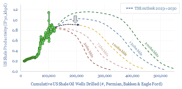
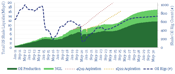
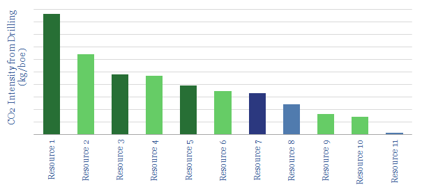
This 17-page note makes the largest changes to our shale forecasts in five years, on both quantitative and qualitative signs that productivity growth is slowing. Productivity peaks after 2025, precisely as energy markets hit steep undersupply. We still see +1Mbpd/year of liquids potential through 2030, but it is back loaded, and requires persistently higher oil prices?
Read the Report?
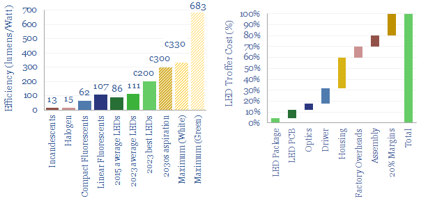
Lighting is 2% of global energy, 6% of electricity, 25% of buildings’ energy. LEDs are 2-20x more efficient than alternatives. Hence this 16-page report presents our outlook for LEDs in the energy transition. We think LED market share doubles to c100% in the 2030s, to save energy, especially in solar-heavy grids. But demand is also rising due to ‘rebound effects’ and use in digital devices.
Read the Report?
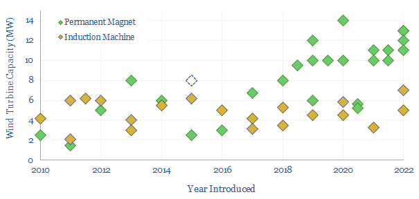
This 14-page report re-visits our wind industry outlook. Our long-term forecasts are reluctantly being revised downwards by 25%, especially for offshore wind, where levelized costs have reinflated by 30% to 13c/kWh. Material costs are widely blamed. But rising rates are the greater evil. Upscaling is also stalling. What options to right this ship?
Read the Report?
This 14-page report explores whether global industrial activity is set to become ever more concentrated in a few advantaged locations, especially the US Gulf Coast, China and the Middle East. Industries form ecosystems. Different species cluster together. Elsewhere, you can no more re-shore a few select industries than introduce dung beetles onto the moon. These mega-trends matter for valuations.
Read the Report?
HJT solar modules are accelerating, as they are efficient and easy to manufacture. But HJT could also be a kingmaker for Indium, used in transparent and conductive thin films (ITO). Our forecasts see primary Indium demand rising 4x by 2050. This 16-page note explores the costs and benefits of using ITO in HJTs, and who benefits as solar cells evolve?
Read the Report?
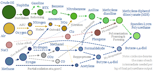
Polyurethanes are elastic polymers, used for insulation, electric vehicles, electronics and apparel. This $75bn pa market expands 3x by 2050. But could energy transition double historically challenging margins, by freeing up feedstock supplies? This 13-page note builds a full mass balance for the 20+ stage polyurethane value chain and screens 20 listed companies.
Read the Report?
There is an economic paradox where shifting towards lower cost supply sources can cause inflation in the total costs of supply. Renewable-heavy grids are subject to this paradox, as they have high fixed costs and falling utilization. As power prices rise, there are growing incentives for self-generation. Energy transition requires a balanced, pragmatic approach.
Read the Report?
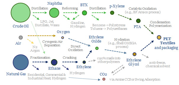
Oil markets are transitioning, with electric vehicles displacing 20Mbpd of gasoline by 2050, while petrochemical demand rises by almost 10Mbpd. So it is often said oil refiners should 'become chemicals companies'. It depends. This 18-page report charts petrochemical pathways and sees opportunity in chemicals that can absorb surplus BTX.
Read the Report?
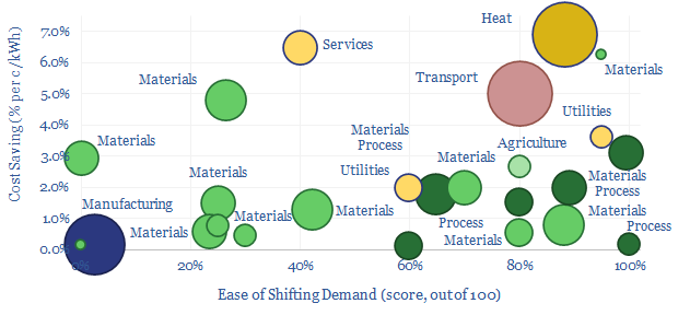
Some industries can absorb low-cost electricity when renewables are over-generating and avoid high-cost electricity when they are under-generating. The net result can lower electricity costs by 2-3c/kWh and uplift ROCEs by 5-15% in increasingly renewables-heavy grids. This 14-page note ranges over 10,000 demand shifting opportunities, to identify who can benefit most.
Read the Report?
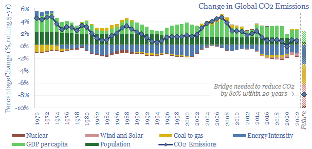
This 16-page report breaks down global CO2 emissions, across six causal factors and 28 countries-regions. Global emissions rose at +0.7% pa in 2017-22, unchanged on 2012-17, even as global income growth slowed by -0.5% pa. Depressing. The biggest reason is underinvestment in gas. Reaching net zero requires vast acceleration in renewables, infrastructure, nuclear, gas and nature.
Read the Report?
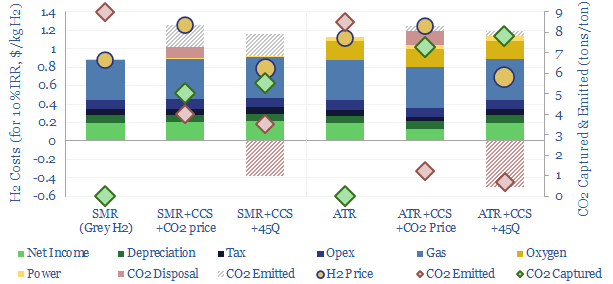
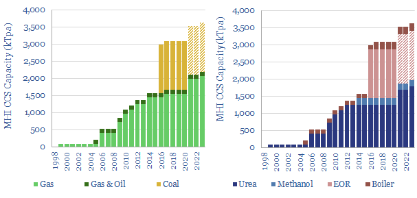
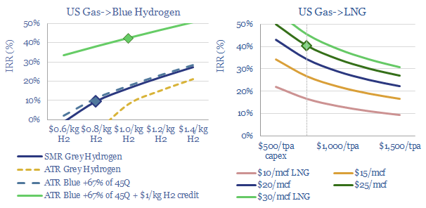
Blue hydrogen value chains are gaining momentum. Especially in the US. So this 16-page note contrasts steam-methane reforming (SMR) versus autothermal reforming (ATR). Each has merits and challenges. ATR looks excellent for clean ammonia. While the IRA creates CCS upside for today’s SMR incumbents, across industrial gases, refining and chemicals.
Read the Report?
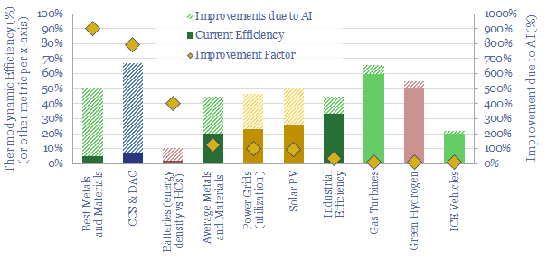
AI will be a game-changer for global energy efficiency, saving 10x more energy than it consumes directly, closing 'thermodynamic gaps' where 80-90% of all primary energy is wasted today. Leading corporations will harness AI to lower costs and accelerate decarbonization. This 19-page note explores opportunities.
Read the Report?
Swing Adsorption separates gases, based on their differential loading onto zeolite adsorbents at varying pressures. Today, tens of thousands of PSA plants purify hydrogen, biogas, polymers, nitrogen/oxygen and possibly in the future, can capture CO2? This 16-page note explores PSA technology for industrial gases.
Read the Report?
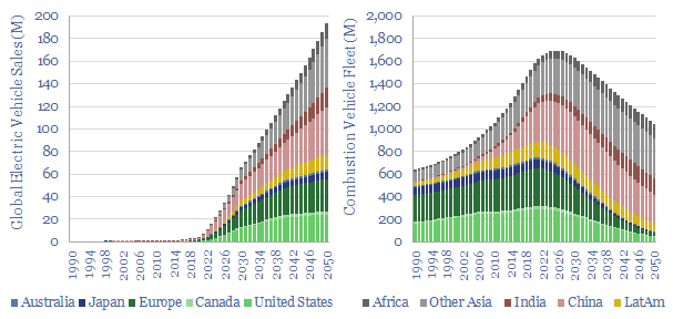
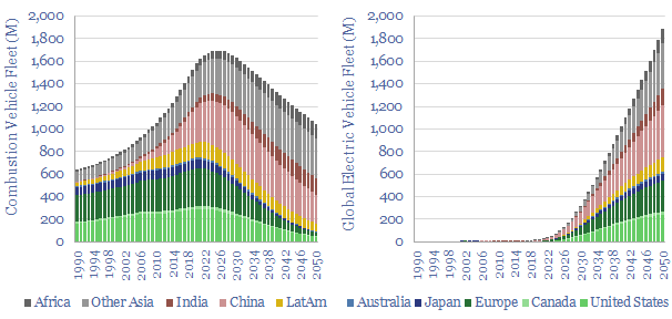
Electric vehicles are a world-changing technology, 2-6x more efficient than ICEs, but how quickly will they ramp up to re-shape global oil demand? This 14-page note finds surprising ‘stickiness’. Even as EV sales explode to 200M units by 2050 (2x all-time peak ICE sales), the global ICE fleet may only fall by 40%. Will LT oil demand surprise to the upside or downside?
Read the Report?
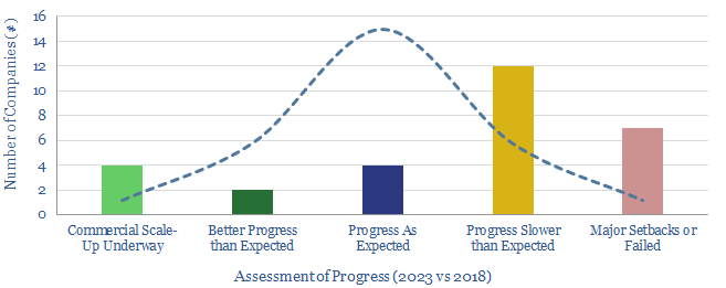
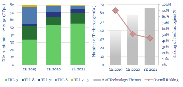
This 12-page note looks back over 5-years of energy technology research. Progress has often been slower than we expected. Maturing early-stage technology takes 20-30 years. Progress slows as work shifts from the lab to the real world. We wonder whether 2050 will look more like 2023 than many expect; or if decarbonization must rely more on today’s mature technologies?
Read the Report?
Cryogenic air separation is used to produce 400MTpa of oxygen, plus pure nitrogen and argon; for steel, metals, ammonia, wind-solar inputs, semiconductor, blue hydrogen and Allam cycle oxy-combustion. Hence this 16-page report is an overview of industrial gases. How does air separation work? What costs, energy use and CO2 intensity? Who benefits amidst the energy transition?
Read the Report?
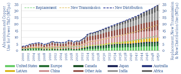
Power grid circuit kilometers need to rise 3-5x in the energy transition. This trend directly tightens global aluminium markets by over c20%, and global copper markets by c15%. Slow recent progress may lead to bottlenecks, then a boom? This 12-page note quantifies the rising demand for circuit kilometers, grid infrastructure, underlying metals and who benefits?
Read the Report?
Energy Market Models
This global energy supply-demand model combines our supply outlooks for coal, oil, gas, LNG, wind and solar, nuclear and hydro, into a build-up of useful global energy balances in 2022-30. We fear chronic under-supply. This is masked by economic weakness in 2023, rises to 3% shortages in 2025, and 5% shortages in 2030. Numbers can be stress-tested in the model.
Download the Model?
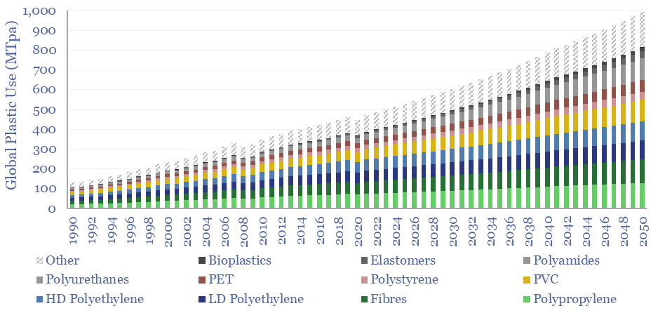
Global plastic is estimated at 470MTpa in 2022, rising to at least 800MTpa by 2050. This data-file is a breakdown of global plastic demand, by product, by region and by end use, with historical data back to 1990 and our forecasts out to 2050. Our top conclusions for plastic in the energy transition are summarized.
Download the Model?
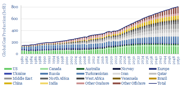
Our roadmap to 'Net Zero' requires doubling global gas production from 400bcfd to 800bcfd, as a complement to wind, solar, nuclear and other low-carbon energy. Reserve replacement must exceed 100% and the global RP ratio halves to 25-years. What do you have to believe?
Download the Model?
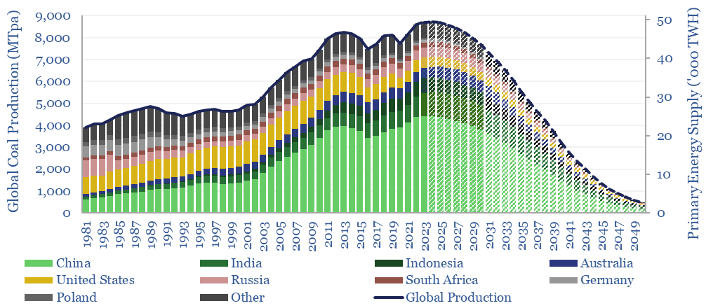
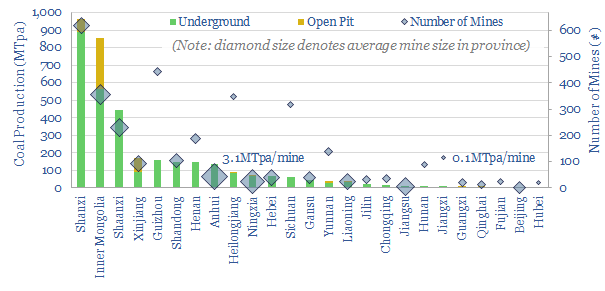
Our models of the energy transition ease coal production back from a new all-time peak of 8.3GTpa in 2022 to 0.5GTpa by 2050. This is sheer fantasy without a vast scale-up of wind, solar, gas and nuclear. This model breaks down coal production by country.
Download the Model?
This model sets out our US shale production forecasts by basin. It covers the Permian, Bakken and Eagle Ford, as a function of the rig count, drilling productivity, completion rates, well productivity and type curves. US shale likely adds +1Mbpd/year of production growth from 2023-2030, albeit flatlining in 2024, then re-accelerating on higher oil prices?
Download the Model?
This data-file forecasts the energy consumption of the internet, rising from 800 TWH in 2022 to 2,000 TWH in 2030 and 3,750 TWH by 2050. The main driver is the energy consumption of AI, plus blockchains, rising traffic, and offset by rising efficiency. Input assumptions to the model can be flexed. Underlying data are from technical papers.
Download the Model?
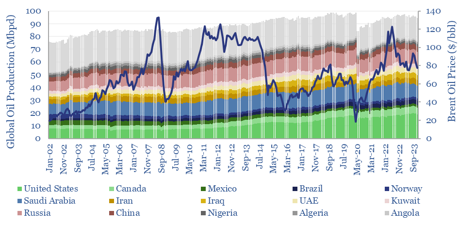
Global oil production by country by month is aggregated across 35 countries that produce 80kbpd of crude, NGLs and condensate, explaining >96% of the global oil market. Production has grown by +1Mbpd/year in the past two-decades, led by the US, Iraq, Russia, Canada. Oil market volatility is usually low, at +/- 1.5% per year, of which two-thirds is down to conscious decisions.
Download the Model?
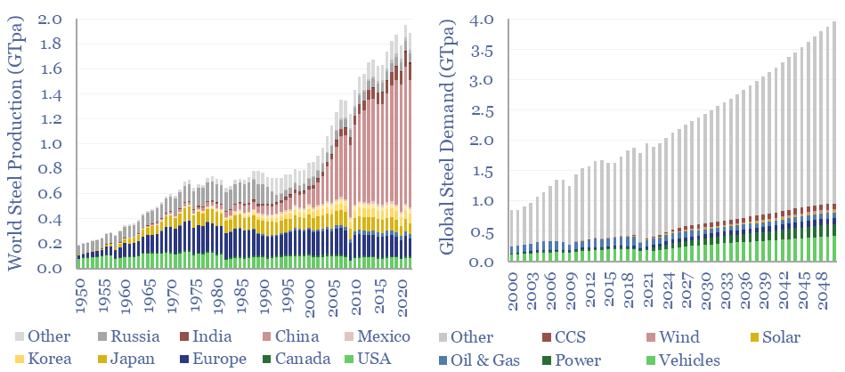
Global steel supply-demand runs at 2GTpa in 2023, having doubled since 2003. Our best estimate is that steel demand rises another 80%, to 3.6GTpa by 2050, including due to the energy transition. Global steel production by country is now dominated by China, whose output exceeds 1GTpa, which is 8x the #2 producer, India, at 125MTpa.
Download the Model?
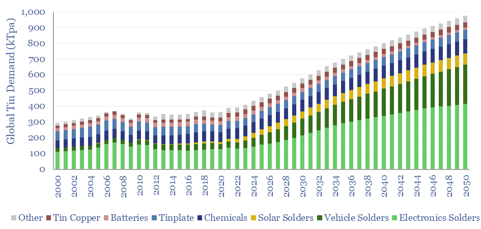
Global tin demand stands at 400kTpa in 2023 and rises by 2.5x to 1MTpa in 2050 as part of the energy transition. 50% of today's tin market is for solder, which sees growing application in the rise of the internet, rise of EVs and rise of solar. Global tin supply and demand can be stress-tested in the model.
Download the Model?
Global production of hydrogen is around 110MTpa in 2023, of which c30% is for ammonia, 25% is for refining, c20% for methanol and c25% for other metals and materials. This data-file estimates global hydrogen supply and demand, by use, by region, and over time, with projections through 2050.
Download the Model?
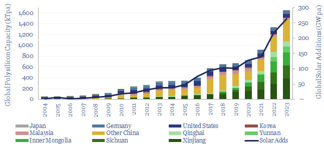
Polysilicon is a highly pure, crystalline silicon material, used predominantly for photovoltaic solar, and also for 'chips' in the electronics industry. Global polysilicon capacity is estimated to reach 1.65MTpa in 2023, and global polysilicon production surpasses 1MTpa in 2023. China now dominates the industry, approaching 90% of all global capacity.
Download the Model?
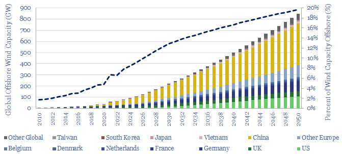
Global offshore wind capacity stood at 60GW at the end of 2022, rising at 8GW pa in the past half decade, comprising 7% of all global wind capacity, and led by China, the UK and Germany. Our forecasts see 220GW of global offshore wind capacity by 2030 and 850GW by 2050, which in turn requires a 15x expansion of this market.
Download the Model?
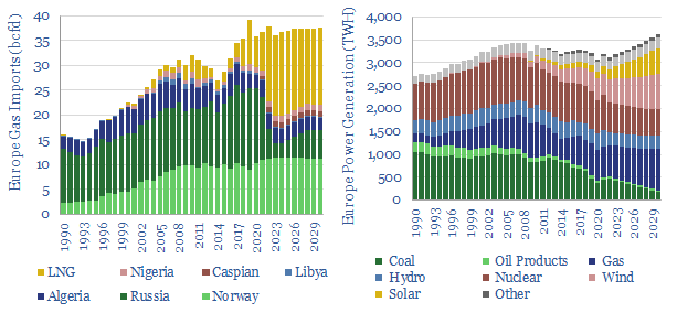
European gas and power markets will look better-supplied than they truly are in 2023-24. A dozen key input variables can be stress-tested in the data-file. Overall, we think Europe will need to source over 15bcfd of LNG through 2030, especially US LNG.
Download the Model?
We have modeled the global light vehicle fleet, light vehicle sales by region, and the world's shift from internal combustion engines (ICEs) towards electric vehicles (EVs) through 2050. Our base case model sees almost 200M EV sales by 2050, and a c40% decline to around 1bn combustion vehicles in the world's fleet by 2050.
Download the Model?
This data-file breaks down global oil demand, country-by-country, product-by-product, month-by-month, across 2017-2022. The goal is to summarize the effects of COVID, and the subsequent recovery in oil markets. Global oil demand is hitting new highs, even though several product categories are still not fully recovered.
Download the Model?
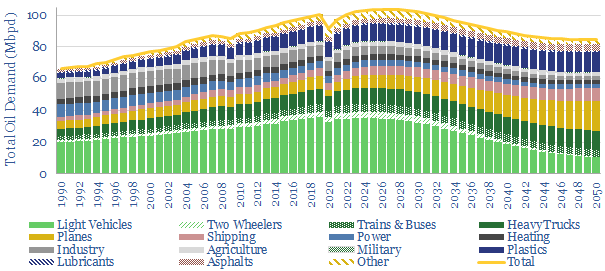
This model forecasts long-run oil demand to 2050, by end use, by year, and by region; across the US, the OECD and the non-OECD. We see demand gently rising through the 2020s, peaking at 104Mbpd in 2025-27, then gently falling to 85Mbpd by 2050 in the energy transition.
Download the Model?
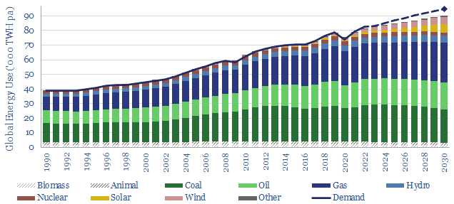
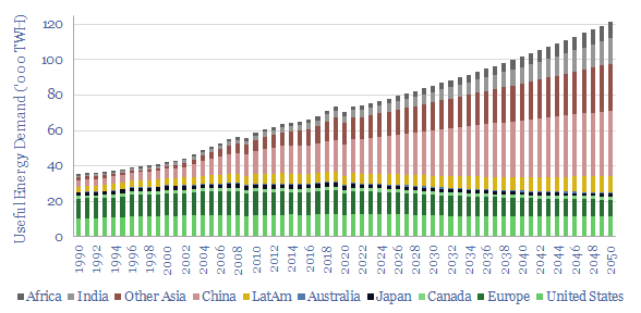
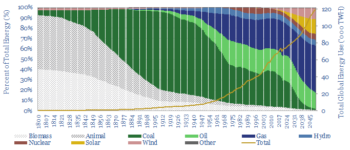
This model captures global energy demand by region through 2050, rising from 70,000 TWH in 2019-22 to 120,000 MWH in 2050. Demand rises c2% pa. Energy use per global person rises at 1% pa from 9.3 MWH pp pa to 12.6 MWH pp pa. Meeting human civilization's energy needs is crucial to the energy transition.
Download the Model?
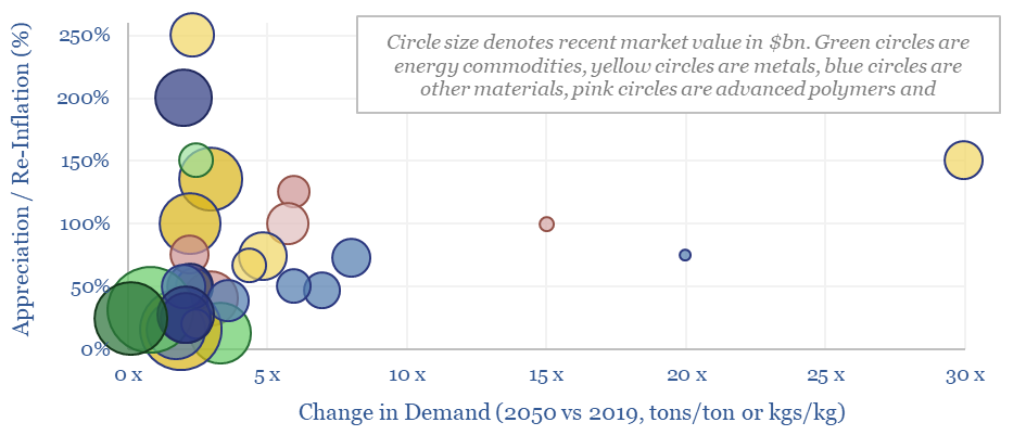
This data-file summarizes our latest thesis on ten commodities with upside in the energy transition. The average one will see demand rise by 3x and price/cost appreciate or re-inflate by 100%. The data-file contains a 6-10 line summary of our work into each commodity.
Download the Model?
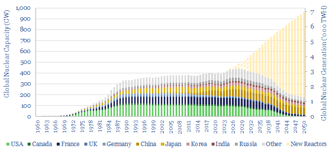
How much nuclear capacity would need to be constructed in our roadmap to net zero? This breakdown of global nuclear capacity forecasts that 30 GW of new reactors must be brought online each year through 2050, if the nuclear industry was to ramp up to 7,000 TWH of generation by 2050, which would be 6% of total global energy. There is a precedent. Delaying shutdowns helps too.
Download the Model?
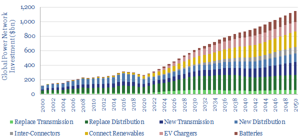
Global investment into power networks averaged $280bn per annum in 2015-20, of which two-thirds was for distribution and one-third was for transmission. Amazingly, these numbers step up to $600bn in 2030, >$1trn in the 2040s and can be as large as all primary energy investment.
Download the Model?
The US consumes 25,000 TWH of primary energy per year, which equates to 13,000 TWH of useful energy, and emits 6GTpa of CO2. This model captures our best estimates for what a pragmatic and economical decarbonization of the US will look like, reaching net zero in 2050, with energy consumption at 11,500 TWH per year.
Download the Model?
We describe c15 problems incurred by industrial and commercial power consumers. Many will require additional investment as renewables replace the large rotating generators of traditional power grids. Hence we see the market for commercial and industrial power electronics trebling from $360bn pa in 2021 to $1trn pa by 2035.
Download the Model?
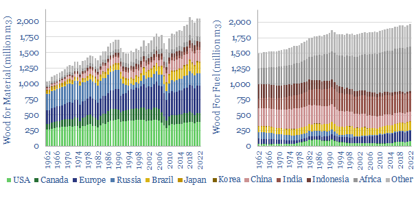
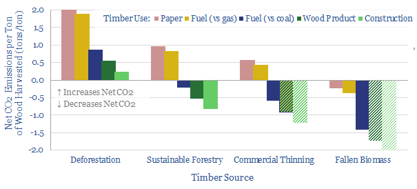
This data-file quantifies global wood production, country-by-country, back to 1960, across energy, pulp and longer-lasting materials. Overall, wood energy has declined from 11% of the world's primary energy mix in 1960 to c4% today, but it remains stubbornly high in less-developed countries, amplifying deforestation.
Download the Model?
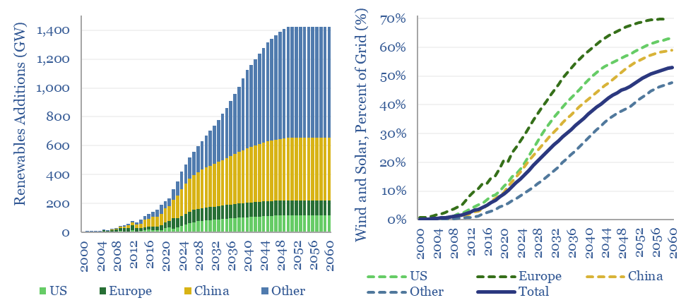
This model aims to calculate global wind and solar capacity additions. How many GW of new capacity would be needed for renewables to reach c25% of the global energy mix by 2050, up from 4% in 2021? In total energy terms, this means a 10x scale up, to 30,000 TWH of useful wind+solar energy in 2050. Gross global wind and solar capacity additions will surpass +1,000 GW by 2040.
Download the Model?
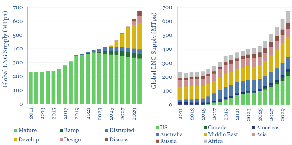
Global LNG output ran at 400MTpa in 2023. This model estimates global LNG production by facility across 140 LNG facilities. Our latest forecasts are that global LNG demand will rise at an 8% CAGR, to reach 670MTpa by 2030, for an absolute growth rate of +40MTpa per year, but the growth is back-end loaded.
Download the Model?
This model breaks down 2050 and 2100's global energy market, based on a dozen input assumptions. You can 'flex' these, to see how it will affect future oil, coal and gas demand, as well as global CO2 emissions. We reach 'net zero' by 2050. Even as fossil fuel demand rises 18%, gas demand trebles and renewables also reach c16%.
Download the Model?
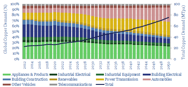
This data-file estimates global copper demand as part of the energy transition, rising from 28MTpa in 2022 to 70MTpa in our base case scenario. The largest contributor is the electrification of transport. You can stress test half-a-dozen key input variables in the model.
Download the Model?
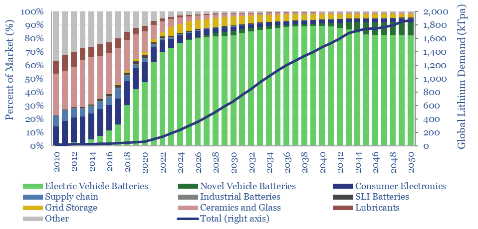
This data-file estimates global demand for lithium as part of the energy transition. The market has already trebled from 23kTpa in 2010 to 65kTpa in 2020, while we see the ascent continuing to 500kTpa in 2030 and almost 2MTpa in 2050. 90% is driven by transport. Global reserves suffice to cover the demand.
Download the Model?
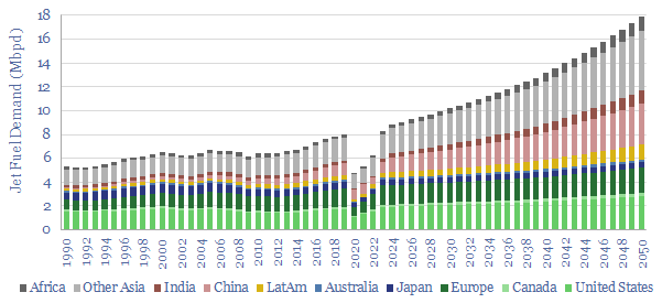
Jet fuel demand ran at 8Mbpd in 2019, the last year before COVID, and could rise to 18Mbpd by 2050, as global population rises 25%, jet fuel demand per capita doubles and fuel economy per aviation mile rises by 20%. This data file breaks down jet fuel demand by region, including our forecasts through 2050, which can be stress-tested, and feed into our global oil demand models.
Download the Model?
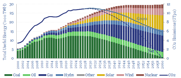
In our base case scenario, total useful energy demand rises 1.5x by 2050, gas demand rises 3.5x to displace coal, wind and solar reach 50% of the final electricity grid, while gross CO2 emissions fall back from 10.5GTpa in 2022 to 8GTpa, and the remainder must be met by (a) waiting until 2060 (b) CCS and (c) CO2 removals.
Download the Model?
This data-file contains energy transition market sizing analysis, for hydrocarbons, new energies, capital goods and materials in $bn pa, integrating over 1,000 items of energy transition research and our latest roadmap to net zero. In aggregate, energy, materials and transition-related markets double from $25 trn pa to $50 trn pa.
Download the Model?
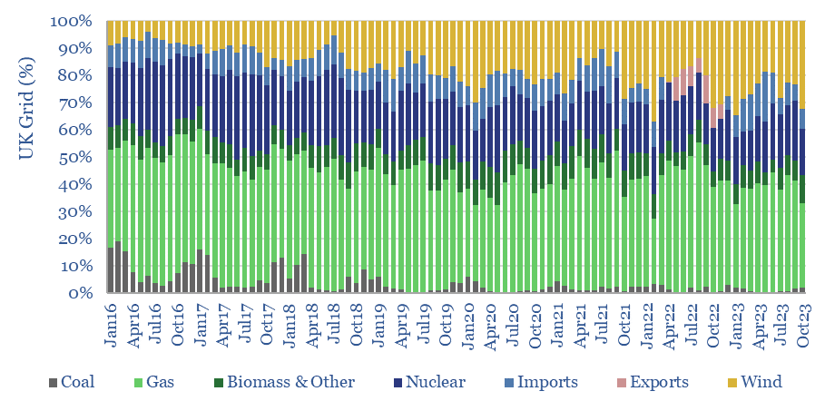
This data-file contains the output from some enormous data-pulls, evaluating UK grid power generation by source, its volatility, and the relationship to hourly traded power prices. We conclude the grid is growing more expensive and volatile, with the increasing share of wind.
Download the Model?
Economic Models
This data-file provides an overview of energy economics, across 175 different economic models constructed by Thunder Said Energy, in order to put numbers in context. This helps to compare marginal costs, capex costs, energy intensity, interest rate sensitivity, and other key parameters that matter in the energy transition.
Download the Model?
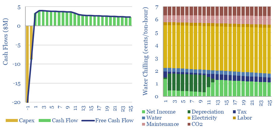
This data-file captures the costs of industrial cooling, especially liquid cooling using commercial HVAC equipment, across heat-exchangers, cooling tower evaporators and chillers. Our base case is that removing 100MW-th of heat has capex costs of $1,000/ton, equivalent to c$300/kW-th, expending 0.12 kWh-e of electricity per kWh-th, with a total cost of 7 c/ton-hour.
Download the Model?
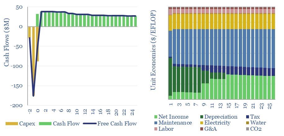
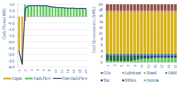
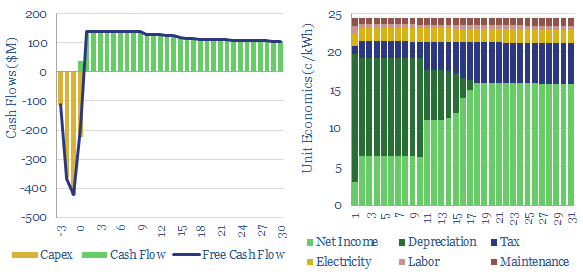
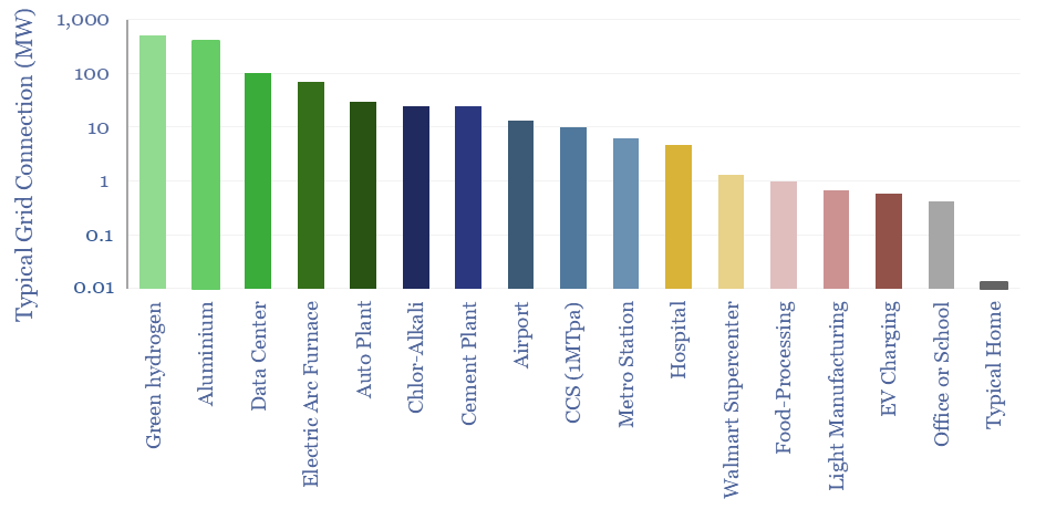
The capex costs of data centers are typically $10M/MW, with opex costs dominated by maintenance (c40%), electricity (c15-25%), labor, water, G&A and other. A 30MW data-center must generate $100M of revenues for a 10% IRR, while an AI data center in 2024 may need to charge $3M/EFLOP of compute.
Download the Model?
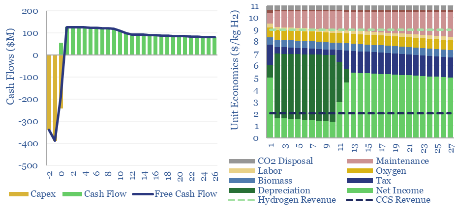
Woody biomass can be converted into clean hydrogen via gasification. If the resultant CO2 is sequestered, each ton of hydrogen may be associated with -20 tons of CO2 disposal. The economies of hydrogen from biomass gasification require $11/kg-e revenues for a 10% IRR on capex of $3,000/Tpa of biomass, or lower, with CO2 disposal incentives.
Download the Model?
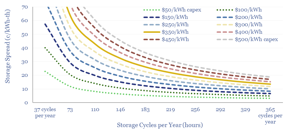
Our base case estimates for Compressed Air Energy Storage costs require a 26c/kWh storage spread to generate a 10% IRR at a $1,350/kW CAES facility, with 63% round-trip efficiency, charging and discharging 365 days per year. Our numbers are based on top-down project data and bottom up calculations, both for CAES capex (in $/kW) and CAES efficiency (in %) and can be stress-tested in the model. What opportunities?
Download the Model?
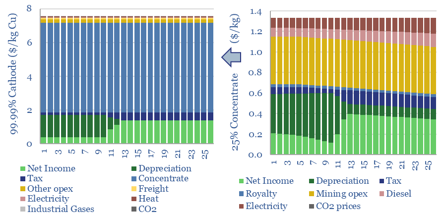
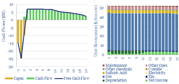
The economic cost of copper production is build up from first princples in this model, from mine, to concentrator, to smelter to 99.99% pure copper cathodes. Our base case is $7.5/kg copper cathode, with 4 tons/ton CO2 intensity, after starting from an 0.57% ore grade. Numbers vary sharply and can be stress-tested in the data-file.
Download the Model?
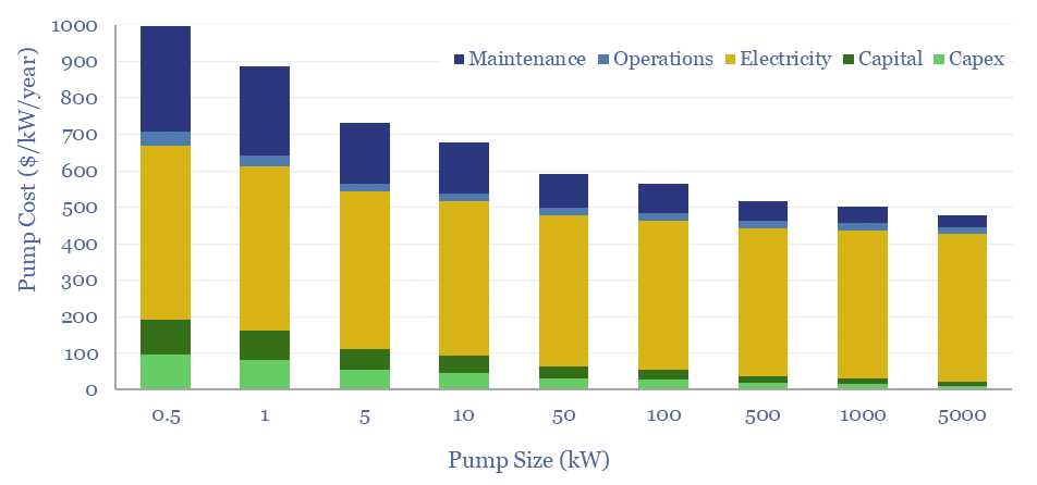
Total pump costs can be ballparked at $600/kW/year of power, of which 70% is electricity, 20% operations and maintenance, 10% capex/capital costs. But the numbers vary. Hence this data-file breaks down the capex costs of pumps, other pump costs, pump energy consumption and the efficiency of pumps from first principles.
Download the Model?
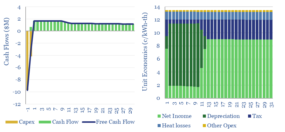
This data-file captures the costs of thermal energy storage, buying renewable electricity, heating up a storage media, then releasing the heat for industrial, commercial or residential use. Our base case requires 13.5 c/kWh-th for a 10% IRR, however 5-10 c/kWh-th heat could be achieved with lower capex costs.
Download the Model?
Hot potassium carbonate is a post-combustion CCS technology that bypasses the degradation issues of amines, and can help to decarbonize power, BECCS and cement plants. We think costs are around $100/ton and energy penalties are 30-50%. Potassium carbonate CCS can be stress-tested in this data-file, across 50 inputs.
Download the Model?
Redox flow battery costs are built up in this data-file, especially for Vanadium redox flow. In our base case, a 6-hour battery that charges and discharges daily needs a storage spread of 20c/kWh to earn a 10% IRR on $3,000/kW of up-front capex. Longer-duration redox flow batteries start to out-compete lithium ion batteries for grid-scale storage.
Download the Model?
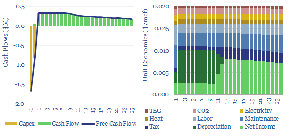
Gas dehydration costs might run to $0.02/mcf, with an energy penalty of 0.03%, to remove around 90% of the water from a wellhead gas stream using a TEG absorption unit, and satisfy downstream requirements for 4-7lb/mmcf maximum water content. This data-file captures the economics of gas dehydration, to earn a 10% IRR off $25,000/mmcfd capex.
Download the Model?
Fans and blowers comprise a $7bn pa market, moving low-pressure gases through industrial and commercial facilities. Typical costs might run at $0.025/ton of air flow to earn a return on $200/kW equipment costs and 0.3kWh/ton of energy consumption. 3,000 tons of air flow may be required per ton of CO2 in a direct air capture plant.
Download the Model?
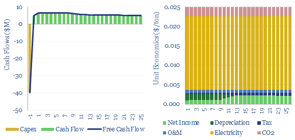
Gas fractionation separates out methane from NGLs such as ethane, propane and butane. A full separation uses up almost 1% of the input gas energy and 4% of the NGL energy. The costs of gas fractionation require a gas processing spread of $0.7/mcf for a 10% IRR off $2/mcf input gas, or in turn, an average NGL sales price of $350/ton. Costs of gas fractionation vary and can be stress tested in this model.
Download the Model?
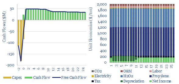
Hydrogen peroxide production costs run at $1,000/Tpa, to generate a 10% IRR at a greenfield production facility, with c$2,000/Tpa capex costs. Today's market is 5MTpa, worth c$5bn pa. CO2 intensity runs to 3 kg of CO2 per kg of H2O2. But lower-carbon hydrogen could be transformational for clean chemicals?
Download the Model?
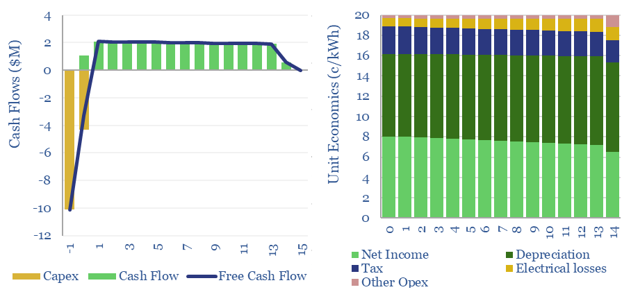
This model estimates the levelized cost of offshore wind at 13c/kWh, to generate a 7% IRR off of capex costs of $4,000/kW and a utilization factor of 40-45%. Each $400/kW on capex adds 1c/kWh and each 1% on WACC adds 1.3 c/kWh to offshore wind levelized costs.
Download the Model?
Propylene oxide production costs average $2,000/ton ($2/kg) in order to derive a 10% IRR at a newbuild chemicals plant with $1,500/Tpa in capex. 80% of the costs are propylene and hydrogen peroxide inputs. 60-70% of this $25bn pa market is processed into polyurethanes. CO2 intensity is 2 tons of CO2 per ton of PO today, but there are pathways to absorb CO2 by reaction with PO and possibly even create carbon negative polymers.
Download the Model?
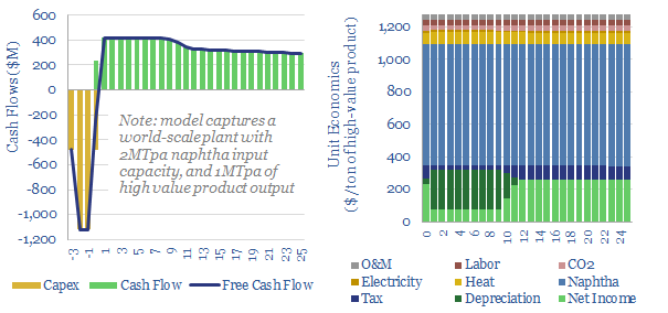
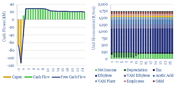
Naphtha cracking costs $1,300/ton for high value products, such as ethylene, propylene, butadiene and BTX aromatics, to derive a 10% IRR constructing a greenfield naphtha cracker, with $1,600/Tpa capex. CO2 intensity averages 1 ton of CO2 per ton of high value products. This data-file captures the economics for naphtha cracking, a cornerstone of the modern materials industry.
Download the Model?
Acetylene production costs are broken down in this data-file, estimated at $1,425/ton for a 10% IRR on a petrochemical facility that partially oxidizes the methane molecule. CO2 intensity is over 3 kg/kg. Up to 12MTpa of acetylene is produced globally for welding and as a petrochemical building block.
Download the Model?
A PTA price of $800-850/ton is needed to earn a 10% IRR on a new, integrated petrochemical facility, catalytically reforming naphtha into paraxylene, then oxidizing the paraxylene into purified terephthalic acid, with upfront capex cost of $1,300/Tpa. Feedstock costs, energy prices and CO2 prices matter too.
Download the Model?
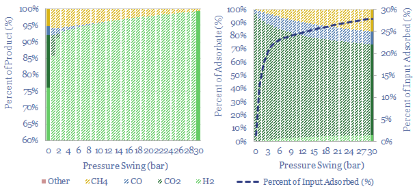
Pressure swing adsorption purifies gases according to their differing tendencies to adsorb onto adsorbents under pressure. Pressure swing adsorption costs $0.1/kg when separating pure hydrogen from reformers, and $2-3/mcf when separating bio-methane from biogas. Our cost breakdowns include capex, opex, maintenance, zeolite replacement, compression power and CO2 costs.
Download the Model?
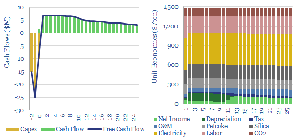
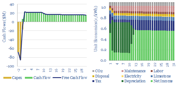
This data-file captures cement costs, based on inputs, capex and energy economics. A typical cement plant requires a cement price of $130/ton for a 10% IRR, on capex costs of $200/Tpa, energy intensity of 1,000 kWh/ton and CO2 intensity of 0.9 tons/ton. Cement costs can be stress tested in the data-file.
Download the Model?
Electrostatic precipitator costs can add 0.5 c/kWh onto coal or biomass-fired electricity prices, in order to remove over 99% of the dusts and particulates from exhaust gases. Electrostatic precipitators cost $50/kWe of up-front capex to install. Energy penalties average 0.2%. These systems are also important upstream of CCS plants.
Download the Model?
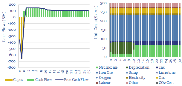
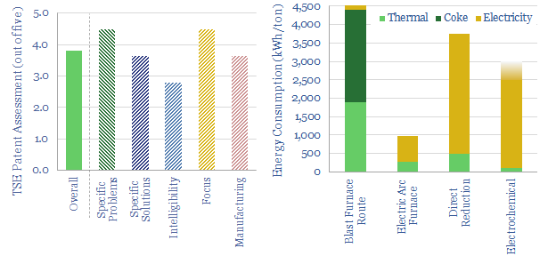
Direct reduced iron (DRI) is produced by reacting iron ore with H2-CO syngas, fueled by natural gas, in over 150 facilities worldwide. Direct reduction iron costs $300/ton, consuming 3,000kWh/ton of energy and CO2 intensity of 0.6 tons/ton. The process can be decarbonized via low-carbon hydrogen in the syngas, as the world strives towards decarbonized steel.
Download the Model?
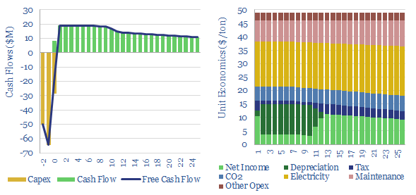
Biogas costs are broken down in this economic model, generating a 10% IRR off $180M/kboed capex, via a mixture of $16/mcfe gas sales, $60/ton waste disposal fees and $50/ton CO2 prices. High gas prices and landfill taxes can make biogas economical in select geographies. Although diseconomies of scale reward smaller projects?
Download the Model?
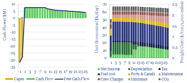
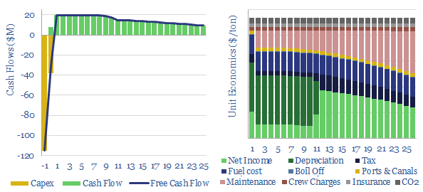
Bulk carriers move 5GTpa of commodities around the world, explaining half of all seaborne global trade. This model is a breakdown of bulk shipping cost. We estimate a cost of $2.5 per ton per 1,000-miles, and a CO2 intensity of 5kg per ton per 1,000-miles. Marine scrubbers increasingly earn their keep and uplift IRRs from 10% to 12% via fuel savings.
Download the Model?
This data-file captures selective catalytic reduction costs to remove NOx from the exhaust gas of combustion boilers and burners. Our base case estimate is 0.25 c/kWh at a combined cycle gas plant, which equates to $4,000/ton of NOx removed. Capex costs, operating costs, coal plants and marine fuels can be stress-tested in the model.
Download the Model?
This data-file captures the costs of producing different grades of silicon carbide: from materials grade SiC ($1,500/ton marginal cost, 5 tons/ton CO2 intensity) through to SiC wafers that are used in the electronics industry ($30M/ton, 200 tons/ton?). SiC semiconductor remains opaque.
Download the Model?
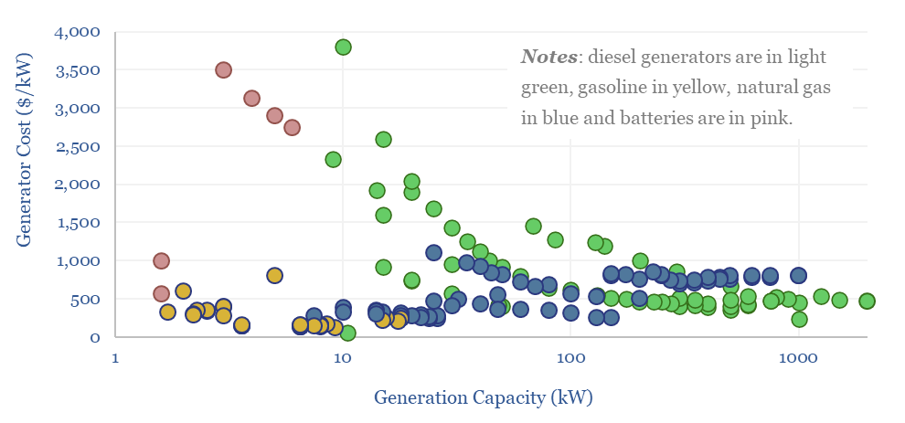
A multi-MW scale diesel generator requires an effective power price of 20c/kWh, in order to earn a 10% IRR, on c$700/kW capex, assuming $70 oil prices and c150km trucking of oil products to the facility. Economics can be stress-tested in the Model-Base tab.
Download the Model?
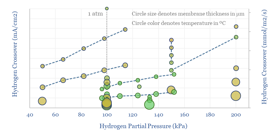
This economic model captures the costs of capturing CO2 using membranes, with a base case of $50/ton to earn 10% IRRs on early commercial deployments, and a possibility of deflating to $20/ton in next-generation membranes. This requires $50/m2 membranes, with 100-2,500 GPU permeance and 125-200x selectivity.
Download the Model?
This data-file captures the costs of flue gas desulfurization, specifically the costs of SO2 scrubbers, used to remove SO2 from the exhaust of coal- or distillate- fueled boilers and burners. We think a typical scrubber will remove 95% of the SO2 from the flue gas, but requires a >1c/kWh surcharge on electricity sales in order to earn a 10% IRR.
Download the Model?
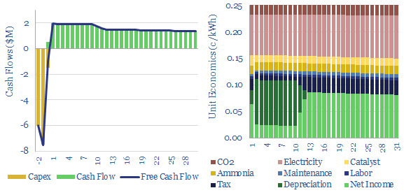
The Sabatier process combines CO2 and hydrogen to yield synthetic natural gas using a nickel catalyst at 300-400C. A gas price of $100/mcf is needed for a 10% IRR, energy penalties exceed 75% and CO2 abatement cost is $2,000/ton?
Download the Model?
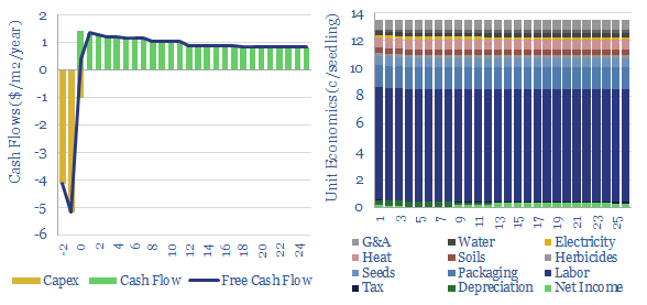
The US plants over 1.3bn tree seedlings per year. Especially pine. These seedlings are typically 8-10 months old, with heights of 25-30mm, root collars of 5mm, and total mass of 5-10 grams, having been grown by dedicated producers. This data-file captures the costs of tree seedlings, to support afforestation, reforestation or broader forestry.
Download the Model?
Grid-scale batteries are envisaged to store up excess renewable electricity and re-release it later. Grid-scale battery costs are modeled at 20c/kWh in our base case, which is the 'storage spread' that a LFP lithium ion battery must charge to earn a 10% IRR off $1,200/kW installed capex costs. Other batteries can be compared in the data-file.
Download the Model?
This model captures the economics of a CO2 carrier, i.e., a large marine vessel, carrying liquefied CO2, at -50ºC temperature and 6-10 bar pressure, for CCS. A good rule of thumb is seaborne CO2 shipping costs are $8/ton/1,000-miles. Shipping rates of $100k/day yield a 10% IRR on a c$150M tanker.
Download the Model?
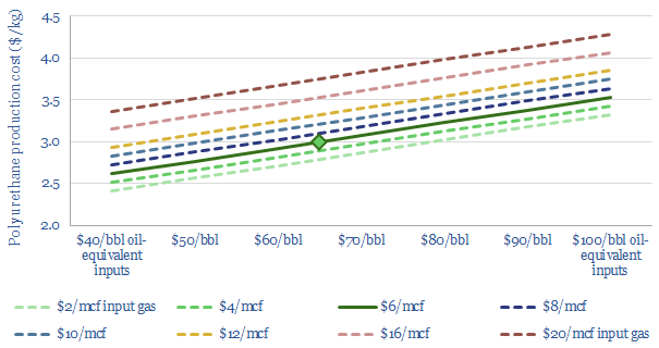
Polyurethane production costs are estimated at $2.5-3.0/kg in our base case model, which looks line-by-line across the inputs and outputs, of a complex, twenty stage production process, which ultimately yields spandex-lycra fibers. Costs depend on oil, gas and hydrogen input prices.
Download the Model?
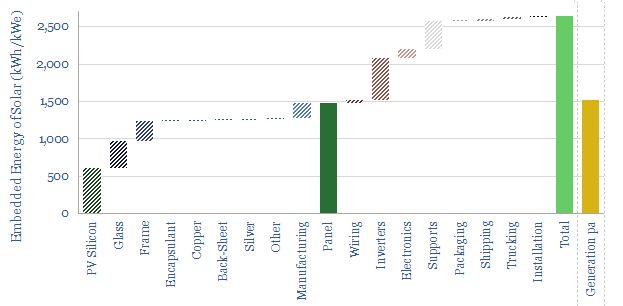
Ethylene vinyl acetate is produced by reacting ethylene with vinyl acetate monomer. This data-file estimates production costs, with a marginal cost between $1,500-2,000/ton, and a total embedded CO2 intensity of 3.0 tons/ton. EVA comprises 5% of the mass of a solar panel and could be an important solar bottleneck.
Download the Model?
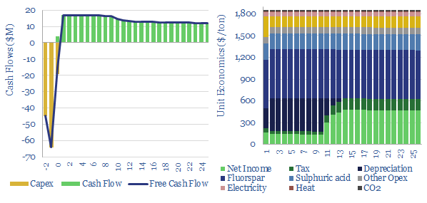
Hydrogen fluoride is a crucial commodity chemical. This model captures its production from acid-grade fluorspar and sulfuric acid. We think marginal costs are around $1,850/ton, in order to earn a 10% IRR on a production facility costing $4,000/Tpa, while the fully loaded CO2 intensity is around 0.75 tons/ton.
Download the Model?
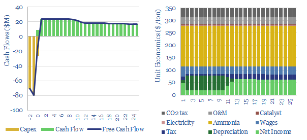
Global production of nitric acid is 60MTpa, in a $25bn pa market, spanning c500 production facilities. This data-file estimates a marginal cost of $350/ton HNO3 and a CO2 intensity averaging 1.8 tons/ton. There are feedback loops where gas shortages could result in fertilizer and metal shortages.
Download the Model?
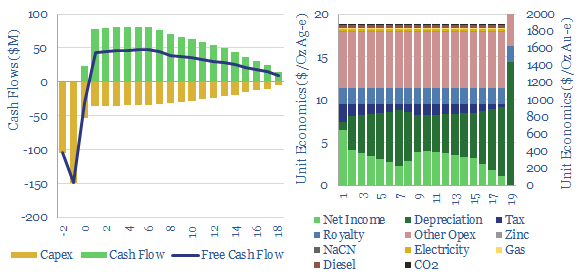
This data-file captures the marginal cost of silver and gold production, at an integrated mining-refining operation. In our base case, a 10% IRR requires a silver price of $17/Oz and a gold price of $1,750/Oz, while the energy and CO2 intensities are an eye watering 100-150 tons/ton and 9,000 tons/ton, respectively. Numbers vary widely on ore grade.
Download the Model?
This data-file captures the energy economics of leaching in the mining industry, especially the costs of heap leaching, for the extraction of copper, nickel, gold, silver, other precious metals, uranium, and Rare Earths. The data-file allows you to stress test costs in $/ton of ore, $/ton of metal, capex, opex, chemicals costs, energy intensity and CO2 intensity.
Download the Model?
Electrowinning costs and energy economics are built up in this data-file. A charge of $900/ton is required to earn a 10% IRR on a $3,000/kTpa plant with a median energy consumption of 2-3 MWH/ton. Although this will vary metal by metal.
Download the Model?
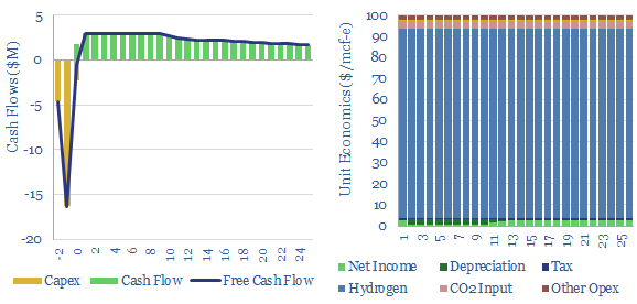
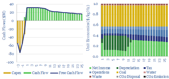
What are the costs of hydrogen from coal gasification? This model looks line-by-line, across different plant configurations, aggregating data from technical papers. Black hydrogen costs $1-2/kg. But CO2 intensity is very high, as much as 25 tons/ton. It can possibly be decarbonized resulting in semi-clean hydrogen costing c$2.5/kg.
Download the Model?
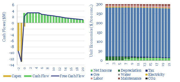
The costs of froth flotation are aggregated in this data-file, building up the typical capex costs (in $/Tpa), energy costs (in kWh/ton) and other opex lines (in $/ton) of one of the most important processes for the modern metals and materials industry. A good rule of thumb is $10/ton costs to concentrate a material by over 4x.
Download the Model?
Hydrogen cyanide is a chemical intermediate, used for making perspex, nylon-6,6 and sodium cyanide, which in turn is a crucial chemical for extracting gold and silver from precious metal ores. Marginal costs are usually $1,500-1,650/ton and CO2 intensities are 2-3 tons/ton.
Download the Model?
Marginal costs of a HPHT project in the UK North Sea are captured via modeling Shell's 40kboed Jackdaw project, FID'ed in 2022. A $7/mcf marginal cost results mostly from high hurdle rates associated with project complexity. CO2 intensity has been lowered to c14kg/boe, we think.
Download the Model?
Bio-coke is a substitute for coal-coke in steel-making and other smelting operations. We model it will cost c$450/ton, c50% more than coal-coke, but saves 2 - 2.5 tons/ton of CO2. Abatement costs can be as low as $70/ton. Although not always, and there are comparability issues.
Download the Model?
Mining crushing-grinding costs are typically $10/ton of ore, breaking 3-10cm rubble into 30-100 micron powders. Capex averages $20/Tpa and energy cost averages 20kWh/ton.
Download the Model?
This data-file assesses pumped hydro costs, to back up wind and solar. A typical project has 0.5GW of capacity, 12-hours storage duration, 80% efficiency, and capex costs of $2,250/kW. Thus it requires a 25c/kWh storage spread, in order to generate a 10% IRR.
Download the Model?
What is the marginal cost of offshore oil and gas? This data-file captures a small project, off Africa, with $15/boe development cost, $15/boe opex, 70% fiscal take. Break-even is at $35-45/bbl. But a $90/bbl forward curve may be needed for definitive go-ahead.
Download the Model?
This data-file captures chlor-alkali process economics, to produce 80MTpa of chlorine and 90MTpa of caustic soda. Our base case requires $600 per ecu for a 10% IRR and a growth project costing $600/Tpa. Electricity is 45% of cash cost. CO2 intensity is 0.5 tons/ton. Interestingly, chlor-alkali plants can demand shift.
Download the Model?
Technology Screens and Company Screens
This database contains a record of every company that has ever been mentioned across Thunder Said Energy's energy transition research, as a useful reference for TSE's clients. The database summarizes over 3,000 mentions of 1,400 energy transition companies, their size, focus and a summary of our key conclusions, plus links to further research.
Download the Screen?
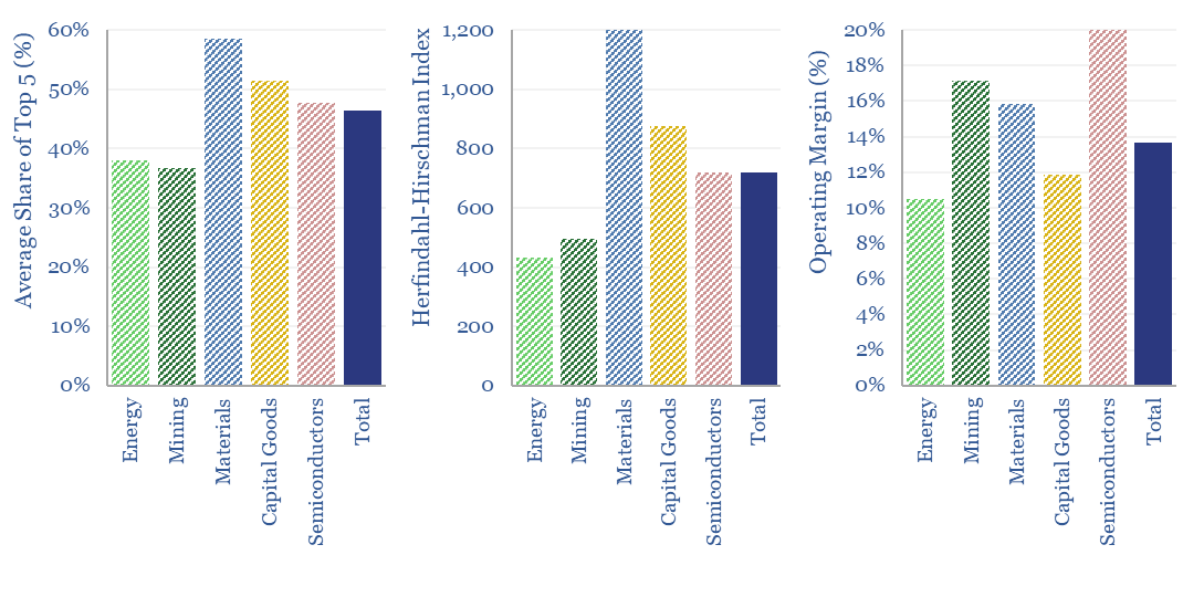
What is the market concentration by industry in energy, mining, materials, semiconductors, capital goods and other sectors that matter in the energy transition? The top five firms tend to control 45% of their respective markets, yielding a ‘Herfindahl Hirschman Index’ (HHI) of 700.
Download the Screen?
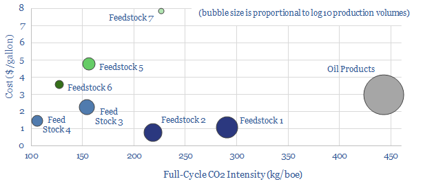
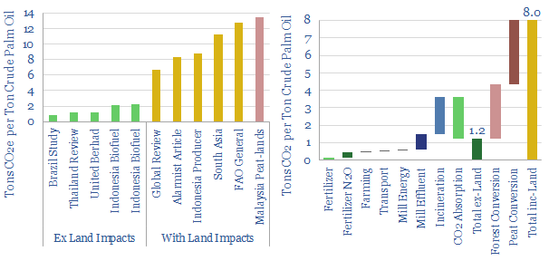
Biofuels are currently displacing 3.5Mboed of oil and gas. But they are not carbon-free, and their weighted average CO2 emissions are only c50% lower. This data-file breaks down the biofuels market across seven key feedstocks, to help identify which opportunities can scale for the lowest costs and CO2, versus others that require further technical progress.
Download the Screen?
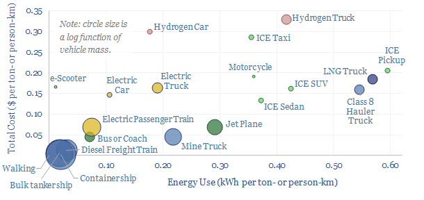
Vehicles transport people and freight around the world, explaining 70% of global oil demand, 30% of global energy use, 20% of global CO2e emissions. This overview summarizes all of our research into vehicles, and key conclusions for the energy transition.
Download the Screen?
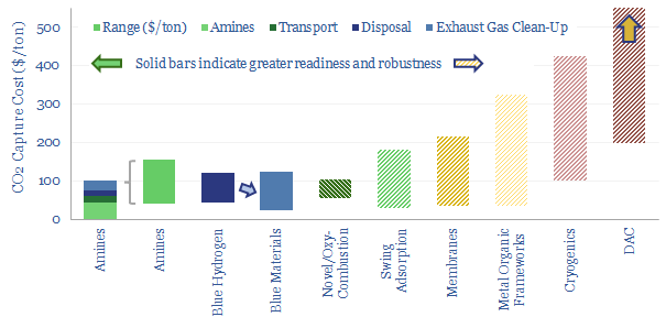
Carbon capture and storage (CCS) prevents CO2 from entering the atmosphere. Options include the amine process, blue hydrogen, novel combustion technologies and cutting edge sorbents and membranes. Total CCS costs range from $80-130/ton, while blue value chains seem to be accelerating rapidly in the US. This article summarizes the top conclusions from our carbon capture and storage research.
Download the Screen?
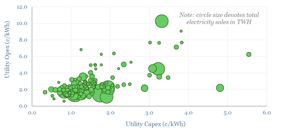
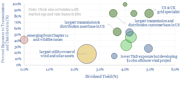
This data-file evaluates transmission and distribution costs, averaging 7c/kWh in 2024, based on granular disclosures for 200 regulated US electric utilities, which sell 65% of the US's total electricity to 110M residential and commercial customers. Costs have doubled since 2005. Which utilities have rising rate bases and efficiently low opex?
Download the Screen?
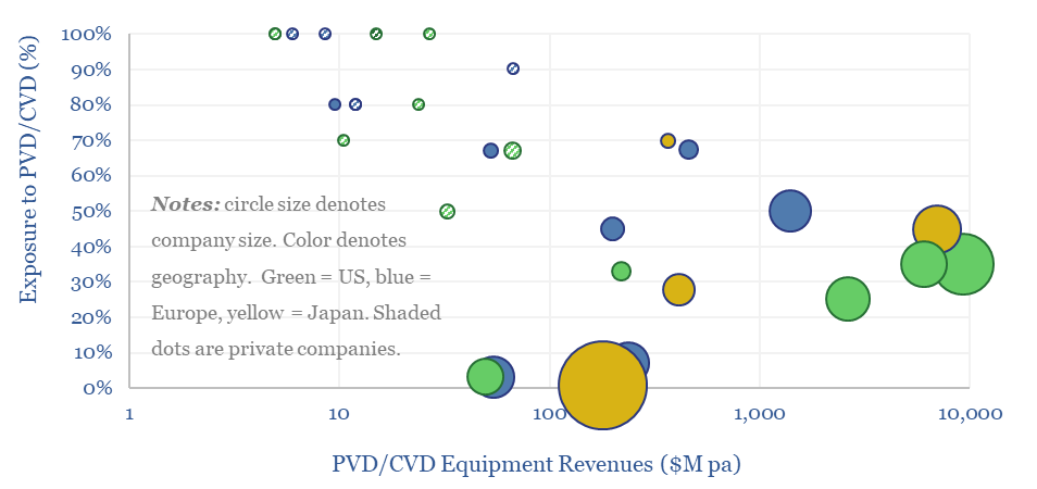
This data-file is a screen of leading companies in vapor deposition, manufacturing the key equipment for making PV silicon, solar, AI chips and LED lighting solutions. The market for vapor deposition equipment is worth $50bn pa and growing at 8% per year. Who stands out?
Download the Screen?
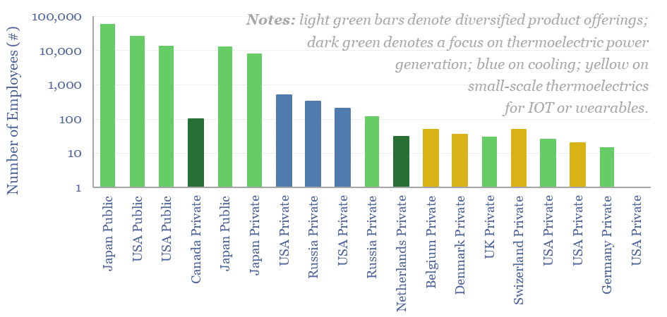
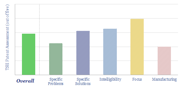
Thermoelectric devices convert heat directly into electricity, or conversely provide localized cooling/heating by absorbing electricity. This data-file screens leading companies in thermoelectrics, their product specifications, applications and underlying calculations for thermoelectric efficiency.
Download the Screen?
50 companies make conductive silver pastes to form the electrical contacts in solar modules. This data-file tabulates the compositions of silver pastes based on patents, averaging 85% silver, 4% glass frit and 11% organic chemicals. Ten companies stood out, including a Korean small-cap specialist.
Download the Screen?
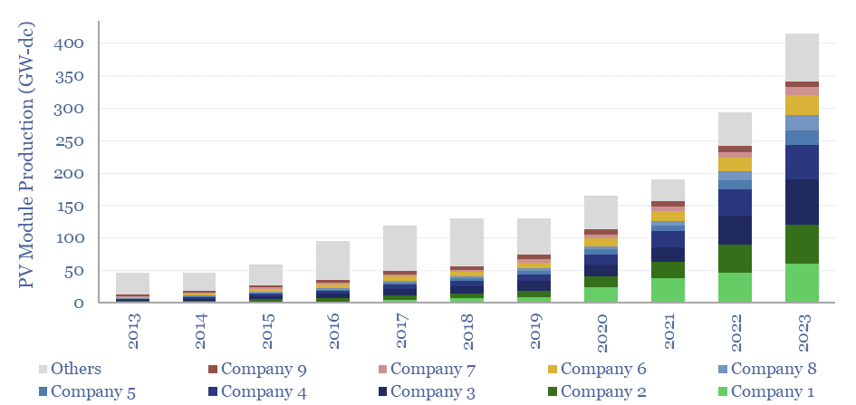
The world produced over 400GW of solar modules in 2023, which is up 10x from a decade ago. This data-file breaks down solar module production by company and over time, comparing the companies by solar module selling prices ($/kW), margins (%), efficiency (%), transparency, and technology development.
Download the Screen?
This data-file aggregates granular data into US gas transmission, by company and by pipeline, for 40 major US gas pipelines which transport 45TCF of gas per annum across 185,000 miles; and for 3,200 compressors at 640 related compressor stations.
Download the Screen?
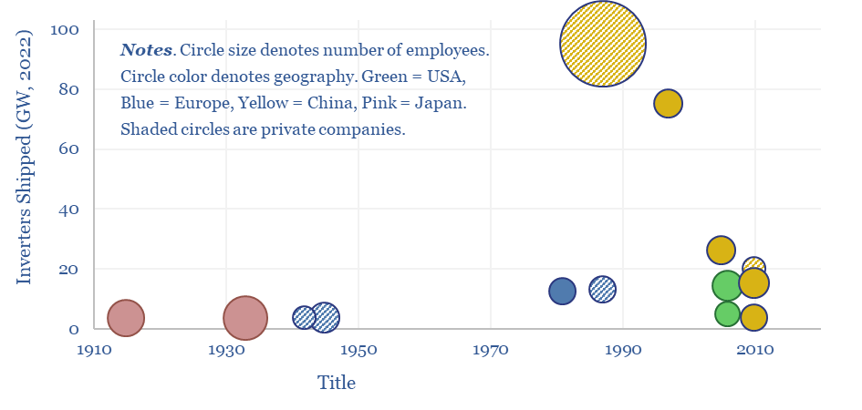
This data-file tracks some of the leading solar inverter companies and inverter costs, efficiency and power electronic properties. As China now supplies 85% of all global inverters, at 30-50% lower $/W pricing than Western companies, a key question explored in the data-file is around price versus quality.
Download the Screen?
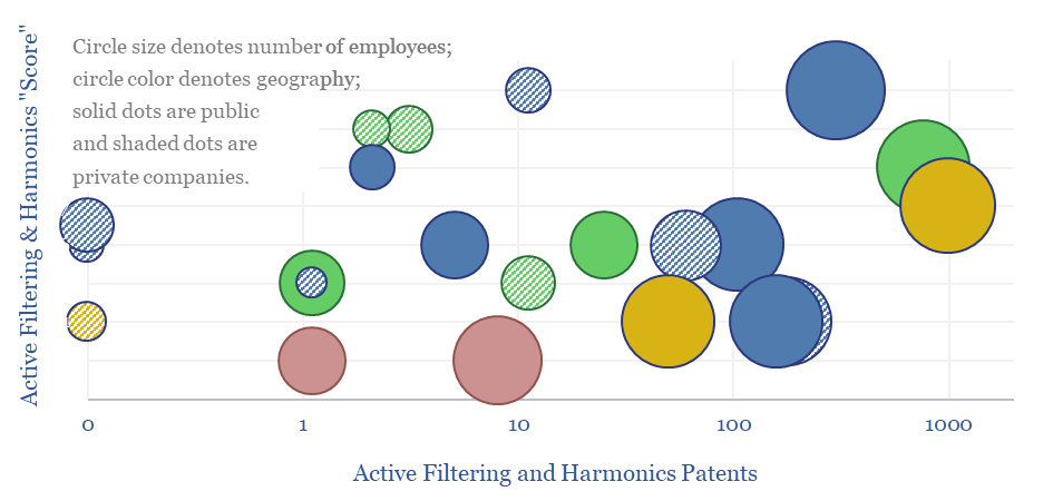
This data-file screens 20 leading companies in harmonic filters, tabulating their size, geography, ownership details, patent filings and a description of their offering. Active harmonic filters reduce total harmonic distortion below 5%, with 97% efficiency, within 5 ms. Half a dozen companies stood out in our screen, including one large, listed Western capital goods company.
Download the Screen?
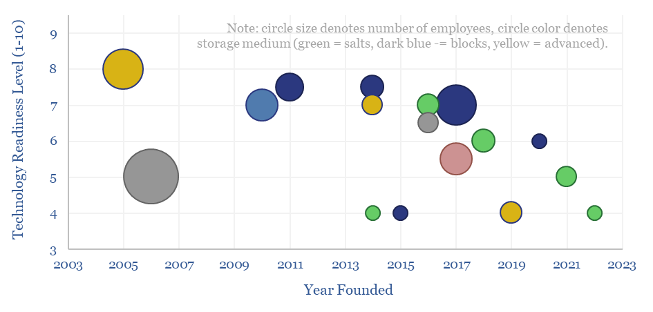
This data-file is a screen of thermal energy storage companies, developing systems that can absorb excess renewable electricity, heat up a storage medium, and then re-release the heat later, for example as high-grade steam or electricity. The space is fast-evolving and competitive, with 17 leading companies progressing different solutions.
Download the Screen?
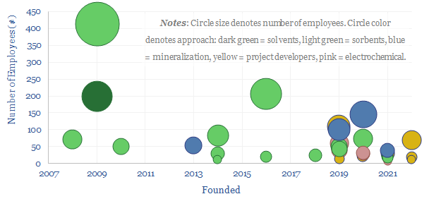
Leading direct air capture companies (DAC companies) are assessed in this data-file, aggregating company disclosures, project disclosures and other data from patents and technical papers. The landscape is evolving particularly rapidly, trebling in the past half-decade, especially towards novel DAC solutions.
Download the Screen?
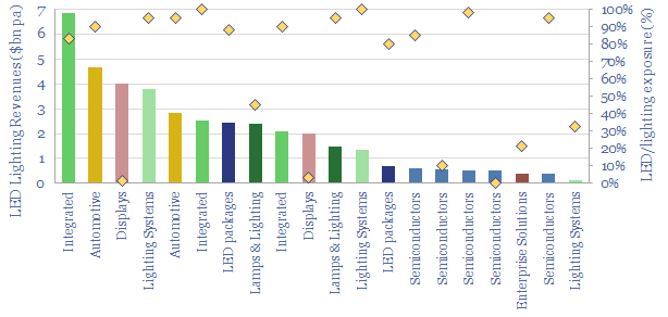
20 leading companies in LED lighting are compared in this data-file, mostly mid-caps with $2-10bn market cap and $1-8bn of lighting revenues, listed in the US, Europe, Japan, Taiwan. Operating margins averaged 8% in 2022, due to high competition, fragmentation and inorganic activity. The value chain ranges from LED semiconductor dyes to service providers installing increasingly efficient lighting systems as part of the energy transition.
Download the Screen?
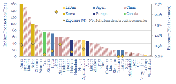
35 indium producers are screened in this data-file, as our energy transition outlook sees primary demand rising 4x from 900 tons in 2022 to over 3.5ktons in 2050, for uses in HJT solar cells and digital devices. 60% of global supply is produced by 20 Chinese companies. But five listed materials companies in Europe, Canada, Japan and Korea also stand out.
Download the Screen?
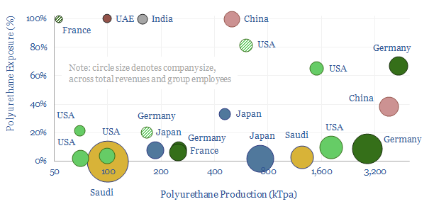
This data-file is a screen of leading companies in polyurethane production, capturing 80% of the world's 25MTpa market, across 20 listed companies and 3 private companies. We see growing demand for polyurethanes -- especially for insulation, electric vehicles and consumer products -- while there is also an exciting prospect that EVs displace reformates from the gasoline pool, helping to deflate feedstock costs. So who benefits?
Download the Screen?
Demand shifting flexes electrical loads in a power grid, to smooth volatility and absorb more renewables. This database scores technical potential and economical potential of different electricity-consuming processes to shift demand, across materials, manufacturing, industrial heat, transportation, utilities, residential HVAC and commercial loads.
Download the Screen?
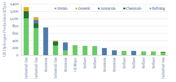
10MTpa of hydrogen is produced in the US, of which 40% is sold by industrial gas companies, 20-25% is generated on site at refineries, 20% at ammonia plants and 15-20% in chemicals/methanol. This datafile breaks down US hydrogen production by facility. Owners of existing steam methane reforming units may readily be able to capture CO2 and benefit from CO2 disposal credits under the US Inflation Reduction Act?
Download the Screen?
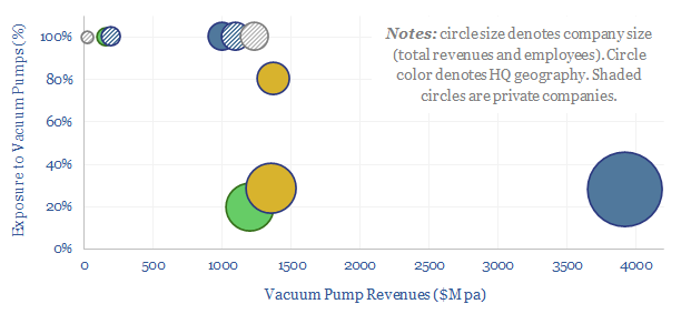
The global market for vacuum pumps is worth $15bn per year, with growing importance for making semiconductors, solar panels and AI chips. This data-file reviews ten leading companies in vacuum pumps, including one European-listed capital goods leader, a European pure-play and a Japanese-listed pure-play.
Download the Screen?
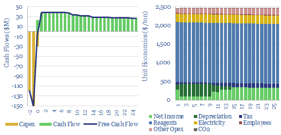
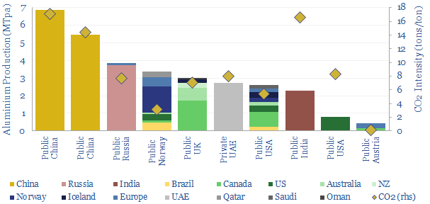
Leading aluminium producers are reviewed in this data-file, across ten companies, producing half of the world's global output. Scale ranges 1MTpa to 7MTpa. CO2 intensity of primary aluminium production ranges from 3 tons/ton to 17 tons/ton, in aggregate across these companies.
Download the Screen?
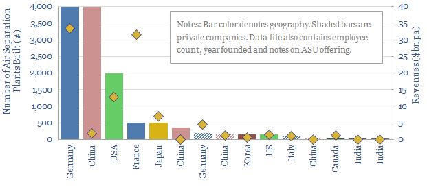
Over $100bn pa of industrial gases and $5-6bn pa of cryogenic air separation plants are produced each year. This data-file is a screen of leading industrial gas companies and cryogenic air separation companies, breaking down their market share (number of ASUs constructed) history, geography, sales and headcounts.
Download the Screen?
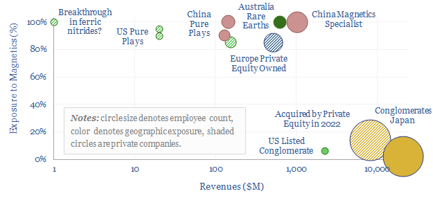
The global magnet industry is fragmented across hundreds of suppliers, including 800 in Asia-Pacific. The total market is worth $20bn pa. The purpose of this data-file is to highlight a dozen leading magnet companies, including producers of permanent magnets, Rare Earth magnets (e.g., NdFeB), ferrites and other magnetic components.
Download the Screen?
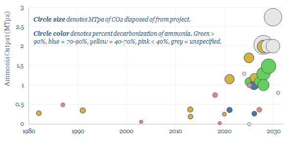
This data-file captures a sample of 30MTpa of blue ammonia projects from 1980 to 2030, including their location, companies, timings (year of FID, year of start-up), their sizes (in MTpa), their CO2 reductions (in %), their capex costs (in $M, where disclosed) and the implied capex costs ($/Tpa). We have also summarized each project with 3-10 lines of text.
Download the Screen?
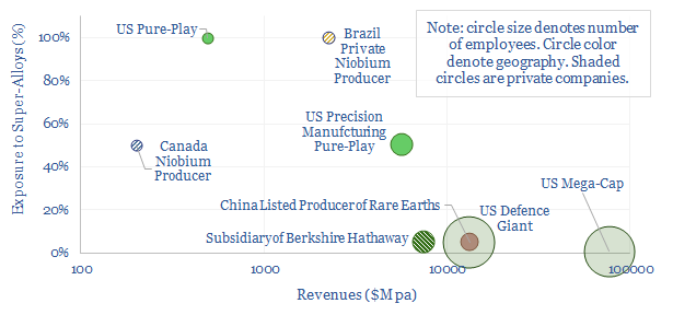
This data-file is a screen of leading companies in super-alloys, covering US pure-plays, mega-caps in industrials and defence, and emerging world producers of Rare Earth metals. In each case, we have included our notes and observations.
Download the Screen?
The average US electric utility has 25 GW of generation, 15,000-miles of power transmission, 100,000 miles of distribution, 8M customers, 3.5% dividend yields and 6.5% long-term target growth. We wonder if there is upside on expanding power grids? A dozen companies are in our screen.
Download the Screen?
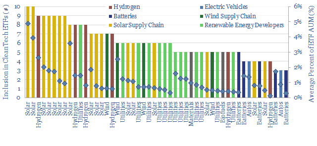
Which stocks are most considered to be energy transition stocks? To answer this question, we have aggregated the holdings of ten well-known energy transition ETFs and clean tech ETFs, in early 2023.
Download the Screen?
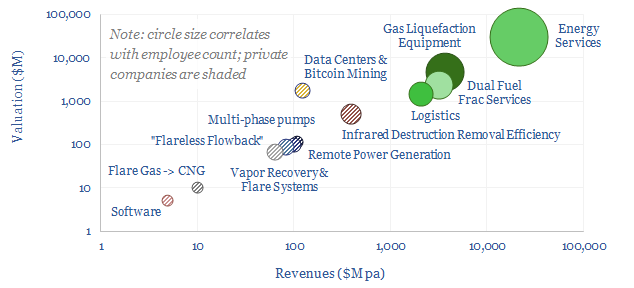
This data-file is a screen of companies that can reduce routine flaring and reduce the ESG impacts of unavoidable residual flaring. The landscape is broad, ranging from large, listed and diversified oil service companies with $30bn market cap to small private analytics companies with
Download the Screen?
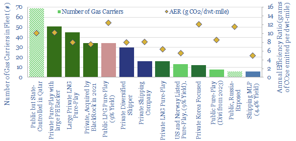
This data-file is a screen of LNG shipping companies, quantifying who has the largest fleet of LNG carriers and the cleanest fleet of LNG carriers (i.e., low CO2 intensity). Many private companies are increasingly backed by private equity. Many public companies have dividend yields of 4-9%.
Download the Screen?
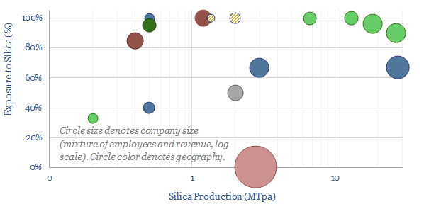
Highly pure silica sand, with well over 95% SiO2 content and less than 0.6% iron oxide, is an important resource used in making glass, metal foundries, "proppant" for hydraulic fracturing in the oil and gas industry and making high-grade silicon (for chips and PV silicon). The market is 350MTpa. This data-file is a screen of the world's largest silica sand producers.
Download the Screen?
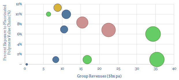
This data-file is a screen of companies in the fluorinated polymer value chain. It captures ten large Western companies, with exposure to producing fluorspar, refining fluorspar into hydrofluoric acid (HF) and/or further processing into fluorinated polymers, which matter increasingly in the energy transition.
Download the Screen?
High-quality building automation typically saves 30-40% of the energy needed for lighting, heating and cooling a building. This matters amidst energy shortages, and reduces payback times on $100-500k up-front capex. This data-file aggregates case studies of KNX energy savings, and screens 70 companies, from Capital Goods giants to private pure-plays.
Download the Screen?
This data-file is an overview of mining equipment companies. For each company, we have noted its location, size, age, number of employees, number of patents, latest revenues, operating margins, exposure to the mining equipment industry, and a few short summary sentences. Where possible, we have also broken down the company's revenues by end-market or by commodity.
Download the Screen?
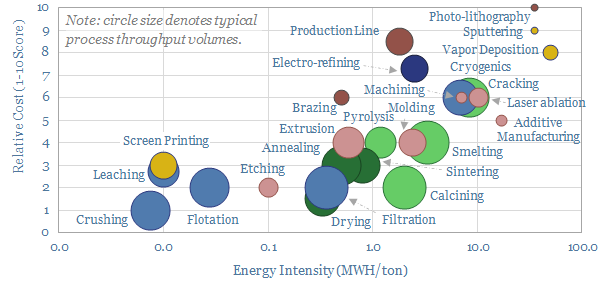
An of overview of manufacturing methods is given in this data-file. Costs are 70% correlated with energy intensity, ranging from well below 0.3 MWH/ton to well above 7MWH/ton. The lowest cost techniques take place at huge throughput in the mining industry, while the most intricate are used in semiconductor.
Download the Screen?
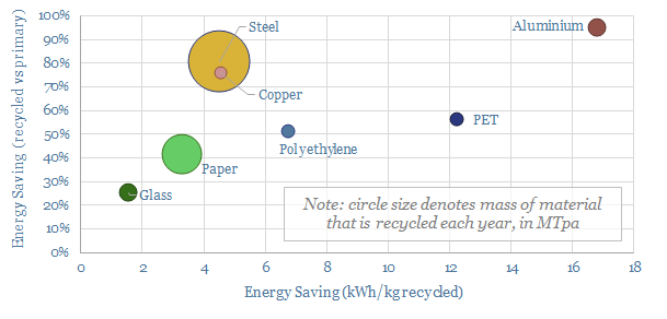
1GTpa of material is recycled globally, across steel, paper, glass, plastics and other metals. On average, 35% of these materials are produced from recycled feeds, saving 70% of the energy and CO2, with upside in the Energy Transition.
Download the Screen?
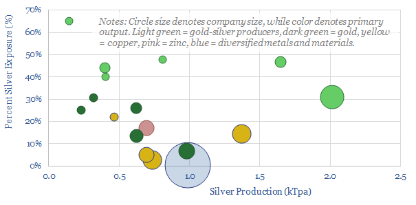
Half of the world's 28kTpa global silver market is controlled by 17 public companies, with silver output ranging from 0.1 - 2.0 kTpa, and co-producing gold, copper or other metals. This data-file is a screen of silver producers, in order to identify leading companies.
Download the Screen?
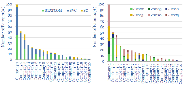
This data file looks for leading companies in STATCOMs and SVCs by aggregating all Western patents that refer in their title, abstract or claims to "STATCOMs", "Static VAR Compensators", or similar. ABB (now part of Hitachi), Siemens Energy and GE stand out as Western leaders in a concentrated space, although competition is growing.
Download the Screen?
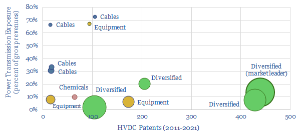
The global HVDC market is $10bn pa, and it might typically cost c€100-600 M to connect a large and remote renewables project to the grid or run a small HVDC inter-connector. This data-file reviews the market leaders in HVDC, based on 5,500 patents. A dozen companies stand out, with c$40bn of combined revenues from power transmission projects.
Download the Screen?
This data-file screens 15 companies that are developing graphite mines, plus downstream refining facilities, to upgrade their output into highly pure spheronized graphite that can be used as an anode material for lithium ion batteries, such as in electric vehicles.
Download the Screen?
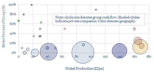
25 companies dominate the world's nickel production, although the supply chain is heavily split between battery-grade materials, Class I metals, and lower-grade products. Each company is summarized, according to its size and asset base. CO2 intensity varies by a very wide 10x margin, from sub-10 tons/ton nickel to 100 tons/ton.
Download the Screen?
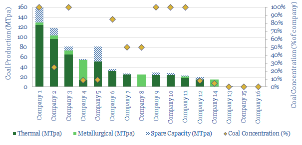
In 2022-25, bizarrely, we could be in a market where deployment of important energy transition technologies is being held back by energy shortages and metals shortages, which both pull on the demand for coal. This data-file screens fifteen of the largest Western coal producers.
Download the Screen?
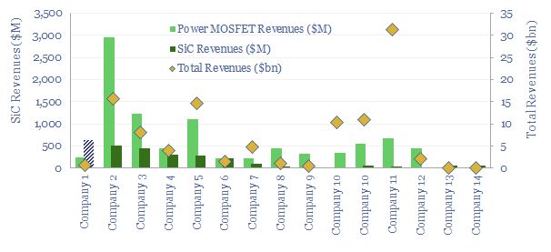
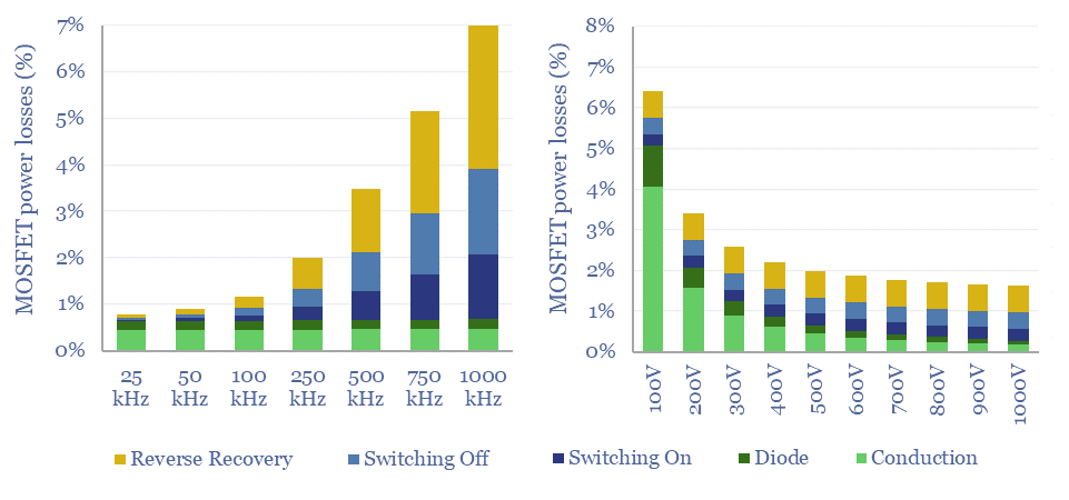
Power MOSFETs are an energy transition technology, the building block behind inverters, DC-DC converters, EV drive trains, EV chargers and other renewables-battery interfaces. Hence this data-file is a screen of companies making power MOSFETs, especially new and higher-efficiency devices using Silicon Carbide as the semi-conductor.
Download the Screen?
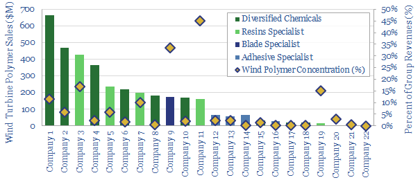
This data-file tabulates details for 20 companies that make epoxy- or polyurethane resins and adhesives, especially those that feed into the construction of wind turbines. We think there are 5 public companies ex-China with 5-35% exposure to this sub-segment of the wind industry.
Download the Screen?
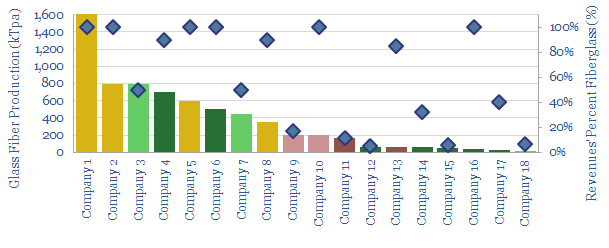
This data-file aims to provide an overview of the world's largest glass fiber manufacturers, quantifying their market share, and summarizing their offering. Covered companies include China Jushi, Owens Corning, Saint Gobain-Vetrotrex, Johns Manville and smaller Europeans.
Download the Screen?
This data-file profiles leading companies and products in the space of axial flux motors, with an average power density of almost 8kW/kg, which is 10x higher than a typical AC induction motor in heavy industry. Leading companies are profiled, based on reviewing over 1,200 patents.
Download the Screen?
This data-file outlines the top twenty companies producing variable frequency drives to precisely control electric motors. The top three companies are European capital goods players. High-quality VFDs may protect against growing competition from China.
Download the Screen?
This data-file profiles a dozen companies that make thermal insulation materials, as 50-75% of all buildings standing today will likely need insulation upgrades on the road to 'net zero', while the pace of progress should be amplified in times of energy shortages.
Download the Screen?
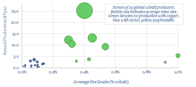
Our global decarbonization models burn through the world's entirely terrestrial cobalt resources. Hence this data-file reviews c25 mines around the world, and the resultant positions of 25 global cobalt producers. All cobalt is produced alongside copper or nickel, but some companies are more cobalt-exposed.
Download the Screen?
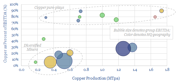
This data-file is a screen of the world's largest copper miners and producers, covering 16 companies that produce half of all global output. The average company produces around 0.8MTpa, has a 30-year reserve life, and derives 30% of its EBITDA from copper.
Download the Screen?
This screen compares the offerings of a dozen small-scale wind turbine providers, with power ratings below 30kW, for residential energy generation. Costs range from $1,000-6,000/kW. The three key challenges are performance, relaibility and cost.
Download the Screen?
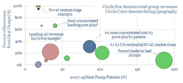
This data-file tabulates our subjective opinions on c20 different heat pump companies, based on their consumer reviews, pricing, reliability, efficiency, company size, models, integration, and visual/acoustic properties. We conclude heat pumps are opaque and must be selected carefully.
Download the Screen?
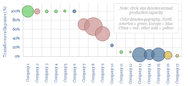
This data-file aims to tabulate helpful data on the grid-scale transformer industry, covering the sizes (tons), costs ($/kW) and companies in the space. Margin pressure looks challenging, amidst material re-inflation, and a competitive set of capital goods giants and emerging Chinese companies.
Download the Screen?
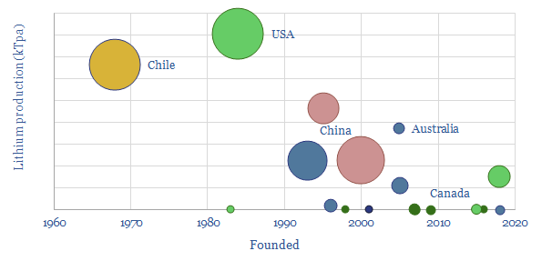
This data-file captures c20 lithium producers, their output (in kTpa), their size and their recent progress. Eight companies effectively control 90% of global supply. 3 out of 12 earlier-stage companies underwent restructurings in 2020, illustrating risks, but also potential future supply shortages.
Download the Screen?
This data-file summarizes the details of c15 companies aiming to commercialise low-carbon electro-fuels, using power-to-liquids technologies, and their progress to-date. The average company was founded in 2015, with 5 patents and 15 employees. Although this is skewed towards 3-4 leaders.
Download the Screen?
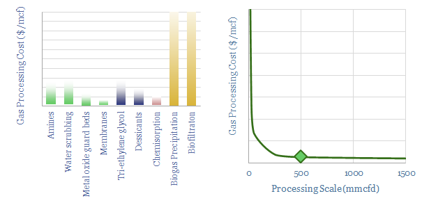
This data-file gives an overview of gas sweetening and treatment processes. The main method is chemical absorption using amines. We estimate that a mid-size facility of 500mmcfd must levy a $0.15/mcf cost and emits 3.5kg/boe to take out c7% H2S and CO2. Other processes are compared.
Download the Screen?
This screen tabulates details of almost twenty leading companies in the production and commercialization of biochar. The average company was founded in 2012, has 8 employees and 1.2 patents, showing an early-stage and competitive space.
Download the Screen?
This data-file captures 17 plastic products derived from mechanical recycling, biologically-sourced feedstocks or that is bio-degradable. The 'greenest" plastics are c30% lower in CO2 than conventional plastics, but around 2x more costly.
Download the Screen?
This screen assesses a dozen companies sequestering CO2 by farming seaweeds and kelp. The area is fast-growing but early-stage. The average company was founded in 2017 and employs 10 people. Commercial products include foods, animal feeds, fertilizers, plastics and even distilled spirits.
Download the Screen?
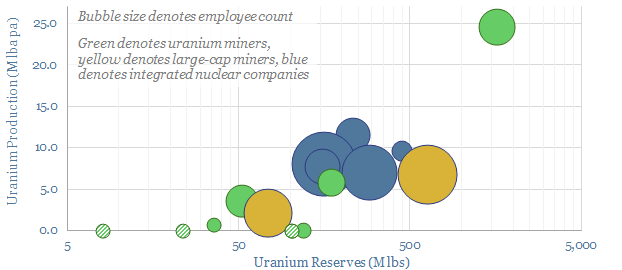
We have screened c20 uranium miners, assessing each company's production, reserves, asset base, size and recent news flow. 10 are publicly listed. Our market outlook is that firm uranium supply may be running 25% short of the level required on our roadmap to net zero.
Download the Screen?
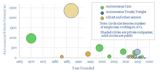
We have screened 25 leading companies in autonomous vehicles (public and private), tabulating their technical progress and proposals for Level 4-5 autonomy. 75% of the companies were founded in the last decade. Leaders are focused on freight, cars, taxis and LiDAR sensing.
Download the Screen?
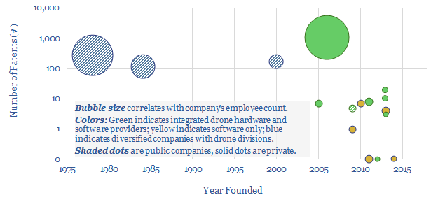
This data-file is a simple screen of companies manufacturing drones and commercializing drone software. It includes 12 private companies and 4 public companies. For each company, we have tabulated their history, geography, number of patent filings and a short description.
Download the Screen?
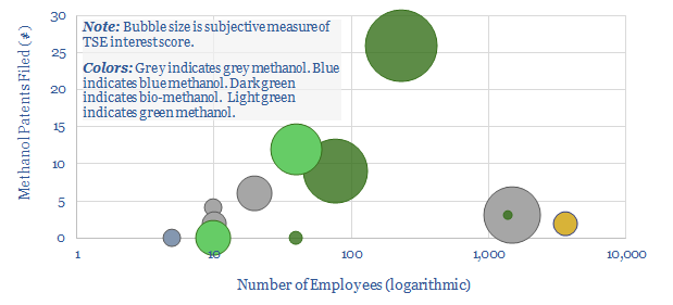
This data-file tabulates details of companies in the methanol value chain. For incumbents, we have quantified market shares. For technology providers, we have simply tabulated the numbers of patents filed. For newer, lower-carbon methanol producers, we have compiled a screen to assess leading options.
Download the Screen?
This screen tracks companies that can improve productivity of agricultural land (so more land is available for reforestation) or increase CO2 uptake rates of plants. It includes large-cap seed and crop protection companies, through to biotech firms, through to indoor farms that achieve 350-400x higher yields per acre.
Download the Screen?
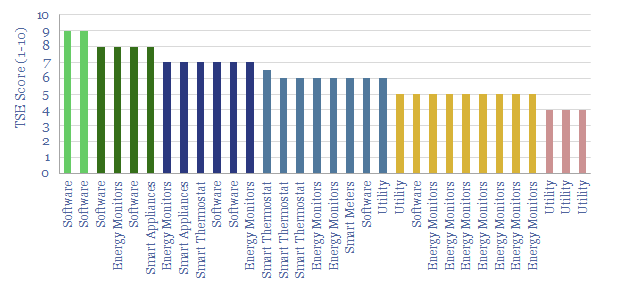
Smart meters and smart devices are capable of transmitting and receiving real-time consumption data and instructions. This data-file tracks 40 leading companies, mostly at the venture and growth stages. They help lower demand, smooth grid volatility and encourage appliance upgrades.
Download the Screen?
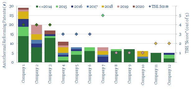
This data-file assesses who has the leading technology for producing industrial hydrogen, but especially blue hydrogen from auto-thermal reformers, after reviewing public disclosures and 750 patents. Companies include Air Liquide, Air Products, Casale, Haldor Topsoe, Johnson Matthey, KBR, Linde, Thyssenkrupp.
Download the Screen?
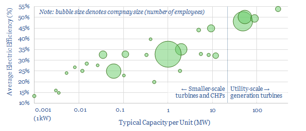
This data-file profiles 30 leading companies in gas turbines and CHPs, from mega-caps such as GE, Siemens and Mitsubishi, down to small-caps and private companies with exciting new technologies. Case studies are also presented, with details on turbine installations.
Download the Screen?
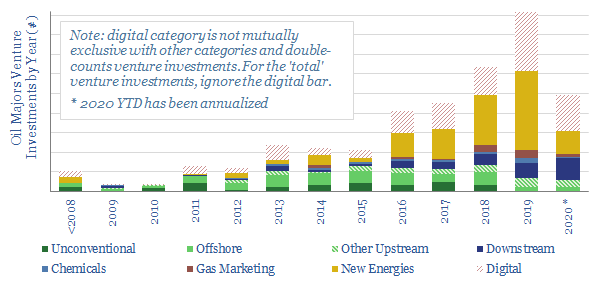
This database tabulates c300 venture investments, made by 9 of the leading Oil Majors. Their strategy is increasingly geared to advancing new energies, digital technologies and improving mobility. Different companies are compared and contrasted, including the full list of venture investments over time.
Download the Screen?
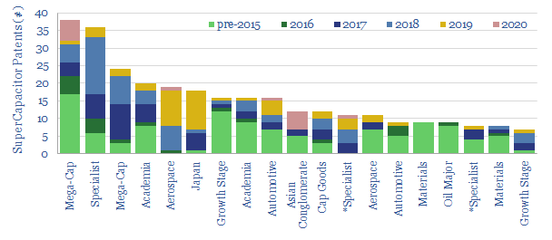
This data-file screens for the 'top twenty' technology leaders in super-capacitors, by assessing c2,000 Western patents filed since 2013. The screen comprises capital goods conglomerates, materials companies, an Oil Major with exposure and specialist companies improving SC energy density.
Download the Screen?
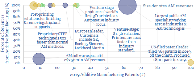
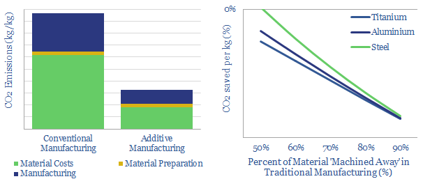
This data-file tabulates 5,500 patents into additive manufacturing (3D printing), in order to identify technology leaders. Patent filings over time show a sharp acceleration, making AM one of the fastest growth areas for the energy transition. We profile 14 concentrated specialists, plus broader Cap Goods and Materials companies.
Download the Screen?
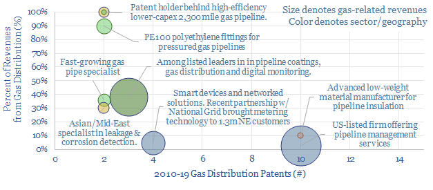
This data-file tracks 800 patents innovating pipeline transportation of natural gas, to screen for exciting technologies and companies. 6 publicly listed firms and 6 venture-stage start-ups stood out from the analysis, commercialising next-generation materials, monitoring methods and optimizing gas distribution.
Download the Screen?
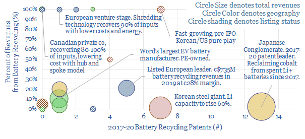
This data-file tracks over 6,000 patents filed into battery recycling technology, escalating at a 15% CAGR since 2000. 18 technology leaders are profiled ex-China, including 6 global, large-cap listed companies and 10 private companies, including some exciting, early-stage concepts to improve material recovery and costs.
Download the Screen?
This data-file screens twenty companies measuring and verifying nature-based carbon offsets, in forests and soils. It includes 5 leading private companies at the cutting edge. Traditionally cumbersome, manual methodologies have evolved rapidly, towards technology-driven, real-time remote sensing, to enable the scale-up of nature-based CO2 offsets.
Download the Screen?
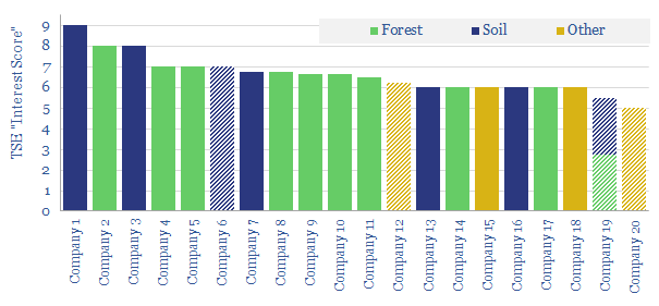
Heat pumps can halve the CO2 intensity of residential heating. Hence we have screened for the leading companies, focusing in upon 4,000 Western-centric patents from 2017-19. The space is competitive. 7 public companies and 4 private companies stand out, with concentrated exposure to the theme.
Download the Screen?
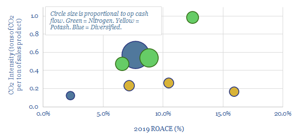
This data-file screens the large, listed fertilizer companies, comparing their CO2 intensity, ROACE, cash flow and recent patent filings. The industry could be disrupted by the rise of conservation agriculture, eroding thee 186MTpa global fertilizer market, which also comprises c1% of global emissions.
Download the Screen?
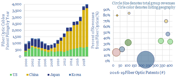
This data-file screens for the technology leaders in fiber-optic cables, which are crucial for the digitization of industries and the world's structural shift towards remote-working, based on screening 37,000 patents. Revenues and market shares are summarized for the leaders.
Download the Screen?
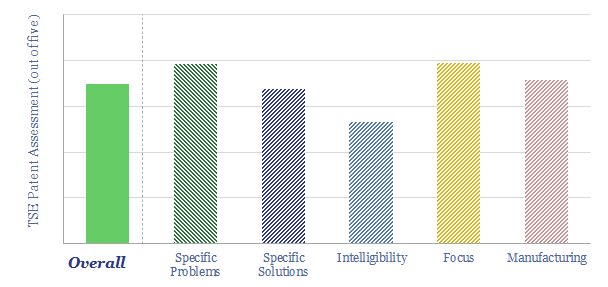
We have compiled a database of 25 leading companies in Redox Flow Batteries, by looking across 1,237 patents since 2017. Exciting progress is visible, with technical maturity rapidly progressing, demonstration facilities under construction and a promise of cost-competitive, long-life, energy storage.
Download the Screen?
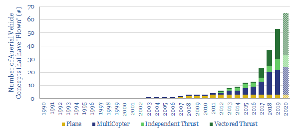
We have updated our database of over 100 companies, which have already flown c50 aerial vehicles (aka "flying cars"), to identify the leading contenders. We categorize each vehicle by fuel type, speed, range, fuel economy and credibility. The data strongly imply aerial vehicles taking off in the 2020s.
Download the Screen?
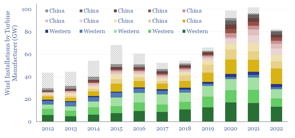
This data-file tracks wind turbine manufacturers, their market shares and their margins. By 2022, fifteen companies account for 98% of global wind turbine installations. This includes large Western incumbents, and a growing share for Chinese entrants, which now comprise over half of the total market, limiting sector-wide operating margins to c3%.
Download the Screen?
This data-file assesses the outlook for 30 plastic pyrolysis companies, operating (or constructing) 100 plants around the world, which use chemical processes to turn waste plastic back into oil. The data-file has been updated in 2023, concluding that the theme is 'on track', but segmented between leaders and setbacks.
Download the Screen?
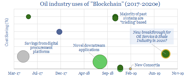
This datafile tabulates ten examples of deploying Blockchain in the oil and gas industry since 2017; including companies and cost savings. Most prior examples are in trading. For 2020, we are particularly excited by the broadening of Blockchain technologies into the procurement industry, which can deflate shale costs.
Download the Screen?
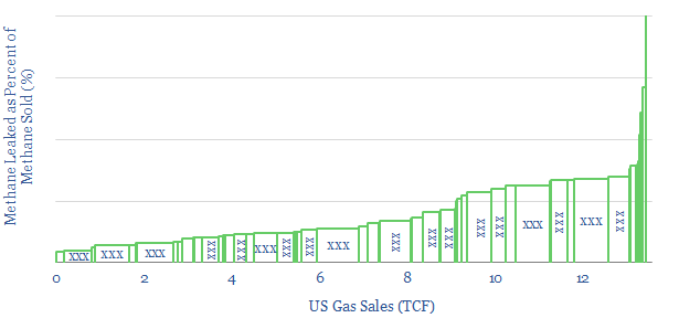
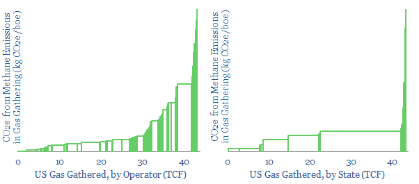
This data-file screens the methods available to monitor for methane emissions. Notes and metrics are tabulated. Emerging methods, such as drones and trucks are also scored, based on technical trials. The best drones can now detect almost all methane leaks >90% faster than traditional methods. c34 companies at the cutting edge are screened.
Download the Screen?
Gas and diesel engines can be 30-80% less efficient when idling, or running at low loads. This is the rationale for hybridizing engines with backup batteries. Industrial applications are increasing, achieving 30-65% efficiency gains, across multiple industries. In 2018-19, the biggest new horizon has been in oil and gas, including hybrid rigs, supply vessels, construction vessels and even LNG plants.
Download the Screen?
This data-file tabulates headline details of c35 companies commercialising catalysts for the refining industry, in order to improve conversion efficiencies and lower CO2 emissions. Five early-stage private companies stand out, while we also profile which Majors have recently filed the most patents to improve downstream catalysis.
Download the Screen?
This data-file is a global hydrogen market breakdown, disaggregating the 110MTpa market (mainly ammonia, methanol and refining), how it is met via different production technologies, and our estimates of those technologies' costs (in $/kg) and CO2 intensities (in kg/kg or tons/ton).
Download the Screen?
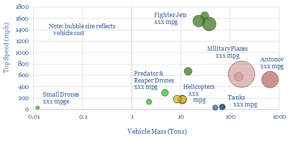
Swarms of drones are emerging as the most devastating military weapon of the 21st century. This was evidenced by the recent attack on Saudi oil infrastructure. But drones' impact on 0.7Mbpd of global military oil demand could be even more devastating. This data-file quantifies their fuel economy at >1,000 mpge compared to today's fighter jets, tanks, helicopters and planes that achieve
Download the Screen?
What if CO2 was not a waste product, but a valuable commercial feedstock? We have assessed the top 27 companies at the cutting edge, commercialising CO2 into next-generation plastics, foams, concretes, specialty chemicals and agricultural products. Each company is assessed in detail. 13 are particularly exciting. 21 are start-ups. Aramco, Chevron, Repsol also screen well.
Download the Screen?
Over 20 next-generation subsea robotics concepts are presented. These electric solutions are increasingly autonomous, they reside subsea and can conduct more thorough inspection/intervention work. Inspection is 2-6x faster, and maintenance costs can be halved, yielding savings of $0.5-1/boe at a typical field. The data-file also summarizes the leading Majors and Service Companies in the space.
Download the Screen?
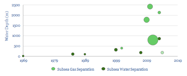
This database covers all 14 subsea separation projects across the history of the oil industry, going back to the "dawn of subsea" in 1969. The technology has been elusive, with just a handful of applications, the largest of which is 2.3MW. This could change, with the pre-salt partners pioneering an unprecedented 6MW facility at Mero.
Download the Screen?
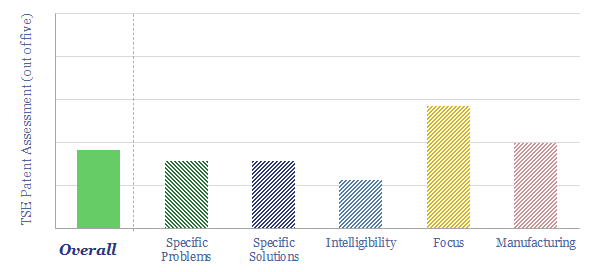
This data-file screens c30 next-generation nuclear companies at the cutting edge of fission and fusion technology. The median one employs 100 people, is developing a 150MWe reactor, and could reach commerciality by 2035. But how has this landscape of companies progressed in the past few years?
Download the Screen?
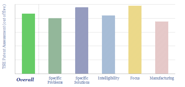
This data-file quantifies the leading companies in Distributed Acoustic Sensing (DAS), the game-changing technology for enhancing shale and conventional oil industry productivity. Operators are screened from their patents and technical papers. Services are screened based on their size and their technology.
Download the Screen?
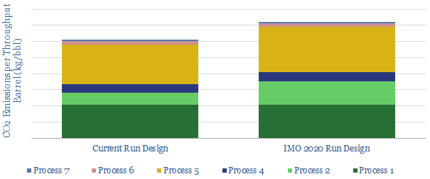
We review the top, proprietary technologies that we have seen from analysing patents and technical papers, to capitalise on IMO 2020 sulphur regulation, across the world's leading integrated oil companies.
Download the Screen?
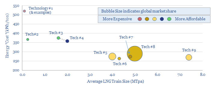
This data-file is an overview of different LNG liquefaction technologies: APCI, APX, Optimised Cascade, Fluid Cascade, DMR, SMR, PRICO and MMLS. A typical LNG liquefaction plant has energy intensity of 280kWh/ton, consuming 5% of the input gas entering the plant, with 20kg/boe of Scope 1&2 CO2 intensity. But efficient and electric-drive compression can lower these penalties by at least 50-75%.
Download the Screen?
Breakthrough Technologies
This data-file aggregates all of our patent assessments into a single reference file, so different companies' scores can be compared and contrasted. Our average score is 3.5 out of 5.0. Skew is to the downside. Intelligibility is the biggest challenge. Scores correlate with TRL and revenues.
Download the Patent Screen?
Cummins is a power technology company, listed in the US, specializing in diesel engines, underlying components, exhaust gas after-treatment, diesel power generation and pivoting towards hydrogen. We reviewed 80 patents from 2023-24. What outlook for Cummins technology and verticals in the energy transition?
Download the Patent Screen?
Is Babcock and Wilcox's BrightLoop technology a game-changer for producing low-carbon hydrogen from solid fuels, while also releasing a pure stream of CO2 for CCS? Conclusions and deep-dive details are covered in this data-file, allowing us to guess at BrightLoop's energy efficiency and a moat around Babcock's reactor designs?
Download the Patent Screen?
This data-file is our LONGi technology review, based on recent patent filings. The work helps us to de-risk increasingly efficient solar modules, a growing focus on perovskite-tandem cells, and low-cost solar modules, with simple manufacturing techniques that may ultimately displace bottlenecked silver from electrical contacts. Key conclusions in the data-file.
Download the Patent Screen?
Origen Carbon Solutions is developing a novel DAC technology, producing CaO sorbent via the oxy-fuelled calcining of limestone with no net CO2 emissions. It is similar to the NET Power cycle, but adapted for a limestone kiln. The concept is very interesting. Our base case costs are $200-300/ton of CO2. This data-file contains our Origen DAC technology review.
Download the Patent Screen?
Solar encapsulants are 300-500μm thick films, protecting solar cells from moisture, dirt and degradation; electrically insulating them at 4 x 10^15 Ωcm resistivity; and yet allowing 90% light transmittance. The industry is moving away from commoditized EVA towards specialized blends of co-polymers and additives. Is there a growing moat around Mitsui Chemicals' solar encapsulants?
Download the Patent Screen?
This data-file reviews Verdox DAC technology, optimizing polyanthraquinones and polynaphthoquinones, then depositing them on porous carbon nano-tube scaffolds. These quinones are shown to selectively adsorb CO2 when a voltage is applied, then desorb them when a reverse voltage is applied, unlocking 70% lower energy penalties than incumbent DAC?
Download the Patent Screen?
Solvay is a chemicals company with growing exposure to battery materials, especially the PVDF binders that hold together active materials in the electrodes. But also increasingly in electrolyte solvents, salts and additives. Interestingly, our patent review finds optimizations of this overall system can improve the longevity and energy density of batteries, which may also lead to consolidation across the battery supply chain?
Download the Patent Screen?
Pressure exchangers transfer energy from a high-pressure fluid stream to a low-pressure fluid stream, and can save up to 60% input energy. Energy Recovery Inc is a leading provider of pressure exchangers, especially for the desalination industry, and increasingly for refrigeration, air conditioners, heat pump and industrial applications. Our technology review finds a moat.
Download the Patent Screen?
Our Plug Power technology review is drawn from the company's recent patent filings, which offer some of the most detailed disclosures we have ever seen into the manufacturing of PEM electrolysers and fuel cells, underlying catalyst materials, membranes and their manufacturing. One patent seems like a breakthrough. Other patents candidly presented challenges.
Download the Patent Screen?
MIRALON is an advanced material, being commercialized by Huntsman, purifying carbon nanotubes from the pyrolysis of methane and also yielding turquoise hydrogen. This data-file reviews MIRALON technology, patents, and a strong moat. Our model sees 15% IRRs if Huntsman reaches a medium-term cost target of $10/kg MIRALON and $1/kg H2.
Download the Patent Screen?
This data-file reviews Bloom Energy's solid oxide fuel cell technology. What surprised us most was a candid overview of degradation pathways of solid oxide fuel cells, a focus on improving the longevity of fuel cells, albeit this sometimes seems to be via heavy uses of Rare Earth metals, and increasing complexity. The patents do suggest a moat around Bloom Energy fuel cell technology.
Download the Patent Screen?
Newlight is converting (bio-)methane and air into polyhydroxybutyrate (PHB), a type of polyhydroxyalkanoate (PHA), a biodegradable bioplastic which it markets as AirCarbon. The product is 'carbon negative', biodegradable, strong, 'never soggy', dishwasher safe. Our AirCarbon technology review found some good underlying innovations, but was unable to de-risk cost and capex aspirations.
Download the Patent Screen?
Montana Technologies is developing AirJoule, an HVAC technology that uses metal organic frameworks, to lower the energy costs of air conditioning by 50-75%. The company is going public via SPAC and targeting first revenues in 2024. Our AirJoule technology review finds strong rationale, technical details and challenges.
Download the Patent Screen?
Alterra Energy has steadily been refining its plastic recycling technology since 2017. The company recently signed license agreements with Neste and Freepoint. The technology is a continuous reactor, with seven discrete stages, using scavengers to remove contaminants, and patented hardware to minimize fouling and devolatilize chars.
Download the Patent Screen?
Advantage is a Montney gas producer, which recently sourced a $300M investment from Brookfield to scale up its Entropy23 amine blend for natural-gas CCS. Entropy has captured 90-93% of the CO2 at the first pilot plant at Glacier, Alberta, with 2.4 GJ/ton reboiler duty, 40% below MEA. This 7-page report confirms a moat around the technology and raises three challenges.
Download the Patent Screen?
Topsoe autothermal reforming technology aims to maximize the uptime and reliability of blue hydrogen production, despite ultra-high combustion temperatures from the partial oxidation reaction, while achieving high energy efficiency, 90-97% CO2 capture and
Download the Patent Screen?
Electra is developing an electrochemical refining process, to convert iron ore into high purity iron, and ultimately into steel, using only renewable electricity. It has raised c$100M, gained high-profile backers, and is working towards a test plant. This 9-page note reviews an exceptionally detailed patent, finds clear innovations, but also some remaining risks and cost question marks.
Download the Patent Screen?
Aker Carbon Capture is a public company, listed in Norway, with c120 permanent employees. It has developed novel solvents for post-combustion carbon capture, modular CCS plants (JustCatch, at 40-100kTpa, and BigCatch at >400kTpa). The company aims to secure contracts for 10MTpa of CCS by 2025. This technology review looks for a moat in the patents.
Download the Patent Screen?
Membrane Technology and Research Inc. (MTR) is a private company, specializing in membrane separations, for the energy industry, chemicals and increasingly, CCS. Its Gen 2-3 Polaris membranes have 50x CO2:N2 selectivity, 2,000-3,000 GPU permeabilities, and are at TRL 6-7. Is there a moat?
Download the Patent Screen?
Boston Metal aims to decarbonize steel, using molten oxide electrolysis, absorbing 4MWH/ton of steel. This data-file is a Boston Metal technology review, based on assessing 55 patents across 3 families. We were unable to de-risk the technology. A key challenge is conveying current into the cell, as it operates around 1,600C, which is above the melting point of most feasible conductor materials.
Download the Patent Screen?
Amprius is commercializing a lithium-ion battery with a near-100% silicon anode, yielding 80% higher energy density. It can achieve 80% charge within 6-minutes. The company is listed on NYSE. We have reviewed Amprius' silicon anode technology. The patent library is excellent, goes back to 2009 and has locked upon a specific design. This allows us to guess at costs, degradation and longevity.
Download the Patent Screen?
NEL is a green hydrogen technology company, headquartered in Oslo, listed on the Oslo Børs since 2014, and employing 575 people. It has manufactured 3,500 electrolyser units, going back to 1927, historically weighted to alkaline electrolysers, and increasingly focused on PEMs and hydrogen fuelling stations. This NEL technology review explores its patents.
Download the Patent Screen?
Verbio is a bio-energy company, founded in 2006, listed in Germany, producing bio-diesel, bioethanol, biogas, glycerin and fertilizers. The company has stated "we want to be in a position to convert anything that agriculture can deliver to energy". Our Verbio technology review is based on its patents. We find some fascinating innovations in cold mash ethanol, integrated with biogas production, and making biogas from lignocellulosic feedstock.
Download the Patent Screen?
Hillcrest Energy Technologies is developing an ultra-efficient SiC inverter, which has 30-70% lower switching losses, up to 15% lower system cost, weight, size, and thus interesting applications in electric vehicles. How does it work and can we de-risk the technology?
Download the Patent Screen?
Our NET Power technology review shows over ten years of progress, refining the design of efficient power generation cycles using CO2 as the working fluid. The patents show a moat around several aspects of the technology. And six challenges at varying stages of de-risking.
Download the Patent Screen?
Goldwind is one of the largest wind turbine manufacturers in the world, headquartered in Beijing, and shares are publicly listed. The wind industry is increasingly aiming to mimic the inertia and frequency responses of synchronous power generators. Goldwind has published some interesting case studies. Hence we have reviewed its patents to see if we can find an edge?
Download the Patent Screen?
Jetti Resources has developed a breakthrough technology to recover copper from low-grade sulfide ores, by leaching with sulphuric acid, thiocarbonyls, ferric iron (III) sulphates and oxidizing bacteria. The patents lock up the technology, with detailed experimental data. But what are the costs of copper production, what CO2 intensity and what technical challenges remain?
Download the Patent Screen?
Tigercat is a private company, founded in 1992, headquartered in Ontario, Canada, with c2,000 employees. The company produces specialized machinery for forestry, logging, materials processing and off-road equipment. Our patent review has found a moat around reliable, easy-to-maintain, mobile and efficient forestry equipment.
Download the Patent Screen?
This data-file is a review of Agilyx's plastic recycling technology, after assessing the company's patents on our usual framework. We conclude that Agilyx has developed a novel and data-driven process, to remove challenging contaminants from feedstocks. Although it may involve higher complexity, higher reagent opex, and some challenges cannot entirely be de-risked from the patents.
Download the Patent Screen?
This data-file is a technology review for Sentient Energy, assessing innovations in smart grids. Its technology can achieve energy savings via a combination of "Conservation Voltage Reduction" and "Volt-VAR optimization at the grid edge". This also helps to integrate more solar and EV charging into power grids. We explain the technology.
Download the Patent Screen?
Powin commercializes energy storage hardware and software. Its LFP battery system is 30% more compact than peers, at 200 MWH/acre, and modular, meaning it may be 50% faster to install. Our patent review finds a moat around specific process improvements, to help back up the short-term volatility of solar and wind.
Download the Patent Screen?
X-Energy is a next-generation nuclear company, progressing a demonstration project in Washington State, due to start up in 2027. The key innovation is using TRISO fuels, whose manufacturing is locked up with a concentrated patent library. Long-term costs are suggested at 6c/kWh.
Download the Patent Screen?
Prysmian scores well on our patent assessment framework. We conclude an array of incremental improvements and industry specializations confer a partial moat and helps to de-risk future installation work.
Download the Patent Screen?
Nostromo is commercializing a thermal energy storage system, for commercial buildings in hot climates, where AC can comprise 40-70% of total energy use. It scores highly on our patent framework and can be an interesting alternative to lithium batteries.
Download the Patent Screen?
PureCycle was founded in 2015, went public via SPAC in 2021 and aims to recycle waste polypropylene into virgin-like polypropylene saving 79% of the usual input energy and 35% of the input CO2. Despite recent controversies, our PureCycle technology review is able to de-risk several ambitions.
Download the Patent Screen?
Aurubis produces copper products from 1MTpa of recycled materials and 2.25MTpa of concetrates. Energy use and CO2 emissions are two-thirds lower than primary copper production. Our technology review finds a partial moat.
Download the Patent Screen?
TerraPower is one of the most active next-generation nuclear companies, with funding from Bill Gates, and 600 engineers working towards the first, 345MWe Natrium reactor before 2030. We could not entirely de-risk a "breakthrough" due to the breadth and novelty of its patents.
Download the Patent Screen?
Semi-solid electrodes are aimed at "dramatically reducing" costs of lithium ion batteries, with 70-100% higher energy density, plus better safety and reliability, for use in battery storage and electric vehicles. 24M has a moat and is licensing technology to Freyr and Volkswagen.
Download the Patent Screen?
Nexwafe is growing standalone silicon wafers on mono-crystalline seed wafers, with no need to slice ingots. It should improve solar efficiency, materials intensity and CO2 intensity. Our technology review found 60 patent filings and can partly de-risk growth ambitions.
Download the Patent Screen?
Terrestrial Energy is a next-generation nuclear fission company, aiming to build a small modular reactor: specifically a 2 x 195MWe Integral Molten Salt Reactor with ultimate costs below $3,000/kWe, yielding levelized costs of 5-7c/kWh. 80 patents lock up 8 core innovations in a high-quality library that helps de-risk the potential.
Download the Patent Screen?
Albemarle is a specialty chemicals company. Our patent screen de-risks incremental improvements in novel fire-proofing bromine compositions, further and better lithium pathways, and longer-lasting catalysts for cleaner fuels. Overall we think 70% of the patents are for technologies that will advance the energy transition in some way.
Download the Patent Screen?
General Fusion is developing a magnetized target fusion reactor, compressing plasma via high-pressure pistons. It hopes to commercialize 100-200MWe fusion reactors with 5-6.5c/kWh levelized costs of electricity in the late 2020s. Our patent de-risks several innovations. Although complexity is high and we note four residual risks for the technology.
Download the Patent Screen?
Tricoya is an engineered wood product like MDF, but it has been "acetylated", in order to confer >50-year longevity, even when exposed to the elements. Accsys Technologies is the parent company listed on AIM and Euronext Amsterdam. This data-file reviews its technology and patent library.
Download the Patent Screen?
CATL produces one-third of the world's lithium ion batteries. Its patents have warned of devastating lithium shortages since at least 2016. Hence in 2021, it announced it would produce commercial sodium-ion batteries by 2023. The technical challenges are captured in its patent library. We cannot fully de-risk its 2023 target.
Download the Patent Screen?
First Solar is a solar manufacturer with capacity to produce 8GW of solar panels per year, using CdTe thin film technology. It has production in the US and uses 60% less energy than photovoltaic silicon. Efficiency is interesting. It is usually lower for CdTe than c-Si, but 70% of First Solar's patents target improvements.
Download the Patent Screen?
Stora Enso is a pulp, paper and forestry products business, headquartered in Finland, with €10bn per year of revenues. It argues "everything made from fossil-based materials today can be made from a tree tomorrow". Our patent screen finds a strong focus on sustainable packaging solutions, especially Microfibrillated Cellulose (MFC).
Download the Patent Screen?
Svante is suggesting its technology can absorb 90% of CO2 in a 60-second cycle that costs 50% less than conventional CCS. It has attracted an amazing list of investors and partners. Agonizingly we could not de-risk the technology based on our usual patent review.
Download the Patent Screen?
Our patent review found CFS to have a high-quality patent library, of specific, intelligible, commercially-minded innovations to densify the magnets that would confine plasma in a tokamak for nuclear fusion. Specific details, and minor hesitations are in the data-file.
Download the Patent Screen?
ESS is emerging as a leader in medium-duration energy storage (4-12 hours), with an iron flow battery costing 2-5c/kWh (assuming >daily cycling) and lasting 20,000 cycles. The patent library is high quality. We note five challenges to consider. The largest is round-trip efficiency.
Download the Patent Screen?
NuScale is developing a small modular nuclear reactor (SMR), producing 77MWe of power. It is the first SMR design to win US regulatory approval and the first plant is being built in Romania for 2028. NuScale's patents scored well on our framework.
Download the Patent Screen?
CarbonCure injects CO2 into concrete during the mixing process, where it mineralizes. The resultant product can most likely save 4-6% of the CO2 intensity of finished concrete. Question marks are explored in the data-file.
Download the Patent Screen?
SolarEdge specializes in the power-electronics needed to use solar energy in practical power systems. Our patent review finds a good, but broad array of incremental improvements. They suggest a vast future market in solar-battery energy systems.
Download the Patent Screen?
Aerogels have thermal conductivities that are 50-80% below conventional insulators. Target markets include preventing thermal runaway in electric vehicle batteries and cryogenic industrial processes (e.g., LNG). This data-file notes some challenges, using our usual patent review framework.
Download the Patent Screen?
Solid Power is developing solid-state batteries, using sulphide electrolytes. Ambitious goals include >500 miles of EV range (50-100% more than today's lithium ion batteries), 2x higher life-spans and costs as low as $85/kWh. The company is going public via SPAC, valued at $1.2bn, and has an exceptional list of backers.
Download the Patent Screen?
Carbon Clean is a CCS company. It has already captured over 1MT, across 38 facilities. But in addition, it is developing a next-generation design, which could ultimately lower cost to $30-40/ton. Our review finds a very decent, albeit concentrated patent library, following our usual framework.
Download the Patent Screen?
Monolith claims it is the "only producer of cost effective commercially viable clean hydrogen today" as it has developed a proprietary technology for methane pyrolysis. But overall this was not one of our most successful patent screens. Some specific question marks are noted in the data-file.
Download the Patent Screen?
Shoals Technologies Group manufactures electrical balance of system solutions for solar energy projects, focused on promoting reliability, safety and ease of installation. Electrical installation costs can be lowered 40%. Our patent review finds a technology moat on 35% EBITDA margins.
Download the Patent Screen?
ChargePoint is the leading provider of Level 2 EV charging stations in the US and aims to help electrify mobility and freignt. Our review finds a library of simple, clear, specific and easy-to-understand patents. More debatable are the technology edge and future IP defensability.
Download the Patent Screen?
Form Energy is aiming to commercialize a metal-air battery, for long-duration energy storage, using only safe and Earth-abundant materials. The first 1MW/150MWH system could be deployed by 2023. Compared to other patent libraries, we have found it harder to de-risk Form's technology.
Download the Patent Screen?
Lilac Solutions aims to commercialize a lithium ion exchange technology, which can extract lithium from dilute brine solutions, rapidly, economically and scalably. Overall Lilac's patents look promising to us. They contain some excellent, precise and intelligible details on making ion exchange materials.
Download the Patent Screen?
Siemens Gamesa is a leader in offshore wind, pushing the boundaries towards a 14MW turbine with an incredible 222m rotor diameter. Our main debate from reviewing its patents is whether the engineering challenges of large turbines is consistent with deflation expectations.
Download the Patent Screen?
Stem Inc. went public via SPAC in April-2021, supporting grid-scale batteries with optimization software, which can lower energy bills by 10-30% in the energy transition. Its patents scored reasonably well on our usual framework. Managing short-term renewables volatility was a crucial focus.
Download the Patent Screen?
Array Technologies IPO-ed in October-2020. It manufactures solar tracking systems, supporting 25% of US solar modules installed to date. Its systems can uplift solar generation by 5-25%. we found clear, specific, intelligible patents, back-stopping six out of seven key strengths that have been cited by the company.
Download the Patent Screen?
Carbios has developed an enyzmatic process to recycle 90% of PET within 10-hours, which has been described in Nature. "This highly efficient, optimized enzyme outperforms all PET hydrolases reported so far". Economics and CO2 savings can be very exciting. But our work identifies four challenges, which were hard to re-risk.
Download the Patent Screen?
Climeworks is a Swiss company, founded in 2009, commercializing a direct air capture technology. The main innovation in its patents optimizes air flow, to avoid steep pressure drops, which can otherwise de-rail DAC economics. But we are still unable to de-risk sub-$200/ton CO2 costs based on reviewing the patents.
Download the Patent Screen?
Danimer Scientific is a producer of PHA, a biodegradable plastic feedstock. PHA still has commercial challenges in its processing, mechanical properties and 4-5x higher costs than conventional plastics. Yet our patent review finds Danimer has made some specific, intelligible innovations, earning a solid score of 3.5 on our technology framework.
Download the Patent Screen?
Nio is a listed, electric vehicle manufacturer, headquartered in Shanghai. It operates over 200 "battery swap" stations, and the 2-millionth battery swap was completed in March-2021, with swap times soon falling to 3-minutes. Our patent analysis suggests a genuine moat in swappable batteries, which could only have been built up by an auto-maker.
Download the Patent Screen?
LanzaTech aspires to "take waste carbon emissions and convert them" into sustainable fuels (and bio-plastics) with a >70% CO2 reduction. We have assessed its patents but concluded we cannot yet de-risk the CO2-to-fuels pathway in our energy transition models.
Download the Patent Screen?
Origin Materials went public via SPAC in February-2021, as it was acquired by Artius Acquisition Inc at a valuation of $1.8bn. Its ambition is to use wood residues to create carbon-negative plastics, cost-competitively with petroleum products. This data-file outlines our conclusions from reviewing patents.
Download the Patent Screen?
Enovix has developed a 3D silicon lithium-ion battery, 5-years ahead of the broader industry, with 2x higher energy density. The company went public via SPAC in February-2021, with an implied post-deal valuation of $1.12bn. This data-file assesses its technology breakthroughs.
Download the Patent Screen?
StoreDot is developing "extreme fast-charging" batteries for electric vehicles, using a proprietary range of nanomaterial additives. It claims prototype cells can charge 5-6x faster than conventional lithium ion. This data-file assesses StoreDot patents from 2019-20, looking to de-mystify its breakthroughs.
Download the Patent Screen?
This data-file reviews 25 of QuantumScape's 2019-20 patents, in order to substantiate its claims of a solid-state battery than can achieve c50-100% higher energy density than conventional lithium ion batteries, 3x faster charging, while also surviving hundreds of charge-discharge cycles without degradation.
Download the Patent Screen?
This data-file tabulates the greatest challenges and focus areas for harnessing deep geothermal energy, based on reviewing 30 recent patents from 20 companies in the space. We conclude that recent advances from the unconventional oil and gas industry are going to be a crucial enabler.
Download the Patent Screen?
CO2 Intensity and Energy Intensity
This data-file tabulates the energy intensity and CO2 intensity of materials, in tons/ton of CO2, kWh/ton of electricity and kWh/ton of total energy use per ton of material. The build-ups are based on 160 economic models that we have constructed to date, and simply intended as a helpful summary reference. Our key conclusions on CO2 intensity of materials are below.
Download the Data?
This data-file aggregates granular data into US gas transmission, by company and by pipeline, for 40 major US gas pipelines which transport 45TCF of gas per annum across 185,000 miles; and for 3,200 compressors at 640 related compressor stations.
Download the Data?
MOSFETs are fast-acting digital switches, used to transform electricity, across new energies and digital devices. MOSFET power losses are built up from first principles in this data-file, averaging 2% per MOSFET, with a range of 1-10% depending on voltage, switching, on resistance, operating temperature and reverse recovery charge.
Download the Data?
Lithium ion batteries famously have cathodes containing lithium, nickel, manganese, cobalt, aluminium and/or iron phosphate. But how are these cathode active materials manufactured? This data-file gathers specific details from technical papers and patents by leading companies such as BASF, LG, CATL, Panasonic, Solvay and Arkema.
Download the Data?
What is the energy intensity of fiber optic cables? Our best estimate is that moving each GB of internet traffic through the fixed network requires 40Wh/GB of energy, across 20 hops, spanning 800km and requiring an average of 0.05 Wh/GB/km. Generally, long-distance transmission is 1-2 orders of magnitude more energy efficient than short-distance.
Download the Data?
The CO2 intensity of oil and gas production is tabulated for 425 distinct company positions across 12 distinct US onshore basins in this data-file. Using the data, we can aggregate the total upstream CO2 intensity in (kg/boe), methane leakage rates (%) and flaring intensity (in mcf/boe), by company, by basin and across the US Lower 48.
Download the Data?
This US refinery database covers 125 US refining facilities, with an average capacity of 150kbpd, and an average CO2 intensity of 33 kg/bbl. Upper quartile performers emitted less than 20 kg/bbl, while lower quartile performers emitted over 40 kg/bbl. The goal of this refinery database is to disaggregate US refining CO2 intensity by company and by facility.
Download the Data?
This data-file is a breakdown of c1MTpa of refrigerants used in the recent past for cooling, across refrigerators, air conditioners, in vehicles, industrial chillers, and increasingly, heat pumps. The market is shifting rapidly towards lower-carbon products, including HFOs, propane, iso-butane and even CO2 itself. We still see fluorinated chemicals markets tightening.
Download the Data?
What is the energy payback and embedded energy of solar? We have aggregated the consumption of 10 different materials (in kg/kW) and around 10 other energy-consuming line-items (in kWh/kW). Our base case estimate is 2.5 MWH/kWe of solar and an energy payback of 1.5-years. Numbers and sensitivities can be stress-tested in the data-file.
Download the Data?
How much does fertilizer increase crop yields? Aggregating all of the global data, a good rule of thumb is that up to 200kg of nitrogen can be applied per acre, increasing corn crop yields from 60 bushels per acre (with no fertilizer) to 160 bushels per acre (at 200 kg/acre). But the relationship is logarithmic, with diminishing returns.
Download the Data?
The CO2 intensity of coal is estimated at 0.37kg/kWh of thermal energy, at a typical coal grade comprising 63% carbon and 6,250 kWh/ton of energy content. This is the average across 25 samples in our data-file, while moisture, ash and sulphur are also appraised. Coal is 2x more CO2 intensive than natural gas.
Download the Data?
The CO2 intensity of producing corn averages 0.23 tons/ton, or 75kg/boe. 50% is from N2O emissions, a powerful greenhouse gas, from the breakdown of nitrogen fertilizer. Producing 1 kWh of food energy requires 9 kWh of fossil energy.
Download the Data?
Scope 4 CO2 emissions capture the CO2 that is avoided by use of a product. Many energy investments with positive Scope 1-3 emissions have deeply negative Scope 1-4 emissions. Numbers are quantified and may offer a more constructive approach to decarbonization investments.
Download the Data?
Global palm oil production runs at 80MTpa, for food, HPC and bio-fuels. Carbon intensity is 1.2 tons CO2e per ton of crude palm oil, excluding land use impacts, and 8.0 tons/ton on a global basis including land use impacts. This means once a bio-fuel has more than c35% palm oil in its feedstock, it is likely to be higher carbon than conventional diesel.
Download the Data?
This data-file calculates the CO2 intensity of wood in the energy transition. Context matters, and can sway the net climate impacts from -2 tons of emissions reductions per ton of wood through to +2 tons of incremental emissions per ton of wood. Calculations can be stress-tested in the data-file.
Download the Data?
Methane leaks from 1M pneumatic devices across the US onshore oil and gas industry comprise 50% of all US upstream methane leaks and 20% of upstream CO2. This file aggregates the data. Rankings reveal operators with a pressing priority to replace >100,000 medium and high bleed devices, and other best-in-class companies.
Download the Data?
630 companies have now pledged to reach some variant of net zero by early-2022. The average year for this ambition is 2044. Although it varies by sector. 50% of companies are including some Scope 3 emissions in their definitions. This data-file presents our conclusions by sector.
Download the Data?
There are 1,500 industrial furnaces in the US manufacturing sector, with average capacity of 60MWth, c90% powered by natural gas, and thus explaining over 3.5 bcfd of US gas demand (4-5% of total). This is an unbelievably complex landscape, but we have captured as much facility-by-facility data as possible.
Download the Data?
This data-file summarizes the costs of capturing CO2. The lowest-cost options are to access pure CO2 streams that are simply being vented at present. Next are blue hydrogen, steel and cement, which could each have GTpa scale. Power stations place next, at $60-100/ton. DAC is carbon negative but expensive.
Download the Data?
The most important determinant of cooking's CO2 intensity is consumer behaviour. At today's energy costs and grid mix, gas-fired cooking yields the lowest costs. Sometimes electrification of cooking will decrease CO2 and sometimes not. Electric induction is most efficient, but 2-3x more expensive than gas and electric hobs.
Download the Data?
This data-file summarizes over a dozen industrial heating technologies, including their temperatures, efficiency, advantages and challenges. Generally 90% of incoming energy can be converted to industrial process heat and c40% achieves useful exergetic output. But ranges very broadly from 10-90%.
Download the Data?
This data-file calculates the costs, the embedded energy and the embedded CO2 of different construction materials, both during their production and for ongoing heating and cooling. Insulated wood and cross-laminated timber have the lowest CO2 intensities and can be extremely cost competitive.
Download the Data?
This data-file illustrates the outsized contribution of blue carbon ecosystems in the carbon cycle, looking across mangroves, tidal marshes, sea grasses and peat bogs. Degradation of blue carbon ecosystems continues with vast CO2 consequences, comparable to the entire global cement industry.
Download the Data?
The aim of this data-file is to compile CO2 concentrations in industrial exhaust streams, as a molar percentage of flue gas. This matters for the costs of CO2 separation. Most promising CCS candidates are bio-ethanol plants, industrial hydrogen production and some gas processing, followed by cement and steel plants.
Download the Data?
The average American consumes 36MWH of energy each year, emits 20 tons of CO2, spends $2,000 directly on energy (6% of income) and $4,500 including the energy embedded in goods and services (15% of income). A CO2 price of $75/ton may fully decarbonize the US but would absorb another 5% of average income.
Download the Data?
Manufacturing metal components can be extremely energy intensive, as 60-95% of original materials are often machined away. Additive manufacturing is thus able to deliver c65% CO2 savings per kg of materials in our base case. This data-file quantifies the CO2 savings based on input variables and technical papers.
Download the Data?
CO2-cured concrete has c60% lower emissions than traditional concrete, which is the most widely used construction material on the planet, comprising 4bn tons of annual CO2 emissions, or 8% of the global total. This data-file profiles the CO2 and economic costs of Solidia versus traditional cement, to size the opportunity.
Download the Data?
US bioethanol plants produce 1Mbpd of liquid fuels, with an average CO2 intensity of 85kg/boe. Overall, corn-based bioethanol has c40% lower CO2 than oil products. We screened the leaders and laggards by CO2-intensity, covering Poet, Valero, Great Plains, Koch, Marathon and White Energy.
Download the Data?
Producing a ton of coal typically emits 0.19T of CO2, equivalent to 50kg/boe. The numbers comprise mining, methane leaks and transportation. Hence domestic coal production will tend to emit 2x more CO2 than gas production, plus c2x more CO2 in combustion. However, numbers vary widely based on input assumptions, such as methane lakage rates, btu content and transportation distances, which can be flexed in the model.
Download the Data?
This data-file calculates the CO2 intensity of producing plastics, based on emissions data from over 20 US petrochemical facilities. We find plastic packaging should tend to be c90% lower-CO2 than glass. Efficiency is improved by larger, integrated crackers and petrochemical plants.
Download the Data?
This data-file calculates the contribution of Platform Supply Vessels (PSVs) to an oil and gas asset's emissions. Our base case estimate is 0.1kg/boe for a productive asset in a well-developed basin. Numbers rise 4x in a remote basin, and by another c4x for smaller fields. 1kg/boe is possible. These emissions can be lowered by 10-20% through by LNG-fuelling or battery-hybridization.
Download the Data?
This data-file quantifies the CO2 intensity of oil sands mining and SAGD, line by line, based on real-world data. We also derive a CO2 curve ranking c2.5Mbpd of production across Alberta, to compare different operators. Steam-oil-ratios explain c60% of the variance in SAGD assets' emissions.
Download the Data?
Methane leakages average 0.2% when distributing natural gas to end-customers, across the US's 160 retail gas networks. Leakages are most correlated with the share of sales to smaller customers. 80 distinct gas companies are ranked in this data-file. State-owned utilities appear to have 2x higher leakage rates versus public companies.
Download the Data?
This model disaggregates the CO2 emissions of producing shale oil, across 14 different contributors: such as materials, drilling, fracturing, supply chain, lifting, processing, methane leaks and flaring. CO2 intensity can be flexed by changing the input assumptions. Our 'idealized shale' scenario follows in a separate tab, showing how Permian shale production could become 'carbon neutral'.
Download the Data?
With methane emissions fully controlled, burning gas is c60% lower-CO2 than burning coal. However, taking natural gas to cause 120x more warming than CO2 over a short timeframe, the crossover (where coal emissions and gas emissions are equivalent) is 4% methane intensity. The gas industry must work to mitigate methane.
Download the Data?
Gas gathering and gas processing are 50% less CO2 intensive than oil refining. Nevertheless, these processes emitted 18kg of CO2e per boe in 2018. Methane matters most, explaining 7kg/boe of gas industry CO2-equivalents. This data-file assesses 850 US gas gathering and processing facilities, to screen for leaders and laggards, by geography and by operator.
Download the Data?
What is more CO2-intensive: the c4,000 truck trips needed to complete a shale well, or giant offshore service vessels (OSVs), which each consume >100bpd of fuel? This data-file quantifies the CO2 intensity of supply-chains, for 10 different resource types, as a function of 30 input variables.
Download the Data?
This data-file tabulates Permian CO2 intensity, based on regulatory disclosures from 20 of the leading producers to the EPA. The data are disaggregated by company, across 18 different categories, such as combustion, flaring, venting, pneumatics, storage tanks and methane leaks. There are opportunities to lower emissions.
Download the Data?
This data-file estimates the CO2 intensity of drilling oil wells, based on the fuel consumption of different rig types. Drilling wells is not the largest portion of the oil industry's total CO2 intensity. Nevertheless there is a 50x spread between the best barrels at prolific onshore fields and the worst barrels at mature deepwater assets.
Download the Data?
CO2 intensity of oil refineries could rise by 20% due to IMO 2020 sulphur regulations, if all high-sulphur fuel oil is upgraded into low-sulphur diesel, we estimate. The drivers are an extra stage of cracking, plus higher-temperature hydrotreating, which will also increase hydrogen demands. This one change could undo 30-years of efficiency gains.
Download the Data?
Industry Data
Annual commodity prices are tabulated in this database for 70 materials commodities; covering steel prices, other metal prices, chemicals prices, polymer prices, all with data going back to 2012. 2022 was a record year for commodities. The average material commodity traded 25% above its 10-year average and 60% of all material commodities made ten-year highs.
Download the Data?
Electronic devices are changing the world, from portable electronics to AI data centers. Hence what materials are used in electronic devices, as percentage of mass, and in kg/kW terms? This data-file tabualates the bill of materials, for different devices, across different studies.
Download the Data?
Electromagentic radiation is a form of energy, exemplified by light, infrared, ultraviolet, microwaves and radiowaves. What is the energy content of light? How much of it can be captured in a solar module? And what implications? We answer these questions by explaining the Planck Equation and Shockley-Queisser limit from first principles.
Download the Data?
Generac is a US-specialist in residential- and commercial-scale power generation solutions, founded in 1959, headquartered in Wisconsin, with 8,800 employees and $7bn of market cap. What outlook amidst power grid bottlenecks? To answer this question, we have tabulated data on 250 Generac products.
Download the Data?
What are the typical sizes of grid connections at different residential, commercial and industrial facilities? This data-file derives aggregates estimates, from the 10kW grid connections of smaller homes to the GW-scale grid connections of large data-centers, proposed green hydrogen projects and aluminium plants.
Download the Data?
More and more renewables plus batteries projects are being developed as grids face bottlenecks? On average, projects in 2022-24 supplemented each MW of renewables capacity with 0.5MW of battery capacity, which in turn offered 3.5 hours of energy storage per MW of battery capacity, for 1.7 MWH of energy storage per MW of renewables.
Download the Data?
Across 130 offshore oil fields in Norway, going back ato 1975, real development capex per flowing barrel of production has averaged $33M/kboed. Average costs have been 2x higher when building during a boom, when one-third of projects blew out to around $100M/kboed or higher. The data support countercyclical investment strategies in energy.
Download the Data?
This data-file is a breakdown of global energy demand by end use, drawing across our entire research library, to disaggregate the global energy system across almost 50 applications, across transportation, heat, electricity, materials and manufacturing. Numbers, calculations, efficiencies and heating temperatures are in the data-file.
Download the Data?
The minimum CO2 purity for CCS starts at 90%, while a typical CO2 disposal site requires 95%, CO2-EOR requires 96%, CO2 pipelines require 97% and CO2 liquefaction or shipping requires >99%. This data-file aggregates numbers from technical papers and seeks to explain CO2 purity for transport and disposal.
Download the Data?
Perfluorinated sulfonate (PFSA) membranes, such as Nafion, are the crucial enabler for PEM electrolyzers, fuel cells and other industrial processes. The market is worth $750M pa. The key challenges are costs, longevity and hydrogen crossover, which are tabulated in this data-file.
Download the Data?
India's electricity demand is growing by 6-8% (+100-140 TWH) per year, but 75% of the total still comes from coal, which has itself grown at a 5% CAGR over the past half-decade. Wind and solar would need to grow 4x faster than 2023 levels for thermal generation just to flatline. What implications and opportunities for global energy markets?
Download the Data?
Electric vehicle battery life will realistically need to reach 1,500 cycles for the average passenger vehicle, 2,000-3,000 cycles after reflecting a margin of safety for real-world statistical distributions, and 3,000-6,000 cycles for higher-use commercial vehicles. This means lithium ion batteries may be harder to displace with novel chemistries?
Download the Data?
Hydro power generation by facility is tabulated in this data-file for the 20 largest hydro-electric plants in the US. The average facility achieves 43% availability, varying from 39% in hot-dry years to 51% in wet years; and from 33% at the seasonal trough in September-October to 53% at the seasonal peak in May-June. What implications for energy markets and renewables?
Download the Data?
Wind and solar curtailments average around 5% across different grids that we have evaluated in 2022, and have generally been rising over time, especially in the last half-decade. The key reason is grid bottlenecks. Grid expansions are crucial for wind and solar to continue expanding.
Download the Data?
This data-file aggregates the statistical distribution of total electricity demand, solar generation and wind generation, every 5-minutes, across California, for the entirety of 2022, in order to understand their volatility and curtailment rates. The data suggest that wind and solar will most likely peak at 50-55% of renewables-heavy grids.
Download the Data?
California's power grid ranges from 26-61GW of demand. Utility scale solar has almost quadrupled in the past decade, rising from 5% to almost 20% of the grid. Yet it has not displaced thermal generation, which rose from 28% to 36% of the grid. We even wonder whether wind and solar are entrenching natural gas generators as backstops.
Download the Data?
How much wind, solar and/or batteries are required to supply a stable power output, 24-hours per day, 7-days per week, or at even longer durations? This data-file stress-tests different scenarios, with each 1MW of average load requiring at least 3.5MW of solar and 3.5MW of lithium ion batteries, for a total system cost of at least 18c/kWh, and up to 800c/kWh.
Download the Data?
The density of gases matters in turbines, compressors, for energy transport and energy storage. Hence this data-file models the density of gases from first principles, using the Ideal Gas Equations and the Clausius-Clapeyron Equation. High energy density is shown for methane, less so for hydrogen and ammonia. CO2, nitrogen, argon and water are also captured.
Download the Data?
Storage tank costs are tabulated in this data-file, averaging $100-300/m3 for storage systems of 10-10,000 m3 capacity. Costs are 2-10x higher for corrosive chemicals, cryogenic storage, or very large/small storage facilities. Some rules of thumb are outlined below with underlying data available in the Excel.
Download the Data?
Post-combustion CCS plants flow CO2 into an absorber unit, where it will react with a solvent, usually a cocktail of amines. This data-file quantifies operating parameters for CCS absorbers, such as their sizes, residency times, inlet temperatures, structural packings and the implications for retro-fitting CCS at pre-existing power plants.
Download the Data?
What determines the Voltage of an electrochemical cell, such as a lithium ion battery, redox flow battery, a hydrogen fuel cell, an electrolyser or an electrowinning plant? This note explains electrochemical voltages, from first principles, starting with Standard Potentials and the Nernst Equation.
Download the Data?
This datafile calculates the conductivity and resistivity of semiconductors from first principles, based on their bandgap, doping, electron and hole mobility, temperature, the Fermi-Dirac distribution and the Effective Density of States. Put in any inputs you like to compute the resistance of silicon, germanium or GaAs.
Download the Data?
The Boltzmann constant, denoted as kB, or 1.381 x 10^-23 J/K, is the most important number in thermodynamics. It denotes the rate at which a single particle will gain thermal energy (in Joules) as its absolute temperature rises (in Kelvin). It underpins the Boltzmann distribution and the Maxwell-Boltzmann distributions, which matter in modelling gases, energy flows, efficiency, chemical processes and semiconductor.
Download the Data?
Utility-scale solar costs have deflated by 75% in the past decade to around $1,000/kW. 60% has been the scale-up to mass manufacturing, and 40% has been rising efficiency of solar modules. Materials costs now look likely to dominate future costs and their trajectory. And advanced materials can help double efficiency again from here? Who benefits?
Download the Data?
Average home sizes matter for overall residential energy demand, heating and cooling demand. Hence the purpose of this data-file is to aggregate average home sizes by country, then translate the data into living space per capita. A good rule of thumb is that each $1k pp pa of GDP translates one-for-one into 1m2 pp pa of useful living space.
Download the Data?
US residential energy consumption runs at 3,000 MWH per annum, equivalent to one quarter of total US energy consumption. Total demand has run sideways since 1980 as rebound effects and new demand sources have offset underlying efficiency savings?
Download the Data?
In 2023, power grids with c20-30% solar variation tend to have intra-day spreads of 9c/kWh, between peak wholesale electricity prices at 8pm and trough prices at 10am. Unusually, night-time electricity prices are 40% higher than day-time prices. This data-file quantifies California electricity prices, on a wholesale basis, at a sample of grid nodes, looking hour by hour in August-2023.
Download the Data?
This data-file quantifies the energy needed to produce steam, for industrial heat, chemicals, CCS plants and hydrogen reforming? As rules of thumb, low pressure saturated steam at 100◦C requires 2.6 GJ/ton (720kWh/ton), medium pressure dry steam at 6-bar and 300◦C requires 3 GJ/ton (830kWh/ton) and super-critical steam at 250-bar and 600◦C requires 4 GJ/ton (1,150kWh/ton).
Download the Data?
MHI has deployed an amine-based CO2 capture technology, in 15 plants globally, going back to 1999. Reboiler duties are around 2.6 GJ/ton on a 10% CO2 feed. Capture rates and capture purity are high. Degradation and amine emissions are controlled, and c80-90% below MEA. CCS costs and complexities remain high. In our view, this is the true baseline for future next-generation amines to beat. This data-file aggregates notes and datapoints.
Download the Data?
The average US home uses 2,000 kWh of electricity for air conditioners each year. Air conditioning energy consumption is broken down from first principles in this data-file, as a function of temperatures, humidity, heating days, household size, insulation and coefficient of performance (COP). What routes to lower the air conditioning energy demand and CO2 emissions?
Download the Data?
Polyester is the most produced textile fiber on planet Earth. Of the world's 8GTpa of oil and gas production, 80MTpa, or 1% ends up as PET, via eleven chemical processing stages that span naphtha-reforming, BTX separation into paraxylene, oxidation to PTA, plus ethane cracking, ethylene oxide and ethylene glycol. This data file covers the polyester production process, step by step, including mass balances and reaction conditions.
Download the Data?
Today's lithium ion batteries have an energy density of 200-300 Wh/kg. I.e., they contain 4kg of material per kWh of energy storage. Technology gains can see lithium ion batteries' energy densities doubling to 500Wh/kg in the 2030s, trebling to 750 Wh/kg by the 2040s, and the best possible energy densities are around 1,250 Wh/kg. This is still 90% below hydrocarbons, at 12,000 Wh/kg.
Download the Data?
At an idealized, 100% stoichiometric ratio, the adiabatic flame temperature for natural gas is 1,960ºC, hydrogen burns 300ºC hotter at 2,250ºC and oil products burn somewhere in between, at around 2,150ºC. The calculations show why hydrogen cannot always be dropped into an existing turbine or heat engine.
Download the Data?
The weighted-average combustion vehicle in the world has a current age of 12-years and an expected service life of 20-years. In other words, a new combustion vehicle entering the global fleet in 2023 will most likely be running through 2043. Useful data and notes are compiled overleaf.
Download the Data?
Wind turbines can use doubly fed induction generators (DFIGs) or permanent magnet synchronous generators (PMSGs) based around Rare Earth metals. This data-file captures the trends in DFIGs vs PMSGs over time by tabulating 40 examples, as turbines have grown larger, and different wind turbine manufacturers have adopted different strategies.
Download the Data?
CANSOLV is a proprietary CCS amine being commercialized by Shell since 2014. This data-file aggregates data into its reboiler duties (2.4-3.2 GJ/ton), amine emissions to air (can be below 0.2ppm) and degradation rates (pretty decent, especially up to 2,500 hours). Interest in workable CCS amines has been accelerating since early-2023.
Download the Data?
This data-file is a simple loss attribution for a thermal power plant. For example, a typical coal-fired power plant might achieve a primary efficiency of 38%, converting thermal energy in coal into electrical energy. Our loss attribution covers the other 62% using simple physics and industry average data-points.
Download the Data?
This data-file aggregates information into the strength, temperature resistance, rigidity, costs and CO2 intensities of important metals and materials. These are used in gas turbines, wind turbines, pipelines, CCS, power transmission.
Download the Data?
Retail electricity prices average 11c/kWh globally, of which 50-60% is wholesale power generation, 25-35% is transmission and 10-20% covers other administrative costs of utilities. The average CO2 intensity of the global average power grid is 0.45 kg/kWh. Variations are wide. And there is a -35% correlation between electricity prices vs CO2 intensities in different countries globally.
Download the Data?
This data-file aggregates significant US power grid disruptions, based on data from the DOE. On average, there are 250 power cuts per year in the United States, lasting for a median average of 5-hours, and affecting a median average of 80,000 customers. 20% of the power cuts last longer than 1-day. 15% affect more than 1M customers. What implications?
Download the Data?
Shorter Insights
Computation, the internet and AI are inextricably linked to energy. Information processing literally is an energy flow. This note explains the physics, from Maxwell's demon, to the entropy of information, to the efficiency of computers.
Read More?
It is a rite of passage for every energy analyst to rent an electric vehicle for an EV road trip, then document their observations and experiences. Our conclusions are that range anxiety is real, chargers benefit retailers, economics are debatable, power grids will be the biggest bottleneck and our EV growth forecasts are not overly optimistic.
Read More?
Europe suffered a full-blown energy crisis in 2022, hence what happened to gas demand, as prices rose 5x from 2019 levels? European gas demand in 2022 fell -13% overall, including -13% for heating, -6% for electricity and -17% for industry. The data suggest upside to for European gas, global LNG and gas as the leading backup to renewables.
Read More?
What are the typical ramp-rates of LNG plants, and how volatile are these ramp-ups? We have monthly data on serveral facilities in our LNG models, implying 4-5MTpa LNG trains ramp at +0.7MTpa/month, with a +/- 35% monthly volatility around this trajectory. Thus do LNG ramps create upside for energy traders?
Read More?
This video explains email mailing lists, SPF, DKIM, DMARC, lessons learned over 15-years, and an unfortunate issue from December that prevented 4,000 subscribers from receiving our research. We're sorry. We've fixed it! And some comments follow below to make sure important research reaches you.
Read More?
Our top three questions in the energy transition are depicted above. Hence we have become somewhat obsessed with analyzing the energy transition from first principles, to help our clients understand the global energy system, understand new energy technologies and understand key industries.
Read More?
In October-2022, we wrote that high interest rates could create an 'unbridled disaster' for new energies in 2023. So where could we have done better in helping our clients to navigate this challenging year? Our new year's resolutions are clearer conclusions, predictions over moralizations, and looking through macro noise to keep long-term mega-trends in mind.
Read More?
A highlight of 2023 has been going back to first principles, to explain the underpinnings of prime movers in the global energy system. If you understand the thermodynamics of prime movers, you will inevitably conclude that the world is evolving towards solar, semi-conductors, electro-magnetic motors, lithium batteries and high-grade gas turbines.
Read More?
Grid-scale battery costs can be measured in $/kW or $/kWh terms. Thinking in kW terms is more helpful for modelling grid resiliency. A good rule of thumb is that grid-scale lithium ion batteries will have 4-hours of storage duration, as this minimizes per kW costs and maximizes the revenue potential from power price arbitrage.
Read More?
After five years researching the energy transition, we believe it favors active managers. Within the energy transition, active managers can add value by ranging across this vast mega-trend, balancing risk factors in a portfolio, timing volatility, understanding complexity, unearthing specific opportunities and benchmarking ESG leaders and laggards.
Read More?
Real levelized costs can be a misleading metric. The purpose of today's short note is simply to inform decision-makers who care about levelized costs. Our own modelling preference is to compare costs, on a flat pricing basis, using apples-to-apples assumptions across our economic models.
Read More?
Blue hydrogen value chains are starting to boom in the US, as they are technically ready, low cost, and are now receiving enormous economic support from the Inflation Reduction Act. But will this divert gas away from expanding US LNG, raise global LNG prices above $20/mcf and impact global energy markets more than expected?
Read More?
The thermodynamic efficiency of materials production averages 20%, within an interquartile range of 5% to 50%. There is most room for improvement in complex value chains. And very different energy costs for blue vs green H2.
Read More?
Many questions that matter in the energy transition are engineering questions, which flow through to energy economics: which technologies work, what do they cost, what energy penalties they have, and which materials do they use? We see an intersection for economics and engineering in our energy transition research.
Read More?
Investing involves being paid to take risk. And we think energy transition investing involves being paid to take ten distinct risks, which determine justified returns. This note argues that investors should consider these risk premia, which ones they will seek out, and which ones they will avoid.
Read More?
This note spells out the top ten differences between alkaline and PEM electrolysers. The lowest cost green hydrogen will likely come from alkaline electrolysers in nuclear/hydro-heavy grids. If hydrogen is to back up wind/solar, it would likely require PEMs.
Read More?
One of TSE's clients asked if Rob would present to their team on the topic of “what makes great research?”. We do not have any delusions of grandeur on this front. But this video nevertheless makes for a nice summary. (1) Ask simple questions, (2) Make complex issues simpler (3) Earn trust (aka be wrong for the right reasons).
Read More?
How does methane increase global temperature? This article outlines the theory. The formulae suggest 0.7 W/m2 of radiative forcing and 0.35ºC of warming has occurred due to methane leaks, which is 20-30% of the total. There are controversies and uncertainties. But ramping gas is still heavily justified in a practical roadmap to net zero.
Read More?
The purpose of this short article is to explain mathematical formulas linking global temperature to the concentration of CO2 in the atmosphere. In other words, our goal is to settle upon a simple equation, explaining how CO2 causes global warming. In turn, this is why our roadmap to net zero aims to reach 'net zero' by 2050, stabilize atmospheric CO2 below 450ppm, and we believe this scenario is compatible with 2ºC of warming.
Read More?
“It provokes the desire, but it takes away the performance.” That is the porter’s view of alcohol in Act II Scene III of Macbeth. It is also our view of 2022’s impact on the energy transition. Our resultant outlook is captured in six concise pages, published in the Walter Scott Journal in Summer-2022.
Read More?
This video covers our top five reflections after 3.5 years, running a research firm focused on energy transition. The greatest value is found in low-cost decarbonization technologies, resource bottlenecks and hidden nuances and bottom-up opportunities.
Read More?
Chinese coal provides 15% of the world’s energy, equivalent to 4 Saudi Arabia's worth of oil. Global energy markets may become 10% under-supplied if this output plateaus per our ‘net zero’ scenario. Alternatively, might China ramp its coal, especially as Europe bids harder for renewables and LNG post-Russia? This note presents our ‘top ten’ charts.
Read More?
Who will ‘win’ the intensifying competition for finite lithium ion batteries, in a world that is hindered by shortages of lithium, graphite, nickel and cobalt in 2022-25? Today’s note argues EVs should outcompete grid-scale storage by a factor of 2-4x.
Read More?
Energy shortages are gripping the world in 2022. The 1970s are one analogy. But the 14th century was truly medieval. Today’s note reviews its top ten features. This is not a romantic portrayal of pre-industrial civilization, some simpler time “before fossil fuels”. It is a horror show of deficiencies. Avoiding energy shortages should be a core ESG goal.
Read More?
Helion is developing a linear fusion reactor, which has entirely re-thought the technology (like the 'Tesla of nuclear fusion'). It could have costs of 1-6c/kWh, be deployed at 50-200MWe modular scale and overcome many challenges of tokamaks. Progress so far includes 100MºC and a $2.2bn fund-raise, the largest of any private fusion company to-date. This note sets out its 'top ten' features.
Read More?
The second world war was decided by oil. Each country's war-time strategy was dictated by its availability, quality and attempts to secure more of it, including by rationing non-critical uses of it. Ultimately, halting the oil meant halting the war. Today's short note outlines out top ten conclusions from reviewing the history.
Read More?
This 13-page note presents 10 hypotheses on Russia's horrific conflict. Energy supplies will very likely get disrupted, as Putin no longer needs to break the will of Ukraine, but also the West. Results include energy rationing and economic pain. Climate goals get shelved in this war-time scramble. Pragmatism, nuclear and LNG emerge from the ashes.
Read More?
This gloomy video explores growing fears that the energy transition could 'fall apart' in the mid-late 2020s, due to energy shortages and geopolitical discord. Constructive solutions will include debottlenecking resource-bottlenecks, efficiency technologies and natural gas pragmatism.
Read More?
Sitka spruce is a fast-growing conifer, which now dominates UK forestry, and sequesters net CO2 up to 2x faster than mixed broadleaves. It can absorb 6-10 tons of CO2 per acre per year, at Yield Classes 16-30+, on 40 year rotations. This short note lays out our top ten conclusions, including benefits, drawbacks and implications.
Read More?
Coal and gas both provide c25% of all primary global energy. But gas's CO2 intensity is 50% less than coal's. This short note explains the different carbon intensities from first principles, including bond enthalpies, production processes and efficiency factors.
Read More?
"If you wish to make an apple pie from scratch, first you must invent the universe". This captures the challenge of decarbonizing complex global supply chains. This note argues for each company in a supply chain to drive its own Scope 1&2 CO2 emissions towards zero on a net basis. Resulting products can be described as "clear", "transparent" or "translucent".
Read More?
Energy transition is like a game of chess: impossible to get right, unless you are looking at the entire board. Rigid coverage models do not work. This video explores the emergence of energy strategist roles at firms that care about energy transition, and how to become a 'grand master' in 2022.
Read More?
Decision-makers are possibly over-indexing their attention on game-changing new technologies, at the expense of over-looking pre-existing ones. Hence the purpose of this short note will be to re-cap our 'top ten' most overlooked, established technologies that can cost-effectively help the world reach net zero.
Read More?
This short note is a progress update, including videos and drone footage, on our aspirations to undertake a series of reforestation projects in Estonia. It covers considerations for selecting land; and our first small investment to plant spruce in 2022.
Read More?
For the first time, in November-2021, a moderate-sized company has gone public with a mandate to generate CPI + 5% returns, by investing in forestry and nature-based afforestation projects. This short article summarizes the key points from the 216-page prospectus.
Read More?
Neodymium is a crucial Rare Earth metal, used in permanent magnets for the ramp-up of wind turbines and electric vehicles. The market is small, but fast-growing. This could create opportunities, as bottlenecks and cost-inflation need to be kept in check. Hence this short note outlines our 'top ten facts'.
Read More?
This note evaluates how sustained gas shortages could re-shape power markets (chart above). Nuclear is the greatest beneficiary, as its cost premium narrows. The balance also includes more renewables, batteries and power-electronics; and less gas, until gas prices normalized. Self-defeatingly, we would also expect less short-term decarbonization via coal-to-gas switching.
Read More?
After six months living in Tallinn, Estonia, the history of the Baltic States has been swirling around in my mind. Especially a list of old jokes, told during Soviet times, about persistent industrial shortages, propaganda, the suppression of dissent and the ridiculousness of planned economies. This video explores whether there is any overlap with energy transition policies.
Read More?
SF6 is an unparalleled dielectric material, used to quench electric arcs in medium- and high-voltage switchgear. There is only one problem. It is the most potent GHG in the world. Therefore, it may be helpful to find replacements for SF6, amidst the ascent of renewables and electrification. This note discusses resultant opportunities in capital goods and some minor cost inflation consequences.
Read More?
UK power price volatility has exploded in 2021. The average daily range has risen 4x from 2019-20, to 35c/kWh in 3Q21. At this level, grid-scale batteries are strongly ‘in the money’. So will the high volatility persist? This is the question in today's 6-page note.
Read More?
The Top Technologies in Energy
What are the top technologies to transform the global energy industry and the world? This data-file ties all our work together, summarising where we have a differentiated viewpoint, across all of our energy transition research to-date. For each technology, we summarise the opportunity, then we score its Economic Impact and Technology Readiness Level (TRL). The output is a “ranking” of the top technologies in energy, available here. All of the companies mentioned in our research are screened here.
Energy Transition Research — Notes and Background
Our energy transition research aims to help decision-makers find opportunities that can drive decarbonization of the world’s energy and industrial system. This page presents all of our recent research, in chronological order, in an array of different carousels. Our latest research is also sent out daily to subscribers on our distribution list.
Written Insights. Every Monday, we publish a 10-20 page, thematic research report. Each report tackles a specific technology or controversy, usually with the same concise structure: what is it? why does it matter? what does it cost? what are the technical challenges? which companies are leading in this theme, both public and private. We are not trying to write ‘war and peace’ in our research. Just to help decision-makers get to helpful, interesting answers, in a way that maximizes their ‘return on time’ spent reading.
Energy market models. All of our work links together into a mega-model for decarbonizing the world. In other words, we need to grasp how it will be possible to satisfy 100,000 TWH pa of human energy demand in 2050, while emitting no net CO2. Our different energy market models capture how much of each commodity and component we would need along the way, from wind/solar capacity installations, conventional energy sources such as oil and natural gas (combined with carbon capture and carbon removals), to long-distance power transmission, to all metals and materials. These are simple and useful models which can be flexed, in order to ballpark numbers and identify bottlenecks.
Economic models. What are the costs of different technologies in the energy transition? We construct economic models in order to capture costs, compare costs, and stress-test sensitivities. All of our models are in the same format. They calculate the marginal cost of product needed to achieve a 10% IRR, underlying capex, operating costs, energy costs (kWh/ton) and CO2 intensity (ton/ton).
Technology Screens and Company Screens. These screens aim to give a summary of the different companies in a particular supply chain, with useful data and summaries. This will either be based on breaking down the market by size, or by facility, or by screening patents.
Breakthrough Technologies. We have developed a five-point framework, for assessing the patents of different companies in the energy transition. The purpose of the framework is to assess which companies/technologies can more readily be de-risked in our roadmap to net zero, and which technologies may still have more risk attached to them (for more on the development of this framework, please see our video on evaluating risks in patents).
CO2 Intensity and Energy Intensity. Our carbon intensity research quantifies how much CO2e is released per unit of production, across materials, transportation, manufactured goods and energy itself. To do this, we aggregate data from technical papers, public data sources. In some cases, we have been able to build up industry “CO2 curves”, using publicly available data from sources such as EPA FLIGHT.
Industry Data. Some of our data-files simply contain useful industrial data, which we have spent time aggregating, cleaning and evaluating. We publish all the data behind our research, to help decision-makers save time, and to subtantiate our published conclusions. Every exhibit or chart in a Thunder Said Energy research report will contain a link to an underlying data-file, which is published somewhere on our website.
If we can help you, or answer any questions on any aspects of our research, or our research philosophy, then please do contact us any time.